You can present data using report books, cube views, and dashboards. Report Books allow you to combine a variety of reports and files in a way that fits your reporting needs. Cube views allow you to query cube data and present it in a variety of ways. Dashboards present data by combining a variety of sources such as components, data adapters, and other files. in this section you will learn how to present data using these methods.
Presenting Data With Books, Cube Views and Other Items
Report Books let you combine a variety of reports and files into a single document. They are commonly used to create financial statements and management report packages. Anyone who needs a snapshot view of their company financials can run report books, but this is done most often by managers and individuals who report to management.
There are pre-built reports that can be customized to fit your reporting needs, such as:
-
Cube views (which can be exported to an Excel file)
-
Dashboard reports
-
Charts
-
Extensible documents
After creating a report book, it can be viewed and used in different contexts. For example, they can be added to other books, added to dashboards using either the Book Viewer or File Viewer dashboard component, or emailed via the OneStream Parcel Service OneStream Solution. You can also generate and view report books by running a data management sequence.
Books can be stored in locations such as a fileshare, your computer desktop, or a dashboard file. When saving a report book it is important to follow pre-defined naming conventions depending on the format of the book, such as bookname.xfDoc.pdfBook (PDF books), bookname.xfDoc.zipBook (zipped books), and bookname.xfDoc.xlBook (Excel books).
NOTE: Embedding fonts in a PDF Report book could increase the size of the PDF file. Use the PDF Embedded Fonts to Remove property in the Application Server Configuration File to specify which fonts should not be embedded. This will reduce the size of PDF files and control the resolution during report book PDF generation. The default font-stack setting is: Arial; Calibri; Segoe UI; Tahoma; Times New Roman; Verdana.
Presenting Data With Books, Cube Views and Other Items › Presenting Data Using Report Books
When designing a book, you will work in the two tabs of the book designer to build and preview your book. The book designer is where you use the book toolbar icon to create a book in a hierarchical format. The OneStream Book Designer includes tools and methods that help you customize data when creating reports.
The following image displays the Book Designer toolbar.
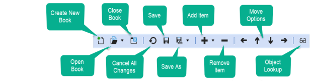
The names of the tools describe their functions, but there are options to choose from when you click Save As and Add Item.
Save As lets you specify the kind of book you are creating and the location.
-
Save as File in OneStream File System: Saves the book in the File Explorer. It can be saved in a public folder or a local folder on your system.
-
Save as File on Local Folder: Saves the book in a local folder on your system.
- Save as Application Workspace File: Saves the book in the File section of an Application Workspace Maintenance Unit.
-
Save as System Workspace File: Saves the book in the File section of a System Workspace Maintenance Unit.
You can create three types of books: Excel books, PDF books, and Zip File books. Excel books produce an Excel Workbook with each piece of content on a new tab. PDF books compile all content in a single PDF file. Zip books produce a zip file where each piece of content exists individually. You can create each type of book by saving it with the appropriate file suffix.
You can specify the book type when you save the file using any of the following extensions:
-
Excel books: ReportBookName.xfDoc.xlBook
-
PDF books: ReportBookName.xfDoc.pdfBook
-
Zip File books: ReportBookName.xfDoc.zipBook
Add Item lets you specify the kind of item to add to the book. You can add:
-
Files
-
Excel Export Items
-
Reports
-
Loops
-
Condition statements (If, Else If, and Else)
-
Item to Change Parameters
Presenting Data With Books, Cube Views and Other Items › Presenting Data Using Report Books
When you are creating a new book, regardless of type, there are two book properties to consider:
-
Determine Parameters from Content
-
Required Input Parameters
Parameters let you determine what data should be displayed in the resulting report book. They act like filters in that only certain data is selected and displayed in the report book. Each of these items is explained in further detail below.
Determine Parameters from Content
This item can be set to True or False. If set to True, it automatically determines the required input parameters from the book's content items. For large report books, setting this to False and manually specifying the required parameters will result in a performance gain.
Required Input Parameters
This field requires a comma-separated list of parameter names. You can leave this field blank if Determine Parameters from Content is set to True.
Using an Item to Change Parameters
Change parameters are used to turn off the prompt that the parameter would normally generate to define the desired result of the book. The Loop definition populates the items instead.
For example, imagine a cube view that would normally prompt you for the time member to be added to the report book. In this case, you might not want the user to make a selection, and instead, you want the report book to run for the workflow time. Rather than copying or altering the cube view, you would add an Item to Change Parameters.
Presenting Data With Books, Cube Views and Other Items › Presenting Data Using Report Books
Part of the process of creating new report books is selecting a file source type. You select a file source type whenever a new file is added to a book.
You can select the following source types for your files:
-
URL: Specify a file from an internal or external web page. You must use the full URL.
- Application Workspace File: Select a file stored in the Application Workspace Maintenance Unit File Section.
-
System Workspace File: Select a file stored in the System Workspace Maintenance Unit File Section.
-
Application Database File: Select a file stored in the Application Database Share.
-
System Database File: Select a file stored in the System Database Share.
-
File Share File: Select a file from the File Share. Many file types can be added such as Word, PDF, CSV, and XLSX.
In addition to specifying the file source type, you must also set the following:
-
URL or Full File Name: Select the URL or name of the file you want to use. Type the full URL or click the ellipsis to browse to a file.
-
Output Name: Type a name for the file when creating a Zip book. If the .pdf extension is included for a Word or Excel file, the file will be converted into a PDF. This property is optional and does not apply to PDF books.
Presenting Data With Books, Cube Views and Other Items › Presenting Data Using Report Books
When creating an XLbook, you will use Excel Export Items. You can specify a cube view to export to an Excel file. Each cube view will display on a separate worksheet in the book. These are useful when added to XLBooks rather than PDFBooks.
NOTE: Report and File items are not supported by Excel books and are ignored if added.
To create an Excel Export Item, set the following properties:
-
Cube View Name: Click the ellipsis and select a cube view to add to the Excel Book.
-
Output Name: This field is optional. Type a name for the cube view to display on the Excel worksheet. The character limit is 31.
Presenting Data With Books, Cube Views and Other Items › Presenting Data Using Report Books
When you add a report to a report book, you must specify a report type. This usually depends on how you have saved the book.
You can select from the following report types:
-
Cube View: The report is based on a cube view.
-
Dashboard Chart: The report is based on an Application Dashboard Chart.
-
Dashboard Report: The report is based on an Application Dashboard Report.
-
System Dashboard Chart: The report is based on a System Dashboard Chart.
-
System Dashboard Report: The report is based on a System Dashboard Report.
NOTE: The chart and report items listed above are application dashboard chart components, rather than dashboard components.
In addition to selecting a report type, you must also set the following:
-
Cube View or Component Name: Name of the Cube View, Dashboard Report or Dashboard Chart that you are using in the book. Click the ellipsis and browse to the source for a report.
-
Output Name: Type a name for the report when it is a Zip book. This field is optional and does not apply to PDF books.
-
Include Report Margins/Report Header/Page Header/Report Footer/Page Footer: Select True to keep the original margins, report or page headers, and report or page footers. Select False to remove the original formatting.
Presenting Data With Books, Cube Views and Other Items › Presenting Data Using Report Books
A loop is a sequence of instructions that will continually run a process as many times as is defined in the loop definition. For example, a book can be set up to loop through all the base entities under a particular hierarchy and generate an instance of the same cube view report for each entity.
Loop Type
There are three types of Loops to use when building your book:
Comma Separated List: Select this option to enter values separated by a comma to be referenced later in the book hierarchy.
Dashboard Parameter: Select this option to use a pre-configured Parameter found in the Application Dashboards page.
For example, a ParamSalesRegions parameter returns a list of all Sales Regions within the application resulting in the report book’s loop variables using the same list.
Member Filter: Select this option to utilize the member filter builder to build a member filter based on dimension members.
This loop will run each of the report book items for the specified members.
Loop Definition
When using the loop type Comma Separated List, enter a comma-separated list of text values to loop over. Use brackets [ ] when names have spaces.
For example:
(Houston, Clubs, [Houston Heights])
When using the loop type Dashboard Parameter Loop Type Used, enter the name of a dashboard parameter to create a list based on an existing parameter.
For example, a ParamSalesRegions parameter returns a list of all Sales Regions within the application resulting in the report book's loop variables using the same list.
When using the loop type Member Filter Loop Type Used, enter a member filter to supply a list of members to use in the loop.
For example:
E#Frankfurt, E#Houston, E#Montreal
This loops over each entity and performs the process three times.
E#[NA Clubs].Base
This loops over each base entity under NA Clubs and performs the process for however many base entities there are.
Dimension (only available when Member Filter is the Loop Type)
The name of the specific dimension used by the member filter. Click the ellipsis and select the correct dimension.
Loop Variables
Create loop variables by selecting a variable from the drop down menu.
|Loop1-4Variable|
Allows all Report Book items located in the loop’s hierarchy to reference the loop definition's values by name.
Up to four loop variables can be referenced and all must be enclosed in |pipes|.
For example
|Loop1Variable|.
Use |Loop2Variable| through |Loop4Variable| to create nested loops within a loop.
|LoopDisplay1-4Variable|
Allows all report book items in the loop hierarchy to reference the loop definition's values by description.
For example
|Loop1Display|
|Use |Loop2Display| through |Loop4Display| to create nested loops within a loop.
|Loop1-4Index|
Assigns a number to the values in the loop definition beginning with number one, which can be referenced in the report book items in the hierarchy.
Use |Loop2Index| through |Loop4Index| to create nested loops in a loop.
Presenting Data With Books, Cube Views and Other Items › Presenting Data Using Report Books
Change parameters are used to enhance the data in report books. Setting these parameters customizes the report book output without altering the input from the source.
Loops require Change parameters to run, but Change parameters are not exclusive to loops. When a Change Parameter type is encountered in a loop, the Loop variable is updated to use the next Loop variable.
For example, a loop may be used to loop through a list of entities and run a report for each. The Change parameters book Item should be added here to pass along the appropriate Loop variable (such as |Loop2Variable|) which applies to each entity included in the loop. 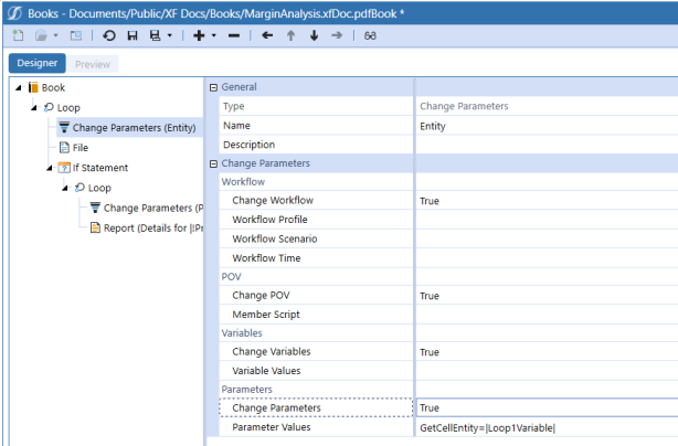
Workflow
Change Workflow: Set to True to change settings for cube views or reports driven by Workflow POV information.
Workflow Profile: Specify the Workflow Profile name to replace the original Workflow Profile referenced in the cube view or report.
Workflow Scenario: Specify the Workflow Profile Scenario Type to replace the original Workflow Profile Scenario Type referenced in the cube view or report.
Workflow Time: Specify the Workflow Profile Time to replace the original Workflow Profile Time referenced in the cube view or report.
POV
POV: Set to True to change the book’s POV without having to change the actual cube view or report.
NOTE: To use this feature, the POV tab in the cube view should not have any members selected.
Member Script: Click the ellipsis button  to launch the Member Filter Builder and enter a Member Script to change the POV. The example below changes the POV for both the entity and account.
E#[|Loop1Variable|]:A#Sales
Variables
Change Variables: This serves as a placeholder that can store up to ten variables. This is valuable when If statements are used.
Variable Values: Enter a comma-separated list of name-value pairs to change the values of the predefined variables named Variable 1-10.
Example: Variable1=Red, Variable2=Large, Variable3=[(Loop1Variable)]
Parameters
Change Parameters: Use to specify a value for a dashboard parameter found in a cube view.
Parameter Values: Click to select a parameter. Enter a comma-separated list of name-value pairs to override the custom parameter’s values.
Example: MyParam=Red, MyOtherParam=[|Loop1Variable|]
NOTE: Use !! to display the Display Items in a report header. Use ! to display the Value items in a report header.
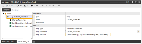
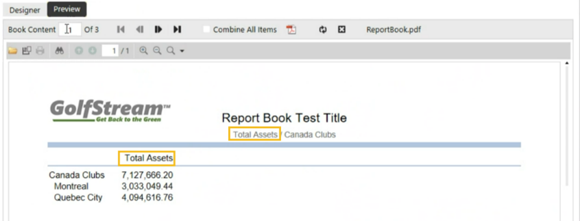
The Loop definition has a single “Change Parameters” definition. Within that definition, it changes to a single variable, “Loop1Variable”. The “Loop1DisplayVariable” and “Loop1Index” variables never change.
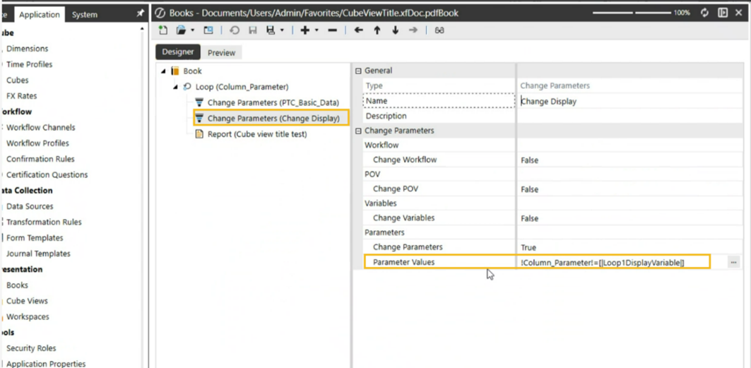
To change the Report Book title based on the Cube View column results, add a second “Change Parameters” definition changing the “Loop1DisplayVariable” variable.
Presenting Data With Books, Cube Views and Other Items › Presenting Data Using Report Books
If Statements can be used to provide conditional logic to your report books. They are commonly used in tandem with loops to create a more fine-tuned output but they can also stand on their own. Additional logic can also be added through the use of Else If and Else statements. If Statements determine how book items within the hierarchy are processed.
Statement: Enter a conditional statement using parameters to determine whether the book items will be processed.
Example of Using Variables in If Statements
(|Loop1Variable| = [Frankfurt])
This is an example of an If Statement that would have existing with a loop. If “Frankfurt” is found within the Loop Definition for the Loop1Variables, the book items in this hierarchy will process for Frankfurt.
Example of Using Parameters in If Statements
(|!UserName!| = Administrator)
If the person running the book has a user name of Administrator, the book items in this hierarchy will be included in the book.
Example of Combining Statements
(|!UserName!| = Administrator) Or (|!UserName!| = JSmith)
If the person running the book has a user name of Administrator or JSmith, the book items in this hierarchy will be included in the book.
Presenting Data With Books, Cube Views and Other Items › Presenting Data Using Report Books
Else and Else If Statements, like If Statements, may or may not be used within loops to provide additional logic to the report book output. Else and Else If statements determine how book items within the hierarchy are processed. An If statement is needed to use an Else or Else If statement.
Statement: Enter a conditional statement using parameters to determine whether the child items will be processed. See examples in If Statement.
Example:
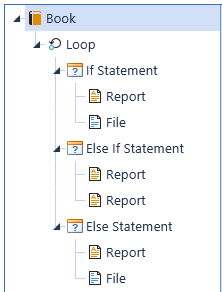
Loop1Variable: E#[Frankfurt], E#[Europe Clubs], E#[Clubs]
If Statement: (|Loop1Variable| = [Frankfurt])
If Loop1Variable is Frankfurt, run the report and file under the If statement.
Else If Statement: (|Loop1Variable| = [Europe Clubs])
Else If (or otherwise if) the Loop1Variable is Europe Clubs, run the report under the Else If statement.
Else: Else (in all other cases) run the report under the Else statement.
Presenting Data With Books, Cube Views and Other Items › Presenting Data Using Report Books
This procedure will guide you through the process of creating a basic report book.
NOTE: When creating books, you can drag and drop book items. This makes it easier to move items up and down the heirarchy.
-
Open OneStream.
-
On the Application tab, under Presentation, click Books. The Book Designer opens.
-
Click Create New Book on the toolbar.
-
Set the Determine Parameters from Content field to either True or False. See Book Properties.
-
If you set the field to False in Step 4, type the appropriate parameters into the Required Input Parameters field.
If you set the field to True, leave the Required Input Parameters field blank.
-
Click Add Item on the toolbar and select the items you want to add to the book:
-
Excel Export Item: See Excel Export Item
-
Report: See Report
-
Loop: See Loop
-
Conditional Statement: See If Statement and Else/Else If Statement.
-
Add Item to Change Parameters: See Parameters
-
If you need to remove items from the Book Designer, click Remove Item on the toolbar.
-
Click Save As and select a location.
-
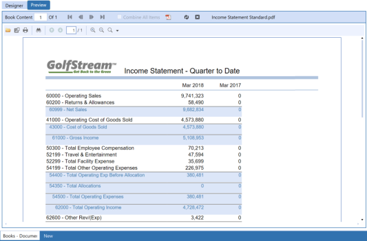
Click the Preview tab to see the new book. A book similar to the following image is displayed.
-
Click Close Book on the toolbar when you are done. You can open another book by clicking Open Book and selecting the kind of book.
Presenting Data With Books, Cube Views and Other Items › Presenting Data Using Report Books
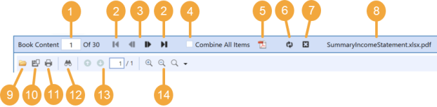
The Book preview toolbar allows you to interact and navigate in the book being previewed.
-
Page Navigation:This displays what page is currently being previewed in the report book. To navigate to a specific page, enter the page number and press Enter.
-
First/Last: Use these buttons to navigate to the first or last page of the report book.
-
Previous/Next: Use these buttons to navigate forward or backward one page.
-
Combine All Items: This combines the report book’s pages and treats them as one content item. Use this feature in conjunction with saving or printing an entire report book. If selected, you can save the entire report book as one PDF file, print the entire book, and navigate page by page using the blue navigation arrows. If this box is cleared, only the current page will save or print, and black navigation icons will be enabled.
-
Download Combined PDF File: This combines the entire report book into a PDF file using the standard Adobe rendering process and uses less memory when attempting to display large combined PDF files. This does not require enabling Combine All Items. This is the suggested method when downloading any report book to PDF.
-
Refresh: Use this button to refresh the report book and select new Parameter values.
-
Close: Use this to close the report book in the Preview screen.
-
File name: Shows the name of the file currently being previewed.
-
Open: Use this to open a report book from a computer desktop or folder.
-
Save: Use this to save the current report book page. To save the entire report book as one PDF file, ensure that the Combine All Items checkbox is selected.
-
Print: Use this to open the Print dialogue box. To print the entire report book, ensure that the Combine All Items checkbox is selected.
-
Find: Use this to find specific keywords in a report book.
-
Previous Page/Next Page: Use these icons to navigate pages of a single report book content item or to navigate a report book’s pages when the Combine All Items checkbox is selected. If a particular content item, such as a Cube View Report, is more than one page, use these buttons to navigate that report.
-
Zoom: Use these buttons to zoom in and out of a report book.
Right-Click Options
Right-click anywhere within the report to select these options.
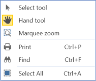
Select tool: Use this to select portions of the report book. This feature allows you to copy and paste. Highlight a portion of the report book, press Ctrl+C then Ctrl+V.
Hand tool: Use this button to scroll through a report book by clicking anywhere on the screen and moving the mouse.
Marquee Zoom: Use this tool to select an area of interest on which to zoom.
TIP: Use Alt+Left to return to the previous view or Ctrl+0 to return to a page level view.
Print: Use this to open the Print dialogue box.
Find: Use this to find specific keywords in a report book.
Select All: Use this to select all the content in a report book.
Presenting Data With Books, Cube Views and Other Items
Cube views submit and present cube data. You can format cube views to display final reports or forms for data entry, both of which can be exported to a PDF or Excel spreadsheet. You create and maintain cube views on the Application tab in the Presentation section, but can access and run cube views from:
-
Application Cube Views page
-
Workflow Task (forms)
-
Workflow Analysis section of a Workflow
-
Cube Views section in the OnePlace tab
-
Spreadsheet/Excel Add-In
You can incorporate cube views in report books, dashboards, form templates, spreadsheets, and extensible documents. That is why they are often called the "building blocks of reporting". You can also link cube views to support a more focused, granular analysis. See:
Presenting Data With Books, Cube Views and Other Items › Build Reports Through Cube Views
A cube view can query and submit data into a cube. They are flexible in how they present data, but this section focuses on how to build a simple cube view.
Cube View Properties
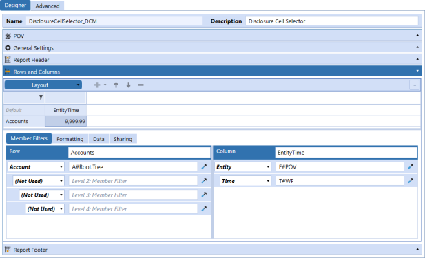
Use the following features to manage cube views. In OneStream, go to Application > Presentation > Cube Views to access the Cube Views page. Then, under Cube View Groups, expand a cube view group, and select a cube view to access these properties.
-
Designer and Advanced: Each tab has the same properties, but they are organized differently. You can use either tab.
-
POV: Make selections for the cube and all dimensions used in the cube view. You do not need to make selections for any dimensions used in rows or columns. Dimensions can also be selected in the Cube POV.
-
General Settings: Apply row and column templates, control common settings, configure headings and formatting, and set navigation links using bound parameters.
-
Report Header: Control what displays in the header when a cube view is run as a data explorer report (PDF style).
-
Rows and Columns: Determine the content for the rows and columns.
-
Member Filters: Select the dimension members, parameters, variables, expansions, expressions, and business rules.
-
Formatting: Set the header and cell formatting for the selected row or column or for the default cell for the entire cube view.
-
Report Footer: Control what displays in the footer when a cube view is run as a data explorer report (PDF style).
Cube View Toolbar
Use the following toolbar items to manage cube views.
 Create Group: Organize cube views.
 Create Profile: Organize cube view groups.
 Manage Profile Members: Assign cube view groups to cube view profiles.
 Create Cube View: Create a new cube view in a cube view group.
 Delete Selected Item: Delete a selected item, such as a cube view or cube view group.
 Rename Selected Item: Rename a selected item.
 Cancel All Changes Since Last Save: Cancel unsaved changes.
 Save: Save changes.
 Copy Selected Cube View: Copy the selected cube view to use it as a template for another cube view.
 Search: Search for cube views.
 Open Data Explorer: Run a cube view and see it in a data explorer report.
 Show Objects That Reference The Selected Item: View other areas where the selected item is used. For example, see where a cube view is being used in an application to know the impact of a change. This icon is available on other pages as well.
 Object Lookup: Find and select an object to copy.
Manage Rows and Columns
Access these additional items on the Advanced tab and the Rows and Columns slider to manage rows and columns.
 Add Row or Column: Add rows or columns to a cube view.
 Move Up: Move rows or columns up.
 Move Down: Move rows or columns down.
 Remove Selected Row or Column: Remove a row or column.
Create Cube View Groups and Profiles
Groups organize the artifacts that users are building. Cube views are organized into cube view groups. A cube view group needs to be created before a cube view, and it can include one or more cube views. Profiles further structure the artifacts and enable them to be used in other places in the application and accessed by users. Cube view groups are organized into cube view profiles that are assigned to different areas of the application, such as a workflow profile. Cube view profiles can include one or more cube view groups.
-
On the Cube Views page, click Create Group.
-
Type a name for the new group.
-
Click Save.
-
Click Create Profile.
-
Type a name for the new profile.
TIP: Use the Visibility drop-down menu to specify where cube views can be viewed in the application. The default is Always, which displays the cube views in all listed locations. If you select a specific location, the cube views will display in that location. If you select Never, the cube views will only display in the Cube Views page in the Application tab.
-
Click Save.
Cube View Group Properties
Cube view group properties apply to general and security settings.
General (Cube View Group)
Name
The name of the cube view group.
Description
A short description of how the group is used, or what it contains.
Workspace
The currently selected workspace.
Maintenance Unit
The currently selected maintenance unit.
Security
Access
Members of this group can access the cube views in the cube biew group.
Maintenance
Members of this group have the authority to maintain the cube views in the cube view group.
NOTE: Click  and begin typing the name of the security group in the blank field. As the first few letters are typed, the groups are filtered making it easier to find and select the desired group. Once the group is selected, click CTRL and double-click. This will enter the correct name into the appropriate field.
Assign Cube View Groups to Cube View Profiles
Assign cube view groups to cube view profiles to control how the cube views in the group are accessed, using the visibility cube view profile property.
-
On the Cube Views page, under Cube View Profiles, select a profile.
-
Click Manage Profile Members.
-
Under Available Groups, select the group and then click the arrow to move it to the right.
-
Click OK.
NOTE: You can assign a cube view group to multiple cube view profiles.
Create a New Cube View
-
On the Cube Views page, under Cube View Groups, select a group.
-
Click Create Cube View.
-
Type a name and description for the cube view.
-
Click Save and specify General Settings.
Copy a Cube View
For efficiency, you can copy a cube view to use its formatting settings rather than creating a new cube view. A copy of a cube view is not linked to another cube view.
-
On the Cube Views page, under Cube View Groups, select a cube view.
-
Click Copy Selected Cube View.
-
Select the cube view group from the drop-down menu.
-
Enter a unique name, not used by another cube view, and click OK.
Set the Cube View POV
Every cube view needs a POV setting to retrieve data. To query data in a cube view, set your Cube View POV, rows, and columns. The Cube View POV will set the cube and all of the dimensions used to query the various cells of the cube views.
-
On the Cube Views page, under Cube View Groups, select a cube view.
-
Select the POV slider. Enter the information individually by typing in the fields or clicking the ellipsis for each member, or move the entire Cube POV.
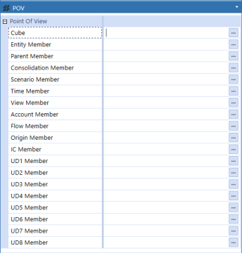
To move the entire Cube POV, on the POV Pane:
-
Right-click Cube POV.
-
Click Copy Cube POV.
-
Right-click the light blue Point Of View header.
-
Click Paste POV.
TIP: To move an entire cube POV, you can also drag and drop the Cube POV from the POV pane into the Cube View POV.
NOTE: The information in the POV slider takes priority over the information in the POV pane.
-
Create Cube View Rows and Columns
-
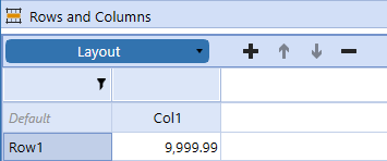
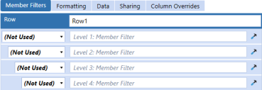
To set the cube view rows and columns, select the Rows and Columns slider. The preview grid for the new cube view displays default row and column names: Row1 and Col1. You can edit these names to make them more descriptive.
-
Click + to add rows or columns, and click - to remove rows or columns.
-
Select a row, column, or intersection in the preview grid, and then set the display options by using the settings tabs. The member filters, formatting, data suppression options, and overrides can be applied at the row and column level.
-
Click Save.
NOTE: See Member Filter Builder.
Create a Cube View Using Shared Rows and Columns
An administrator can share all rows and columns or selected rows and columns from another cube view. Sharing is more efficient when building and managing cube views.
-
On the Cube Views page, under Cube View Groups, select a cube view.
-
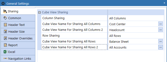
Go to General Settings > Sharing.
-
In the rows for the Row Sharing and Column Sharing, click in the fields to the right to access the drop-down menus. Select the option to share all or specified rows or columns.
-
All Rows/Columns: Enter the source cube view name of the rows and columns to be shared.
-
Specified Rows/Columns: Reference a single row or column from the source cube view when designing rows and columns.
TIP: You can share rows and columns from two cube views. If you share rows or columns with another cube view, updates are automatically linked. This can make building a cube view more efficient.
-
-
If you selected the option to share all rows or columns, click the ellipsis and then select the cube view. Click OK to confirm.
-
Click Save.
Use a Cube View Template
Creating and using cube views as templates can increase efficiency and consistency for cube views that have similar formatting and properties for the rows and columns. If you plan to use templates, create a cube view group specifically for this purpose. For example, create a cube view group with the name template (Templates_Columns or Templates_Rows) and save cube views to use as templates in this cube view group. Then, other users can find and use the templates.
-
On the Cube Views page, under Cube View Groups, select a cube view to use as a template.
-
Click Copy Selected Cube View.
-
Select the cube view group from the drop-down menu and type a name for the new cube view.
-
Click OK.
NOTE: Each cube view must have a unique name.
Presenting Data With Books, Cube Views and Other Items › Build Reports Through Cube Views
Use Cube View shortcuts to launch other cube views. This is helpful when an administrator wants to use the same cube view but does not want to use the same parameters.
For example, a user can launch a cube view for an Income Statement and be prompted with a ParamView parameter. The ParamView has two values of YTD or Periodic, meaning an Income Statement can be launched to show the data with a Year to Date view or a Periodic view (such as Month to Date).
In this case, a shortcut can be used for save two versions of the same report without prompting the user or having to maintain two cube views. In each case, the shortcut cube view Name would be the same (such as Income Statement), but the literal parameter value would be different. The YTD version would be ParamView = [YTD] and the Periodic version would be ParamView = [Periodic]. Each would open the Income Statement cube view to the proper view settings without prompting the user.
Presenting Data With Books, Cube Views and Other Items › Build Reports Through Cube Views
The Member Filter Builder dialog box makes it simple to build complex member filters without having to remember or look up the proper syntax.
On the Cube Views page, select a cube view. Select Rows and Columns and then select a row or column header. Click the Member Filters tab and then Member Filter Builder to launch the dialog box.
Navigation
Hover over the items in the Member Filter Builder dialog box for additional information.

-
Member Filter: Location where the member filter is built. Type in this section or use the other items in the dialog box to enter information into the field.
-
Dimension Tokens: There is a button for each dimension that launches the appropriate selection dialog box.
-
Member Expansion Functions: Double-click a member expansion to add it to the member filter.
-
Member Expansion Where Clause: If you select Member Expansion Where, use the where clause properties to complete the expression.
Example: UD2#AllProducts.Children.Where(Name Contains Clubs) -
Time Functions: Only applies to the Time dimension, such as T#POVPrior1. Double-click a time function to add it.
-
Substitution Variables: Double-click a system-wide substitution variable to add it.
-
Samples: Refer to this tab for example syntax for complex queries and calculations, including how to build member expansions, where clause expressions, time expressions, calculations (GetDataCell and column/row expressions), custom member list expressions, and XFBR, XFCell, and XFGetMemberProperty.
-
Expansion: Commonly used member expansions added to the end of filters. Double-click the expansion to add it.
-
Workflow: Commonly used workflow member expansions used in cube views that point to a report, form, or dashboard and are affiliated with a specific workflow profile.
-
Other: Commonly used member filter functions that enable you to create calculated rows and columns or use a custom parameter to store member lists.
Member Expansion Tab
To reduce cube view maintenance, use simple member expansions and connect your cube views to the metadata when complex expansions are needed. Avoid referencing individual members.
-
Reverse order expansions: These selections include ChildrenInclusiveR, TreeDescendantsR, and TreeDescendantsInclusiveR.
-
Where clauses: Enable further qualification of the results and can pull members based on properties such as "name contains" or text properties.
-
Remove functions: Removes some of the members from the results.
-
Parents: Returns the direct parent of the member. There may be multiple parents if there are alternate hierarchies.
-
Ancestors: Returns all members up the chain from the original member.
-
Options: Advanced option if you are a report builder familiar with the extensibility design in your application. This expansion is commonly used to focus on one portion of your extensible dimensionality.
This is not an exhaustive list of all the member expansions. Each expansion can also be found in the Samples tab. Hover over each to see the purpose and a sample of the expected syntax. Double-click the member expansion to place the sample syntax in the Member Filter field.
Use the member filter to filter data by creating a list of restricted members. Member filters can contain multiple member scripts. A member script queries a defined set of dimensional members. Members can be specified for any or all dimensions and the primary dimension can also specify a member expansion formula (for example, Descendants).
For example, a simple member script that returns the year 2022: T#2022.
For example, a member script with a member expansion that returns all the income statement accounts: A#[Income Statement].Descendants.
If one or a few dimensions in the member script have a dimension token, the remaining dimensions are pulled from the Cube View POV, the Global POV, or Workflow, Time, and Scenario. Separate each dimension that has a token in the member script with a colon as in the following example:
Cb#GolfStream:E#Houston:P#Texas:C#Local:S#Budget:T#2022M3:V#YTD:A#60000:F#None:
O#Forms:IC#None: U1#Sales: U2#HybridXL: U3#Northeast: U4#SportsCo: U5#None: U6#None: U7#None: U8#None
For example, a member filter that contains three different member scripts that returns the Actual, Budget, and Forecast scenarios: S#Actual, S#Budget, S#Forecast.
Time Functions Tab
Time is a fixed dimension and is based on the time dimension type associated with the application. OneStream software has custom time dimensions (for example, weekly and monthly), which affect time functions and expansions. Time functions pivot the member, and time expansions extend the member.
-
Time function example to display the prior period of the time member in a Cube POV: T#POVPrior1
-
Time expansion example to display all months in the year 2022: T#2022.Months
Add a time function from the Time Functions tab:
-
In the Member Filter Builder dialog box, click the Time Functions tab.
-
Select the type of time function to display the examples available: POV, WF, Global, or General. You can also select All.
-
Double-click a function to populate it in the Member Filter field.
NOTE: Click the Samples tab to view more time functions.
The following time function example demonstrates a style of syntax that provides flexibility. You can choose from a variety of time functions, but this one enables you to pivot easily on the year and period separately:
T#YearPrior1(|PovTime|)PeriodNext1 (|PovTime|)
-
Prior year from the POV time: T#YearPrior1(|PovTime|)
-
Next period from the POV time: PeriodNext1 (|PovTime|)
Variables Tab
Substitution variables are short scripts that use pipe characters to include a predefined substitution variable. For example, |WFProfile| would refresh to display the current workflow profile name. They come with every installation of OneStream and cannot be edited, so you do not need to create or maintain them.
Substitution variables can be used throughout the application. For cube views, you can use them for:
-
Headers and footers
-
Rows and columns
-
Cube view page captions
Substitution variables are always referenced with pipes (for example, |POVTime|). The Member Filter Builder dialog box includes substitution variables in the following categories:
-
POV (Cube POV)
-
WF (Workflow POV)
-
Global (Global POV)
-
CV (Cube View POV)
-
MF (Member Filter)
-
General (items not related to a POV)
When using a substitution variable to return a member name, the prefix indicates where the value of the variable is pulled from. Choose if it should refresh based on the Cube View POV (CV), Workflow POV (WF), Cube POV (POV), Member Filter (MF), or Global POV (Global).
Choose if you want to display the member description (usually in headers and footers) by adding Desc as the suffix. Time has an added short description option that is set through the time profiles. For example, |WFTimeDesc| returns the description Feb 2022, and |WFTimeShortDesc| returns the short description Feb.
Common substitution variables:
-
Username that ran the report: |UserName|
-
Cube view name: |CVName|
-
Members text properties: |Text1|
-
Today's date: |DateDDMMYYYY|
On the Variables tab, you can double-click a substitution variable to add it to a member filter. You can also copy a substitution variable from the Object Lookup dialog box:
-
On the Cube Views page, click Object Lookup to open the dialog box.
-
Under Object Type, select Substitution Variables.
-
Select a substitution variable from the list. Use the Filter field to find a specific option.
-
Click Copy to Clipboard and then paste the substitution variable where needed.
Samples Tab
The Samples tab holds example syntax for more complex queries and calculations in the following categories:
-
Member Expansions
-
Where Clause Expressions
-
Time Expressions
-
Calculations (GetDataCell Expressions and Column/Row Expressions)
-
Custom Member List Expressions
-
XFBR, XFCell, and XFGetMemberProperty
Add an expression from the Samples tab:
-
In the Member Filter Builder dialog box, click the Samples tab.
-
Double-click a sample to populate it in the Member Filter field.
Where Clauses
Where clauses are commonly used in reporting to create a more flexible query. The where clause can pull members based on properties:
-
Text properties
-
Portions of the description or name (for example, starts with or contains)
-
Security
-
Account types (account dimension only)
-
Intercompany (entity and account dimension only)
-
Specific currency (entity dimension only)
-
In use property
-
Has children
NOTE: Where(HasChildren = True) can only be used for the dimensions assigned to the cube on the default Scenario Type.
-
Has a member formula
NOTE: Click the Samples tab to view common where clauses.
Add a where clause from the Samples tab:
-
In the Member Filter Builder dialog box, click the Samples tab.
-
Expand the Where Clause Expressions list.
-
Double-click a sample to populate it in the Member Filter field.
Presenting Data With Books, Cube Views and Other Items › Build Reports Through Cube Views
Cube view performance includes the following information:
Database Sparsity
Sparsity is the ratio of data record volumes in the cube compared to the dimensions modeled in the cube. We see sparsity when the data unit (combination of cube, entity, parent, consolidation, scenario, and time) has sparsely populated data intersections across the account-type dimensions (account, intercompany, flow, and user-defined). The absence of data records can affect reporting performance because it is difficult to render reports if data is sparse.
Avoid sparsity in your application design when possible. Use analytic blend, extensibility, or other design frameworks to ensure the Dimension Library is designed for your reporting structure and to minimize sparsity. However, even with an optimal design, sparsity can still occur if a large report pulls in a lot of dimensions. Suppression settings can help improve reporting performance if this is the case.
Row and Column Suppression
Use row and column suppression in larger reports to make them easier to read while still enabling the report builder to create a low maintenance report based on the metadata design.
To adjust the suppression settings:
-
On the Cube Views page, under Cube View Groups, select a cube view.
-
Select Rows and Columns to expand the slider.
-
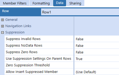
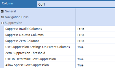
Select the row or column and then click the Data tab. The following settings are available.
-
Suppress Invalid Rows/Columns: Set to True to suppress any invalid cells.
-
Suppress NoData Rows/Columns: Set to True to suppress any cells without data. When data entry is required, the recommended setting is False.
-
Suppress Zero Rows/Columns: Set to True to suppress any cells containing zeros.
-
Use Suppression Settings on Parent Rows/Columns: This property relates to the prior properties and controls whether the parent members in this member filter use the same settings.
-
Zero Suppression Threshold: When Suppress Zero Rows/Columns is set to True, enter a value to suppress all numbers below it. All numbers below the specified number are recognized as zeros. For example, entering 499.99 results in every number lower than that value being recognized as zero and therefore suppressed.
-
Allow Insert Suppressed Member (rows only): Use this setting to access a member currently suppressed for data entry purposes. You can only use this with cube views and form templates.
-
All: Enables visibility to all cube view row expansions
-
False: All row expansions remain suppressed
-
Nested: Enables visibility of the row expansions two through four
-
Innermost: Enables visibility of the row expansion that is at the bottom level
-
-
User To Determine Row Suppression (columns only): Set to True to improve performance on large cube views by enabling the designer to better define how to apply row suppression.
-
Allow Sparse Row Suppression (columns only): Provides performance improvements for cube views that use multiple nested row dimensions and works in conjunction with a General Settings property. When set to True, sparse row suppression is applied to the entire cube view. It can be turned on and off for specific columns.
Suppressed Members
This section includes instructions for how to manage suppressed members.
Apply Modify Suppression Property
With this setting, you can choose whether rows are suppressed from the data explorer grid. This feature is useful for a small cube view that will not generate a large number of additional rows if the suppression is turned off.
-
On the Cube Views page, under Cube View Groups, select a cube view.
-
Go to General Settings > Common.
-
Under Restrictions, set the Can Modify Suppression property to True.
-
Click Save.
Modify Suppression
To modify suppression, you must first apply the correct property. See Apply Modify Suppression Property.
-
Open a cube view in Data Explorer view.
-
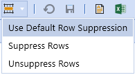
Select the Row Suppression drop-down menu.
-
Choose the option to apply.
-
Use Default Row Suppression: Apply the cube view suppression settings.
-
Suppress Rows: Suppress any rows with zeros or no data regardless of the cube view settings.
-
Unsuppress Rows: Unsuppress all rows that were suppressed with zeros, no data, or invalid data regardless of the cube view settings.
-
Apply Property to Allow Insert Suppressed Members
You can insert suppressed members so that their data is entered in the cube view.
-
On the Cube Views page, under Cube View Groups, select a cube view.
-
Go to Rows and Columns > Data > Suppression and confirm that Allow Insert Suppressed Member is set to All.
NOTE: The Allow Insert Suppressed Member option is only available for rows.
-
Click Save.
Insert Suppressed Members
To insert suppressed members, you must first apply the correct property. See Apply Property to Allow Insert Suppressed Members.
-
Open a cube view in Data Explorer view.
-
Right-click in the account or entity.
-
Click Insert Suppressed Member.
-
To the right of the account or entity field, click Select Member.
-
Select an item and click the arrow to add it to the Result List.
-
Click OK and then click OK to confirm.
-
Enter data as needed in the white cells.
-
Click Save and then click OK.
Sparse Row Suppression
Designs for analytic reports typically have multiple dimensions nested in rows. The combination of members generated from the nested expansions can easily result in billions of potential expanded rows, many of which may not have data. In these designs, standard row and column suppression (invalid, no data, or zero) in the cube view would still require each of those billion rows to be inspected individually for data. So, we recommend sparse row suppression be enabled to enhance the performance of a large cube view when, due to widespread database sparsity, the report is likely to return many records without data and take a long time to run. Sparse row suppression evaluates the data records of the cube view intersections and filters records with no data (not zeros) before rendering the cube view.
IMPORTANT: Sparse row suppression cannot be applied to dynamically calculated data through dynamically calculated members and cube view math. Avoid errors by correctly applying the settings on the dynamically calculated columns.
NOTE: When sparse row suppression is applied, OneStream assesses all row data before displaying the cube view. Cells containing dynamic calculations are populated on-the-fly. When OneStream assesses the rows of data, the rows containing dynamically calculated data are omitted from the cube view because the data is not saved in the database.
To enable sparse row suppression in cube views:
-
On the Cube Views page, under Cube View Groups, select a cube view.
-
Go to General Settings > Common.
-
Under Suppression, set Allow Sparse Row Suppression to True.
-
Select Rows and Columns to expand the slider. Select the row and then the Data tab.
-
Ensure the additional row suppression properties you will use are also set to True.
NOTE: Any row assigned a suppression setting will be enabled for sparse row suppression. If no suppression is applied, sparse row suppression will not be applied.
-
In the Rows and Columns slider, select the column and then the Data tab.
-
Under Suppression, set Allow Sparse Row Suppression to True.
-
Ensure the additional column suppression properties you will use are also set to True.
NOTE: If columns contain dynamically calculated data, set Use to Determine Row Suppression and Allow Sparse Row Suppression to True to avoid an error.
Cube View Paging
Cube view paging is only applied to the data explorer view of a cube view and is used to enhance the performance of cube views containing more than 10,000 unsuppressed rows. The cube view will attempt to return up to 2000 unsuppressed rows within a maximum processing time of 20 seconds. The purpose of paging is to protect the server from large cube views that could affect application performance.
Evaluations are performed on the potential size of the rows and the processing requirements to determine if paging is enabled and the number of rows returned.
-
Evaluation 1 – Enable Paging: An evaluation is performed on the entire cube view to determine the total number of possible unsuppressed rows that will be generated. If the total number of potential unsuppressed rows is less than 10,000, no paging will be enabled.
-
Evaluation 2 – Paging Enabled: If the total number of unsuppressed rows is greater than or equal to 10,000, paging is enabled.
-
Evaluation 3 – Paging: Once paging begins, the cube view evaluates the rows attempting to return a minimum of 20 to a maximum of 2000 unsuppressed rows. In the case of nested dimensions on rows, the evaluation starts on the left most dimension expansion, as defined in the cube view. After a maximum processing time of 20 seconds, the first page of the cube view will be returned for display containing only the rows that completed processing during the time constraint. For this reason, cube view pages are not a fixed number of rows. The rows are ultimately determined by their time to process. This also relates directly to the percentage display, because each page is generated by processing time requirements, and the last page is not known while the cube view is running. Therefore, this percentage is not intended to be a precise measurement.
When a row is defined with nested dimensions, the paging evaluation is performed on the left most dimension. For each expansion of the left most dimension, the paging will not progress to the next sibling until all the records are returned by all the other dimension expansions to be completed.
To set the properties, on the Cube Views page, under Cube View Groups, select a cube view. Go to General Settings > Common. The following settings are available.
-
Max Unsuppressed Rows Per Page: Determines how many rows are written before the cube view starts paging (default is -1). The maximum value is 100,000.
-
Max Seconds To Process: Determines how many seconds the cube view processes before it starts paging (default is -1). The maximum value is 600 seconds.
See Cube View Paging for more information on how to cancel a long-running cube view through Task Activity.
Presenting Data With Books, Cube Views and Other Items › Build Reports Through Cube Views
There are several advanced uses with cube views such as setting them to change by Point of View or Workflow. Using advanced settings let you create and maintain fewer cube views.
With Workflow
Set the POV, rows, and columns in the cube view so it is driven by the Workflow POV and the entities assigned to the workflow profile in use. By doing this, you can make forms, dashboards, cube views, and reports driven dynamically by the workflow profile.
Workflow Entities
Using an expression such as E#Root.WFProfileEntities from within the Rows or Columns Tab shows the entity or entities assigned to that particular Workflow Profile at run time. WFProfileEntities or similar expressions cannot be assigned to the POV because there can be more than one and the POV only requires a single member.
Workflow Scenario
Under the cube view Point of View Slider, select the WF Member for the Scenario dimension, or use WFScenario|, or a similar Substitution Variable in Rows and Columns.
Workflow Time
Under the cube view Point of View Slider, select the WF Member for the Time dimension, or use WFTime|, or a similar Substitution Variable in Rows and Columns.
With Dashboard and Form Parameters
When using dashboards and forms, use parameters to focus the data to what is needed. For example, when a Dashboard is launched, it can prompt for the specific entity or region needed. See Parameter Guides for details.
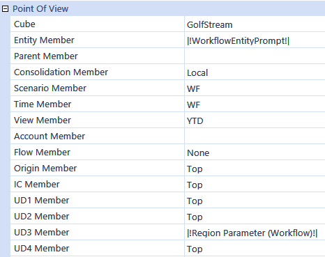
Within the cube view, refer to parameters in the Point of View and Rows and Columns Slider to restrict the query to just the data expected. Surround the parameter name in pipes and exclamation points (for example, |!ParameterName!|).
The following image shows an example of using the entity and region parameters in the cube view’s Point of View:
TIP: Use dashboard parameters as a single repository for parameters that are used in dashboards or forms. If a parameter is referred to within a cube view (for example, |!ParameterName!|) and there is not a parameter by that name associated with the form, it will search through the application’s dashboard parameters for one with that name and use it.
Changing Member Display Name
Change the name returned with a member script in a cube view by adding :Name(“enter name here”) at the end of the member filter. The double quotes around the Name() value are optional.
For example
A#60999:Name(“Net Sales”) or A#60999:Name(Net Sales)
Presenting Data With Books, Cube Views and Other Items › Build Reports Through Cube Views
Presenting Data With Books, Cube Views and Other Items › Build Reports Through Cube Views › Format a Cube View
Formatting settings and overrides combine to create the cell format. You can apply formatting and isolate it to nested expansion levels on rows or columns by using property filters found in the conditional formatting dialog box.
Apply property filters in this order:
-
Application properties standard report settings
-
Cube view default settings
-
Column settings
-
Row settings
-
Column row overrides
-
Row column overrides
The primary output for a cube view is the data explorer grid. You can also export to Excel or use a report viewer.
Presenting Data With Books, Cube Views and Other Items › Build Reports Through Cube Views › Format a Cube View
Cube view formatting controls how cube views display. Most of the format settings transfer to Excel and can still be overridden with the standard Excel styles. The formatting also transfers to reports where the cube view is being used in a data adapter.
Cube view formatting can be selected for the entire cube view or specific rows, columns, headers, and individual cells. The formatting options enable the number formats, percentage signs, scaling, currency symbols, colors, fonts, and font size to be unique to the business needs. Label row and column sets to support cube view maintenance when editing, formatting, and applying calculations.
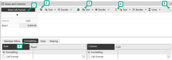
In the cube view, select the Rows and Columns slider. Then click an individual cell or header and then the Formatting tab to view and edit the toolbar options for data explorer, Excel, and report formats. The icons in the toolbar include the most common formatting properties. Each icon coincides with the cell selected in the Rows and Columns slider. For example, if a column header is selected, the formatting changes made will only affect the specific column header.
-
Selector
-
Data explorer formatting options
-
Excel export formatting options
-
Report formatting options
-
Advanced formatting options
-
Formatting tab
Set Up Basic Formatting for a Cube View
-
On the Cube Views page, under Cube View Groups, select a cube view.
-
Select Rows and Columns to expand the slider.
-
Select the row, column, or cell to edit.
NOTE: Click the Default cell to update the default settings for all headers and cells.
-
Click the Formatting tab.
-
Select the options to change the header and cell format settings for the data explorer, Excel, and report output types.
Data Explorer
The formatting settings available are organized in the following groups.
-
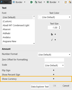
Text: Font, color, size, bold, and italic settings. When you select a cell, the following formatting properties become available in the Text drop-down menu: number, zero offset, scale, flip sign, show percent sign, and show currency.
-
Border: Background color and gridline color
-
Column: Whether the column is visible and its width
There are different settings available for the headers and cells.


Excel
The formatting settings available are organized in the following groups.
- Text: Color, horizontal alignment, vertical alignment, indent level, and wrap settings. When you select a cell, the following formatting properties become available in the Text drop-down menu: number and use scale.
-
Border: Background color and the color and line styles of the cell borders
-
Column: Column width
There are different settings available for the headers and cells.


Report
The formatting settings available are organized in the following groups.
- Text: Color, alignment, size, and underline settings. When you select a cell, the following formatting properties become available in the Text drop-down menu: no data number, use numeric binding, and numeric binding.
-
Border: Background color and cell borders
-
Lines: Settings for the top and bottom lines for the first row, padding, color, and thickness
-
Column: Column width
There are different settings available for the headers and cells.


Apply Scaling, Indents, and Currencies
-
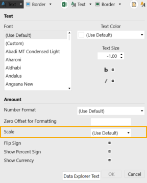
Scale: Open the Data Explorer Text drop-down menu to view the Scale setting. You can also apply it to Excel and report formatting.
-
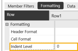
Indent level: On the Formatting tab for a row or column header, view the Indent Level setting.
-
Show currency: Open the Data Explorer Text drop-down menu to view the Show Currency setting.
Header Format Details
The formatting properties for a cube view header include default, row, and column headers. These properties are in the Rows and Columns slider. Not all properties are available for each header.
-
In the Rows and Columns slider, select the Default cell to apply the formatting settings to all of the cube view headers.
NOTE: You can select an individual row or column header instead if you want to edit the settings for a specific header.
-
In the Formatting tab, click the ellipsis to the right of Header Format.
-
Click Format to view the options. The Excel section only affects how the cube view data display in Excel.
-
Custom Parameters: Click the ellipsis to select and assign a custom parameter such as a cube view style to the cube view header.
-
RowExpansionMode: Control expansion of nested rows. This determines how rows are displayed in the data explorer grid. The default sets this property to False.
-
ShowDimensionImages: Set to False to hide the dimension icons in the data explorer grid row and column headers. The default setting will display the dimension icons.
-
HeaderWrapText: When False, column and row header text does not wrap. When set to True, column and row header text displays as wrapped. This applies to Default Cube Views and works with Header Overrides.
NOTE: ColumnWidth and Row Header Width must be set from the Header Size settings menu for row header text to wrap
-
IsColumnVisible: Set to False to hide specific columns. Set this property at run time with a parameter to show and hide detail.
-
ColumnWidth: Enter a numerical value for column width. If the header label exceeds the column width, the header will automatically wrap the text.
-
ColumnHeaderWrapText:False, column header text does not wrap. When set to True, column header text displays as wrapped. This applies to individual column headers and works with Header Overrides. ColumnWidth must be set for Column Headers to wrap.
NOTE: ColumnWidth must be set for header text to wrap
-
MergeAndCenterColumnHeaders: When set to False, column headers are left justified. When set to True, column headers are centered. This applies to Default Cube Views or individual column formatting in Data Explorer and Reports.
NOTE: MergeAndCenterColumnHeaders does not apply to Header Overrides.
-
IsRowVisible: Set to False to hide specific rows. Set this property at run time with a parameter to show and hide detail.
-
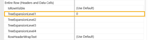
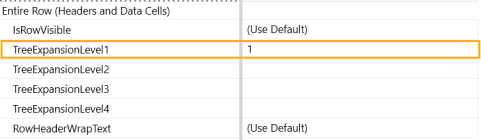
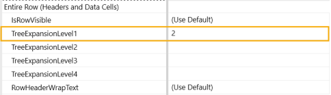
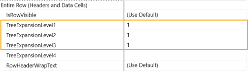
TreeExpansionLevel1-4: Automatically expand up to 4 nested rows in Data Explorer. Enter the number of rows to be expanded from 0 – 4 in the corresponding TreeExpansionLevel.
NOTE: For TreeExpansionLevel to work, RowExpansionMode from the Default Header must be set to "Use Default". Using Collapse All or Expand All overrides this setting.
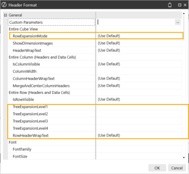
TreeExpansionLevels are tied to the Member Filter Dimension Types on the Designer tab and require a .Tree Member Expansion.
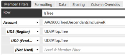
NOTE: Default settings are overwritten by Row Overrides when set.
Set the TreeExpansionLevel to 0 to collapse all nested rows.

Set the TreeExpansionLevel to 1 to expand the first level of nested rows.

Set the TreeExpansionLevel to 2 to expand the first two levels of nested rows.

Set the TreeExpansionLevel to 3 to expand the first 3 levels of nested rows.
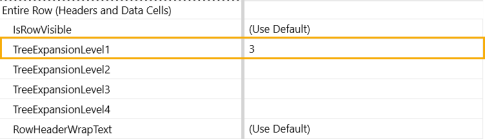

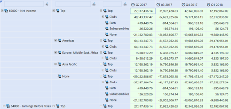
This example shows the TreeExpansionLevel 1, 2, and 3 expanded:
-
RowHeaderWrapText: When False, row header text does not wrap. When set to True, row header text displays as wrapped. This applies to individual row headers and works with Header Overrides.
NOTE: Row Header Width must be set from the Header Size settings menu for row header text to wrap.
-
Font and color options are available. For the FontFamily, any .Net font installed on the Excel client operating system is included in the font family. The FontSize default is 11.
-
ExcelMaxOutlineLevelOnRows and ExcelMaxOutlineLevelOnCols: Up to six outline levels can be used for the creation of collapsible and expandable Excel groups of rows or columns when exporting. Enter the number of outline levels needed. This relates to the Excel Indent Level setting that is applied in the header format on each row or column, so the number entered here should equal the highest setting applied on the rows or columns.
-
ExcelExpandedOutlineLevelOnRows and ExcelExpandedOutlineLevelOnCols: When a cube view is exported to Excel, these settings control to which outline level the file is initially opened. The default is 1, which means each grouping is fully collapsed.
-
ExcelColumnWidth: Default Excel column width in pixels unless overridden in columns.
-
ExcelOutlineLevelCol and ExcelOutlineLevel: Default Excel outline level for rows and columns is 1 unless specified here or overridden in rows or columns.
-
ExcelHorizontalAlignment and ExcelVerticalAlignment: Control how the data will be aligned horizontally and vertically using the Excel standard alignment options.
-
ExcelIndentLevel: The number of characters to indent the text or value.
-
ExcelWrapText: This determines if text like headers will be wrapped in the output.
-
Color and border options are available.
-
ReportSeparateBandPerCubeViewRow: This is a setting to optimize performance for large cube views that will be dynamically generating a data explorer report with many row definitions with unique formatting. Default setting is (Use Default), which is a conditional setting. This applies to when a data explorer report is run from a cube view and background temporary database tables in memory, one for each row name in the cube view are created. If there are more than 100 row definitions, fewer report bands (separate temporary in-memory tables) are created, combining rows where formatting is the same. Set to True to create a separate table per cube view row definition, which may affect performance with hundreds or thousands of row definitions. Set to False to combine row definitions of the same format into fewer temporary in-memory tables.
-
Page and column header and table layout options are available.
-
ReportColumnWidth and ReportRowHeight: Sets the width of a column or the height of a row by number of pixels.
-
ReportTopLinesOnFirstRowOnly and ReportBottomLinesOnLastRowOnly: If the row definition results in multiple rows, a top line will be placed on the first line only or a bottom line will be placed on the last line only.
-
ReportBandHeightBeforeFirstRow and ReportBandHeightAfterLastRow: Allows a number to be entered in pixels to add before the first row or after the last row of where a row definition starts.
NOTE: The top and bottom report bands used for lines and spacing are removed if there are no data rows or for suppressed rows.
-
ReportRowPageBreak: Applies a page break where appropriate for this row.
-
ReportRowContentTop: Specifies the vertical position of the row relative to the row above it. If it is set to zero, the top of the row immediately follows the row above it with no vertical spacing.
-
ReportRowContentHeight: The height of the row in pixels.
-
ReportRowPaddingTop and ReportRowPaddingBottom: Control the extra space (padding) above and below a row in a report.
-
ReportFontSize: The point size of the font on the report if it differs from the font size displayed in data explorer.
-
ReportTextAllignment: Controls how the data are aligned in a report.
-
ReportUnderline: Creates a simple underline of report values.
-
Color options are available for text and background.
-
Top Lines and Bottom Lines: Used for underlines and overlines. The Line1 and Line2 options can be used together to create a double underline or double overline. For the lines to have a small gap between each column, use the ReportBottomLine1PaddingLeft property or one similar.
-
Borders: Allows a line to be drawn around the border of a cell.
Cell Format Details
The format properties for a cell include font, colors, background, and grid lines.
-
In the Rows and Columns slider, select the Default cell to apply the formatting settings to all of the cube view cells.
NOTE: You can select an individual cell instead if you want to edit the settings for a specific cell.
-
In the Formatting tab, click the ellipsis to the right of Cell Format.
-
Click Format to view the options. The Excel section only affects how the cube view data display in Excel.
-
Custom Parameters: Click the ellipsis to select and assign a custom parameter such as a cube view style to the cube view cell.
-
NumberFormat: Uses the Microsoft .NET standard number format syntax, which allows different formats to be specified for positive and negative numbers separated by a semi-colon (not available in Excel). For example:
-
#,### ;(#,###);0 would show the number using a comma as the thousands separator, no degrees of precision, parenthesis around negative numbers, and a zero for null values. The pattern of this format choice is Positive;Negative;Null values with each separated by a semicolon. After the first #,### there is a space. This enables the numbers to line up with negative numbers due to the parenthesis.
-
#,###.#% ;(#,###.#%);” – “ would show a percentage with a comma as the thousands separator, one degree of precision, negative percentages in parenthesis and a dash for null values.
-
N2 would show the data as a numeric value with two degrees of precision. Negative numbers are presented with a minus sign.
-
P1 would show a percentage with one degree of precision.
-
-
ZeroOffsetForFormatting: Related to NegativeTextColor, which is determined by whether a number is less than zero. For example, if sales were less than 100, rather than 0, they could be displayed in red. A valid setting is any number other than zero.
-
Scale: -12 to +12 are the valid values for the scale. For example, to show a number in thousands, the scale should equal 3, or for millions, the scale should equal 6.
-
FlipSign: This will flip the display value between positive and negative. This is useful for reports where certain expense numbers are stored as positive or negative and need to be shown on the report.
-
ShowPercentageSign: Determines whether a percentage sign is displayed.
-
ShowCurrency: Shows the currency code (for example, EUR). This is not available in Excel.
-
Font and color options are available. For the FontFamily, any .Net font installed on the Excel client operating system is included in the font family. The FontSize default is 11. NegativeTextColor, WritableBackgroundColor, and SelectedGridLinesColor can optionally override the format for negative numbers, writeable data cells, and selected data cells.
-
ExcelNumberFormat: Apply to control how numbers display when exporting to Excel. A number format can have up to four sections of code separated by semicolons. These code sections define the format for positive numbers, negative numbers, zero values, and text, in that order.
<POSITIVE>;<NEGATIVE>;<ZERO>;<TEXT>
For example, use these code sections to create the following custom format. Note that this format can include the underscore to create a space after the trailing positive number and can control the color of the negative number to be red:
#,##0.00_);[Red](#,##0.00);0.00
NOTE: ExcelNumberFormat settings [#,##0,,.0 ;[Red](#,##0,,.0)] on a cube view scales numbers when the cube view is exported to Excel.
-
ExcelUseScale: Determines if Excel uses the scale property.
-
Alignment, color, and border options are available.
-
ReportNoDataNumberFormat: By default, NoData (null) cells display as empty in the data explorer and as zeros in a report. However, any .NET number format text can be specified to format those zero values differently in the report. For example, type NODATA in that setting. To display empty text, type # in that setting. If the number format setting of the cell already does something with null values, this property does not need to be filled.
-
ReportUseNumericBinding and ReportNumericBindingFormat: These are related to the export of dashboard reports to Excel, so numbers can be rendered in the proper number format rather than appear in Excel as text. Set ReportUseNumericBinding to True to use numeric amounts instead of OneStream text-based formatting when generating a cube view report. The ReportNumericBindingFormat setting must follow a specific syntax. This number format is related to the report engine, so Excel standard number formats are not used. For example, to represent a number format for positive, negative, and no values:
{0:#,# ;(#,#);" - "}
This feature provides the ability to generate numbers instead of text when exporting a dashboard report to Excel. However, it cannot be used for calculation status and annotation data cells because those features cannot be represented as numbers. In those cases, use column overrides to display the values as text.
-
Position, font, color, top lines, bottom lines, and borders are available. See Header Format Details.
Presenting Data With Books, Cube Views and Other Items › Build Reports Through Cube Views › Format a Cube View
In a cube view, you can nest up to four different dimensions as rows and two different dimensions as columns.
NOTE: When nesting cube view columns, if the top column header is longer, it will span the nested column headers when displayed on a cube view report.
Dimension Type: Select a dimension type from the drop-down list. Indicates which dimension type will display on the selected row or column.
Member Filter: Enter a member filter to express the specific members needed from the dimension.
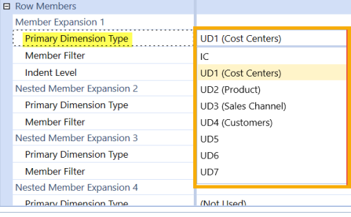
User Defined Description – Cube View: In the Cube View Editor, the custom user-defined descriptions will display in the Designer and Advanced tabs, in the Member Filters dimension type:
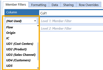
In the Advanced tab, Row and Column dimension type:
Data
Can Modify Data: If False, specific rows or columns are read-only. If True, the False setting will override it. However, if Can Modify Data is False, the entire cube view is read-only and this setting will not override if True.
Text Box: Makes the cube view cell numerical. Only numerical values can be entered in the data cell at run time. This is the default setting.
Combo Box: Select this when a List Parameter is used in a cube view data cell. Enter the name of the List Parameter in the property below.
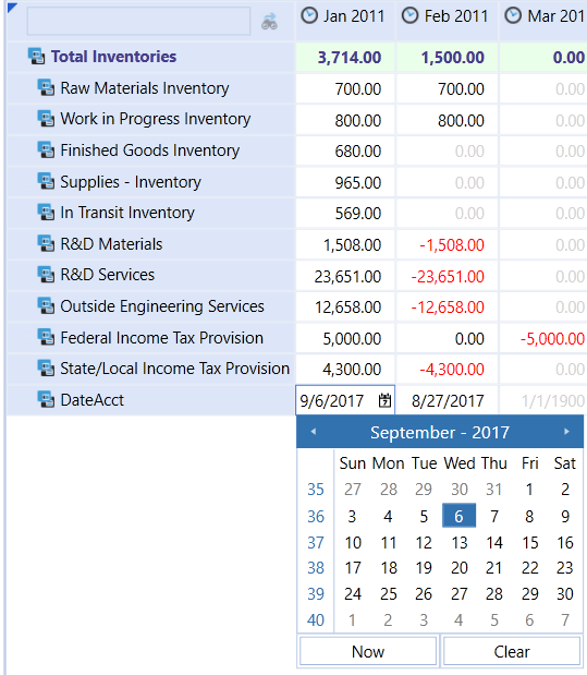
Date: Enables a calendar in the cube view cell and allows you to select a specific date in the data cell.
Date Time: Enables a calendar and a time display and allows you to select a specific date and time in a data cell.
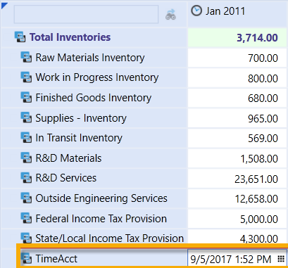
NOTE: Selecting Now in the calendar enters the current date or current date and time.
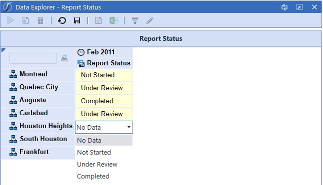
List Parameter: Enter a parameter to create a drop-down list of choices in a cube view data cell.
Enable Report Navigation Link (Rows Only): Set to True to enable Navigation Link Drill Downs in dashboards. Enter a value in the Dashboard to Open in Dialog field. Set to False if this function is not used for the cube view. See Navigation Links.
Dashboard to Open in Dialog (Rows Only): Name of the dashboard or parameter used for the Report Navigation Link. Use a parameter for a cube view acting as a row template across multiple cube views.
Linked Cube Views: Enter a comma-separated list of cube views that will be available to open when viewing a cube view in the Data Explorer Grid. The cube views specified in this field apply to the selected row or column and are available when you right-click on any data cell in the specified row/column.
NOTE: Row settings override column settings which override cube view settings.
Presenting Data With Books, Cube Views and Other Items › Build Reports Through Cube Views › Format a Cube View
By default, a cube view has standard headers to represent rows and columns. All the header settings control the row and column headers presented when the cube view is run if the default is not used. See General Settings.
If the header name for a row or column must be different than the dimension name or description, use the rename function. The rename function is an expansion of the end of a member filter that enables you to enter what you want displayed. For example, A#CashBalance:Name(Cash Balance) will display Cash Balance as its header.
Another way to use the rename function is to include the XFMemberProperty, which returns member properties. For example:
A#6009.base:Name(XFMemberProperty(DimType=Account, Member=|MFAccount|, Property=AccountType))
-
Use the rename function to pull in the member property: Name(XFMemberProperty
-
Define the dimension type: (DimType=Account,
-
Determine what will be in the member filter: Member=|MFAccount|,
-
Pull in the property: Property=AccountType))
Presenting Data With Books, Cube Views and Other Items › Build Reports Through Cube Views › Format a Cube View
Conditional formatting provides the ability to format headers or cells based on defined criteria. Conditional formatting in cube views supports data analysis by highlighting cells or ranges of cells, identifying key values, and using data bars, color scales, and icon sets that correspond to specific variations in the data. Conditional formatting is applied and visible in data explorer, Excel, and report views. The conditional formatting criteria are applied to cube view rows or columns on the formatting property within the cube view editor.
Conditional formatting is available on the formatting elements of a cube view.
-
Cube view default formatting
-
Row and column headers
-
Row and column data cells
-
Row and column overrides
Conditional formatting follows the cube view processing order of operations:
-
Number format as defined in application properties
-
Cube view default
-
Column formatting
-
Row formatting
-
Column overrides
-
Row overrides
The combination of formats and overrides equals the format for the cell when rendered. Formatting can be applied and isolated to the nested expansion levels on rows and columns by using property filters in the dialog box. This feature is a cube view formatting option.
NOTE: If there are any existing formats before applying conditional formatting, they will be retained if the range of cells containing the conditional formats does not meet the conditions of the rule. All styles from the cube view and the selection styles that had been applied to that range are overridden by conditional formatting.
Conditional Formatting Properties
General and conditional formatting can be applied in the Header Format and Cell Format dialog boxes. The Condition and Format buttons launch additional dialog boxes with available options. The dialog box for conditional formatting is divided into sections.
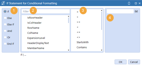
-
Conditional statement: Defines the options for conditional statements to apply constraints to formatting.
-
Filter: Applies the criteria that pertain to your statement.
-
Operator: Contains criteria filters to use in your conditional statement.
-
Text/object: Find the text or object to be tested.
Header Property Filters
|
Header Property Filter |
Description |
|---|---|
|
IsRowHeader |
Boolean, determines if an object is a row header field (appropriate for Cube View Default). |
|
IsColHeader |
Boolean, determines if an object is a column header field (appropriate for Cube View Default). |
|
RowName |
Cube view row name |
| ColName | Cube view column name |
|
ExpansionLevel |
Determines the expansion level for rows (1-4) and columns (1-2). Related to isolating the row expansion headers. |
|
HeaderDisplayText |
Custom descriptions used with the :Name() function |
|
MemberName |
Metadata member labels |
|
MemberDescription |
Metadata member descriptions |
|
MemberShortDescription |
Metadata member short descriptions (only Time dimension) |
|
IndentLevel |
Indentation level derived as a formatting setting or that is system-generated based on tree expansions |
Expansion Specific Property Filters
| Expansion Specific Property Filter |
Option |
Description |
|---|---|---|
| RowE expansion level - criteria |
Row expansions 1–4 |
Identify nested or expansion rows with specified criteria |
| ColE expansion level - criteria |
Column expansion 1 and 2 |
Identify nested or expansion columns with specified criteria |
Cell Format Property Filters
| Cell Format Property Filter |
Description |
|---|---|
|
IsNoData |
Test for no data |
|
IsRealData |
Test for stored data, ignoring derived Zero-View data |
|
IsDerivedData |
Test for derived data, commonly resulting from Scenario Zero-View settings |
|
IsRowNumberEven |
Test for the row number as an expansion or on a fixed row |
|
ExpandedRowNum |
Test the count of expanded rows, Zero-based. This property filter is based on the total cube view count of rows generated from each row and its expansions. |
|
CellAmount |
Test cell data amount |
|
CellStorageType |
Test the method used to store data |
Define Properties for Conditional Formatting
Conditional formatting can be applied based on a data point. Cell formatting conditions can occur based on member names or descriptions, indent levels, row and column names, and expanded and even numbered rows.
Conditional formatting can also be applied based on members. The ability to format based on the name or description is enhanced by using a standardized metadata naming convention. Summary level members with keywords such as “Total” or prefixes or suffixes such as “Tot” could be used in conditional formatting. Members can be formatted using dynamic criteria, such as StartsWith or EndsWith. HeaderDisplayText differs from the MemberName and MemberDescription property filter because it references the custom name parameter in a member filter. Dynamic criteria can be applied to the name and description property filters to apply the required formatting.
-
On the Cube Views page, under Cube View Groups, select a cube view.
-
Select Rows and Columns to expand the slider.
-
Select a row or column.
-
Click the Formatting tab.
-
Click the ellipsis to launch the dialog box.
-
Click Condition, set the requirements, and then click OK.
-
Click Format, set the requirements, and then click OK.
-
Click Condition and then End If to close the condition.
-
Click OK twice.
Presenting Data With Books, Cube Views and Other Items › Build Reports Through Cube Views › Format a Cube View
Below are common usage examples of conditional formatting.
Indent Level
The IndentLevel Property filter will dynamically format from defined rows or expansions. Indentation is zero-based. The formatting can be applied to the default or to rows. This solution can speed formatting for summary level dimension members.
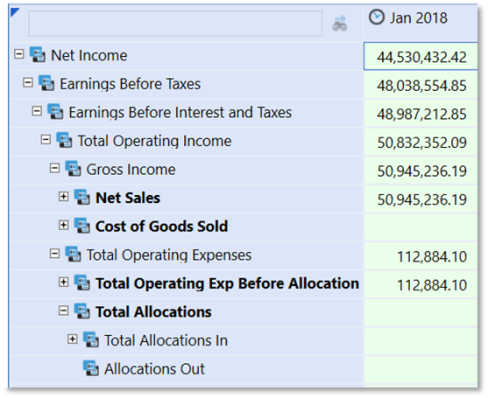
Apply the formatting to the cube view's Header section or to specific rows.
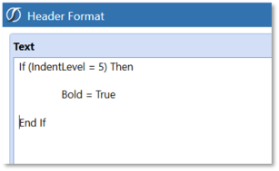
Examples of Using Conditional Property Filters Conditional “Traffic-Lighting”
“Traffic-Lighting” is data related and therefore applied as a cell format. The designer has a choice to apply the conditional formatting to either a row or a column. The order of operations for formatting can impact the decision. Row overrides are the final layer of formatting applied to a cube view and would not be impacted by other more general formatting.
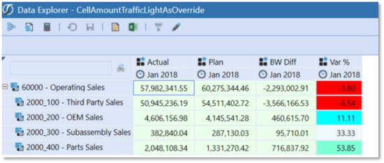
1. Conditional formatting can be applied to the rows or columns. A definition applied to the row Formatting tab would apply to all columns. A row override would isolate the formatting to a specified column(s).
2. The CellAmount filter is used within multiple If/ElseIf statements to define the various tests required for the report.
ExpandedRowNum Expansion Range
Conditional formatting provides the ability to format an expanded range of data cells using the ExpandedRowNum Property Filter. This is useful in formatting to support “Top 10” type reports. This filter best supports cube view designs that use known expansions, such as ranking business rules or member lists. If applied to specific rows, the formatting applies to the defined row, but the Expansion Number Reference relates to the entire cube view. Formatting defined on subsequent rows will be impacted if the expansion members change on previous rows. The ExpandedRowNum Property
Filter can also be applied as a default cube view format, in which the definition will apply to all rows. This would require If/ElseIf type statements to support all rows.
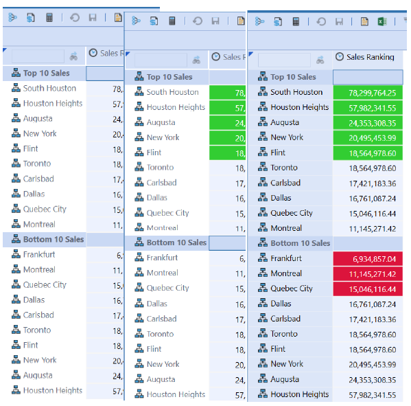
1. Design or open a report which supports formatting for ExpandedRowNum , such as a ranking report in the example.
2. Determine how the formatting should be applied, as a default, row or column. The example will use the cube view default formatting.
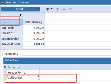
3. Cell format is applied for conditional formatting using the ExpandedRowNum filter. Being zero-based, and having to account for each row and its expansions:
-
Condition1 – Rows < 6 is defined because the text header row “Top10Title” initiates the count at zero.
-
Condition2 – Rows > 11 and < 15 is defined because all the rows up to Row4, “SalesBottom10”, reflect rows 0-11 on the cube view. The conditional row references must reflect all the cube view expansions.
Test for Row IsRowNumberEven
The IsRowNumberEven property filter may be useful to vary formatting by the even/odd numeric expansion of rows on a cube view. For example, to replicate a “green-bar” style report the IsRowNumberEven would be a suitable filter.
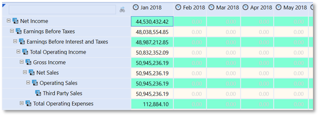
In this example the formatting can be applied to the cube view default cell format since it will globally apply to all rows.
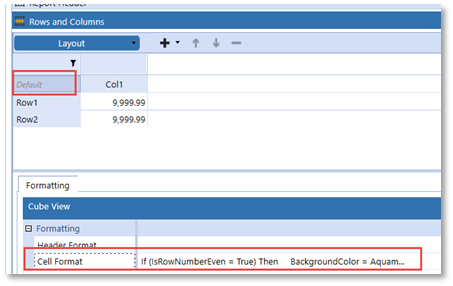
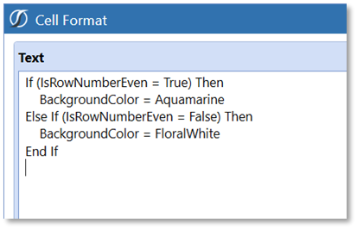
MemberName, MemberDescription or HeaderDisplayText
The ability to format based on the Name or Description is greatly enhanced by adhering to a standardized metadata naming convention. Summary level members having keywords such as “Total” or prefixes or suffixes such as “Tot” could be used in conditional formatting. Members could be formatted using dynamic criteria, such as StartsWith or EndsWith.
HeaderDisplayText differs from the MemberName and MemberDescription Property filter in that it references the custom Name parameter in a Member Filter.
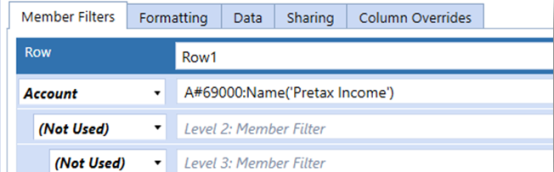
Dynamic criteria can be applied to the Name and Description property filters to apply the required formatting.
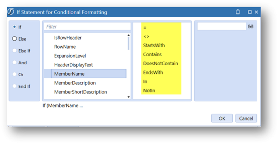
Apply conditional formatting to row header.
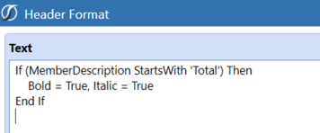
The result is a dynamically formatted report.
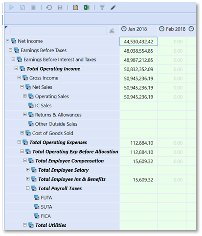
Parameter Formatting
Conditional formatting definitions can be applied to a cube view as a Literal parameter. To apply, select the format string from the cube view, press Ctrl-C, select the Default value property of a Literal Value-type parameter and press Ctrl-V. Once saved, this parameter can be referred to in a cube view format. As shown, the reference of |!Param_Conditional_PLTree!| in a cube view format would apply the associated format string.
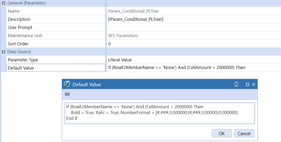
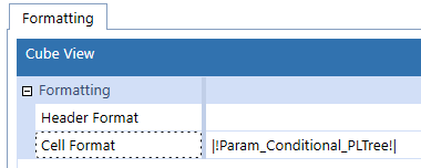
Presenting Data With Books, Cube Views and Other Items › Build Reports Through Cube Views › Format a Cube View
This section explains how to view, define, and apply standard report setting properties. These settings determine the information you see and the actions you can take in the cube view. To edit the following properties, on the Cube Views page, under Cube View Groups, select a cube view and then General Settings to expand the slider.
-
Sharing: Share all or specific rows or columns from another cube view. Sharing can increase efficiency and consistency when building and managing cube views.
-
Common: These options control general, shortcut, restrictions, suppression, and paging properties.
-
Is Visible in Profiles: When set to True, the Cube View is visible in the Cube View Profile. When false, the Cube View is not visible within the Cube View Profile. In these cases, the Cube View would not be visible in Workflow, Excel, Dashboards, or OnePlace.
-
Page Caption: Appears at the top of the Data Explorer grid when viewing the output of a cube view. If left blank, it will get its value from the cube view description. If the description is blank, it will display the cube view name.
-
Is Shortcut: Determines whether the cube view is a shortcut.
-
Shortcut Cube View Name: Enter the name of another cube view that will open when this cube view is being used as a shortcut.
-
Is Dynamic: Set this property to True to make the Cube View dynamic. When set to True, the developer can programmatically manipulate Cube View formatting and data at runtime through the Dynamic Cube View Service that can be added to the Workspace Assembly.
-
Literal Parameter Values: Enter a comma-separated list of name-value pairs for parameter values to be used when this cube view is used as a shortcut to open another cube view. Piped variable names cannot be used (for example, |!ParamView!|) in this setting.
Example: Param1=Value1, Param2=[Value 2]
-
Can Modify Data: If set to True, the cube view can be modified in OnePlace. If set to False, the cube view is read only.
NOTE: You can still make annotations to accounts in a cube view if this property is set to False.
-
Can Calculate, Can Translate, and Can Consolidate: If set to True, you can right-click on a cell and calculate, translate, or consolidate data in OnePlace.
NOTE: These properties coincide with the Can Calculate from Grids Scenario security group. If set to True but the user is not in the group for that given scenario member, they cannot calculate from a cube view grid.
-
Can Modify Suppression: Set to True to enable a row suppression icon in the data explorer grid toolbar and enable users to turn the suppression settings on and off when viewing a cube view.
-
Include Cell Attachment Status: If set to True, a cell containing a data attachment will display a red tick mark. If set to False, there will be no indication of a data attachment in the cell. In large data sets, if set to True, it can affect performance.
NOTE: This setting only applies to Cube Views in Spreadsheet and the OneStream Excel Add-In. It does not currently apply to Quick Views.
-
See Sparse Row Suppression and Cube View Paging.
-
-
Header Text: The default is a cube view with standard row and column headers. All the header settings control the row and column headers presented when the cube view is run if the default is not used.
-
Header Size: Column Header Heights align column headers with the bottom of a report. The default setting is -1 (which means they are auto-sized), so for bottom alignment to work in column headers, the height of the column header needs to be set. This is helpful for wrapped headers, which may cause the columns to expand.
Row Header Widths are viewed in the cube view. Excel Row Header Widths are viewed when exporting to or rendering a cube view in Excel. Report Header Widths are viewed when a report on-the-fly is generated from a cube view. These can be changed from the default value. The -1 default value means that these Row Header Widths are auto-sized. Otherwise, set a positive number of at least 100 to determine the number of pixels wide (96 pixels = 2.5 cm). These settings can change for a maximum of six nested rows. The same can be done when reporting to Excel by using the ExcelRowHeader1Width property. The default value for this is also -1.
NOTE: If a cube view Row Header Width is not specified, text and font information from all the expanded headers is used to automatically determine the width. The automatic row width maximum is a half of a page. Any text longer than a half of a page is wrapped.
-
Header Overrides: By default, the software determines which dimensions to show for row and column headers based on the member expansions specified in the Rows and Columns slider. These dimensions can also be selected manually.
Report Column Index for Row Headers can be used for a report to display the row headers after the column instead of on the left side. The default value is -1, but setting this to a positive number changes the cube view column index. Specifying several columns greater than the existing number of columns reverts the row headers back to the left side of the report. Hidden columns are not included in the column count.
NOTE: If a cube view report exceeds the width of the page, the software automatically adds a page break on the appropriate column and repeats the row headers on the following page. If Report Column Index for Row Headers or Auto Fit to Page Width are enabled, the report does not repeat the row headers.
-
Report: These properties apply advanced formatting to cube views.
-
Custom Report Task: Custom report formatting can be applied to cube views using a cube view extender business rule or inline formula.
-
Select No Task if there are no cube view business rules or inline formulas running on this report.
-
Select Execute Cube View Extender Business Rule to call a cube view extender.
-
Select Execute Cube View Extender Inline Formula to include an inline formula.
-
-
Business Rule: This property is only enabled when Execute Cube View Extender Business Rule is selected as the custom report task. Click the ellipsis and select the cube view extender business rule.
-
Formula: This property is only enabled when Execute Cube View Extender Inline Formula is selected as the custom report task. Click the ellipsis and select the cube inline formula.
Additional options are available for report formatting to set paper size, page orientation, and margins, and to automatically fit the information to a specific page width or number of pages.
-
-
Excel: Controls whether gridlines are displayed in the Excel file.
-
Navigation Links: Determines the information you can view in a cube view in the data explorer grid.
-
Linked Cube Views: Enter a comma separated list of cube views that will be available to open when viewing a cube view in the data explorer grid. The cube views specified in this field apply to the entire cube view and are available when you right-click any cube view data cell. See Linked Cube Views.
-
Linked Dashboards: Enter a comma separated list of dashboards that you can right-click to open when viewing a cube view in the data explorer grid.
-
Include Default NavLink Parameters: Set to True in source cube views to use NavLink parameters - with a intuitive, standard syntax, as Bound parameters for any dimension. This simplifies cube view design and reduces error as you:
-
Do not have to define parameters for navigation, and can use a standard syntax to ensure parameter names match across cube views and other objects.
-
Can navigate cube views from any dimensional intersection to analyze data that is refined by passed point of view selections, in linked cube views. See Analyze Data in Linked Cube Views Wtih Passed Point of View Selections.
-
-
Bound Parameter Names for Navigation Links: Lists all the dimensions that may be assigned to a row when the Report Navigation Links property is set to True and represents the member name being passed from this report to another using navigation links.
-
Bound Parameter Names: For a linked cube view to open and display the correct member data for a selected cell, parameters with the member need to be specified using a bound parameter. This lists all the dimensions that may have a parameter included in a linked cube view.
-
Presenting Data With Books, Cube Views and Other Items › Build Reports Through Cube Views › Format a Cube View
Navigation links let you set up one dashboard to launch another in order to drill into more detail or related detail on a certain row of data from a report, while other times it can create a chart of the reviewed data.
The following information provides a detailed example including the steps one must take to create Navigation Links. The implementation of this feature will differ, but for this example an Income Statement Summary Dashboard will launch another Dashboard with more detail:
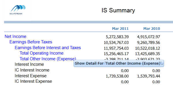
Click Total Other Income (Expense) to display the following dashboard:
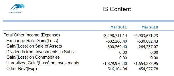
NOTE: This only works in dashboard mode.
Below is a sample cube view called IS Summary which contains income statement summary accounts. First, select the row to be highlighted for navigation. Set Enable Report Navigation Link to True and type the name of the dashboard to open in the Dashboard to Open in Dialog field. The specified dashboard (not a cube view) opens when this highlighted row is selected from this cube view’s related dashboard.
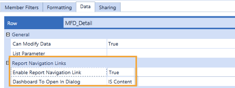
This next step is optional. Add a header format using a cube view style. This displays the row in a color different from the other rows to indicate the row is clickable. In this case, |!Highlight_Row!| is related to a parameter that was made in a sample application. When this cube view is run, the format of TextColor=Blue activates for this row.
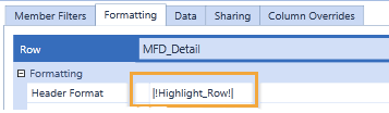
The cube view passes the clicked account to the other dashboard and there the account and its children can be viewed. Now, determine how the account is to be passed. Go to the General Settings slider and go to the Report Navigation Links section. A value of ClickedAccount was entered for the Account Bound Parameter Name which is going to be passed from one dashboard to another. More than one dimension can be passed if it is defined in rows, but in this case this does not need to happen.
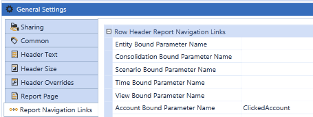
Copy  this cube view to have the same columns and POV settings for the drilled cube view containing the contents. This one is called IS Content because it contains the content of the drilled data. Whatever it is called, be consistent and come to an agreement with the project team.
In the new cube view (called IS Content in this case), remove the rows that were there and add the rows that will be seen when this Dashboard appears. In this case, refer to the parameter for ClickedAccount and add the ChildrenInclusive extension.
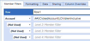
Under dashboards, a maintenance unit  was created and called GolfStream Navigation Link Example, which stores all the objects needed to get this to work properly.
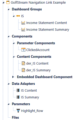
Starting from the bottom of the example above is the parameter  needed to highlight the row.
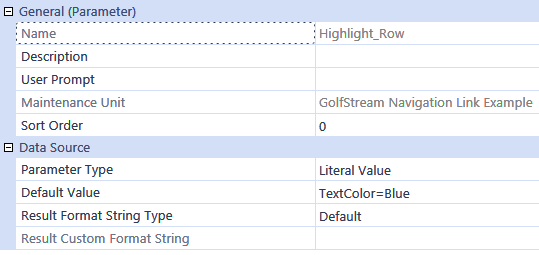
The data adapters  are required to point to the cube views. First, set up one for IS Content. Set the Command Type to Cube View and set the cube view to IS Content.
Next, set up the data adapter for IS Summary. Set the Command Type to Cube View and set the cube view to IS Summary. Set the Include Row Navigation Link property to True to drill from Cube Views in a Dashboard.

Now, set up two content components for a dashboard. Namethese with the prefix of der_ because they are data explorer reports and not charts or another form of component. Again, come up with a naming schema with the project team, so the result is organized. In this case, click  to create a component and chose Data Explorer Report as the type. Do this for both IS Summary and IS Content and click
  in the dashboard toolbar to attach the appropriate data adapter to each.
Select Parameter Components and create a new component with a type of Supplied Parameter. In the Bound Parameter field, enter the name of the parameter being passed, which is ClickedAccount in this example. Do this for each parameter being passed from dashboard to dashboard.
Create a dashboard group (called IS in this example) and two dashboards. Create one for the launching dashboard (for example, IS Summary) and one for the launched dashboard (for example, IS Content). In this example, a layout of Uniform is being used, but the use of this feature may vary.
Under Dashboard Components, attach the data explorer report component. Do this for both IS Summary and IS Content. For just the IS Summary (the launched dashboard), also attach the parameter component being passed (ClickedAccount in this example). This allows that account to be passed from the initial dashboard to the other.
Presenting Data With Books, Cube Views and Other Items › Build Reports Through Cube Views › Format a Cube View
Linked cube views provide the option to launch a cube view from another when viewing it in the Data Explorer grid, spreadsheet tool, or Excel Add-In. You can right-click a cube view's data cell and open a separate cube view to access more detail and visibility. This applies to any cube view, such as those for data entry forms. See:
TIP: For information about evaluating source cube view data in a linked cube view using passed point of view selections, see Analyze data with passed point of view selections.
NOTE: For Linked Cube Views, the Workspace Name will not be automatically prefixed. The search order of operations (requested workspace, current workspace, default workspace, and then shared workspaces) will be used to find the correct Cube View.
Create a Sample Linked Cube View
The following describes how to create a sample linked cube view. In this example, an Income Statement Summary cube view has an Account Detail cube view assigned to all data cells and a Sales by Product cube view linked to specific rows. You can also add a second level of linked cube views for an even more granular analysis.
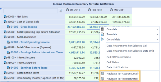
Link a Cube View to an Entire Cube View
-
Select the cube view to be linked and apply to the entire cube view, specific columns, or specific rows. If the linked cube view applies to the entire cube view, you can right-click any data cell in the Data Explorer grid, spreadsheet tool, or Excel Add-In to access the cube view. If it only applies to columns or rows, the linked cube view is available when you right-click on a data cell in that row or column.
-
Once the base cube view is determined, in this example IncomeStatementSummary, create a cube view that will display more detailed data.
The AccountDetail cube view will display Account details based on the selected data cell. The IncomeStatementSummary’s data displays Parent accounts for a specific time, so the AccountDetail’s data will display the selected Account’s children for that same time period. -
In the AccountDetail cube view, configure the columns and rows to query the correct data.

|!DrillAccount!| is a Bound parameter and will display the correct account data based on the selected account in the IncomeStatementSummary cube view.
!DrillTime!| is a Bound parameter and will display the correct Time data based on the selected time in the IncomeStatementSummary cube view -
Ensure the AccountDetail’s POV matches the IncomeStatementSummary’s POV with the exception of Account and Time. Enter the |!DrillAccount!| and |!DrillTime!| parameters into these member fields to ensure that the AccountDetail cube view displays data based on the selected Account and Time in the IncomeStatementSummary.
-
Add any required formatting to the AccountDetail cube view. In this example, the following was added to Page Caption:

-
To assign the AccountDetail to the entire IncomeStatementSummary cube view, select IncomeStatementSummary and click General > Navigation Links . Enter the names of the linked cube view in Linked Cube Views or click the ellipsis to find the cube view using Object Lookup.
-
Enter the Bound parameters which will pass from one cube view to the next. In this example, a Bound parameter was entered for Account and Time so both members are based on the selected IncomeStatementSummary data cell.
NOTE: Column settings override cube view settings and row settings override column settings.
Run IncomeStatementSummary, noting that you can right-click cells to access the AccountDetail cube view.
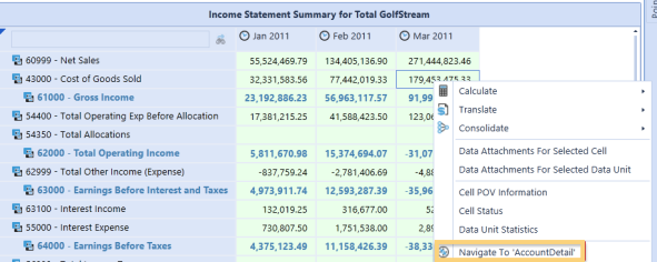
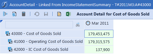
Link a Cube View to Specific Rows or Columns
This topic describes how to assign a linked cube view to specific rows. The ProductDetail cube view will display product details based on the IncomeStatmentSummary’s selected data cell. The IncomeStatementSummary’s data displays parent accounts for a specific time, so the ProductDetail’s data displays the selected account’s product sales.
In the ProductDetail cube, configure the rows/columns, POV, and formatting to ensure that the user sees the correct data. See the AccountDetail instructions above for details.
To assign the ProductDetail cube view to IncomeStatementSummary rows, select the IncomeStatementSummary cube view, then go to the Linked Cube Views property on the Data tab in the Rows/Columns. Select the row or column and enter the name of the cube view.
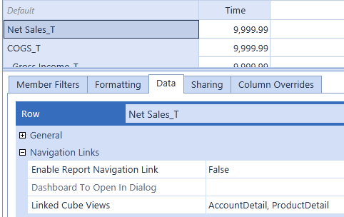
NOTE: Due to overrides, assign the AccountDetail cube view to this property too. Previously, AccountDetail was assigned to the entire cube view. However, because a cube view is being assigned to a row, the cube view settings are overridden and only display the cube view specified for this property. For both cube views to be available on the row, specify them both.
If any Bound parameters need to be entered (in this example, the same Bound parameters are used for both cube views), enter them under Navigation Links in General Settings.
In the example above, the ProductDetail Cube View was assigned to the Net Sales row. When a user right-clicks on a Net Sales cell in the Data Explorer grid, Spreadsheet tool, or Excel Add-In, this cube view is available.
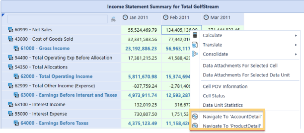
Nest Linked Cube Views
You can link a cube views to cube views that are already linked. In this example, the ProductDetail_2 cube view is linked to ProductDetail and displays specific product data tied to a selected ProductDetail cell.
-
In ProductDetail_2, configure the rows and columns as needed.

-
Enter a |!DrillProduct!| Bound parameter to display specific product details. For example, if you right-click a Clubs cell in the ProductDetail cube view and select the ProductDetail_2, sales details for Clubs displays.

-
Ensure a |!DrillTime!| parameter is also used.
-
Set the POV for ProductDetail_2 so it matches the ProductDetail POV, except for the User Defined 2 member. In this example, products are viewed using the UD2 member. Enter |!DrillProduct!| in User Defined 2.
-
Add any required formatting to the ProductDetail_2, such as page captioning:

-
Open ProductDetail and navigate to Linked Cube View under General Settings > Navigation Links.
-
Click the ellipsis and select the ProductDetail_2 cube view. This link the cube view to the entire ProductDetail cube view.
-
Enter the Bound parameter from ProductDetail_2.
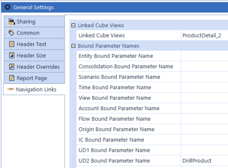
-
Run ProductDetail from IncomeStatementSummary, right-click cells and select Navigate To ProductDetail_2.
Presenting Data With Books, Cube Views and Other Items › Build Reports Through Cube Views › Format a Cube View
Use the Include Default NavLink Parameters property to enhance cube view design and navigation for optimal data analysis. Set the property to True to use the following standard syntax to more easily look up parameters and ensure parameter names match across linked cube views and other objects.
|!dimensionNavLink!|
Point of view selections you specify in a source cube view pass to the linked cube view, for a refined, focused analysis. For example, to pass the Time dimension from a source cube view to a linked cube view, specify |!TimeNavLink!|in the linked cube view's POV. The data in the cell point of view in the source cube view (2018Q1 as shown below) passes to the linked cube view's point of view at runtime.
 Watch to learn more.
Using Default NavLink Parameters
To use passed point of view selections in a linked cube view:
-
Click Application > Cube Views, and then the cube view containing the source data to access and analyze further in a linked cube view.
-
Click General Settings > Navigation Links.
-
Set Include Default NavLink Parameters to True and click Save.
-
Open the linked cube view in which to retrieve and evaluate the source data based on point of view selections. Set Include Default NavLink Parameters to False.
-
Click POV , specify |!dimensionNavLink!| for each dimension to analyze and then click Save.
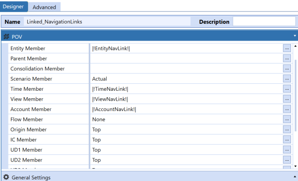
-
Return to the source cube view and click Open Data Explorer.
-
Right-click cells to navigate to the linked view, retrieving data for the specified point of view parameters that are also identified in the header.
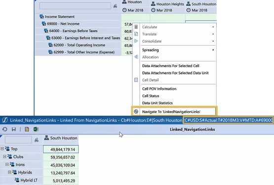
Presenting Data With Books, Cube Views and Other Items › Build Reports Through Cube Views › Format a Cube View
The following settings in the cube view address page formatting:
-
Header (text, size, overrides)
-
Report
-
Headers and footers
Ensure the general settings are correct before formatting your page. See General Settings.
To edit the header and report settings, on the Cube Views page, under Cube View Groups, select a cube view and then General Settings to expand the slider.
Header Settings
Row and column headers can be adjusted to refine your cube view.
-
Header Text: Decide if you want to see the name, description, or both for each of the dimension types. Also, set the Culture property of a cube view, which determines the language for the report. Ensure the Member Descriptions Culture properties are set up correctly before setting the Culture property.
-
Header Size: Provide a height for columns and width for rows. The rows can be edited separately by Data Grid (Row Header), Excel (Excel Row Header), and PDF (Report Row Header). Each of these items defaults to -1, but you can change them by typing a pixel number.
-
Header Overrides: Change which dimensions display in the rows and columns. The default for a cube view is to display what is available in the rows and columns. However, you can apply Header Overrides to change the order or add dimensions.
The Report Column Index for Row Headers can also be set here. This changes the location of the row headers from their usual place (the left). Type the number of columns that should display before the row headers are shown. This only applies to the PDF version of the report.
Report Settings
These properties apply advanced formatting to cube views.
-
Custom Report Formatting: Write or assign cube view extender rules to provide intricate cube view formatting. This only applies to the PDF version.
- Paper: Select the paper size.
- Landscape: Select the page orientation.
- Margin: Set margins on individual reports. Type a pixel number to override the default settings of the page in the general settings.
- Auto Fit Settings: Set Auto Fit to Page Width to True if the report should re-size to fit all columns on one page. Use the Auto Fit Number of Pages Wide property to type the number of pages to display the columns.
- Scale Factor: Sets and adjusts the scale of the report by this value and automatically centers report content horizontally. The default value is 1, and the maximum value is 2. If you enter a value greater than 2, it will default to a scale factor of 2.
NOTE: Scale Factor is not compatible with Auto Fit to Page Width.
Header and Footer Settings
Report headers and footers control what displays at the top and bottom of the page when a cube view is run as a data explorer report. Standardize headers and footers across reports and make as dynamic as possible to reduce reporting maintenance. On the Designer tab of the Cube View, Report Header and Report Footer are separate sliders. Enter text in the fields or use substitution variables.
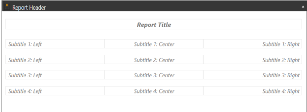
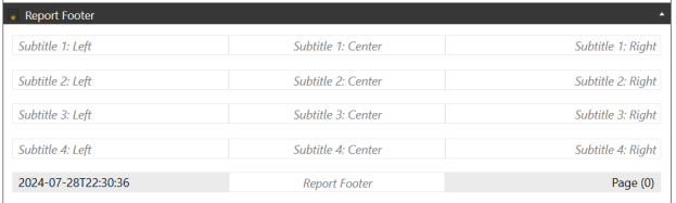
Use substitution variables to reduce the maintenance of headers and footers. Substitution variables are short scripts that use pipe characters to include a predefined substitution variable. They come with every installation of OneStream and cannot be edited, so you do not need to create or maintain them. Substitution variables can be used throughout the application. For cube views, you can use them for:
-
Headers and footers
-
Rows and columns
-
Cube view page captions
To copy and paste a substitution variable into your application:
-
On the Cube Views page, click Object Lookup to open the dialog box.
-
Under Object Type, select Substitution Variables to see the list of options.
-
Select the name of the substitution variable.
-
Click Copy to Clipboard.
-
Paste the substitution variable where needed.
Presenting Data With Books, Cube Views and Other Items › Build Reports Through Cube Views
When you create a calculation in a cube view, the data is generated on-the-fly and not stored in the database. When you run the cube view, the calculation returns a value.
You can use calculations in a cube view to calculate:
-
Variances
-
Sums
-
Differences
-
Ratios
Calculations are useful for variance reporting, What If scenarios in cube views, and KPI calculations.
Presenting Data With Books, Cube Views and Other Items › Build Reports Through Cube Views › Calculations
There are three ways to create calculations in cube views. Each option uses the GetDataCell function, which retrieves specific cells and performs math or business rule operations.
The most common ways to create a calculation in a cube view use:
Choose the option that has the least maintenance and highest usability.
NOTE: You can also create more complex calculations with business rules.
Presenting Data With Books, Cube Views and Other Items › Build Reports Through Cube Views › Calculations
Write GetDataCell expressions in the cube view row or column. It will calculate at runtime. The expressions require a reference to specific dimension members to return a data point. Use GetDataCell expressions if you are running calculations on members that are not currently in the cube view or if the expression is easy to create and maintain. GetDataCell expressions are simpler versions of dynamic calculations.
NOTE: Use one of the other calculation types if you are querying multiple member combinations.
Samples Tab
In the Member Filter Builder, use the Samples tab to create simple GetDataCell expressions in your cube view.
In Member Filter Builder, click Samples.
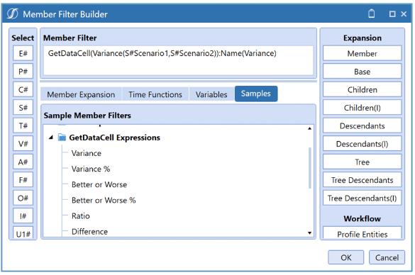
There is a list of preexisting GetDataCell expressions you can use. For detailed information, see the following table.
| Function Name | Description | Example |
|---|---|---|
| Variance | Calculates the difference as a ratio between two scenarios using the Variance function. | GetDataCell(Variance(S#Scenario1, S#Scenario2)):Name(Variance) |
| Variance% | Calculates the difference as a percentage between two scenarios using the VariancePercent function. | GetDataCell(VariancePercent (S#Scenario1, S#Scenario2)):Name(Var%) |
| Better or Worse | Calculates the difference between two scenarios while considering account types using the BWDiff function. | GetDataCell(BWDiff(S#Scenario1, S#Scenario2)):Name(BW Diff) |
| Better or Worse% | Calculates the difference as a percentage between two scenarios while considering account types using the BWPercent function. | GetDataCell(BWPercent(S#Scenario1, S#Scenario2)):Name(BW%) |
| Ratio | Calculates the ratio between two scenarios using the Divide function. | GetDataCell(Divide(S#Scenario1, S#Scenario2)):Name(Ratio) |
| Difference | Calculates the difference between scenarios using the Subtraction function. |
GetDataCell(S#Scenario1-S#Scenario2): Name(Difference) |
| Sum | Calculates the sum of two scenarios using the Addition function. | GetDataCell(S#Scenario1+ S#Scenario2: Name(Total) |
| Custom Function (condensed syntax) | Calls a Finance business rule using the BR# function. | GetDataCell(BR#[MyBusinessRuleName, MyFunctionName]): Name(Custom Function) |
| Custom Function | Calls a Finance business rule using the BR# function. | GetDataCell(BR#[BRName=MyBusinessRuleName, FunctionName=MyFunctionName]):Name(Custom Function) |
| Custom Function with Parameters | Calls a Finance business rule using the BR# function. | GetDataCell(BR#[BRName=MyBusinessRuleName, FunctionName=MyFunctionName, Name1=Value1, AnotherName=[Another Value]]):Name(Custom Function) |
Presenting Data With Books, Cube Views and Other Items › Build Reports Through Cube Views › Calculations › GetDataCell Expressions
A GetDataCell expression is the performance section of a dynamic calculation. It tells the dynamic calculation what it will be doing. The following example shows a common GetDataCell expression. GetDataCell expressions are simpler versions of dynamic calculations.
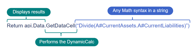
Return api.Data.GetDataCell("Divide(A#CurrentAssets,A#CurrentLiabilities)")
-
Return api.Data: Tells OneStream which results to display.
NOTE: This is not required for GetDataCell expressions, but it is required for dynamic calculations.
-
GetDataCell: Performs the calculation.
-
("Divide(A#CurrentAssets,A#CurrentLiabilities): Math syntax in a string format to calculate.
You can use the Samples tab to create simple GetDataCell expressions in your cube view.
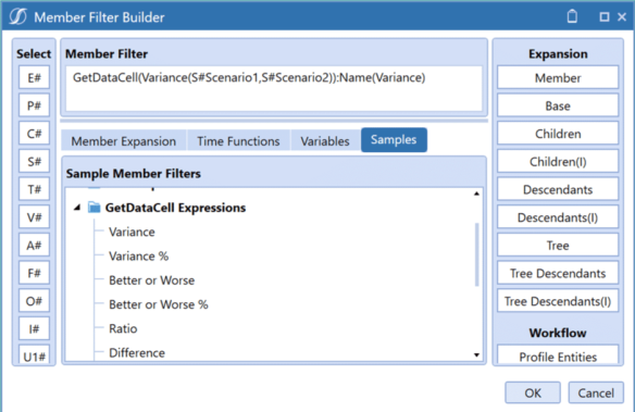
Presenting Data With Books, Cube Views and Other Items › Build Reports Through Cube Views › Calculations › GetDataCell Expressions
There are several GetDataCell expressions. You can find a complete list under OnePlace > Dashboards > Application Reports > Application Reports Dashboards > Report Groups > Application Analysis.
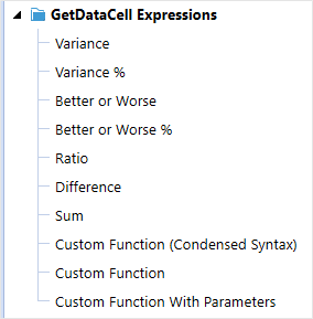
-
Variance: Calculate the difference as a ratio between two scenarios using the [Variance] function in a GetDataCell expression.
For example: GetDataCell(Variance(S#Scenario1,S#Scenario2)):Name(Variance)
-
Variance %: Calculate the difference as a percentage between two scenarios using the [VariancePercent] function in a GetDataCell expression.
For example: GetDataCell(VariancePercent(S#Scenario1,S#Scenario2)):Name(Var %)
-
Better or Worse: Calculate the difference between two scenarios while considering account types using the [BWDiff] function in a GetDataCell expression.
For example: GetDataCell(BWDiff(S#Scenario1,S#Scenario2)):Name(BW Diff)
-
Better or Worse %: Calculate the difference as a percentage between two scenarios while considering account types using the [BWPercent] function in a GetDataCell expression.
For example: GetDataCell(BWPercent(S#Scenario1,S#Scenario2)):Name(BW %)
-
Ratio: Calculate the ratio between two scenarios using the [Divide] function in a GetDataCell expression.
For example: GetDataCell(Divide(S#Scenario1,S#Scenario2)):Name(Ratio)
-
Difference: Calculate the difference between two scenarios using the [Subtraction] function in a GetDataCell expression.
The example that appears when you double click this expression in Member Filter Builder: GetDataCell(S#Scenario1-S#Scenario2):Name(Difference)
-
Sum: Calculate the sum of two scenarios using the [Addition] function in a GetDataCell expression.
For example: GetDataCell(S#Scenario1+S#Scenario2):Name(Total)
-
Custom Function (Condensed Syntax): Call a Finance business rule using the [BR#] function in a GetDataCell expression.
For example: GetDataCell(BR#[MyBusinessRuleName, MyFunctionName]):Name(Custom Function)
-
Custom Function: Call a Finance business rule using the [BR#] function in a GetDataCell expression. For example:
GetDataCell(BR#[BRName=MyBusinessRuleName,FunctionName=
MyFunctionName]):Name(Custom Function)
-
Custom Function with Parameters: Call a Finance business rule using the [BR#] function in a GetDataCell expression. For example:
GetDataCell(BR#[BRName=MyBusinessRuleName, FunctionName=MyFunctionName, Name1=Value1, AnotherName=[Another Value]]):Name(Custom Function)
Presenting Data With Books, Cube Views and Other Items › Build Reports Through Cube Views › Calculations › GetDataCell Expressions
GetDataCell expressions run a calculation directly in a cube view by referencing specific dimension members.
In the Member Filter Builder, use the Samples tab to create simple GetDataCell expressions.
Some common errors when developing GetDataCell expressions are:
-
Not having the correct dimension listed. Make sure to use the Member Filter Builder if you are not sure what to use.
-
Not having the correct number of parentheses. Make sure to use the correct number of opening and closing parentheses.
To add a row expression to a column in a cube view:
-
In OneStream, go to Application > Presentation > Cube Views.
-
Select a cube view group and then a cube view.
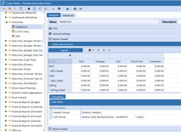
-
Expand the Rows and Columns slider.
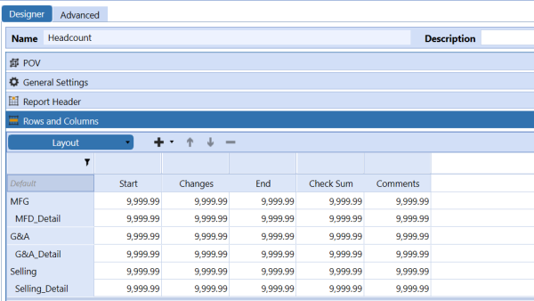
-
To add a row to insert the CVC/CVR calculation, in Rows and Columns, click the plus sign.
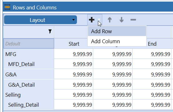
-
In Member Filters, rename the row.

-
Click Member Filter Builder for the row to insert a calculation.
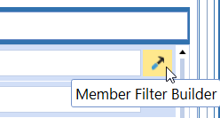
-
Delete any existing content in the Member Filter field.
-
Click Samples.
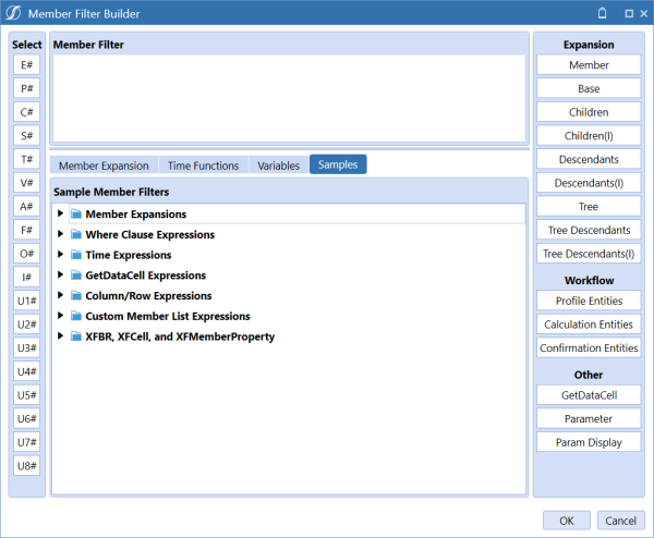
-
Expand Column/Row Expressions.
-
Click Sum of Rows (CVR). The GetDataCell syntax is generated and displays in Member Filter.
-
Update the row names to add the rows together. Rename Row1 to Cash and Row2 to AR.
-
Replace the name at the end of the expression to reflect the row name. The expression is complete.
-
Click OK and then click Save.
-
Click Open Data Explorer to run the cube view and verify the result.
Presenting Data With Books, Cube Views and Other Items › Build Reports Through Cube Views › Calculations › GetDataCell Expressions
These are some common errors when using GetDataCell expressions:
-
Incorrect dimension: Make sure you have the correct dimension listed. If you are unsure, use the Member Filter Builder.
-
Incorrect use of parentheses: Verify that you have the correct number of parentheses and that they are positioned correctly to avoid a script error.
Presenting Data With Books, Cube Views and Other Items › Build Reports Through Cube Views › Calculations
Cube views accept calculated columns and rows using the GetDataCell function and references to cube view column and row names. This is known as Column/Row math.
Write column and row expressions in the cube view row or column itself. They calculate at runtime.
These expressions require a reference to the specific cube view column or row name to return a data point.
Use column and row expressions if you need to perform math across columns and rows. A common use case is with variance columns. Column and row expressions are useful if the query is more complex or if the expression is easy to understand and maintain.
NOTE: Use one of the other expression types if you are using multiple member expansions, especially when performing math on rows.
Presenting Data With Books, Cube Views and Other Items › Build Reports Through Cube Views › Calculations › Column and Row Expressions
Cube views accept calculated columns or rows using the GetDataCell() function and references to cube view column or row names. This is also known as cube view column/row math.
These are based on the names given to a cube view column, for example "Col1" or "TimePeriods" or cube view row, for example “Row2” or “Accounts” by the creator of the cube view.
NOTE: Using the column or row names may be more useful than using member filters.
-
Cube view columns: Uses the GetDataCell function to perform math on columns.
-
Cube view rows: Uses the GetDataCell function to perform math on rows.
There are several variations on this method, depending on whether the expression refers to columns, rows, or a combination.
When naming a new calculation, do not include spaces or special characters that could make the column/row calculations read incorrectly.
Create a CVC/CVR Calculation
-
Add a row or column to insert the calculation.
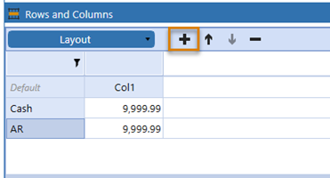
-
Rename the row relevant to your calculation. In this case, the is CurrAssets.
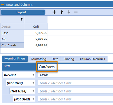
-
Open the Member Filter Builder for the row or column where you want to insert a CVC/CVR calculation.

-
Delete what is in the Member Filter pane.

-
Navigate to the Samples tab.
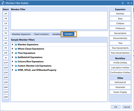
-
Expand Column/Row Expressions.
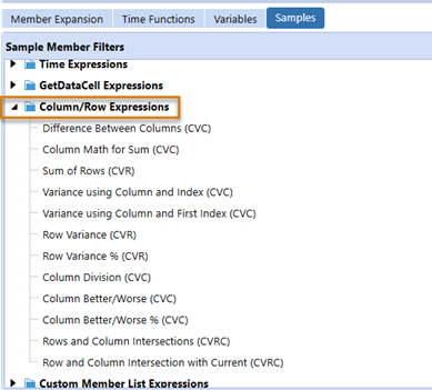
-
Double-click Sum of Rows (CVR). This will populate the GetDataCell expression that you need.
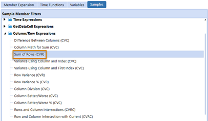
-
Update the row names to add the rows together. Rename Row1 to Cash and Row2 to AR because Cash and AR are row header names used in the cube view.
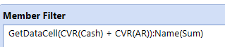
-
Replace the name at the end of the expression to display Current Assets.

-
Click OK.
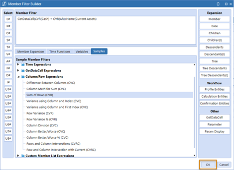
-
Click Save.
-
Run the cube view.
CVC: Cube View Column Calculations
The example below shows a Column Math example of the difference between columns (CVC).
The syntax is GetDataCell(CVC(SomeColumnName) - CVC(SomeOtherColumnName)):Name(Header Name)
The example of simple member math includes the :Name() function typically applied to a column in a cube view:
GetDataCell(CVC(Col1) - CVC(Col2)):Name(Variance)
GetDataCell(CVC(Col1) + 1):Name(Column Plus One)
GetDataCell(CVC(Col1) * (-1)):Name(Column with Sign Flipped)
CVR: Cube View Row Calculations
The example below shows a Row Math example of Sum of Rows (CVR).
The syntax is similar, but instead of CVC, a calculated row uses CVR for retrieving the value of a row in a formula.
An example of the syntax: GetDataCell(CVR(SomeRowName) + CVR(SomeOtherRowName)):Name(HeaderName)
NOTE: If a column name is numeric (for example, 500), single quotes are required when specifying the row name. Square brackets are allowed, but not required. For example: GetDataCell(CVR('123') - CVR(['4,567'])):Name(Difference)
When you need a column and row index: Col1 has a member filter of S#Actual, S#Budget, meaning it will return two columns. In this case, a variance between Actual and Budget scenarios can be shown like this: GetDataCell(CVC(Col1, 1) - CVC(Col1, 2)):Name(Variance).
Alternatives: GetDataCell(CVC(Col1, First) - CVC(Col1, 2)):Name(Variance) GetDataCell(CVC(Col1) - CVC(Col1, 2)):Name(Variance)
Column Math Example with Division and Other Advanced Functions
Member Expansions may require some more intricate formulas. This may require using indexes or a CVRC expression. Use functions like Divide to avoid divide by zero situations.
GetDataCell(Variance(CVR(Col1,2), CVR(Col1,1)):Name(Variance)GetDataCell(VariancePercent(CVR(Col1,2), CVR(Col1,1)):Name(Variance %) GetDataCell(Divide(CVC(Col3), CVC(Col2))):Name(Ratio) GetDataCell(BWDiff(CVC(Col1), CVC(Col2))):Name(BetterWorse Difference)GetDataCell(BWPercent(CVC(Col1), CVC(Col2))):Name(BetterWorse %)
Presenting Data With Books, Cube Views and Other Items › Build Reports Through Cube Views › Calculations › Column and Row Expressions
Presenting Data With Books, Cube Views and Other Items › Build Reports Through Cube Views › Calculations › Column and Row Expressions
Use the CVMathOnly option to perform math on columns when the columns are not visible.
-
From the Application tab, under Presentation, click Cube Views.
-
Expand Cube View Groups, expand a specific cube view group and select a cube view.
-
Click Rows and Columns. In the example below there are three columns, where Column 3 has the GetDataCell() function applied for the total of Column 1 and Column 2.
-
Click Open Data Explorer to generate the Cube View and see the data. In the example below you see that it is adding the value 200.00 from Column 1 to the value 200.00 from Column 2 to generate the total of 400.00 in Column 3.
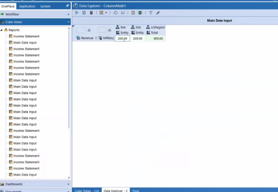
-
Click Edit.
-
Select Column 1 and at the bottom of the window click the Formatting tab.
-
In Header Format, click the ellipsis. The Header Format window opens.
-
Click Format.
-
In the General section, find isColumnVisible and select CVMathOnly.
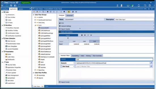
Presenting Data With Books, Cube Views and Other Items › Build Reports Through Cube Views › Calculations
Dynamic calculations enhance the consolidation performance because the amount is calculated when requested for display and is not written to the database.
Use dynamic calculations in cube views and business rules.
-
There is no performance impact on consolidation times.
-
You can make dynamic calculations drillable so users can see the source for the calculated result when drilling down.
-
Use these calculations for ratios or variances.
In the dimension library, write dynamic calculations on specific members. They will calculate at runtime.
Dynamic calculations have a syntax similar to GetDataCell expressions because they also require reference to specific dimension members to return a data point.
NOTE: A difference between dynamic calculations and GetDataCell expressions is that dynamic calculations require proper business rule logic.
Use dynamic calculations if you need a repository of commonly used calculations which allows for consistency and reduces maintenance.
Create common calculations in the UD8 dimension. It allows you to have the most flexibility with your rule syntax.
Use another calculation type if the calculation is only used on a specific cube view because you may not want to create a member in the dimension library. Also, consider if you will grant a report builder access to the dimension library to view, create, and edit these calculations.
Presenting Data With Books, Cube Views and Other Items › Build Reports Through Cube Views › Calculations › Dynamic Member Formulas and Cube Views
Dynamic calculations enhance the consolidation performance because the amount is calculated when requested for display and is not written to the database.
Account, Flow, and all UDs can contain dynamically calculated members.
-
There is no performance impact on consolidation times.
-
You can make dynamic calculations drillable so users can see the formulas running.
-
These calculations can be used for ratios or variances.
Two properties must be set to make the calculation dynamic: Account Type and Formula Type. Ensure that the Formula Type is set to DynamicCalc. If using on an Account dimension type, both the Account type and Formula Type need to be set to DynamicCalc.

Here are some common examples of how dynamic calculations are used:
-
Api.Data.Calculate(“Target = A + B”)
-
Api.data.calculate(“A#InsuranceExp = A#Payroll * A#InsuranceCostPcent”)
-
Api.Data.GetDataCell(“A + B”)
-
Return Api.data.GetDataCell(“A#GrossSales – A#ReturnsAndAllowances”)
Calculated Members and Example
In the Dimension Library, there are likely a few members that will be calculated using a member formula. Dynamically calculated members are members that use the GetDataCell function to return values based on math when they are queried.
These members require that a Formula Type of DynamicCalc be defined before writing a member formula.
NOTE: If this property is not defined, the member will return an error and the rule will not compile.
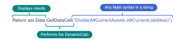
-
Display Results: This section tells the system how to display the results of the function.
-
Performs the DynamicCalc: This section tells the system to perform the DynamicCalc using the GetDataCell function.
-
Any Math syntax in a string: This tells the system what math you want it to perform.
Presenting Data With Books, Cube Views and Other Items › Build Reports Through Cube Views › Calculations › Dynamic Member Formulas and Cube Views
Before you add a dynamic calculation to a cube view, you must define it or write the simple dynamic calculation.
In this example, we are going to navigate to a UD8 member that you want to update to define the simple dynamic calculation.
-
Open the UD8 member.
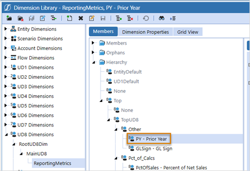
-
Open the formula editor for the member and ensure that the formula type is set to DynamicCalc.
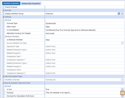
-
Open the stored value.
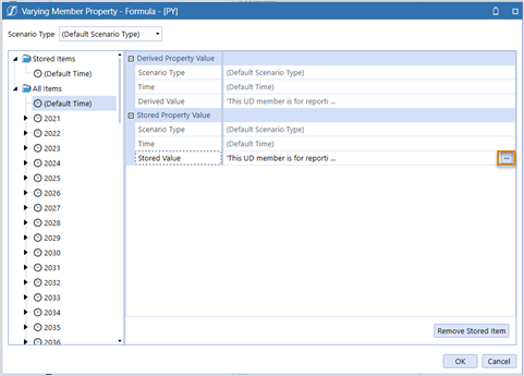
Now you can write a dynamic calculation. In this example, the formula will display an entity’s Text1 value if an Annotation type View member is referenced.
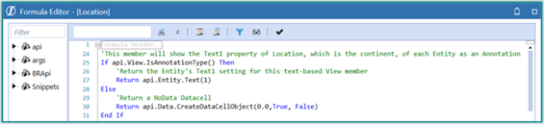
Presenting Data With Books, Cube Views and Other Items › Build Reports Through Cube Views › Calculations › Dynamic Member Formulas and Cube Views
You can write a simple dynamic calculation before adding it to a cube view.
-
Open the formula editor for the member that you want to update and navigate to Snippets > Presentation Helpers > Reporting.
-
Select the dynamic calculation you want to use.
-
Copy and paste the syntax.

-
Edit the dimensions of the pasted syntax to make sure they are correct.
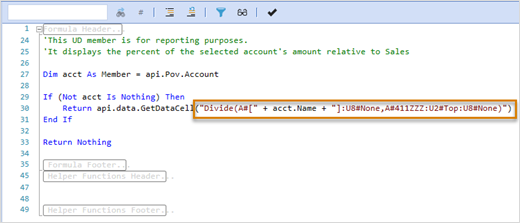
-
Double-check your syntax.
-
Click OK.
-
Close the Formula Member Property.
-
Save the member.
Presenting Data With Books, Cube Views and Other Items › Build Reports Through Cube Views › Calculations › Dynamic Member Formulas and Cube Views
After you define and write a dynamic calculation, you can add the calculation to a cube view.
-
In OneStream, go to Application > Presentation > Cube Views.
-
Select a cube view group and then a cube view.
-
Create a new column. You will add a dynamic calculation to the second column. All the selections and properties of Col1 are carried over to the new Col2. Our reporting dynamic calculations are located in UD8. Therefore, the dimension will need to change.
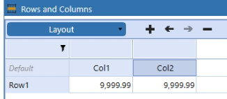
-
Open the column dimension drop-down and select UD8.
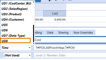
-
Click the Member Filter Builder.
-
Delete the current filter.
-
Select the U8# dimension token.
-
Select VariancePctPriorMonth and move the selection over.
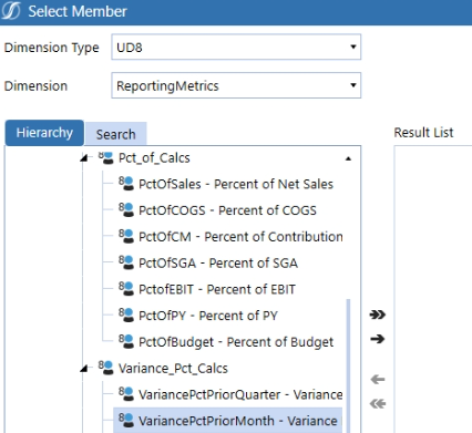
-
Select the VariancePriorMonth member and move the selection over.
-
Click OK.
-
Click OK to confirm the Member Filter selection.
-
Save your changes.
-
Run the cube view as a Data Explorer Grid. The cube view renders and displays the dynamic calculations in the two far-right columns.
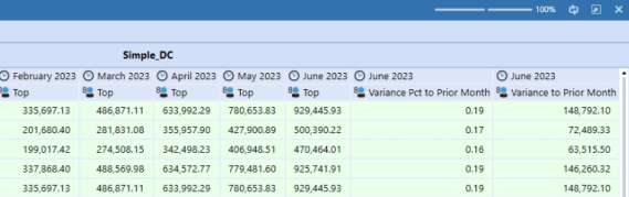
Presenting Data With Books, Cube Views and Other Items › Build Reports Through Cube Views › Calculations › Dynamic Member Formulas and Cube Views
When you apply dynamic calculations to both rows and columns the row formula takes precedence, whether it is a dynamic calculation member or cube view math.
Rows and columns contain several override properties by row:
-
When you use the row override in the column it will use the column formulas for the specified rows.
-
When you use the column override in the rows it will use the formulas for the specified columns.
Apply Overrides
-
In the cube view, select a column.
-
Select the Row Overrides tab to apply row overrides in the column.
-
Define the row range. Enter a row name or apply a range of row names to override the results for the specific rows in the column of the cube view.
-
Enter the member filter to override the value for the row range. This defines what dimension member data displays or specifies complex calculations for the row range.
-
Set the format for the row range, which includes selecting fonts, text colors, cell background color, grid lines, cell borders, and so on.
-
Select a value from the list parameter drop down list.
Presenting Data With Books, Cube Views and Other Items › Build Reports Through Cube Views › Calculations › Dynamic Member Formulas and Cube Views
You can have up to four overrides for your column and four overrides for your row. These can be used to change the display for a given column or row. In this example, two columns for the Flash Scenario (Col1) vs. Budget (Col2) are needed. If Row1 is being used by the Net Sales Account (e.g. A#60999), and it needs to be compared to the Flash Net Sales which is a different account (e.g. A#FlashNetSales), then you would use a column override.
Row/Column Range
Type a column name to display a different value in the Cube View. You need to use the name of your rows or columns. The row range isn't looking for a numerical order, it's looking for the actual name of the rows and columns in your Cube View. In this example, Col1 would be typed to show a different value for Flash Scenario Column.
TIP: Your Row Range can be a single row or column. To apply to multiple rows or columns, use a comma-separated list or use a hyphen to define a range.
Member Filter
Type the Member Filter to override the value for the columns or rows. In this example, type A#FlashNetSales to override the results from A#60999.
The override results will display the value from A#FlashNetSales in Col1 for the Flash Scenario.
Cell Format
See Cube View Formatting.
List Parameter
See List Parameter under Data earlier in this section.
Presenting Data With Books, Cube Views and Other Items
Dashboards are a powerful way for users to view formatted cube views, pixel perfect financial reports and expressive charts. Dashboards are contained in a dashboard group and comprised of components, data adapters and potentially parameters. All of the objects are managed and shared across Dashboard Maintenance Units. Each is a building block on the other. Dashboard Maintenance Units are stored, created, and maintained in Workspaces. Workspaces vary by dashboard project needs and applications.
Workspaces store Dashboard Maintenance Units and facilitate community development by providing an isolated environment for developers to segregate and organize Dashboard objects. Workspaces are the foundation for dashboards and will continue to evolve into the framework that encapsulates the artifacts needed to develop business solutions.
The main use of a Dashboard Maintenance Unit is to enable the sharing of key dashboard artifacts like parameters, data adapters and components across multiple dashboard groups. These objects do not have security access settings, so they assume the settings of the maintenance unit. Once a maintenance unit is created, dashboard groups, components, data adapters, parameters, and files can be created within the unit.
Dashboard groups are created to organize dashboards and work as placeholder where the dashboards reside. The dashboard groups are then available to assign to dashboard profiles for viewing throughout the workflow process.
Dashboards are composed of components which are broken into parameter components, content components, and embedded components. Components can have one to many data adapters and can be used across multiple dashboards and dashboard groups in the same Dashboard Maintenance Unit.
When creating a component, give it a name and description. Feed parameters and other Substitution Variables into the description, so they display in the resulting component.
Account: |!TrendAccountParam!| Region: |!!Region Parameter!!| Year: |WFYear| Will appear as:Account: Net Income Region: Asia Pacific Year: 2012
Data adapters are the minimum building block for components. These specify where the data is coming from for the dashboard component. A list can be made of each data adapter which names the resulting table created when the dashboard runs.
Parameters can be used to filter data in the resulting dashboard. They are not required, but extremely useful. See Presenting Data With Books, Cube Views and Dashboards.
The File section allows an administrator to create company specific dashboards by uploading documents and images.
NOTE: Optimal display size is 1920 x 1080 resolution. For the Windows desktop application, we recommend setting the scale to 100% and using the zoom functionality to zoom in. This is especially helpful in dashboards such as People Planning and Reporting Compliance.
The process works as follows:

Presenting Data With Books, Cube Views and Other Items › Dashboards
Dashboards are contained in Dashboard Groups made up of Components, Data Adapters, potentially Parameters, and Files. All these objects are managed and shared across Maintenance Units which are then assigned to Dashboard Profiles.
Dashboard Toolbar
 Create Group
Use this to create Dashboard Groups which is where all Dashboards are organized.
 Create Profile
Use this to create a Dashboard Profile which is where all Dashboard Groups are organized.
 Manage Profile Members
Use this to assign Dashboard Groups to Dashboard Profiles.
 Create Workspace
Use this to create a workspace. Workspaces store maintenance units and facilitate community development by providing an isolated environment for developers to segregate and organize dashboard objects. See Workspaces
 Create Maintenance Unit
All Dashboards and their corresponding Components, Data Adapters, Parameters, and Files are kept in a Maintenance Unit.
 Create Dashboard
Use this to create a Dashboard.
NOTE: A Maintenance Unit and a Dashboard Group need to be created first for this icon to be available.
 Create Cube View
Use this to create a cube view.
 Create Dashboard Component
Use this to create a Component to assign to a Dashboard.
 Create Data Adapter
Use this to create a Data Adapter to assign to a Component.
 Create Parameter
Use this to create a Parameter to use in a Dashboard or cube view.
 Create File
Use this to store files to be used in a Dashboard.
 Create String
Used with XFString functionality and displayed as a caption in a cube view.
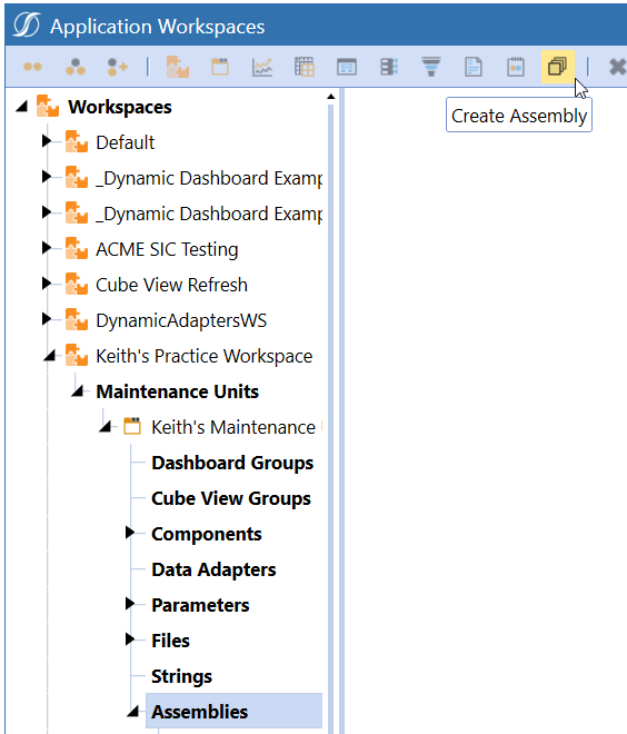
Create Assembly
Use this to create an assembly.
 Delete Selected Item
This allows the deletion of a single child item (e.g., Data Adapter or Component) within a Maintenance Unit, or the deletion of an entire Maintenance Unit including all child items.
 Rename Select Item
Use this to rename the selected item.
 Cancel All Changes Since Last Save
Use this to cancel any changes made to items since the last save.
 Save
Save
Use this to save all changes.
 Copy Selected Dashboards, Components, Adapters, Parameters, Files, and Strings
Use this to create copy of the selected Dashboards, Components, Adapters, Parameters, Files, and Strings within or across Maintenance Units.
Multiple items can be selected all at once using Shift+click or Ctrl+click. Items can be copied and pasted multiple times and each time the item is pasted a suffix of _Copy will be added. For every additional instance of the Dashboard item that is pasted a suffix of _Copy (instance#) will be added.
NOTE: Users can Copy using right-click on the Dashboard Item or toolbar menu Copy button.
 Paste Selected Dashboards, Components, Adapters, Parameters, Files, and Strings
Use this to paste copies of selected Dashboards, Components, Adapters, Parameters, Files, and Strings within or across Maintenance Units.
Items can be pasted multiple times and each time the item is pasted a suffix of _Copy will be added. For every additional instance of the Dashboard item that is pasted a suffix of _Copy (instance#) will be added.
NOTE: Users can Paste using right-click on the Dashboard Item or toolbar menu Paste button.
 Search
Use this to open the Search Workspace Object dialog box and search for an object.
 Add Dashboard Component
Use this to add a new dashboard component.
 Move Up/Down
Use these to move components up or down in a list.
 Remove Selected Dashboard Component
Use this to remove a dashboard component.
 Open Data Explorer
Use this to open the Data Explorer dialog box
 View Dashboard
Use this to run a Dashboard from the Application Tab.
 View Dashboard in Design Mode
Select a Dashboard and click the black arrow in order to Set Selected Dashboard as Default. Click the icon to launch the default Dashboard in design mode. The Dashboard must be set as the default prior to viewing it in design mode. Select Clear Default Dashboard in order to remove the current saved Dashboard from the default state. See Dashboard Design Mode in Presenting Data With Extensible Documents for more details on this feature.
 Show Objects that Reference the Selected Item
Use this to see other areas where the selected item is being used. For example, you can see where a parameter is being used in an application and therefore know the impact when you want to make a change.
 Object Lookup
See Object Lookup.
 Navigate to Security
This icon appears in the Maintenance Group, Dashboard Group, and Profile Security properties and when clicked it navigates to the Security screen. This is an easy way to make changes to Security Users or Groups before assigning them to specific Maintenance Units, Groups, and Profiles.
Presenting Data With Books, Cube Views and Other Items › Dashboards
Dashboard design mode makes it easy to design and edit dashboards because it pinpoints exactly where the desired change needs to be made. Dashboard in design mode displays a dashboard draft and all the dashboard maintenance unit items associated with it. You can then select different sections of the maintenance unit hierarchy which highlight that portion of the completed dashboard, or select a portion of the dashboard and be directed to that exact item in the maintenance unit.
To run a dashboard in design mode:
-
Select the dashboard to which changes need to be made and set it as the default dashboard.
-
Click
 to run the dashboard in design mode.
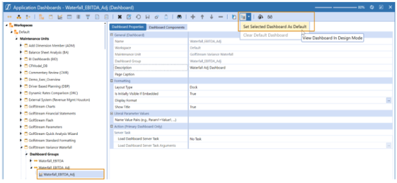
Design Mode
The following describes the design mode page elements.
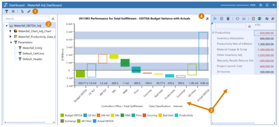
TIP: Highlight a specific dashboard item (such as a data adapter or component) and select this icon to go directly to that item in the dashboard maintenance screen.
-
Toolbar:
 Click this to hide or display the Dashboard Maintenance Unit items.
 Click this to go back to maintenance mode.
TIP: Highlight a specific dashboard item (such as a data adapter or component) and select this icon to go directly to that item in the dashboard maintenance screen.
-
Dashboard Maintenance Unit items: This provides the entire dashboard maintenance hierarchy for the default dashboard. For more complex dashboards, use the search to find the desired item. This dashboard example contains one chart component, one cube view component and the custom substitution variables used (parameters and their variables). Hover the mouse over each item to display a tool tip that identifies the value currently being used. Each component has its own data adapter.
-
Dashboard Draft: This is the default Dashboard.
-
Find Tree Item
 When a user clicks this icon, the maintenance items involved in this part of the Dashboard are highlighted in the tree. For example, to change the dashboad title above, click to see what part of the maintenance hierarchy controls the chart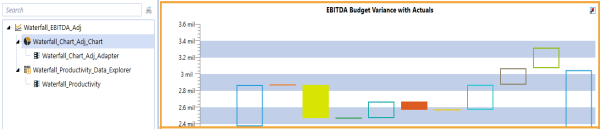
This indicates exactly where these changes can be made.
Click
 to return to edit mode and it navigates directly to the chart component selected in design mode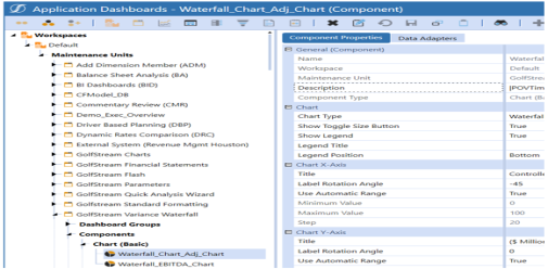
Make the necessary changes and preview it once more in design mode to see the outcome.

NOTE: Authoring dashboards which are designed to contain more than six levels of nested dashboards is a rare use case and not recommended. When viewing in the Silverlight web browser, results may be inconsistent. If there is a desire to nest dashboards to this level or beyond, it is recommended to use the OneStream Windows application interface.
Presenting Data With Books, Cube Views and Other Items › Dashboards
Click  to preview a completed Dashboard. Once in preview mode, Parameters may need to be entered, and then click Ok to get the Dashboard to run. Click
  to go back to Parameters and run the Dashboard again under a different input value.
Click  to toggle back to design mode.
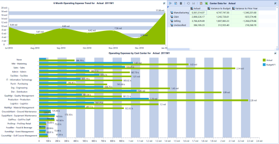
The example above shows a Dashboard with two Chart Components and one Data Explorer Component.
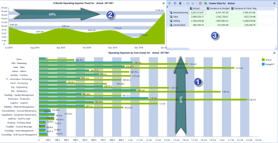
In this example above, there are three Components listed in the Dashboard Components tab in the order in which they appear on the screen.
Component 1 has the Dock Position set to Bottom and Height to 65%.
Component 2 has the Dock Position set to Left and Width to 60%.
Component 3 has the Dock Position set to any position such as Right and all other setting were left blank. The Dashboard will automatically dock this last Component to fill the rest of the available space.
Set layout type to Tabs in order to view each Component in its own tab.

By right clicking on a Profile under OnePlace Dashboards on the left in the Navigation Pane, a user can export all the Dashboards in the Profile out to a combined PDF file. Right click and choose Export All Reports in this Profile… and then choose Combined PDF File or PDFs in Zip File. This is a quick and easy way to produce Report books. The only exception is that currently graphs and charts do not export to PDF in these mass forms.

Presenting Data With Books, Cube Views and Other Items › Dashboards
Is Mobile
If set to True, the Dashboards within this Maintenance Unit can be used with the OneStream Mobile Solution. If set to False, the Maintenance Unit may only be used within the OneStream application. This property cannot be changed once the Maintenance Unit is saved.
NOTE: Dashboards intended for OneStream Mobile have Dashboard Component limitations. These limitations are noted under Dashboard Components. Any Dashboard within a Mobile Dashboard Maintenance Unit can be launched from the Application Dashboard screen but cannot be assigned to Workflows or used in OnePlace.
Presenting Data With Books, Cube Views and Other Items › Dashboards
General (Dashboard Group Unit)
Name
The name of the Dashboard group.
Description
A short description of how the Dashboard group is used, or what it contains.
Security
Access Group
Members of this group can access the dashboards in the Dashboards group.
NOTE: Click and begin typing the name of the Security group in the empty field. As the first few letters are typed, groups are filtered making it easier to find and select the desired group. Select a group, press CTRL and then double-click.
Presenting Data With Books, Cube Views and Other Items › Dashboards
Once a Dashboard group is completed, it is organized into a dashboard profile. Profiles are then assigned to various functions. Click to create a new profile. Click to assign a group to a profile, allowing users to select the groups to be in a profile.
Dashboard Visibility controls what dashboards are viewed throughout the application. This is the key property for all dashboard profiles. The options are as follows:
Never
This is used for dashboards that are expired, or no longer being used.
Always
This allows the dashboard to be available in OnePlace and Workflow.
OnePlace
This allows the dashboard to be viewed in the Dashboard section under the OnePlace tab.
Workflow
This allows the dashboard to be attached to a workflow profile. This can be completed in Workflow Profiles under the Integration and Data Quality Settings.
Presenting Data With Books, Cube Views and Other Items › Dashboards
General
Name
The name of the dashboard.
Description
A quick description of the dashboard.
Page Caption
This is used to give a name to the dashboard when it is displayed. The name will be displayed at the top left of the dashboard. If the Page Caption is left blank, then it will default to the name given to the dashboard.
Dashboard Group
The Dashboard group to which it belongs.
Behavior
Dashboard Type
This indicates how each dashboard within a group is used. It helps reduce the number of groups needed and simplifies dashboard maintenance.
-
(Use Default): Default is Top Level.
-
Top Level: This dashboard type indicates which dashboards in a group should be visible if assigned to OnePlace or a Workflow.
-
Top Level Without Parameter Prompts: This dashboard type has the same behavior as Top Level, but if the dashboard has runtime parameters, it will have a slight performance improvement. It does not prompt for parameters.
-
Embedded: This dashboard type indicates which dashboards in a group should not be visible in OnePlace because they are dependent on other dashboard objects.
-
Embedded Dynamic: This dashboard type enables you to dynamically modify dashboard properties, component properties, parameters, adapters, and cube view properties. See Dynamic Dashboards.
-
Embedded Dynamic Repeater: This dashboard type enables you to dynamically modify dashboard properties, component properties, parameters, adapters, and cube view properties. This dashboard type can be used to add multiple instances of the same component without having to re-create each component individually. See Embedded Dynamic Repeater Dashboard.
-
Embedded Top Level: This dashboard type acts as a new top level with its own parameter resolution and rendering stages. As a result, it allows for the Load Dashboard Server Task to be run even when embedded.
NOTE: Currently, Embedded Top Level dashboards should not be used with Smart Links.
-
Embedded Top Level Without Parameter Prompts: This dashboard type acts as a new top level with its own parameter resolution and rendering stages. As a result, it allows for the Load Dashboard Server Task to be run even when embedded. It does not prompt for parameters, resulting in a slight performance improvement.
NOTE: Currently, Embedded Top Level Without Parameter Prompts dashboards should not be used with Smart Links.
-
Custom Control: This dashboard type has the same behavior as Embedded, but each instance maintains its own set of input parameters, variables, and Event Listeners (actions).
Custom Control
A new dashboard type with required input parameters, which is a comma separated list of parameter names that must be provided by the containing dashboard when processing a custom control dashboard. For example, Param 1, Param 2, Param 3. A parameter component inside the custom control forwards events to the parent dashboard.
Formatting
Layout Type
Canvas
A component docks to the top, bottom, right, or left of the dashboard. The component only shows in the small space defined by the dock position and does not display fully on a screen. Slide bars are used to view the components.
Dock
A component docks to the top, bottom, right, or left of the dashboard. Use Dock Position to determine how much of the screen will be used for this layout.
Grid
This allows the ability to make a dashboard in a grid format by using rows and columns to add Components, Lines, or Moveable Splitters.
Horizontal Stack Panel
Each Component will display horizontally. Horizontal Stack Panel dashboards are generally used as part of other dashboards.
Tabs
Each component will display in its own tab.
Uniform
Each Component is docked, but all are equal in size.
Vertical Stack Panel
Each component will display vertically. Vertical Stack Panel dashboards are generally used as part of other dashboards.
Wrap
See Canvas
Is initially Visible if Embedded
When set to True, the selected dashboard will be hidden if it is retrieved from another dashboard. The hidden dashboard can be set to visible from a Parameter component by listing its name in the dashboard to Show property under User Interface Action and selecting Refresh for the dashboard containing the embedded dashboard.
Display Format
This allows unique display formatting per dashboard for background color, dialog width and height, and border formatting. See "Display Format Settings".
Literal Parameter Values
Name Value Pairs (e.g., Param1=Value1,…)
Enter a comma-separated list of name-value pairs for this dashboard’s static parameter values. Piped variable names cannot be used in this setting.
Action (Primary Dashboard Only)
Load Dashboard Server Task
Dashboard Extender Rules can run upon launching and refreshing dashboards. This only applies to the main dashboard, not embedded dashboards.
No Task
A Dashboard Extender business rule is not being used on this dashboard.
Execute Dashboard Extender Business Rule (Once)
This runs the assigned Business Rule once upon refresh or initial launch
Execute Dashboard Extender Business Rule (All Actions)
This does an iterative action and runs the business rule as many times as needed.
Load Dashboard Server Task Arguments
Enter the arguments required by the server task. When executing a Dashboard Extender business rule, the arguments include {BusinessRuleName}{FunctionName}{Optional Named-Value Pairs} each enclosed in curly brackets. Click the ellipsis and select the desired argument format and then enter each object.
Example: {DashboardLoadBRName}{TestFunction}{Param1=[Value1], Param2=[Value2]}
Grid Layout Type
This only becomes available if Grid is chosen as the Layout Type.
Number of Rows
The number of rows the dashboard will use for the grid layout.
Number of Columns
The number of columns the dashboard will use for the grid layout.
Row/Column Type
Component
Use the Component option if a Content or Parameter component is needed for the row or column of the grid layout for the dashboard.
Line
Use the Line option if a line is needed for the row or column on the dashboard.
Moveable Splitter
Use the Moveable Splitter option if one is needed for the row or column on the dashboard. This allows the ability to move the grid up and down, or left and right.
Row/Column Height
Utilize Row/Column Height to customize the sizing of the rows and columns heights and widths to be displayed on the dashboard. Auto expands the size based on the contents of the row. You can use an * to create a fractional value of the remaining space. For example, if there are three rows, then each row will take a third of the space.
Presenting Data With Books, Cube Views and Other Items › Dashboards › Dashboard Properties
General
Background Color
This is used to display the background color of one dashboard.
InnerBackgroundColor
This is used to define the background color of a dashboard containing embedded dashboards.
Dialog
DialogDisplayStyle
Controls how a dashboard is sized when viewed as a dialog box. If the specified value exceeds the current screen, the value will be changed to the maximum display setting for height and width to fit to screen.
Specify Maximize or Normal. The default is Normal. Maximize opens using the Dialog Maximize mode to full screen. Normal opens to the defined Dialog Height and Width settings.
DialogWidth
Customize the width of the dialog for the dashboard. The dialog width supports up to 10,000. If set to -1, the size will set at run time to the maximum width for the active screen.
DialogHeight
Customize the height of the dialog for the dashboard. The dialog height supports up to 10,000. If set to -1, the size will set at run time to the maximum height for the active screen.
EnableSystemClose
This is used to control the display and use of the Close button of the dialog. Setting this to True removes the Close button.
Styles
TabControlStyle
Choose from Classic, No Border, or Rounded Corners to define how tabs appear in the application. The tab control functionality remains the same. TabControlStyle is only available in the Windows version.
Dashboard Tabs
There are three different tab styles that can be selected for dashboards:
-
Use Default or Classic – The original style for dashboard tabs.

-
No Border – Rounded corners and no borders.

-
Rounded Corners – Rounded on the edges with borders.

These tabs are only available for use with the dashboards and do not apply to the rest of the product.
Select a Tab
-
Go to Application > Dashboards and select a dashboard.
-
Click to open the dashboard and in Dashboard Properties > Formatting make sure the Layout Type is Tabs.
-
Go to Display Format and click the ellipsis to edit.
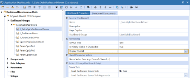
-
Click Styles > TabControlStyle and click in the field to get a menu option. If the Layout Type is not set for Tabs, the field is unavailable.
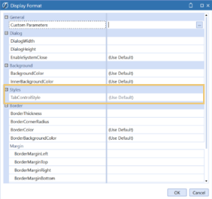
-
Choose the type of tab for the dashboard.
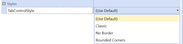
-
Click OK and then Save.
-
Click View Dashboard.
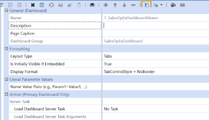
-
The tabs have no borders.
Border
BorderThickness
This is used to customize the border thickness for the dashboard.
BorderCornerRadius
This is used to customize the border corner shape for the dashboard. If left blank, the border will be square.
BorderColor
This is used to customize the outer border coloring for the dashboard.
BorderBackgroundColor
This is used to specify the border background color of a dashboard containing embedded dashboards.
Margin
BorderMarginLeft/Top/Right/Bottom
Used to customize the margin of the border on the dashboard.
Padding
BorderPaddingLeft/Top/Right/Bottom
Used to customize the padding or spacing of the border on the dashboard.
Presenting Data With Books, Cube Views and Other Items › Dashboards
General
Name
The name of the dashboard component.
Description
A free form field to enter a description of the dashboard component.
Components
 Add Dashboard Component
Use this to add and assign a dashboard component.
Move Up
Use this to move a dashboard component up in the Components list.
Move Down
Use this to move a dashboard component down in the Components list.
Remove Selected Dashboard Component
Use this to remove a selected dashboard component from a Components list.
NOTE: To select and add multiple components, press CTRL and then click to select. Once all items are selected, click OK.
Position on Dashboard
Dock Position
Left/Top/Right/Bottom
Allows the ability to dock a Component in a specific position on the dashboard.
Left
This sets the amount of dashboard space to allocate to the left dock position.
Top
This sets the amount of dashboard space to allocate to the top dock position.
Width
Enter a percentage to set the width of the dashboard.
Height
Enter a percentage to set the height of the dashboard.
Presenting Data With Books, Cube Views and Other Items › Dashboards › Dashboard Components
The following properties are available under the Display Format field for Parameter and Content components. Not all properties in this section are available for all components. For information about parameters, see Filter Runtime Data and Reduce Maintenance with Parameters.
General
Custom Parameters
Click the ellipsis in order to select and assign a custom parameter such as a cube view style to the cube view header.
IsVisible
This determines if the component is visible on the dashboard. Settings are True, False, or Use Default.
ShowSearch
This adjusts the behavior of the ComboBox component. When True, the ComboBox retains typed text and auto complete is enabled. When False, typed text is not retained and auto complete is disabled.
HorizontalAlignment
This determines how the component should be aligned horizontally on the area allocated in the dashboard.
Left
The component is aligned on the left of the allocated area.
Center
The component is aligned in the center of the allocated area.
Right
The component is aligned on the right of the allocated area.
Stretch
The component is stretched to fill the allocated area.
Use Default
Use the default setting for horizontal alignment.
VerticalAlignment
This determines how the component should be aligned vertically on the area allocated in the dashboard.
Top
The component is aligned on the top of the allocated area.
Center
The component is aligned in the center of the allocated area.
Bottom
The component is aligned on the bottom of the allocated area.
Stretch
The component is stretched to fill the allocated area.
Use Default
Use the default setting for vertical alignment.
Width
The width of the control.
Height
The height of the control.
MarginLeft, Top, Right, and Bottom
The spacing used on the sides of the control.
BorderThickness
The thickness of the border used when displaying the control.
FontFamily
The font type used on the component (e.g., Ariel, Times Roman, etc.).
FontSize
The font size used on the control text.
Bold
If set to True, the font will be bold.
Italic
If set to True, the font will be italicized.
Color
The color of the text displayed in the control.
TextColor
Choose a color from the drop-down options for the control text.
BackgroundColor
Choose a color from the drop-down options for the text background.
BorderColor
Choose color from the drop-down options for the border of the control.
HoverColor
Choose color from the drop-down options to change the hover color of a button dashboard component.
Image
HorizontalContentAlignment
This determines how the image’s content should be aligned horizontally on the area allocated in the dashboard.
VerticalContentAlignment
This determines how the Image’s content should be aligned vertically on the area allocated in the dashboard.
ImageStretch
This setting allows the image to be re-sized when being displayed.
None
This does not re-size the image.
Fill
The image stretched to fill the control.
Uniform
This preserves the aspect ratio of the image.
UniformtoFill
This scales the source image to fit within the bounds of the image object and keeps the source image centered within the image object.
ImageCropLeft, Top, Width, Height
Use these settings to crop and position the image in order to align the desired content appropriately.
Label
LabelPosition
The location where the control label is placed.
None
This does not display a label for the control.
Left
This displays the label to the left of the control.
Top
This displays the label above the control.
Right
This displays the label to the right of the control.
Bottom
This displays the label below the control.
Use Default
Use the default label display location
LabelFontFamily
The font type to use on the label (e.g., Ariel, Times Roman, etc.).
LabelFontSize
The font size to use on the label.
LabelBold
If set to True, the font is bold.
LabelItalic
If set to True, the font is italicized.
Colors
LabelZeroOffsetForFormatting
This holds a number with the default value of 0.0. When a label is being used to display a number, and the number is greater than the number in this field, it will be displayed using the color associated with LabelTextColor. Otherwise, the number will be displayed using the color associated with LabelNegativeTextColor.
LabelTextColor
Choose a color from the drop-down options for the label text.
LabelNegativeTextColor
Choose a color from the drop-down options for the label’s negative text.
Presenting Data With Books, Cube Views and Other Items › Dashboards › Dashboard Components
Parameter components are objects such as a button or list box that, when selected, could drive additional actions, such as opening a different dashboard or running a Custom Calculate.
Custom calculate executed from a Dashboard Parameter component allow the passing of a complete set of name value pairs that align to the dimension Point of View (i.e. Entity=MyEntity,Time=2017M11,Consolidation=Local, etc) and the custom calculation processor will use those variables to initialize the Finance Engine API POV Variables (i.e. api.POV.Entity.Name will equal MyEntity). All API.POV objects (Cube, Entity, Parent, Consolidation, Scenario, Time, View, Account, Flow, Origin, IC, UD1, UD2, UD3, UD4, UD5, UD6, UD7, UD8) are initialized and available to this function. This makes it possible to share custom calculation rules with standard consolidation/calculation rules because both rule sets have a fully initialized set of API.POV variables. For consolidation business rules, this POV is related to the data unit. When using a Parameter component with a cube view on the same dashboard, API.POV is related to the 18-dimension POV that is available from each cell rendered. See "Custom Calculate" under Finance Function Types for more information.
Button
This displays a button on a dashboard. Buttons can be used to initiate a variety of functions including business rules, dashboards, file uploads and so on. This component can be used with dashboards.
Formatting
Text:
The text to be displayed with the button. This is an optional field. If left blank, the Text field will default to display the button name. To clear the default Name from displaying, enter |SPACE|.
Tool Tip
The text to be displayed when hovering over the button.
Display Format
The formatting assigned to the control. See Component Display Format Properties.
Image File Source Type
The Image (if any) displayed on the button.
URL
The image displayed on the button is based on a URL.
Workspace File
The image displayed on the button is in a file stored in the Workspace Maintenance Unit File section.
Application Database File
The image displayed on the button is in a file in the Application Database Share.
System Database File
The image displayed on the button is in a file in the System Database Share.
File Share File
The image displayed on the button is in the File Share.
URL or Full Name File
The URL, file path or file name for the displayed image.
URL Syntax
Access a built-in toolbar image, or use an image from any web server
Built-in OneStream Image Example /OneStream.ClientImages;component/Misc/ToolbarImage.png.
Web Server Example
http://www.onestreamsoftware.com/img/onestream-logo.png
Database File System Example
Enter the path and file name Documents/Public/TestImage.png.
Workspace File Syntax
Enter the name of the file resource TestImage.png.
The following Excel properties are used to specify an Excel file from either an Extensible Document or Report Book in order to display it as an image or button.
Excel Page Number
Enter the page number of the Excel document to display.
Excel Sheet
Enter the name of the Excel worksheet to display.
Excel Named Range
Enter the named range from Excel to display. The named range must be in the specified Excel sheet in the Excel Sheet property, or the Excel Sheet property must be blank in order to use a named range. See Image under Component Display Format Properties to position and align the Excel image as needed.
Button
Button Type
Specify the functionality to be assigned for the selected button.
Standard
Displays a generic button that can have custom functionality assigned such as display a dashboard, execute a business rule, and so on.
File Explorer
This sets the button to display the File Explorer dialog.
File Upload
This sets the button to display the File Upload dialog.
Select Member
This sets the button to display the Select Member dialog.
Dimension Type
Specify the Dimension Type. This is required.
Use All Dimensions for Dimension Type
When True, it overrides the Cube Restriction and displays all dimension types. When False, the dimensions are limited to defined dimension type.
NOTE: If no dimension type is defined, the selections are reverted to the default dimension type.
Dimension
Specify a specific dimension. This is optional.
Example: HoustonSalesRegionalBudget
Cube
Specify a cube. This is optional.
Member Filter
Specify a Member Filter. This is optional.
Example: U3#Root.TreeDescendantInclusive
Member Filter Builder
This sets the button to display the Member Filter Builder dialogue.
Default Member Filter
Specify default member filter to display upon opening. This is optional.
Example: E#[Total Golfstream]

Workflow
This sets the button for Complete and Revert Workflow, replacing the need for a custom business rule.
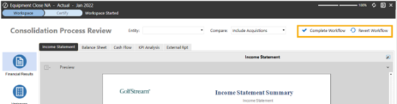
Workflow Button Action Type
Select Complete Workflow to enable the Complete action button or Revert Workflow to enable the Revert action button.
Workflow Button Image Type
Select one of the standard button images, Use Button Image to use a custom image, or Not Used to not use a button image.
Action
Bound Parameter
This is the name of the parameter the component will represent. Piped variable names are not available in this setting. The component will use the parameter to get its list of options. The selection will specify a value for the parameter when it is referenced elsewhere via piped variable naming. Click and begin typing the name of the parameter in the blank field. As the first few letters are typed, the names are filtered making it easier to find and select the one desired. If the name is unknown, expand a Workspace Maintenance Unit and scroll to identify a parameter. Then press CTRL and double-click.
Parameter Value for Button Click (Button Component Only)
The value or string to pass into the Bound parameter.
Apply Selected Value to Current Dashboard
If set to True, the Bound Parameter on the current dashboard will use the current updated value or use the value prior to update. If set to False, the current dashboard will not be updated.
Save Action
Selection Changed Save Action
What occurs when the button is pressed.
No Action
When the Parameter components are changed, changes will not be saved.
Save Data for Components
This will save the data modified by the Dashboard components specified in the Selection Changed Save Arguments property.
Prompt to Save Data for Components
This will ask the user if the modified data should be saved or not for a defined list of Dashboard components.
Save Data for all Components
This will save all data modified by each of the Dashboard components assigned to the dashboard. These components do not have to be specified in the Selection Changed Save Arguments property.
Prompt to Save Data for All Components
This will ask the user if the modified data on any included dashboard component should be saved or not.
Save Data for Components and Save Files
This will save the components modified by the Dashboard components specified in the Selection Changed Save Arguments property and their files.
Prompt to Save Data for Components and Save Files
This will ask the user if the modified data should be saved or not for the defined list of Dashboard components and their files.
Save Data for All Components and Save Files
This will save all components modified by the Dashboard components included in the Dashboard and their files.
Prompt to Save Data for All Components and Save Files
This will ask the user of the modified data should be saved or not for all dashboard components and their files.
Save All Files
This will save all modified file data within the dashboard and exclude saving any modified component data.
NOTE: The Selection Changed Save Argument field is only active when you choose a Selection Changed Save Action that requires you to specify components.
Save Files Properties
You can use these Save Files properties to save edits made in Text Editor and Spreadsheet Component files through a dashboard button. For example, the user has a dashboard containing a spreadsheet and button component, and the developer sets the button component's Selection Changed Save Action property to one of the Save Files options. When the user edits the file data in the spreadsheet component's file and then clicks the dashboard button, all file changes are saved. The dashboard component changes will also be saved. Component changes are only not saved if the Save All Files property is selected, which only saves modified file data. Users can utilize these Save Files properties through button components instead of having to navigate to File > Save in the component's toolbar to save file changes.
Considerations
-
Since Text Editor components cannot have nested components, the Save Data For Components And Save files, Save Data For All Components And Save Files, and Save All Files options will only save the Text Editor component's file.
-
When working in a spreadsheet component embedded in a dashboard, the Save Files properties enable users to save nested components while also saving the spreadsheet file. When the dashboard button is set to Save All files, only spreadsheet file modifications are saved.
USE CASE
Add a Save Files Action to the Narrative Reporting Dashboard Button
| Role | Benefits |
|---|---|
|
Developer: sets dashboard button properties User: utilizes the dashboard button |
The developer can streamline the save process for users in Narrative Reporting by reducing the possibility of users checking in files without saving. |
A user is in the Narrative Reporting solution which utilizes a Dashboard Text Editor component that displays the content of a specific file, and a developer wants to give users the ability to save their file edits using the Check In button to prevent them from checking in their file without saving. The developer also wants to do this so that users will not have to navigate to the Text Editor's File > Save toolbar button before clicking Check In.
-
Navigate to the correct Maintenance Unit that contains the Narrative Reporting solution's Check In button component.
-
Go to Component Properties > Action > Save Action > Selected Changed Save Action.
-
Select one of the Save Files save actions from the Selection Changed Save Action drop-down menu. If you select Save Data For Components And Save Files or Prompt To Save Data For Components And Save Files, you need to specify the Text Editor Component's name in the Selection Changed Save Arguments field.
-
Click the Save button.
With one of these options selected, when the user clicks the Check In button, it will perform the same save action as the Text Editor's File > Save toolbar button in the ribbon and successfully save any file modifications.
Save As
If the Text Editor or Spreadsheet components are not linked to or displaying an existing file, clicking a button component with the Save File options opens the Save New File Options window. This enables users to save a new file in different locations and performs the same function as the components' File > Save As toolbar button action.
NOTE: If you have already used the button component to Save As and created a new file, when you select the same button component again, the updates made in the dashboard component will save to that initially created file. It will not prompt the Save New File Options window to create a second new file until the user refreshes or reloads the dashboard.
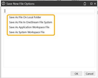
Local Folder
Select location on local computer/network to save a file to.
NOTE: The Save As File on Local Folder option is not available in the Modern Browser Experience.
OneStream File System
Select location within OneStream File Explorer to save a file to.
Application Workspace File
Select Application Workspace location to save a file to.
System Dashboard File
Select System Workspace location to save a file to.
POV Action
Selection Changed POV Action
No Action When Parameter components are changed, no change will be made to the user’s POV.
Change POV
This setting will change the user’s POV to a specified POV when Parameter components are changed.
Change Workflow
This changes the user’s Workflow to a specified Workflow when Parameter components are changed.
Change POV and Workflow
This changes the Workflow and POV to a specified value when Parameter components are changed.
Selection Changed POV Arguments
Enter the arguments for the selected POV action.
Change POV Example
Cube=Corporate, Entity=|!MyEntityParam!|, Scenario=Actual
Change Workflow Example
Enter a value for WFProfile, WFScenario, and/or WFTime.
WFProfile=|!MyWFProfileParam!|, WFScenario=Actual, WFTime=2012M1
Change POV and Workflow
See above for examples
NOTE: The Selection Changed POV Action must be set to something other than No Action for this change to occur.
Server Task
Selection Changed Server Task
No Task
When Parameter components are changed, no server task is executed.
Execute Dashboard Extender Business Rule (server type)
Executes the assigned Business Rule when Parameter components are changed. For a long-running business rule, it is optionally able to run on a specific server type, such as a Consolidation server type. Here are the options:
-
Execute Dashboard Extender Business Rule (General Server)
-
Execute Dashboard Extender Business Rule (Stage Server)
-
Execute Dashboard Extender Business Rule (Consolidation Server)
-
Execute Dashboard Extender Business Rule (Data Management Server)
Execute Finance Custom Calculate Business Rule
Executes a single year custom calculation from a Finance business rule when Parameter components are changed. The calculation is performed on the cube view assigned to the dashboard Data Adapter and calculates time based on the cube view Time member set in the Point of View. This is considered a partial calculation and does not store the calculated data or run the calculation during a consolidation. Running a custom calculation from a dashboard will impact calculation status for the affected data unit even if the data does not change. A calculated dimension member can call this business rule to do a full stored calculation.
See About the Financial Model for an example of this calculation logic.
Execute Data Management Sequence
Executes the assigned Data Management Sequence when Parameter components are changed.
Calculate
Executes a Calculation when Parameter components are changed.
Force Calculate
Executes a Force Calculate when Parameter components are changed.
Calculate with Logging
Executes a Calculate with Logging when Parameter components are changed.
Force Calculate with Logging
Executes a Force Calculate with Logging when Parameter components are changed.
Translate
Executes Translate when Parameter components are changed.
Force Translate
Executes Force Translate when Parameter components are changed.
Translate with Logging
Executes Translate with Logging when Parameter components are changed.
Force Translate with Logging
Executes Force Translate with Logging when Parameter components are changed.
Consolidate
Executes Consolidate when Parameter components are changed.
Force Consolidate
Executes Force Consolidate when Parameter components are changed.
Consolidate with Logging
Executes Consolidate with Logging when Parameter components are changed.
Force Consolidate with Logging
Executes Force Consolidate with Logging when Parameter components are changed.
TIP: For more details on these calculation types, see Data Management in Application Tools.
Selection Changed Server Task Arguments
Enter the Parameter components to which the Save action applies. If Save Data for all Components or Prompt to Save Data for All Components is selected, this can be left blank.
Dashboard Extender Business Rule Example (each enclosed with curly braces)
{Business Rule Name}{Function Name}{Optional Name-Value Pairs}
Finance Custom Calculate Business Rule Example (each enclosed with curly braces)
{Business Rule Name}{Function Name}{Optional Name-Value Pairs}
NOTE: Name Value Pairs can have settings for Cube, Parent and any Dimension Type. It can also have a setting for any Time Member Filter including CurrentPeriod, AllPriorInYearInclusive or AllInYear. It can have any other name-value pair for use by the Business Rule since they are passed into the rule using the CustomCalculateArgs object.
Data Management Sequence Example (each enclosed with curly braces)
{Sequence Name}{Optional Name-Value Pairs}
Calculation, Translation or Consolidation Example (each enclosed with curly braces)
{Data Unit Member Script}
{E#|!EntityParam!|:C#Local:S#Actual:T#|!TimeParam!|}
User Interface Action
Selection Changed User Interface Action
No Action
When Parameter components are changed, no user interface action is executed.
Redraw
This repaints the screen without making a connection to the database acquiring updated data.
Refresh
This refreshes the dashboard specified in the Dashboards to Redraw property which makes a connection back to the database acquiring all new data.
Close Dialog
This closes the dialog upon performing a specified action in a dashboard.
Close Dialog As OK
This closes the dialog after the user clicks OK.
Close Dialog As Cancel
This closes the dialog after the user clicks Cancel.
NOTE: The refresh of the parent dashboard is based on performing a specified action setup in a dashboard. For example, if a dashboard is set to "Open Dialog With No Buttons and Refresh," the "Close Dialog As OK" will refresh the parent dashboard and run the UI action.
Close All Dialogs
This closes all open dialogs upon performing a specified action in a dashboard.
Open Dialog
Opens a Dashboard in a modal window.
Open Dialog With No Buttons
Performs an Open Dialog action and does not display the Close button.
Open Dialog With No Buttons and Redraw
Performs an Open Dialog, allows the user to apply changes, and then Redraw without displaying the close button.
Open Dialog With No Buttons and Refresh
Performs both an Open Dialog & Refresh action without displaying the close button.
Open Dialog and Redraw
Performs both an Open Dialog & Redraw action.
Open Dialog and Refresh
Performs both an Open Dialog & Refresh action.
Open Dialog, Apply Changes, and Redraw
Performs an Open Dialog, allows the user to apply changes, and then Redraw.
Open Dialog, Apply Changes, and Refresh
Performs an Open Dialog, allows the user to apply changes, and then Refresh.
Open Dialog, Apply Changes, and Redraw if OK
Performs an Open Dialog, allows the user to apply changes, and then Redraws once the user selects OK.
Open Dialog, Apply Changes, and Refresh if OK
Performs an Open Dialog, allows the user to apply changes, and then Refreshes once the user selects OK.
Dashboards to Redraw
Comma separated list of embedded dashboards to redraw when the user changes the selection in this Parameter Component.
Dashboards to Show
Comma separated list of embedded dashboards to make visible when the user changes the selection in this Parameter component. This is typically used when multiple Parameter components are needed to collect settings to display an embedded content dashboard. After the last selection has been made, that Parameter Component will show the previously hidden embedded content dashboard.
Dashboard to Hide
Comma separated list of embedded Dashboards to hide when parameter components are changed.
Dashboards to Open in Dialog
Single Dashboard to open in a modal dialog when the selected button is clicked.
Dialog Initial Parameter Values
Enter a comma separated list of name-value pairs to specify initial parameter values for the opened dialog. For example: DlgParam1=Value1, DlgParam2=[Value 2].
Dialog Input Parameter Map
Enter a comma separated list of name-value pairs to map parameter names used by this component’s dashboard to parameter names used by the opened dialog. For example, DlgParamName1 = This ParamName1, DlgParamName2=ThisParamName2. When the dialog is opened, the names of the parameters adjust to accommodate the dialog.
Dialog Output Parameter Map
Enter a comma separated list of name-value pairs to map parameter names modified by the closed dialog to parameter names used by this component’s dashboard. For example, ThisParamName1=DlgParamName1, ThisParamName2=DlgParamName2. When the dialog is closed, the names of the parameters adjust to accommodate this component’s dashboard.
Navigation Action
Selection Changed Navigation Action.
No Action
No navigation action is performed when Parameter components are changed.
Open File
When Parameter components are changed by a user, a new file will open. This is specified in the Selection Changed Navigation Arguments field.
Open Page
When Parameter components are changed by a user, a new page will open. This is specified in the Selection Changed Navigation Arguments field.
Open Website
When Parameter components are changed by user, a website will open in a new browser. This is specified in the Selection Changed Navigation Arguments.
Selection Changed Navigation Arguments
Enter the arguments for the selected navigation.
Open Page Example
Specify the page name followed by a colon and the page type’s arguments separated by two ampersands
XFPage=Dashboard:NameofDashboard or XFPage=Workflow:NameofWorkflow
Open Page in New Tab Example
An option in the Open Page Navigation type allows dashboards launched from within a dashboard to launch into a new tab. Valid values are True and False.
XFPage=Dashboard:MyDashboardName, OpenInNewXFPage=True
Open File or Website Example
Specify the file source type (e.g., Dashboard, Application, System, FileShare or URL) and the file name. Also use PinNavName=True/False or PinPOVName=True/False to open or close the Navigation or POV panes.
FileSourceType=FileShare, FullFileName=Document/Public/NameofFile, OpeninXFPageIfPossible=False
NOTE: Click and begin typing the argument string in the blank field. As the first few letters are typed, the names are filtered making it easier to find and select the one desired. If the name is unknown, scroll through the list to select the correct one. Once the argument string is selected, click CTRL and Double Click. This will enter the correct string into the appropriate field.
Chart (Advanced)
See Advanced Chart Examples in Presenting Data With Extensible Documents for some examples on the Diagram Types and associated properties.
Action
See Button.
Diagram Type
Polar2D
This is used to display data as a circular graph and displays values on the basis of angles.
Radar2D
This is used to display data as a circular graph and has multiple axes along which data can be plotted.
Simple2D
This is commonly used to compare percentage values of different point arguments in the same series.
XY2D
This is commonly used to show filled areas on a diagram. Values can be used separately or aggregated.
NOTE: The properties below do not apply to all of the Diagram Types.
Show Toggle Size Button
This controls whether the toggle  icon displays on the Dashboard at runtime.
Swap Axes
If set to True, this exchanges the X-axis with the Y-axis.
Domain Color
This is the chart’s background color.
Show Point Labels
If set to True, this displays data values above each data series on the chart.
Point Label Text Format
Within curly braces enter a Value Identifier and optionally a colon followed by a Format String. The Value Identifier can be S for series name, V for value, or A for argument (argument is typically used for the X-axis text format). Format Strings specify how to display the series name, value, or argument.
For example, to display a value to two decimal places enter {V:0.00} where 0.00 is the Format String. Another common example is {V:0,,M} which will display the value in the millions or {V:0,T} which will display the value in thousands.
In order to apply a standard number format to a value enter {V:NumberFormat}.
For example, {V} displays a value as follows:

Applying a number format after the colon displays the value in a desired format.
{V:#,###,0}

Any text written within the curly braces after the Format String will be displayed as text. Additionally, any text written before or after the curly braces will also be displayed as text. Refer to MSDN's topic on Format Strings for additional information.
Enable Animations
This controls how the chart renders at runtime. Set this to True to include chart animations upon launching the dashboard.
Show Border
Set this to True in order to display a border around the chart.
Use Clockwise Rotation
Set this to True to display the legend in clockwise order.
Show Legend
Set this to True in order to create and display a customized legend for the Dashboard chart.
Title
Enter the legend title.
Vertical/Horizontal Position
This controls where on the screen the legend will display.
Orientation
This determines whether the legend displays vertically or horizontally.
Show Check Boxes
If set to True, this creates a check box next to each legend item. Users can then uncheck/check specific data points in order to hide/display them while viewing the dashboard chart.
Show Border
Set this to True in order to display a border around the legend.
Crosshair Enabled
A crosshair is similar to a point label, but only displays when the user hovers over the data series. Set this to True, in order to enable the crosshair function.
Show Crosshair Lines
Identifies where the axis hits per data point.
Show Crosshair Labels
This displays the crosshair data in a pop-up box.
Crosshair Label Mode
Show Common for all Series
This displays the crosshair data for the entire chart no matter where the user is hovering.
Show for Each Series
This displays crosshair data for each series simultaneously.
Show for Nearest Series
This only displays crosshair data when the user is hovering on a specific series.
Crosshair Label Text Format
See Point Label Text Format.
Show X-Axis/Show Y-Axis
Set this to True in order to display the X and Y-axis. To disable either axis, set the appropriate property to False.
Title
Enter a title for each axis.
Argument Type (X-Axis Only)
This specifies the type of information feeding into the chart’s arguments.
DateTime
Use this if dates are included in the arguments. This causes the chart’s x-axis to be continuous meaning the x-axis ticks are independent of the point’s argument.
Double
This causes the chart’s x-axis to be continuous meaning the x-axis ticks are independent of the point’s argument.
String
This causes the chart to be discrete meaning the axis ticks are dependent on the point’s arguments.
Text Format
See Point Label Text Format.
Label Rotation Angle
Enter a value to rotate the X or Y-axis labels. The default is 0 resulting in no label rotation.
Logarithmic
Setting this to True will force the axis values to follow a logarithmic pattern specified in the Logarithmic Base property below.
Logarithmic Base
Set the Logarithmic Base value. For example, logarithmic values with base 10 yields the axis values 0, 1, 10, 100, 1000, 10000, etc.
Use Automatic Range
If this is set to True, this sets the minimum and maximum values automatically depending on the points contained in the chart. In order to customize the minimum/maximum value, set this to False and specify the values in the properties below.
Minimum/Maximum Value
Specify the minimum and maximum range values.
Use Automatic Step
Set this to True in order to create the tick marks by certain interval values automatically. Set this to False to specify the specific intervals for the tick marks.
Step
Specify the intervals for the tick marks.
Reverse Order
By default, the order of values on a chart begins at the bottom and works its way to the top, so the first color in the legend is the bottom value's color. Setting this property to True will reverse that order. When the order is reversed, the values are displayed top to bottom, thus following the order of the legend.
Interlaced
Set this to True for the chart’s domain color to alternate between the interlaced color. If this is set on the x-axis, the color will display horizontally. If this is set on the y-axis, the color will display vertically.
Interlaced Color
Enter the desired interlaced color.
Show Grid Lines
Set this to True to display grid lines at each data point on the axis.
Show Minor Grid Lines
Set this to True to display grid lines at each tick mark on the chart’s axis.
Polar2D Types
PolarArea
The data series displays as a filled area on a circular diagram.
PolarLine
The data series displays in a continuous line on a circular diagram.
PolarPoint
The data series displays in a series of small circles on a circular diagram.
Radar2D Types
RadarArea
The data series displays as a filled area on a circular grid with multiple axes along which data can be plotted.
RadarLine
The data series displays as a line on a circular grid with multiple axes along which data can be plotted.
RadarPoint
The data series displays as a series of small circles on a circular grid with multiple axes along which data can be plotted.
Simple2D Types
Funnel
A funnel chart displays a wide area at the top, indicating the total points' value, while other areas are proportionally smaller.
NestedDonut
This is similar to a Doughnut Chart but compares the data with one doughnut nested in another one.
PieAndDonut
This is used to compare the percentage values of different data points in the same series.
XY2D Types
AreaRange
This displays the data series as filled areas on a diagram, with two data points that define minimum and maximum limits. This chart is used to illustrate the difference between start and end values.
BarRangeOverlapped/Waterfall
This displays either vertical or horizontal bars along the Y axis (the axis of values). Each bar represents a range of data with two values. This chart type is used to show activity from different data series one above another to compare.
BarRangeSideBySide/Waterfall
This displays either vertical or horizontal bars along the Y axis (the axis of values). Each bar represents a range of data with two values. This chart type is used to show activity from different data series grouped by their settings.
BarSideBySide
This displays the data series as individual bars where the height of each bar is determined by the data value.
BarSideBySideFull/SideStacked
This can stack different bars and combine them into groups displayed side-by-side across the same axis value.
LineScatter
This is a type of Line Chart where the data points are connected by a continuous line.
LineStep
This is used to display to what extent values have changed for different points in the same series.
Point
This is used to show points from two or more different series on the same chart plot.
Stock
This is used to show variation in stock prices over the course of time.
NOTE: See Chart (Basic) under Content Components for all other XY2D Chart Types.
Model Display
Change the look of the series by choosing between three tiers (Basic, Moderate, Advanced) to determine which preset model the chart series will use. Selecting Moderate or Advanced provides a more enhanced view of the chart.
Show Markers
This is used in conjunction with Line Charts to display a circular marker at each end of the line. Set this to True to display line markers.
Marker Size
Enter a value for the marker size. Values are entered in pixels.
Bar Width
This is used in conjunction with Bar Charts. Enter a value to control the width of each bar on the chart.
Line Thickness
Enter a value measured in pixels to control the line thickness displayed in a Line Chart.
Line Style Type
This determines whether a Line Chart will display Solid or Dashed lines.
Pie Hole Radius Percent
This is used in conjunction with Pie and Donut Charts and controls how large the middle hole is. A 0 value will result in no hole.
Series 1-10 Color
Select a color for each Data Series. For example, if a chart is displaying data for an Actual and Budget Scenario, data displayed for Actual would be one data series and data displayed for Budget would be a second data series. In this example, a color can be entered into Series 1 Color and Series 2 Color. By default, the order of values on a chart begins at the bottom and works its way to the top, so the first color in the legend is the bottom value's color. See the Reverse Order property for details on changing this order.
Series 1-10 Point Colors
Enter a color for the data points within a specific data series. If there are several data points and each one needs to be a different color, enter a comma separated list of colors. If there are more data points in the series than specified colors, the data points will cycle through the colors and repeat as needed.
Data Series Source Type
Cube View
A Cube View from the chart’s Data Adapter is being used as the data source.
Business Rule
A Dashboard DataSet Business Rule from the chart’s Data Adapter is being used as the data source. Utilizing a Business Rule gives more control to the chart’s data series and provides additional customized settings.
Suppress Zeros
If set to True, this removes all results that are zero.
Row List Type
This specifies the rows to include from the chart’s Data Adapter.
All Rows
The chart will include all rows.
First Row
The chart will only include the first row.
Row Index List
The chart will include the list of rows specified in the Row Index List field.
Row Index List
Enter the list of rows to include in the chart.
Cube View Data Point Legend Type
Default
The legend text comes from the row headers.
Annotation
The legend text comes from the Annotation View Member in the Cube View instead of the default. The Data Adapter must include this information for this option.
Assumptions
The legend text comes from the Assumptions View Member in the Cube View instead of the default. The Data Adapter must include this information for this option.
Audit Comment
The legend text comes from the AuditComment View Member in the Cube View instead of the default. The Data Adapter must include this information for this option.
Footnote
The legend text comes from the Footnote View Member in the Cube View instead of the default. The Data Adapter must include this information for this option.
Variance Explanation
The legend text comes from the VarianceExplanation View Member in the Cube View instead of the default. The Data Adapter must include this information for this option.
Check Box
This provides a small box that when selected is filled with a check mark. This component can be used with dashboards.
Formatting
See Button.
Action
See Button.
Cube View
Use this component to attach a Cube View to a dashboard.
Cube View
Click the  and select the desired Cube View Name.
Show Header
Select True in order to display the Cube View’s Page Caption, select False in order to hide it.
Show Toggle Size Button
Select True to enable the toggle button and allow users to toggle the size of the Component at run time, select False to hide the toggle button.
Actions
For all Action settings and examples, see Button earlier in this section.
NOTE: In order to enable Component Actions, the Cube View must have Navigation Link Parameter(s) configured otherwise, the actions will not function.
Combo Box
This displays a drop-down list of strings. This component can be used with dashboards.
Formatting
See Button.
Action
See Button.
Gantt View
This is a graphical illustration of a schedule over time and is used for relational or hierarchical data (non-Cube data). This component can use a SQL query to query the data, but in order to fill these components with data, a Dashboard Data Set Business Rule must be used within a Data Adapter. The Business Rule must use an XFGanttTaskCollection object that helps the user convert a normal data source into the object-based data source required to feed these new hierarchical components. See Gantt View Component Business Rule Example in Implementing Security for an example of the Dashboard Data Set Business Rule.
Action
See Button.
Show Header
When set to True, the grid Name/Description will display as the Component’s header on the Dashboard, when set to False, it will be hidden.
Show Toggle Size Button
Select True to enable the toggle button and allow users to toggle the size of the Component at run time, select False to hide the toggle button.
Grid View
This displays data from a Data Adapter in a grid. Similar to the SQL Table Editor, but data is not editable.
NOTE: The Grid View dashboard component should not be used for large data sets as it is not a component that uses paging. In this instance a "SQL Table Editor" component should be used to display the data to the end user and it will use paging to return the full data set.
Grid View Multiselect
Allow Multiselect will generate the Bound Parameter as a comma delimited list.
Use one of the following selection methods:
-
Select all rows with the Select All checkbox.
-
Select multiple rows using the Shift key.
-
Select individual rows with Ctrl-click or select each row individually.
Deselect each row individually or click the Deselect All toolbar button.
Show Column Settings Button 
Shows (if set to True) or Hides (if set to False) the Column Setting Button which allows user to reorder and set visibility of columns.
Formatting
See Button.
Action
See Button.
Grid View
Table Name
The name of the table created in the data Parameter.
Show Header
When set to True, the grid Name/Description will display as the Component’s header on the Dashboard, when set to False, it’s hidden.
Show Column Settings Button
When set to True, Column Setting  will show on the Dashboard, if set to False, it’s hidden.
Allow Column Reorder
When set to True, you can drag columns and put them in a different order, if set to False, you can’t drag them to put them in a different order.
Show Toggle Size Button
Select True to enable the toggle button and allow users to toggle the size of the Component at run time, select False to hide the toggle button.
Show Group Panel
When set to True, the column grouping option will be shown on the Dashboard. Active users can drag and drop column headers to a group area to apply grouping on the data in the grid. If set to False, it’s hidden.
Show Row Headers
When set to True, the grid row headers will be shown on the Dashboard, if set to False, it’s hidden.
Show Column Headers
When set to True, the grid column headers will be shown on the Dashboard, if set to False, it’s hidden.
Show Horizontal Grid Lines
When set to True, the horizontal grid lines will be shown on the Dashboard, if set to False, it’s hidden.
Show Vertical Grid Lines
When set to True, the vertical grid lines will be shown on the Dashboard, if set to False, it’s hidden.
Default for Columns are Visible
If set to True, all columns will be hidden unless overridden on an individual column.
Retain Table Column Order
Default value which allows reordering of the columns displayed. If this setting is True, then the column order can be changed via the Grid View Column Format section.
Column Name for Bound Parameter
Specify the name of the database column to be used to change the value of the Bound Parameter when a database row is selected. This is used when a SQL Table Editor is being used to affect the display of other Dashboard components. (e.g., when showing detailed information for the selected row.)
Save State
Enables User Preferences for Column: Order, Visibility, Filtering, Sorting and Width. If this setting is True, then the column activity can be changed and saved via the Grid View Column Format section.
Vary Save State By
Apply Vary Save State By to workflow profile settings and scenario. The current Save State elements will have the control state tied to the current Workflow Profile and Workflow Scenario settings. If you select Falseor Use Default, Vary By Save State will not apply.
When Vary Save State By is enabled, the related Dashboard Component will have the additional reset option of Reset All States, which can be used to clear the user's Save States across all the Vary Save State By parameters.
Grid View Column Format
Column Name
Column name from the table where the selected formatting is to be applied. Specified name must match the column name from the table exactly.
Description
Column description to be displayed. By default, the column name from the table is displayed.
Column Display Type
Standard
This displays the default data in the column.
OneStreamClientImage
This replaces the data in the column with the associated image.
WorkflowStatusImage
This replaces the data in the column with the associated Workflow status indicator image.
IsVisible
Setting to override the default Columns Visible setting. Settings are True, False, or Use Default.
ParameterName
The assigned Parameter name to be used to store the Parameter value from the specified column.
Background Color
Background color to be displayed on the selected column. Choose color from drop down options.
IsGroupable
This determines whether the column can be used in the Group panel on the grid. Settings are True or False.
IsFilterable
This setting, located at the top of the column, turns the filter button on and off. Settings are True or False.
ShowDistinctFilters
This setting turns the filter option on and off, which enables users to click check boxes to select filtered Members. Settings are True or False.
ShowFieldFilters
This enables and disables advanced filtering on the specified column. Settings are True or False.
IsSortable
This enables and disables sorting on the specified column. Settings are True or False.
IsMultilineText
This setting allows columns to display data on mulrows if the column is not wide enough to display the full value. Settings are True or False.
TIP: The data will wrap on string spacing. If there are no blank spaces, the column data will not wrap. Additionally, keyed fields cannot be wrapped.
DataFormatString
Specify a number and date format to the data in the column. For example, mm/dd/yyyy will return the current Month/Day/Year using a slash. MM-dd-yyyy will return the Month-Day-Year using a dash. N0 will return a number without a decimal point, and #,###,0 will return a number without a decimal and a comma depicting the thousandth place. See Application Properties in Application Tools for more examples of number formats.
Width
Specifies the default column width to be displayed.
Drag and Drop
You can rearrange the columns, drag and drop the headers, and sort the columns.
If Save State is True, changes to headers and columns ware saved.
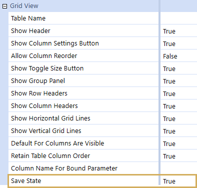
If Save State is False and you view the dashboard, you can’t drag and drop headers. Click Column Settings  to open the Column Settings window.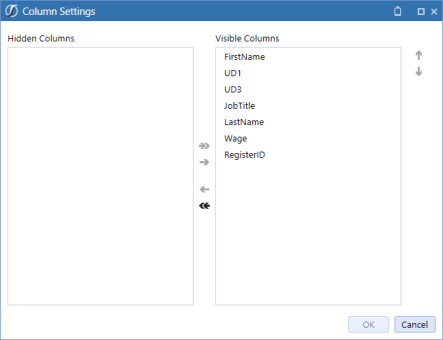
You can hide columns and change the order that the columns are shown on the dashboard.
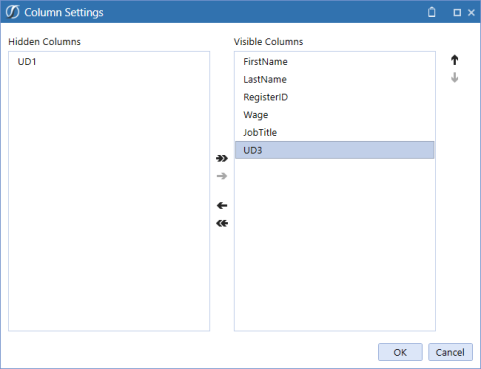
Reset State
When you view a dashboard, you can right click Reset State  to go back to the default settings of the grid view component.
Sort Column
When you click on a column header it will sort the column:
-
first click, ascending order,
-
second click, descending order,
-
third click, no sorting order.
If Save State is set to True, the changes to the sort order will be saved.
Filter
When a new filter is applied to the grid, the filter icon is orange to show that it has been changed.

List Box
This component displays a vertical list of predefined strings that are contained in a box and can be configured to allow single or multiple selections.
See Formatting and Action.
Map
The Map Component is used to display specific locations on a geographical map via a Dashboard DataSet Business Rule. Within each location, users can pass in Parameters in order to perform specific actions and display additional data. Map components can only display data via a Dashboard DataSet Business Rule using the XFMapItemCollection objects. Define the data set in the Business Rule, assign the rule to a Data Adapter, and the Data Adapter to the Map Component. See Map Dashboard Component Business Rule Examples in Implementing Security for examples on using this component.
Action
See Button.
Show Toggle Size Button
This controls whether the toggle icon displays on the dashboard at runtime.
Display Type
Humanitarian
This displays all countries/states/cities in English. The geographical location labels display smaller than Standard and Transport.
Standard
This displays all countries/states/cities in the respective local language. The map displays geographical location labels and road lines.
Transport
This displays all countries/states/cities in the respective local language. The map displays major cities with large labels.
Zoom Level
Enter the zoom value to which the map will open upon running the dashboard.
Center Latitude/Longitude
Enter the GPS coordinates to use upon launching the dashboard.
NOTE: To define the exact GPS coordinates refer to a GPS coordinate website.
Member Tree
This component displays dimensional hierarchies represented in a tree view. The dimensional hierarchies are passed to the component by adding a Bound Parameter and are filterable based on the component's configuration using a Member Filter.
See Formatting and Action.
NOTE: When adding a Bound Parameter, the only valid Parameter Type for the Member Tree is Member Dialog.
Radio Button Group
This displays a choice of mutually exclusive related options where users can only choose one. This component can be used with dashboards.
Formatting
See Button.
Action
See Button.
Supplied Parameter
This is a control that holds a Parameter value for use on a Dashboard, but it will not be displayed. This component can be used with dashboards.
Bound Parameter
See Button.
Text Box
This provides a box for entering text.
Formatting
See Button.
Action
See Button.
Allow Rich Text
Set this to True to enable special formatting options such as font, color, alignment, and more. Set this to False for a plain text box without formatting options.
Enable Spell Check
Set this to true to display spell check options in the toolbar when Allow Rich Text is set to True. Set the Text Box's Spell Check toolbar button to Not Used to not display red lines underneath misspelled words or the Spell Check right-click options. Enable Spell Check only works when English is selected in Windows for International users.
Multiline
Set this to True for word wrap or to click Enter and go to the next line. Set this to False for one string of text.
Tree View
This provides a graphical illustration of hierarchical data. This is used for relational or hierarchical data (non-Cube data).
Action
See Button.
Presenting Data With Books, Cube Views and Other Items › Dashboards › Dashboard Components
Presenting Data With Books, Cube Views and Other Items › Dashboards › Dashboard Components › Content Components
This is an Interactive Dashboard Engine that is used to quickly create a Business Intelligence (BI) visualization of data from existing or new Data Adapters. The user can quickly create BI Dashboards that will allow the user to visualize and analyze data.
The BI Dashboards are a powerful tool and allow the user to dynamically add data and build Charts, Gauges, Maps, Grids, Cards. Etc. This BI component integrates well with the cube view MD Data adapter, allows the user at design time to; Add Calculated fields to the Data Source to create new fields and measures, design a path for Drill Down, Multi-Select filtering and Conditional formatting for dynamic viewing at runtime and provides the ability Customize Palette Colors.
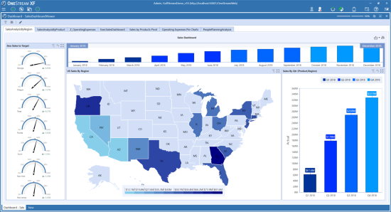
Key Elements of the BI Viewer
-
Compatible with existing dashboards
-
Simple to build, share, and reuse components
-
Fast drag and drop ad hoc data exploration
-
Easily combine OneStream and non-OneStream data
-
Bring trusted, validated OneStream data to the masse
Key Items for a Quick Start
-
Data Adapter – used to source the data and render the dataset
-
BI Viewer Component – to design the dashboard
-
Dashboard Component – to display the BI Dashboard
-
Literal Parameter (optional) – to store the color palette
Presenting Data With Books, Cube Views and Other Items › Dashboards › Dashboard Components › Content Components › BI Viewer
To use borders to separate areas on dashboards, select Component Properties > BI Viewer and set Show Borders to True.
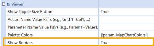
For example:
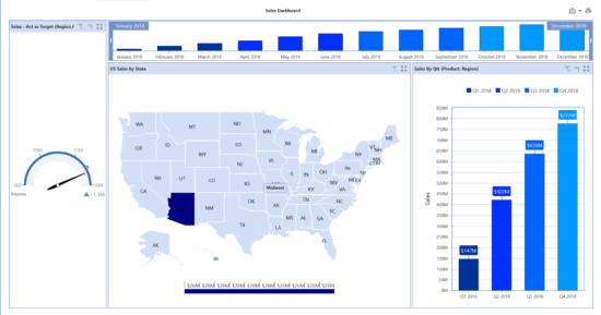
If Show Borders is False, borders are not displayed. For example:
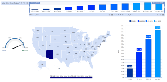
Additional information on the use and design elements of BI Viewer can be found in the BI Viewer Design and Reference Guide.
Book Viewer
This is used to display a Report Book in a Dashboard. This Component is not compatible with Mobile Dashboards.
File Source Type
Dashboard File
Display a Book stored in a Dashboard Maintenance Unit File section.
Application/System Database File
Display a Book stored in the Application or System Database Share.
File Share File
Display a Book from the File Share.
Full File Name
The name of the Book. Click the ellipsis and browse to the desired Book’s file name.
Show Header
Select True in order to display a header derived from the Component’s Name or Description.
Show Toggle Size Button
Select True to enable the toggle button and allow users to toggle the size of the Component at run time, select False to hide the toggle button.
Initial Content Item
Enter a number to navigate to a specific page in the Report Book when the Dashboard runs.
Presenting Data With Books, Cube Views and Other Items › Dashboards › Dashboard Components › Content Components
This is used to display a chart in a Dashboard. This Component can be used with Mobile and Application Dashboards.
NOTE: OneStream has intentions to deprecate the Basic Chart Dashboard Component targeted for 2026 R3. We recommend all customers analyze their applications to determine if any dashboards are utilizing the Basic Chart. Any affected Dashboards should make use of the more versatile, and browser-compatible, Advanced Chart, or BI Viewer Components.
Chart Type
Area
An area chart or area graph displays graphically quantitative data and it is based on the line chart. The area between axis and line are commonly emphasized with colors, textures and hatchings. Commonly, two or more quantities are compared with an area chart. Area charts are used to represent cumulated totals using numbers or percentages over time. Use the area chart to show trends over time among related attributes.
Bar
A bar graph is a chart that uses vertical bars to show comparisons among categories. One axis of the chart shows the specific categories being compared, and the other axis represents a discrete value.
Bubble
A bubble chart is a variation of a scatter chart in which the data points are replaced with bubbles, and an additional Dimension of the data is represented in the size of the bubbles.
CandleStick
A candlestick chart is a combination of a line and bar chart, in that each bar represents the range of price movement over a given time interval.
Doughnut
A doughnut chart is functionally identical to a pie chart, except for a blank center and the ability to support multiple statistics as one.
Horizontal Bar
A horizontal bar graph is a chart that uses horizontal bars to show comparisons among categories. One axis of the chart shows the specific categories being compared, and the other axis represents a discrete value.
Horizontal Stacked Bar
A horizontal stacked bar chart stacks multiple data points in each bar on the chart instead of a single data point.
Line
A line chart displays information as a series of data points connected by straight line segments.
Pie
A pie chart is a circular chart divided into sectors, illustrating numerical proportion
Range
The range chart displays a range of data by plotting two Y values per data point, with each Y value being drawn as a line chart. The range between the Y values can then be filled with color.
Scatter
A scatter chart displays numerical values along the horizontal and the vertical axis, combining these values into single data points that are displayed in uneven intervals.
Spline
A spline chart is a specialized form of a line chart. Unlike conventional charts which connect data points with straight lines, a spline chart draws a fitted curve through the data points.
Spline Area
A spline area chart is a specialized form of an area chart. Unlike conventional charts which connect data points with straight lines, a spline chart draws a fitted curve through the data points.
Spline Range
The spline range chart displays a range of data by plotting two Y values per data point, with each Y value drawn as a line chart. The range between the Y values can be filled with color.
Stacked Area
The stacked area chart stacks two or more data series on top of one another.
Stacked Area 100
The stacked area 100 chart displays multiple series of data as stacked areas. The cumulative proportion of each stacked element is always 100% of the Y axis.
Stacked Bar
A stacked bar chart stacks multiple data points in each bar on the chart instead of a single data point.
Stacked Bar 100
A stacked bar 100 chart displays multiple data series as stacked bars where the cumulative proportion of each stacked element always totals 100%.
Stacked Line
A stacked line chart has lines that do not intersect because they are cumulative at each point.
Stacked Spline
A stacked spline chart has lines that do not intersect because they are cumulative at each point.
Stacked Spline Area
A stacked spline area chart is very similar to a spline chart. Data is displayed using different colors in the "area" below the line. Each series of points is represented with a different color.
Stacked Spline Area 100
The stacked spline area 100 chart is a variation of the spline area chart. The areas are stacked so that each series adjoins, but does not overlap the preceding series. This chart displays contributions for each data point to the category as a percentage that totals to 100%.
Stick
A stick chart is a combination of a line and bar chart.
Waterfall
A Waterfall chart is a visualization of the sequence of positive and negative values that arrive at a final value.
Show Toggle Size Button
Select True to enable the toggle button and allow users to toggle the size of the Component at run time, select False to hide the toggle button.
Show Legend
If set to True, a legend containing a list of the variables will appear in the chart and an example of each appearance. This information allows the data from each variable to be identified in the chart.
Legend Title
The text to be displayed under the legend.
Legend Position
The location of the legend in relation to the chart. The options are Bottom, Left, Top, Right.
Chart X/Y Axis
Title
The title for the horizontal axis of the chart.
Label Rotation Angle
The angle to display the X Axis & Y Axis labels.
Use Automatic Range
If set to True, it automatically determines the range of values to display on the X & Y Axis based on the values being shown in the graph, if set to False, it needs to be set manually in the following fields.
Minimum Value
Manually set the X & Y Axis starting value. This can only be set if Use Automatic Range is False.
Maximum Value
Manually set the X & Y Axis maximum value. This can only be set if Use Automatic Range is False.
Step
Manually set the change in values displayed on the X & Y Axis. This can only be set if Use Automatic Range is False.
Chart Data
Data Series Source Type
The Data Source for the chart.
Cube View
A Cube View from the chart’s Data Adapter is being used as the data source.
One Column Multiple Rows
One column and multiple rows from the chart’s Data Adapter are being used for the data source.
One Row Multiple Columns
One row and multiple columns from the chart’s Data Adapter are being used for the data source.
Suppress Zeroes
If set to True, this removes all results that are zero.
Row List Type
This specifies the rows to include from the chart’s Data Adapter.
All Rows
The chart will include all rows.
First Row
The chart will only include the first row.
Row Index List
The chart will include the list of rows specified in the Row Index List field.
Row Index List
Enter the list of rows to include in the chart.
Column List Type for X Axis
This specifies the columns from the Data Adapter to include in the chart’s X axis. When the Data Series Type is set to Cube View, all columns are included.
Column List
A specified list of columns used as X Axis types for the chart. These columns are entered in the Column List for X-Axis field.
All Columns
All columns are used as X-Axis Members.
All Numeric Columns
All columns with numeric values are used as X-Axis Members.
Column List for X Axis
The column names used as X-Axis Members. This field is only used when Column List is selected as the Column List Type for X Axis.
Use Column Headers for X Axis
If set to True, the column names are used as X-Axis Members, if set to False, the values/text in the named column are used as X-Axis Members.
Column List Type for Data
This specifies the columns from the Data Adapter to include in the chart. When the Data Series Type is set to Cube View, all columns are included.
Column List
A specified list of columns used as Data Sources for the chart. These columns are entered in the Column List for Data field.
All Columns
All columns are used as Data Sources.
All Numeric Columns
All columns with numeric values are used as Data Sources.
Column List for Data
The column name containing the data to display in the chart. This field is only used when the Column List Type field for Data is set to Column List.
Cube View Data Point Legend Type
Default
The legend text comes from the row headers.
Annotation
The legend text comes from the Annotation View Member in the Cube View instead of the default. The Data Adapter must include this information for this option.
Assumptions
The legend text comes from the Assumptions View Member in the Cube View instead of the default. The Data Adapter must include this information for this option.
Audit Comment
The legend text comes from the AuditComment View Member in the Cube View instead of the default. The Data Adapter must include this information for this option.
Footnote
The legend text comes from the Footnote View Member in the Cube View instead of the default. The Data Adapter must include this information for this option.
Variance Explanation
The legend text comes from the VarianceExplanation View Member in the Cube View instead of the default. The Data Adapter must include this information for this option.
Column for Legend Label
The legend text comes from the column name specified here.
Legend Labels List
Comma separated strings used in the legend to identify the data series.
Presenting Data With Books, Cube Views and Other Items › Dashboards › Dashboard Components › Content Components
This Component can be used with Mobile and Application Dashboards to display charts.
Series Type
Waterfall
A waterfall chart (also known as a Walk or Bridge chart) is a type of chart that provides a visual story of the net changes of values between two identified points, such as starting and ending values in income statements, balance sheets, and operational expenses. You can build a waterfall chart with data supplied in a particular format from a Data Adapter. You can also convert existing BarRangeSideBySideWaterfall charts to the new waterfall chart type.
Waterfall charts display net changes of a single value per bar. They provide positive variance values above the bar and negative variance values below the bar, as shown in the following image.
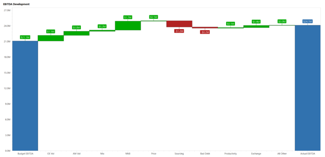
When you select the Waterfall type chart, the Waterfall Series Properties section provides configurations specific to the Waterfall chart:
-
Start Bar Color: Sets the color of the first bar in the series.
-
Total Bar Color: Sets the color of the bar that represents a Total.
-
Rising Bar Color: Sets the color of all bars whose values are positive (but are not Start or Totals).
-
Failing Bar Color: Sets the color of all bars whose values are negative (but are not Start or Totals).
-
Total Included in Series: Indicates if the data source includes a total value (a sum). If set to TRUE, the chart identifies the last value in the data source as a Total bar on the chart. If set to FALSE, the chart auto-calculates a sum and adds the result as a Total bar on the chart.
-
Total Value Label: Sets the label of the Total bar.
-
Include Subtotals: Indicates auto-calculated subtotals added to the waterfall chart. If set to TRUE, you can indicate where you would like to place the subtotal bar(s). If FALSE, no subtotals are defined. Default is False.
-
Subtotal Indexes: Enter a comma separated list of number(s) to indicate where you would like your subtotal bar(s) to be placed. For example, to display a subtotal after your first delta value, you would enter 1. You can also enter 2,4 for example, which would display a subtotal after the second delta value and also after the fourth delta value. These numbers count the delta values.
-
Subtotal Labels: Enter a comma separated list of labels for each subtotal. Each label needs to have unique text. The number of labels must equal the number of subtotal indexes specified. If nothing is listed, defaults to “Subtotal 1,” “Subtotal 2,” “Subtotal 3,” and so forth.
-
Subtotal Bar Color: Sets the color of bar(s) that represent a subtotal. Defaults to XFDarkBlueBackground.
-
Label Position: Sets the position of the bar labels. Default is Auto. Options include:
-
Auto: Labels are placed above the bar for rising values and below the bar for falling values.
-
Center: Labels are placed in the center of the bars.
-
InsideEnd: Labels are placed on the inside bottom of the bar for falling values and on the inside top of the bar for rising values.
-
InsideStart: Labels are placed on the inside bottom of the bar for rising values and on the inside top of the bar for falling values.
-
Create a Waterfall Chart
-
From the My Company Name, LLC Application tab, click Dashboards.
-
Expand Dashboard Maintenance Units and then expand the appropriate maintenance unit.
-
Click the Components label and then, from the toolbar, click Create Dashboard Component.
-
In the Create Dashboard Component dialog, click Chart (Advanced) and then click OK.
-
In the Name field, type a name for the new waterfall chart.
-
Scroll down to the Series Properties section and select Waterfall in the Type field.
-
Click Save.
If you have an existing BarRangeSideBySideWaterfall chart type, you can change it to waterfall by selecting Waterfall in the Type field.
Presenting Data With Books, Cube Views and Other Items › Dashboards › Dashboard Components › Content Components › Chart (Advanced)
XY2D Line Chart Examples
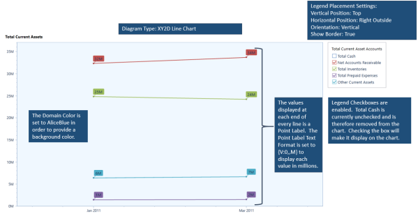
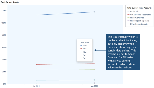
Radar2D Radar Point Example
The chart below is displaying product revenue by region. This data is driven by a Cube View where the Cube View Rows display the region and the Cube View Columns display the products. Only the Y axis can be customized with this chart type which is driven by the Cube View data. The Legend is driven by the Members on the Cube View Rows and the column Members display multiple axes organized in a circle.
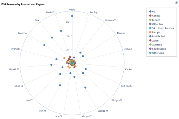
Presenting Data With Books, Cube Views and Other Items › Dashboards › Dashboard Components › Content Components
This component is linked to a cube view and displays in the standard Data Explorer view which is seen when a cube view is launched from the Analysis area on the OnePlace tab. To use this component, specify a name and add a Data Adapter linked to a cube view. You cannot use this component with mobile dashboards.
Data Explorer Report
This is a component linked to a cube view and displayed in Report Viewer as if generated on the fly from a Data Explorer window. To use this, name the component and add a Data Adapter linked to a cube view. The component can be used with mobile and application dashboards. See Report in the Cube Views section.
Presenting Data With Books, Cube Views and Other Items › Dashboards › Dashboard Components › Content Components
Dynamic Grid
The Dynamic Grid Component displays data in a tabular format from a Workspace Assembly-driven data source. Each column represents a field, and each row represents a record. This grid enables you to read data from various sources, transform that data, and write it back to any specified target. This offers a flexible and high-performance feature for managing large datasets. It supports paging, dynamic columns, custom formatting, and other customizations. This component maintains the core functionality of the SQL Table Editor Component while enhancing the flexibility of data presentation and end-user interaction.
The key features of the Dynamic Grid Component include the following benefits:
-
Flexible data transformation: Read, write, and transform data from various sources using Workspace Assemblies.
-
High performance: Manage large datasets efficiently with paging.
-
Dynamic columns: Add, remove, and customize columns.
-
Custom formatting: Apply custom formatting to data for better visualization.
This component is created in the Windows Application and can be displayed in the Modern Browser Experience and the Windows Application.
To use the Dynamic Grid Component, follow these steps:
Review the Prerequisites
Before you create a Dynamic Grid, review these developer and setting prerequisites.
Developer
-
Primarily, the Dynamic Grid will be created by a developer. Users will interact with the grid.
-
The Workspace Assembly required can be complex and is designed to be used by a developer.
-
The developer should have in-depth knowledge of OneStream Workspace Assemblies, source data, and target data.
Settings
-
Create a Workspace and Maintenance Unit. See Workspaces Setup.
-
Create a Dashboard Group and Dashboard. See Dashboards.
Create a Dynamic Grid Component
-
Go to Application > Presentation > Workspaces.
-
Click the arrow to the left of the Workspace to expand the navigation tree.
-
Click the arrow to the left of the Maintenance Unit to expand the navigation tree.
NOTE: Do not select the Default Maintenance Unit if you have also selected the Default Workspace because you will not be able to add a Dashboard Component.
-
Click Components.
-
In the toolbar, click the Create Dashboard Component button.
-
In the Create Dashboard Component dialog box, select Dynamic Grid and then click the OK button.
-
Name the Dynamic Grid.
NOTE: The Dynamic Grid name must be unique within its Workspace.
-
Update the configuration settings. See Update Configuration Settings.
-
Click the Save button.
Update Configuration Settings
Configure the available settings for the Dynamic Grid Component.
| Property | Description |
|---|---|
| General (Component) | |
| Name | Enter a name for the Dynamic Grid Component. The name must be unique within its Workspace. |
| Description | Enter a description for the Dynamic Grid Component. The description will display as the title text in the title header row. |
| Formatting | |
| Display Format |
Click the ellipsis button to select an option for how the colors display in the background.
Display Format settings in the Assembly code will override the option selected in this property. |
| Processing | |
| Template Parameter Values | Enter a comma-separated list of name-value pairs to specify Template Parameter Values. These values are used as the default settings for Template Parameters referenced using the ~!tParam!~ syntax related to Dynamic Workspace processing (for example, “tParam1=Value1, tParam2=Value2”). |
| Text 1 | Enter arbitrary text that can be accessed by Business Rules or Dynamic Workspace processing. For example, this property can be used to specify a parameter name or a functional name as a hint when implementing Selection Changed actions. See User Interface Action and Navigation Action in Action. It also supports template variables (for example, ~!tParam!~) for Dynamic Workspace processing. |
| Text 2 | Enter arbitrary text that can be accessed by Business Rules or Dynamic Workspace processing. For example, this property can be used to specify a parameter name or a functional name as a hint when implementing Selection Changed actions. See User Interface Action and Navigation Action in Action. It also supports template variables (for example, ~!tParam1!~) for Dynamic Workspace processing. |
| Action | |
|
See Action. |
|
| Dynamic Grid | |
| Filter Mode |
Configure to filter data from column headings using options Popup and Filter Row.
This setting is the same as the Filter Mode setting for the SQL Table Editor Component. See SQL Table Editor Filtering. |
| Default For Columns Are Visible |
Select True to display all columns in the grid (unless overridden at the individual column level). Select False to hide all columns in the grid (unless overridden at the individual column level). |
| Show Title Header |
Configure to show (True) or hide (False) the title header row at the top of the grid. NOTE: If set to False, the Default For Allow Column Updates, Process Selection Changed For Inserts, Allow Inserts, and Allow Deletes options remain enabled. |
| Default For Allow Column Updates |
Select True to allow the data in the existing table to be updated. Select False to turn off this option. |
| Show Title | Configure to show (True) or hide (False) the title text in the title header row. |
| Show Column Settings Button | Configure to show (True) or hide (False) the Column Settings button, which enables users to reorder the columns and set the column visibility. |
| Show Deselect All Button | Configure to show (True) or hide (False) the Deselect All button, which enables users to clear the checkboxes for all selected rows. |
| Process Selection Changed For Inserts |
Select True, and set the Allow Inserts option to True to allow the Insert button to process the selection changed event, which is often configured to refresh a portion of the dashboard. Select False to turn off this option. |
| Allow Inserts |
Select True to allow rows of data to be added to the table. Select False to turn off this option. |
| Allow Deletes |
Select True to allow rows of data to be deleted from the table. Select False to turn off this option. |
| Retain Table Column Order |
Select True to allow the column order to be changed using the Assembly service. Select False to turn off this option. |
| Read Only Text Color | Select (Use Default) to set the default text color to standard black text. Update to use any text color, including a system color (for example, XFReadOnlyText). |
| Column Name for Bound Parameter | Enter the name of the column to use to change the value of the bound parameter when a database row is selected. This is used when a Dynamic Grid is being used to affect the display of other Dashboard Components (for example, when showing detailed information for the selected row). |
| Default For Show Search |
Select True to enable search functionality within the drop-down menu for all columns that are bound to a list parameter, unless specified otherwise for individual columns. This setting is the same as the Default For Show Search setting for the SQL Table Editor Component. See SQL Table Editor Searchable Drop-Down List. Select False to turn off this option. |
| Allow Multiselect |
Select True to allow checkboxes to be selected for multiple rows. The active selected items will be passed to the defined Bound Parameter field as a comma-delimited list. The Bound Parameter format will be: Item1, Item2, Item3. If three values, A, B, C,D, are selected (where C,D is one value), the resulting Bound Parameter string is: A, B, "C,D". This setting is the same as the Allow Multiselect setting for the SQL Table Editor Component. See SQL Table Editor Multiselect. Select False to turn off this option and only pass a single Bound Parameter at a time. The checkboxes will not display in the user interface. |
| Rows Per Page | Enter a numeric value between 1 and 3000 to specify the number of rows to display before a page break. The default is -1, which turns off the property and uses your defined user preference property Grid Rows Per Page, which is located in the Security settings on the user profile. If you enter a value greater than 3000, the maximum number of results per page is still 3000. |
| Save State Settings | |
| Save State |
Select True to retain the user settings on the component. User preferences for columns saved will be for Order, Visibility, Filtering, Freeze Bar, Sorting, and Widths. This setting is the same as the Save State setting for the SQL Table Editor Component. See SQL Table Editor Save State User Preferences. Select False to turn off this option. NOTE: To reset the Save State to default, right-click on the dashboard to enable the Reset State to return to its Component Properties settings. |
| Vary Save State By |
Select True to save the Save State settings by Workflow Profile and Workflow Scenario. The related Dashboard Component will have the option Reset All States, which can be used to clear the Save States for a user across all the Vary Save State By parameters. Select False or (Use Default) to turn off this option. |
| Data Manipulation Buttons | |
| Show Data Manipulation Buttons | Configure to show (True) or hide (False) the Add Row, Remove Row, Cancel, and Save buttons. |
| Show Add Row Button | Configure to show (True) or hide (False) the Add Row button. |
| Show Remove Row Button | Configure to show (True) or hide (False) the Remove Row button. |
| Show Cancel Button | Configure to show (True) or hide (False) the Cancel button. |
| Show Save Button |
Configure to show (True) or hide (False) the Save button. |
Add the Dynamic Grid Component to a Dashboard
-
In the same Maintenance Unit as the Dynamic Grid Component, click the arrow to the left of Dashboard Groups to expand the navigation tree.
-
Select a dashboard.
-
Click the Dashboard Components tab.
-
In the toolbar, click the Add Dashboard Component button.
-
In the Add Dashboard Component dialog box, select the Dynamic Grid Component and then click the OK button.
-
Click the Save button.
Create a Workspace Assembly Dynamic Grid Service
-
In the same Maintenance Unit as the Dynamic Grid Component, click Assemblies.
-
In the toolbar, click the Create Assembly button.
-
On the Assembly Properties tab, in the Name field, name the Assembly.
NOTE: The Assembly name must be unique within its Workspace.
-
In the Compiler Language drop-down menu, select a language.
-
In the toolbar, click the Save button.
-
Create files for the Service Factory and the Dynamic Grid Service.
-
On the Assemblies Files tab, right-click on Files and select Add File. In the Add File dialog box:
-
In the File Name field, enter a name for the file (for example, ServiceFactory).
-
In the Source Code Type drop-down menu, select Service Factory.
-
In the Compiler Action drop-down menu, select (Use Default).
-
Click the OK button.
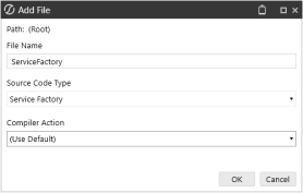
-
-
On the Assemblies Files tab, right-click on Files and select Add File. In the Add File dialog box:
-
In the File Name field, enter a name for the file (for example, DynamicGridService).
-
In the Source Code Type drop-down menu, select Dynamic Grid Service.
-
In the Compiler Action drop-down menu, select (Use Default).
-
Click the OK button.
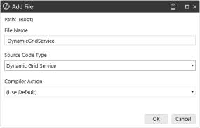
-
-
-
By default, Dynamic Grid methods for Get and Save are included. See Dynamic Grid Service. Modify the code as needed.
-
To enable the Dynamic Grid, in the Service Factory Assembly File, highlight the lines for the Dynamic Grid, and click the Uncomment the selected lines. button.
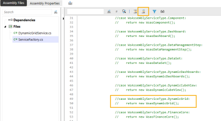
NOTE: Ensure the object name matches the name of the Dynamic Grid Service file.
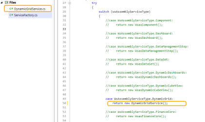
-
In the toolbar, click the Save button.
-
Select the Maintenance Unit. In the Workspace Assembly Service field, enter the name of the Assembly and the Service Factory Assembly File in this format: <Assemblyname>.<ServiceFactoryAssemblyFilename>
Example: If the Assembly name is DynamicGridService and the Service Factory Assembly File name is ServiceFactory, the Workspace Assembly Service would be: DynamicGridService.ServiceFactory
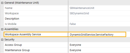
-
In the toolbar, click the Save button.
-
Select the Assembly, and click the Compile Assembly to check syntax button to ensure the Workspace Assembly files compile.
Presenting Data With Books, Cube Views and Other Items › Dashboards › Dashboard Components › Content Components
This is used to present files such as PDF’s stored on the OneStream file share. This Component can be used with Mobile and Application Dashboards.
There are only three situations where users can see these files:
-
They must have the ManageFileShare system role
-
The files must be stored in a folder under the Incoming folder.
Example: \\MyServerName\OneStreamShare\Applications\MyApplicationName\Incoming\MyDashboardFiles
-
The file is placed in one of the folders under \\MyServerName\OneStreamShare\Applications\MyApplicationName\Groups and then in a named folder with the same name as a User Group. The file must be in the folder with same name as the User Group and the user must have permissions to that Group.
File Source Type
URL
Display a file from an internal or external web page.
Dashboard File
Display a file stored in a Dashboard Maintenance Unit File section.
Application/System Database File
Display a file stored in the Application or System Database Share.
File Share File
Display a file from the File Share.
URL or Full File Name
The URL or name of the file being used. Enter the full URL name, or click the ellipsis and browse to the desired file.
Show Header
Select True in order to display a header derived from the Component’s Name or Description.
Show Toggle Size Button
Select True to enable the toggle button and allow users to toggle the size of the Component at run time, select False to hide the toggle button.
Show PDF Toolbar
Select True to display the PDF Toolbar while viewing the Component on a Dashboard, select False to hide it.
Auto Play (audio and video files)
If set to True, the video/audio files shown in the Dashboard Component will automatically start.
Process Extensible Document
If set to True, the File Viewer Component will run and process the attached Extensible Document, if set to False the unprocessed file will display which is mainly used for testing purposes.
NOTE: An Extensible Document is a Text, Word, PowerPoint, or Excel file that uses Parameters in its content. The file name must contain .xfDoc before the extension.
Example: StatusReport.xfDoc.docx
See Extensible Document Framework in Presenting Data With Extensible Documents for more details on this feature.
Presenting Data With Books, Cube Views and Other Items › Dashboards › Dashboard Components › Content Components
This is used to display an image on a Dashboard. This Component can be used Application Dashboards.
Formatting
See Label
Image
File Source Type
The Image (if any) to display.
URL
The image displayed is located on a URL.
Workspace File
The image displayed is located in a file stored in the Workspace Maintenance Unit File Section.
Application Database File
The image displayed is located in a file in the Application Database Share.
System Database File
The image displayed is located in a file in the System Database Share.
File Share File
The image displayed is located in the File Share.
URL or Full Name File
The URL, file path or file name for the displayed image.
URL Syntax
Access a built-in toolbar image, or use an image from any web server
Built-in OneStream Image Example /OneStream.ClientImages;component/Misc/ToolbarImage.png
Web Server Example
http://www.onestreamsoftware.com/img/onestream-logo.png
Database File System Example
Enter the path and file name Documents/Public/TestImage.png
Workspace File Syntax
Enter the name of the file resource TestImage.png
The following Excel properties are used to specify an Excel file from either an Extensible Document or Report Book in order to display it as an Image or Button on a Dashboard.
Excel Page Number
Enter the page number of the Excel document to display.
Excel Sheet
Enter the name of the Excel worksheet to display.
Excel Named Range
Enter the named range from Excel to display. The named range must be the specified Excel sheet in the Excel Sheet property, or the Excel Sheet property must be blank in order to use a named range.
See Image under Component Display Format Properties to position and align the Excel image as needed.
Presenting Data With Books, Cube Views and Other Items › Dashboards › Dashboard Components › Content Components
This is used to display text strings on a Dashboard. This Component can be used with Mobile and Application Dashboards.
Formatting
Text (use {1}, {2} for Data Table Cells) (Label Component Only)
The text to display in the Label. Use {1}, {2} to reference cells from the associated Data Adapter’s Data Table.
Example: Sales and Profit for |!EntityParam!| are {1} and {2}
Tool Tip
The text to display when a user’s mouse hovers over the Component.
Display Format
The formatting assigned to the control. See Component Display Format Properties
Data Table Cells from Adapter
Number of Data Table Cells
Specify the Data Table Cells available for display if the Label Component is being used, or to determine which State to display if the State Indicator Component is being used.
The following properties become available if a number is specified in the Data Table Cells field.
Data Row Selection Type
This specifies how the data cell row from the attached Data Adapter is identified and passed into the Label placeholder.
First Row
The specified row is the first row of data from the Data Adapter.
Row Index (0-based)
The row is specified by entering the row number in the Key Column Value or Row Index field. This selection uses 0-base row numbering where the first row is identified as row 0. (e.g., if there are six rows returned in the Data Adapter, enter 5 to get the last row)
Key Column Name and Value
The row is specified by querying the attached Data Adapter. Enter the column name to search in the Key Column Name field and enter the string/value to search in the Key Column Value or Row Index field. The row where the value is found will be the specified row.
Key Column Name
This property is only available when Key Column and Value is selected for the Data Row Selection Type. Enter the column name to search.
Key Column Value or Row Index
This property is only available when Row Index (0-based) or Key Column Name and Value is selected for the Data Row Selection Type. Enter the Key Column value/string to search or enter the Row Index Number.
Result Column Name
Enter the column name to return to the Label placeholder.
Number Format
The formatting applied to a value returned to the label placeholder if a string is not returned.
Logo
This is used to display a logo on a Dashboard. This Component can be used with Mobile and Application Dashboards.
Formatting
See Label
Presenting Data With Books, Cube Views and Other Items › Dashboards › Dashboard Components › Content Components
The Password Box displays a text box in which characters entered are hidden, so you can securely enter a password. When you create a Password Box, you can enter tool tip text.
Create a Password Box
-
Go to Presentation > Dashboards.
-
Expand a Dashboard Maintenance Unit and then Components.
-
Click Create Dashboard Component. The Create Dashboard Component window opens.
-
Select Password Box and click OK.
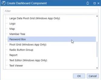
-
In Component Properties, enter a name. Optionally, enter text that displays as a tool tip.
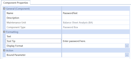
-
Click Save. The password box component appears in the Components list.
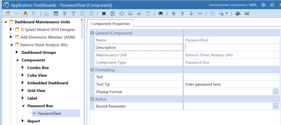
-
Add the password box component to the dashboard and then run the dashboard.
Presenting Data With Books, Cube Views and Other Items › Dashboards › Dashboard Components › Content Components
The Pivot Grid is a component within the Dashboard Maintenance Unit that allows you to create a pivot table, utilizing data from any existing and new Data Adapters to perform multi-dimensional analysis. At runtime, the user can customize the layout of the report using simple drag-and-drop operations and conditional formatting based on their analysis requirements. In the Pivot Grid, data can be summarized, calculated fields (text and decimal) can be added and displayed in a cross-tabular format that can be sorted, grouped and filtered. The Pivot Grid also supports drill-down (to view the underlying Data Adapter Results Table). The resulting output can be printed or exported to various file formats (such as PDF, XLS and XLSX).
All Data Adapters are supported when using the Pivot Grid. Utilizing Cube View MD (Multi-Dimensional) as the source of a Data Adapter will return the selected Cube View as a Multi-Dimensional Fact Table and provide an easy to use source table for the Pivot Grid. The results of the Cube View MD are Dimensions (Entity, Consolidation, Scenario, time, View, Account, Flow, Origin, IC, UD1-UD8) as columns.
Component Properties
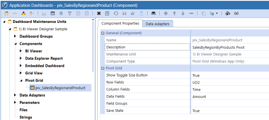
Name
The name of the Pivot Grid.
Description
A quick description of the Pivot Grid.
Maintenance Unit
The Maintenance Unit to which the Component belongs.
Component Type
The type of Component
Pivot Grid
Show Toggle Size Button
Select True to enable the toggle button and allow users to toggle the size of the Component at run time, select False to hide the toggle button.
Row Fields
Enter a comma separated list of Column Names (from the Results Table) to be placed in the Row Area of the Pivot Grid by default.
Column Fields
Enter a comma separated list of Column Names (from the Results Table) to be placed in the Column Area of the Pivot Grid by default.
Data Fields
Add a Measure (from the Results Table) to be assigned as the default Measure. Multiple measures can be added using a comma “,” to separate the column names.
Field Groups
Enter a comma separated list of Column Names (from the Results Table) to be grouped together as a default.
Save State
Enables the Save Button on the Pivot Grid when set to True and Disables the Save button when set to False.
NOTE: Layout button on Pivot Grid when copying Dashboards:
When copying a Dashboard that contains a Pivot Grid or Large Data Pivot Grid, the Pivot Grid and Large Data Pivot Grid component layouts are saved per dashboard location, not by component. Next time each dashboard is run the Pivot Grids should have different saved layouts.
Additional information on the use and design elements of the Pivot Grid can be found in the Pivot Grid.
Report
This Component can be used with Mobile and Application Dashboards.
Auto Fit to Page Width
If set to True, this will auto fit the Report to the area allocated in the Dashboard.
Text Editor
This is used to display documents created with the Text Editor feature in a Dashboard. It also can process Extensible Documents when embedded in a Dashboard. This Dashboard Component is only compatible with the OneStream Windows App. If using any version other than the OneStream Windows App to see files created with the Text Editor feature within a Dashboard, information will not display, and an error message appears telling the user that Text Editor documents are not available in the OneStream browser version. See Text Editor in Application Tools for more information.
Show Toggle Size Button
Select True to enable the toggle button and allow users to toggle the size of the Component at run time, select False to hide the toggle button.
File Source Type
Dashboard File
Display a file stored in a Dashboard Maintenance Unit File section.
Application/System Database File
Display a file stored in the Application or System Database Share.
File Share File
Display a file from the File Share.
Allow Create File
If set to True, this allows users to create text files.
Allow Open File
If set to True, this allows users to open text files.
Allow Save File
If set to True, this allows users to save text files.
Show Ribbon
Select True to enable users to see the Ribbon below the Menu Bar, select False to hide the Ribbon.
Presenting Data With Books, Cube Views and Other Items › Dashboards › Dashboard Components › Content Components
This component can be used with the Windows Application dashboards to display Sankey diagrams.
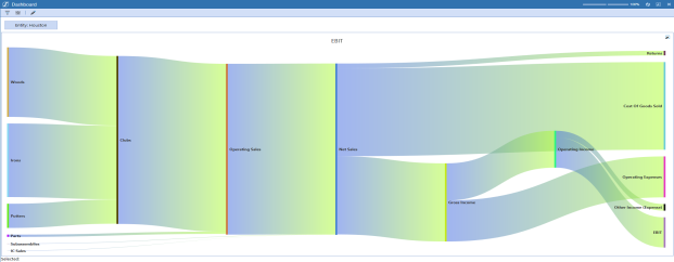
Sankey diagrams enhance the visualization of connected data sources and entities using the method command type business rules or single-row cubes views with multiple columns.
Diagrams can be exported as .png files by right-clicking outside of the links then selecting PNG.
Create a Sankey Diagram
-
From the OneStream Application tab, click Dashboards.
-
Expand Dashboard Maintenance Units and then expand the appropriate maintenance unit under Workspaces.
-
Click the Components label and then, from the toolbar, click Create Dashboard Component.
-
In the Create Dashboard Component dialog, click Sankey Diagram (Windows App Only) and then click OK.
-
In the Name field, type a name for your Sankey diagram.
-
Click Save.
Sankey Diagram Component Properties
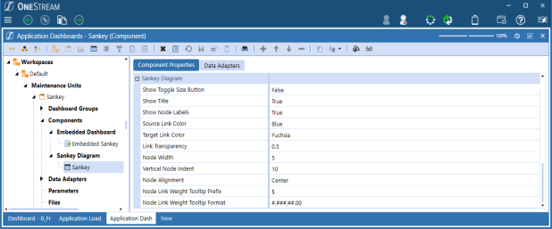
Enhance the data presentation by adjusting the component properties. Navigate to the components: Dashboards > Workspaces > Default > Maintenance Units > Sankey > Components > Sankey Diagram
Show Toggle Size Button:When True, the toggle size button is available. When False, the toggle size button is unavailable.
Show Title: When True, the title is centered above the diagram. When False, no title is shown in the diagram.
Show Node Labels: When True, node labels display on the diagram. When False, node labels do not display on the diagram.
Source Link Color: When Default, source link colors automatically change with each refresh. Set a custom or preloaded color to maintain the same color.
Target Link Color: When Default, target link colors automatically change with each refresh. Set a custom or preloaded color to maintain the same color.
Link Transparency: Specify the level of transparency displayed on the diagram by selecting a value between 0 and 1. 0 is opaque and 1 is transparent. The default is 0.5.
Node Width: Specify the width of the bar for the node. Increase this number for a wider bar.
Vertical Node Indent: Specify the vertical space between nodes. Increase this number for more white space.
Node Alignment:Specify the vertical alignment to the top, bottom, or center of the diagram.
Node Link Weight Tooltip Prefix: Set the tooltip prefix as any keyboard character (!@#$%^&*()<>?) or alphanumeric text. This lets you input a currency culture like $ or €.
The example below sets prefix as $ if the user is set to English:
if (args.FunctionName.XFEqualsIgnoreCase("GetUserCultureCurrency"))
{
UserInfo userInfo = EngineUsers.GetUser(si);
CultureInfo culture = new CultureInfo(userInfo.UserPreferences.Culture);
return culture.NumberFormat.CurrencySymbol;
}
XFBR can be changed for culture. To get another user culture, replace GetUser(si) with GetUser(si, "nameOfUser").
Node Link Weight Tooltip Format:Specify the tooltip formating.
Example: 0.00; #.##; #,###,###.00; 000.#'string'
See Standard numeric format strings.
Business Rules and Sankey Diagrams
When using a method command type business rule, in addition to defining the Sankey items, at least 4 columns must be defined from the data table:
-
Name
-
Source
-
Target
-
Value
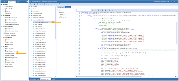
NOTE: Negative values are not recognized by Sankey diagrams. Links between items will not flow when a negative value is present.
Presenting Data With Books, Cube Views and Other Items › Dashboards › Dashboard Components › Content Components
Text Editor
This is used to view the Text Editor component in a dashboard. This is available in the Windows Application and can be displayed in the Modern Browser Experience.
Text Editor
Show Toggle Size Button
Defaults to True, which enables the toggle button to allow users to toggle the size of the component at run time. If set to False, the toggle button will not display in the component.
File Source Type
Workspace File
Displays a file stored in a Workspace Maintenance Unit's File section.
Application or System Database File
Displays a file stored in the Application or System Database.
File Share File
Displays a file from the File Share.
NOTE: Application Database, System Database, and File Share exist in the File Explorer.
Url Or Full File Name
Specifies the URL or full name of the file being used.
Process Extensible Document
Set to True, which will process Extensible Documents when embedded in a dashboard.
Allow Create File
Defaults to True. If set to True, enables you to create files.
Allow Open File
Defaults to True. If set to True, enables you to open text files.
Allow Save File
Defaults to True. If set to True, enables you to save files.
Allow Refresh
Defaults to True. If set to True, the Refresh Document toolbar button will appear under the OneStream ribbon in the Text Editor component. If set to False, the Refresh Document button will not display in Text Editor Component under the OneStream Ribbon.
Show Ribbon
Defaults to True. If set to True, enables you to view the Ribbon below the Menu Bar. If set to False, hides the Ribbon.
Minimize Ribbon
Defaults to False. If set to True, minimizes the Ribbon below the Menu Bar. If set to False, the Ribbon displays as normal.
Presenting Data With Books, Cube Views and Other Items › Dashboards › Dashboard Components › Content Components
This is used to view text and rich text documents similar to those created in Microsoft Word. This is available in the OneStream Windows App version. Documents cannot be created or edited using this tool.
Spreadsheet
This is used to display spreadsheet files created with the Spreadsheet feature in a Dashboard. See Spreadsheet in Application Tools for more information.
NOTE: There are some configuration changes necessary for the Spreadsheet referenced in a Dashboard if functions such as XFGetCell or XFSetCell are included in that XLSX file that reference a custom Parameter that is driven by the Dashboard.
In this case, the function available to Excel Add-in and Spreadsheet called XFGetDashboardParameterValue should be used. If that function is used within an XLSX file that is using a function like XFGetCell or XFSetCell (or similar) where these are referencing a custom parameter value (e.g. ParamEntity) that is on the Dashboard that references this Spreadsheet from within it as a Component.
The practice to get this Custom Parameter value is to use XFGetDashboardParameterValue to fetch the text from that Parameter or its default value and place it in a cell on the Spreadsheet (e.g. B1). Then the cell that is using a retrieve function such as XFGetCell would reference this other cell (i.e. B1).
Spreadsheet
Show Toggle Size Button
Select True to enable the toggle button and allow users to toggle the size of the Component at run time, select False to hide the toggle button.
File Source Type
Dashboard File
Display a file stored in a Dashboard Maintenance Unit File section.
Application/System Database File
Display a file stored in the Application or System Database Share.
File Share File
Display a file from the File Share.
Url or Full File Name
Displays the URL or Full name of the file being used.
Process Extensible Document
Defaults to True. It will process Extensible Documents when embedded in a dashboard.
Refresh Spreadsheet When Opened
If set to True, will automatically refresh the spreadsheet file when it is opened.
Allow Create File
If set to True, allows users to create spreadsheet files.
Allow Open File
If set to True, allows users to open spreadsheet text files.
Allow Save File
If set to True, allows users to save spreadsheet files.
Allow Submit Data
If set to True, the Submit button on the Ribbon is enabled and users can load data to the forms channel.
Allow Calculate Data
If set to True, the Calculate button on the Ribbon is enabled and users can call calculate options using it.
Show Ribbon
Select True to enable users to see the Ribbon below the Menu Bar, select False to hide the Ribbon.
State Indicator
This is used to indicate a specific status on a Dashboard. This Component is not compatible with Mobile Dashboards.
Formatting
See Label
Data Table Cells from Adapter
See Label
States
State Indicator Type
The type of image used for indicating the status. Valid states start at index 0 and include the following:
Lamp
Off, Green, Yellow, Red
Arrow
Up, Down, Left, Right Arrow is displayed
Smile
Very Happy, Happy, Neutral, Sad
Traffic Lights
Off, Green, Yellow, Red
Default State Index
The default state is 0-4.
State Selection Type (Image = Off)
Specify the State selection type and then define the Minimum Amount, Maximum Amount and/or a list of comma-separated text items that the value from the first Data Table Cell must satisfy in order for the State to be selected.
(Not Used)
The State is not used.
Minimum Amount
The minimum amount for the State to be selected.
Minimum Amount Inclusive
The minimum amount including the specified value for the State to be selected.
Maximum Amount
The minimum amount for the State to be selected.
Maximum Amount Inclusive
The maximum amount including the specified value for the State to be selected.
Range
The amount between two values for the State to be selected.
Range Minimum Amount Inclusive
The amount between two values including the minimum amount for the State to be selected.
Range Maximum Amount Inclusive
The amount between two values including the maximum amount for the State to be selected.
Range Minimum and Maximum Amount Inclusive
The amount between two values including both the minimum and the maximum amount for the State to be selected.
Equals Text Item
If the string equals the string specified in the Text Items field, it should be selected for the specified State.
Starts with Text Item
If the value starts with the string specified in the Text Items field, it should be selected for the specified State.
Ends with Text Item
If the value ends with the string specified in the Text Items field, it should be selected for the specified State.
Contains Text Item
If the value is listed in the Text Items field, it should be selected for the specified State.
Minimum Amount
The value used in State tests for minimum amount.
Maximum Amount
The value used in State tests for maximum amount.
Text Items
The text values used in the types: Equals Text Item, Starts with Text Item, Ends with Text Item & Contains Text Item.
Web Content
This is used to display a URL or file embedded in a OneStream Dashboard. It can be used with Mobile and Application Dashboards.
NOTE: This component uses Microsoft Edge WebView2 Runtime to embed the web content. It must be installed on the client device. If the client device does not have it installed, you will receive an error when accessing a dashboard that is configured with a Web Content component.
Web Content Type
URL
The URL to a web page. This can be internal or external.
Dashboard File
The image displayed on the button is based on a file stored in the Dashboard Maintenance Unit File Section.
Application Database File
Display a file from the Application Database share.
System Database File
Display a file from the System Database share.
File Share File
Display a file from the file share.
URL or Item Name
Item to display (URL or file) in the control.
Show Borders
Select False to remove the border around the Web Content dashboard component. This property defaults to True.
Show Header
Select True in order to display a header derived from the Component’s Name or Description.
Show Toggle Size Button
Select True to enable the toggle button and allow users to toggle the size of the Component at run time, select False to hide the toggle button.
Large Data Pivot Grid
The Large Data pivot grid is a dashboard component that lets you connect to external tables or large database tables for “pivot” style analytic reporting. The grid helps designers seamlessly integrate data from external tables into a OneStream environment through a dashboard for analytic reporting. The grid's paging and server based processing features support very large data sets/tables. In some cases, this component requires server configuration settings so users can access specific database tables.
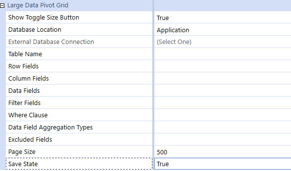
You can specify the following properties:
|
Property |
Setting |
|---|---|
|
Show Toggle Size Button |
True/False, to activate resize button. |
|
Database Location |
Identify the type of table location, External, Application or Framework |
|
External Database Connection |
Database Connection defined in the Application Server Configuration |
|
Table Name |
Table Name to be retrieved |
|
Row Field |
Comma-separated database column names to be placed in Row area by default |
|
Column Fields |
Comma-separated database column names to be placed in Column area by default |
|
Data Fields |
Comma-separated database column names to be placed in Data area by default |
|
Filter Fields |
Assign Dimensions as a default filter and assign filtering |
|
Where Clause |
Used to assign global filters to focus the returned results from the source table |
|
Data Field Aggregation Types |
List of comma-separated key value pairs that specify one aggregate function type per data field. Supported Sum, Average, Min and Max. |
|
Excluded Dimensions |
Allows Database Column Dimensions to be excluded from the Pivot |
|
Page Size |
Number of records returned in a page. Defaults to 500 with a maximum value of 3000. |
|
Save State |
Enables the Save Button on the Large Data Pivot Grid when set to True and Disables the Save button when set to False |
Presenting Data With Books, Cube Views and Other Items › Dashboards › Dashboard Components › Content Components
You can set a date in a dashboard by creating a date selector component.
-
Go to Presentation > Dashboards.
-
Select a dashboard under Dashboard Maintenance Units.
-
Click Components.
-
Select a component and click Create Dashboard Component.
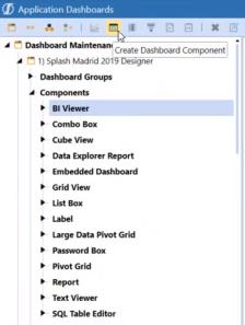
-
Click Date Selector
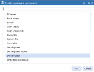
-
Enter the properties.
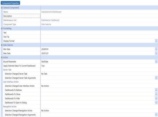
-
When you set the properties at design time, you set a minimum and maximum date range that is viewed at run time. For example, Min Date to 20200101 and the Max Date to 20201231, others can only select dates within that range.

if you click the ellipsis, you can choose an existing parameter which will automatically fill in the|!...!|.
You can enter and use a Dashboard XFBR string.

NOTE: Min and Max Date values should be entered in the following format: yyyyMMdd. This value is converted at run time based on your application culture setting.
Add the Date Selector Component to a Dashboard
Once the date selector dashboard component has been created, you can add it to a dashboard.
-
Select the dashboard and click Add Dashboard Component.
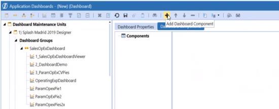
-
Select the date selector component and click OK.
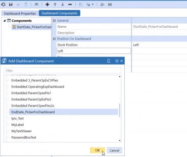
-
Click Save and View Dashboard.
-
Click the arrow to show the calendar.
Use the double arrows >> to show the max date and << to show the min date.
NOTE: If no min date is specified, the min date is set to 1/1/1900. If no max date is specified, the max date is 12/31/9999.
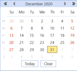
Presenting Data With Books, Cube Views and Other Items › Dashboards › Dashboard Components › Content Components
The Report Designer is built into the dashboard report component, which allows you to edit reports on the report itself.
NOTE: The OneStreamClientApi.dll is now included with the Windows application install. The OneStream Windows application includes the Client API installer.
Access the Report Designer
-
Go to the Application tab, then click Presentation > Dashboards.
-
Scroll to a maintenance unit and select Components.
-
Expand Report and open a specific report.
-
Click the Report Designer tab.
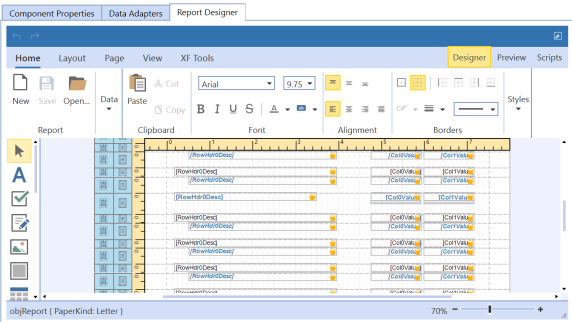
Presenting Data With Books, Cube Views and Other Items › Dashboards › Dashboard Components › Content Components › Report
-
Click Toggle Page Size in the upper right corner of the Report Designer to maximize the Report Designer as full screen.
-
Setting the display Zoom slider will assign the display percentage to the Maximize view.
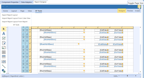
The report changes to full screen.
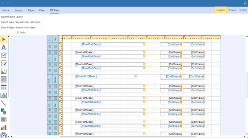
Export Report Layout
Export the report *.repx file.
-
Click the XF Tools tab and then click Export Report Layout. The Save As dialog box opens.
-
Browse to a location to save the report and click Save.
Import Report Layout from Cube View
-
Click the XF Tools tab and then click Import Report Layout from Cube View. The Object Lookup dialog box opens.
-
Browse to a cube view and click OK.
-
The report layout changes to the formatting of the selected cube view.
-
Click Save to save the new report layout or click Cancel All Changes Since Last Save to revert to the previous layout.
Import Report Layout from Report
-
Click the XF Tools tab and then click Import Report Layout from Report. The Object Lookup dialog box opens.
-
Browse to a dashboard report component and then click OK.
-
The report layout changes to the formatting of the dashboard report component you selected.
-
Click Save to save the new report layout or click Cancel All Changes Since Last Save to revert to the previous layout.
Functionality
For most right-click functionality in Report Designer, use the Properties dialog box.
NOTE: When editing sub reports, you can access the Generate Own Pages option from the Properties menu.
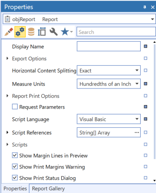
Display Band Details
To expand any of the bands, double-click the icon in the left column.
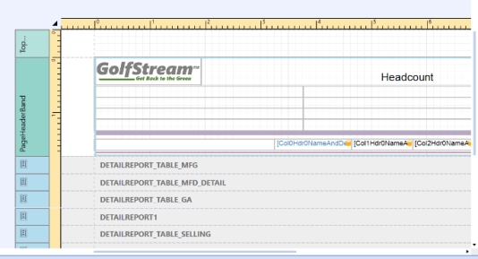
Edit Bindings by Report
Edit bindings directly and evaluate all the controls with the built-in component in the Report Designer. The Edit Bindings dialog box lists all of the controls, property type and data binding. It displays invalid status and allows you to apply corrections.
The Property type contains type definitions.
Access Edit Bindings
-
From the Report Designer tab, select XF Tools, then Edit Bindings.
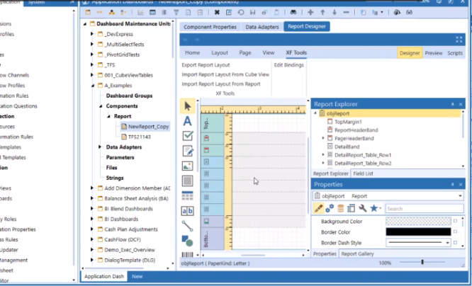
The Edit Bindings dialog box opens.
-
Click any of the column headings to sort the data in the column.
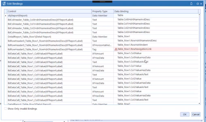
Show Invalid Bindings
The Edit Bindings dialog box lists invalid bindings. The source binding is set to a path that does not exist in your data set.
-
From the Edit Bindings dialog box, click Show only invalid bindings.
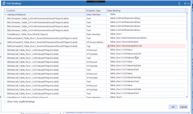
A list of invalid bindings opens. The invalid bindings have a red background.
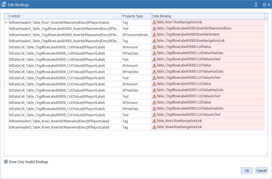
-
Select one of the invalid bindings from the Data Binding column and click the down arrow.
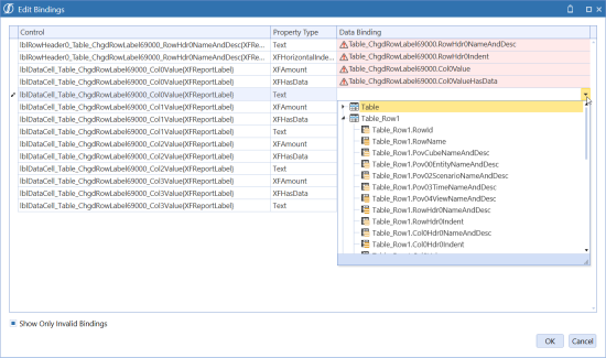
-
From the drop-down list select the correct data to a path that exists in your data set.
-
After you click off of that row, the color of the row changes to yellow to identify that it is modified.

NOTE: Even if you modify an invalid binding to make it valid, it still appears in the invalid list.
-
Click OK to close the Edit Bindings dialog box.
-
Click Save in the Report ribbon to save your changes to the report and database. Or, click Undo to revert the changes without saving.
Presenting Data With Books, Cube Views and Other Items › Dashboards › Dashboard Components › Content Components
Displays a grid linked to a SQL table and the contents of the table are shown in the grid. Settings in the object determine whether the grid allows changes to the table data. This Component is not compatible with Mobile Dashboards.
Action
See Button
SQL Table Editor
Database Location
Application
Select if the table to be displayed is located in the application database.
Framework
Select if the table to be displayed is located in the framework database.
External
Select if the table to be displayed is located in an external database.
External Database Connection
Connection information to enable connecting to an external database. This is only needed if the Database location is set to External.
Table Name
The name of the table being displayed in the control.
Where Clause
The SQL string where clause used to pull data from the table.
Table Column Names
Optional. A comma-separated list of database table column names you can use in the SQL Select statement. Only the entered columns are displayed in the control.
NOTE: If editing existing data or adding new rows is enabled, any columns that exist in the underlying database table are excluded from the list. This property must have default constraints set in the database table.
Order by Clause
The SQL string to order the results of the table.
NOTE:
The Order by Clause property does not allow SQL Functions, like YEAR(effectiveDate). When run inside a dashboard, the Table Editor's columns allow clicks to change the order to ascending, descending, or no sort. SQL functions can not be allowed in the ordering.
Filter Mode
The SQL Table Editor lets you filter results using Filter Mode. This filtering mode is built into the header cell of each filterable column. It is simpler to use than Popup mode (an alternative filtering mode) and uses only one field editor to filter. All filters start as empty until a value is entered into the editor.
Default for Columns are Visible
If set to True, all columns will be hidden unless overridden on an individual column. Settings are True or False.
Default for Allow Column Updates
If set to True, the data in the existing table can be modified, if set to False, it cannot be modified.
Show Title Header
Show or Hide entire bar including the items within the bar. If you set it to False, the Default For Allow Column Updates, Process Selection Changed For Inserts, Allow Inserts, and Allow Deletes remain enabled.
Show Title
Show or Hide the text in the Title Header.
Show Column Settings Button
Shows (if set to True) or Hides (if set to False) the Column Setting Button which allows user to reorder and set visibility of columns.
Show Deselect All Button
Shows or Hides Deselect All Button which allows the user to deselect all selected rows.
Process Selection Changed For Inserts
If set to True, (and the “Allow Inserts” property is also set to True), it will allow the Insert button to process the selection changed event which is often configured to refresh a portion of the Dashboard. If set to False, it will not allow the Insert button to process the selection changed event.
Allow Inserts
If set to True, new rows of data can be added to existing data in the table. If set to False, new rows cannot be added.
Allow Deletes
If set to True, rows of data can be deleted from the existing data in the table. If set to False, rows cannot be deleted.
Retain Table Column Order
If set to True, the column order can be changed via the SQL Table Editor Column Format section. If set to False, the order cannot be changed.
Read Only Text Color
This field sets the default color to standard black text. The setting can be changed to any color including a system color (e.g., XFReadOnlyText).
Column Name for Bound Parameter
Specify the name of the database column to use to change the value of the Bound Parameter when a database row is selected. This is used when a SQL Table Editor is being used to affect the display of other Dashboard Components (e.g., when showing detailed information for the selected row.)
Allow Multiselect
If set to True, the multiple selection of records will be enabled by item selection or using a selection check box. The active selected items will be passed to the defined Bound Parameter field as a comma delimited list. The Bound Parameter format will be as: item1, Item2, Item3. If the 3 values A, B, C,D are selected (where C,D is one value) the resulting bound parameter string is A, B, "C,D". If set to False, only a single Bound Parameter can be passed at a time and the selection boxes will be deactivated from the user interface.
Rows Per Page
Specify how many rows to display before a page break. This is a numeric value between 1 and 3000. By default, this property is set to -1, which turns OFF the property and uses your defined user preference property Grid Rows Per Page. Any value greater than 3000 results in a maximum value of 3000.
Save State
If set to True, user settings on the Component are retained. User preferences for Columns saved will be for: Order, Visibility, Filtering, Freeze Bar, Sorting and Widths.
NOTE: Reset Save State Back To Default: Right-click on the Dashboard to enable the “Reset State” to return back to its Component Properties settings.
Vary Save State By
Apply Vary Save State By to workflow profile settings and scenario. The current Save State elements will have the control state tied to the current Workflow Profile and Workflow Scenario settings. If you select Falseor Use Default, Vary By Save State will not apply.
When Vary Save State By is enabled, the related Dashboard Component will have the additional reset option of Reset All States, which can be used to clear the user's Save States across all the Vary Save State By parameters.
Display Format
Sets the SQL Table Editor formatting options such as row color. Set row BackgroundColor property to a color, and set AlternateRowBackgroundColor to a different color.
Data Manipulation Buttons
Show Data Manipulation Buttons
Hide or Show Insert Row(s), Delete Row(s), Cancel All Changes Since Last Save and Save. Settings are True or False.
Show Insert Row(s) Button
Hide or Show Add Row Button. Settings are True or False.
Show Delete Row(s) Button
Hide or Show Remove Row Button. Settings are True or False.
Show Cancel All Changes Since Last Save Button
Hide or Show Cancel Button. Settings are True or False.
Show Save Button
Hide or Show Save Button. Settings are True or False.
Server Task
Create Table if Necessary
The option to create the table if it does not already exist. Settings are True or False.
Table Creation Script
The SQL script to create the new table.
Save Data Server Task
No Task
There is not a performed task for a SQL table save data event.
Execute Dashboard Extender Business Rule
This will use a Dashboard Extender Business Rule to perform a save data event.
Save Data Server Task Arguments
Enter the arguments required by the server task.
Dashboard Extender Business Rule Example (each enclosed in curly braces)
{Business Rule Name}{Function Name}{Optional Name-Value Pairs}
TIP: The data will wrap on string spacing. If there are no blank spaces, the column data will not wrap. Additionally, keyed fields cannot be wrapped.
DataFormatString
Specify a number/date format to the data in the column. For example, mm/dd/yyyy will return the current Month/Day/Year using a slash. MM-dd-yyyy will return the Month-Day-Year using a dash. N0 will return a number without a decimal point, and #,###,0 will return a number without a decimal and a comma depicting the thousandth place. See Application Properties in Application Tools for more examples of number formats.
Width
This specifies the default column width to be displayed.
Presenting Data With Books, Cube Views and Other Items › Dashboards › Dashboard Components › Content Components › SQL Table Editor
ColumnName
Column name from the table where the selected formatting is to be applied. Specified name must match the column name from the table exactly.
Description
Column description to be displayed. By default, the Column name from the table is displayed.
Column Display Type
See Grid View for Column Format
IsVisible
Setting to override the default Columns Visible setting. Settings are True, False, or Use Default
AllowUpdates
This is a setting to override the Default For Allow Column Updates setting for each individual column. If set to True, users can modify data displayed in the grid. The Use Default setting uses the Default For Allow Column Updates setting.
ParameterName
The assigned Parameter name to be used to store the Parameter value from the specified column.
DefaultValue
The default value to be entered when allowing new records to be added. This helps ensure that invalid blank cells are not created.
IsMultilineText
If set to True, this will allow columns to display data on multiple rows if the column is not wide enough to display the full value.
Presenting Data With Books, Cube Views and Other Items › Dashboards › Dashboard Components › Content Components › SQL Table Editor
Enabling the Allow Multiselect on the SQL Table Editor Component will expand the functionality of the Component for use in interactive dashboards.
-
Allow Multiselect will generate the Bound Parameter as a comma delimited list.
-
Selection Methods can be performed with the Select All check box, selecting a range using Shift key, and by item using Ctrl-Click.
-
Deselecting can be done by item or using the Deselect All toolbar button.
-
Applying a Column Filter after selections are activated is not allowed. Applying a column filter will clear any existing selected records. The column must be first filtered, once filtered, selections can be performed.
-
Defer Refresh button can be used to manually control the execution of tasks defined in the Actions properties of the SQL Table Editor Component. This user-controlled execution of actions may provide better performance within complex dashboards.
NOTE: Defer Refresh remains checked after the Refresh button is clicked in SQL Table Editor.
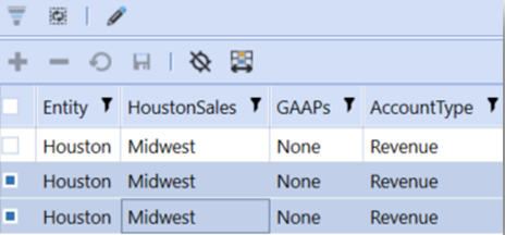
NOTE: Multi-select retains selected items after column filtering and sorting by using a table’s primary key columns. If the referenced table does not contain a primary key column, the selection is not retained across pages or after filtering or sorting columns.
Presenting Data With Books, Cube Views and Other Items › Dashboards › Dashboard Components › Content Components › SQL Table Editor
When drop-down lists have many items to choose from, finding a suitable item in the list can be cumbersome. You can make the drop-down list searchable to improve the efficiency of finding the appropriate item. As you type, search options are narrowed down to those that contain the typed text and you no longer have to scroll through a long list.
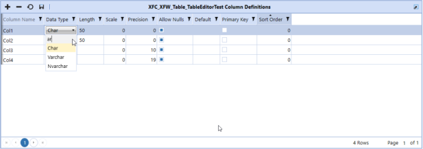
NOTE: To use this search feature, the table editor must be configured so that you can edit existing data or add new rows. Columns must be configured with a parameter of type Delimited List, Member List, or Bound List, which is what configures a column as a standard drop-down list.
Enable the Search
-
From the Application tab, select Dashboards, and expand the appropriate Workspace, Maintenance Unit, and Component until you reach the SQL Table Editor component you want to modify.
-
Select the SQL Table Editor to view its properties.
-
Enable the search feature.
-
For all columns that are configured with a list parameter:
-
In the SQL Table Editor section, set Default for Show Search to TRUE.
-
Click Save.
-
-
For specific columns only:
-
In the SQL Table Editor Column Format section, locate the column where you want to enable the search feature and click the ellipses (...).
-
In the dialog box, set the ShowSearch property to TRUE.
-
Click OK.
-
Click Save.
-
-
Use the Search
-
Run the dashboard that contains the SQL Table Editor component.
-
Double-click in a cell to expand the drop-down menu.
-
Start typing in the search field. The drop-down list narrows down to items that contain the typed text.
Presenting Data With Books, Cube Views and Other Items › Dashboards › Dashboard Components › Content Components › SQL Table Editor
Use Save State to retain your user preferences for the SQL Table Editor display. Your preferences for the following are saved if you set Saved State to True:
-
Column order
-
Visible or hidden columns
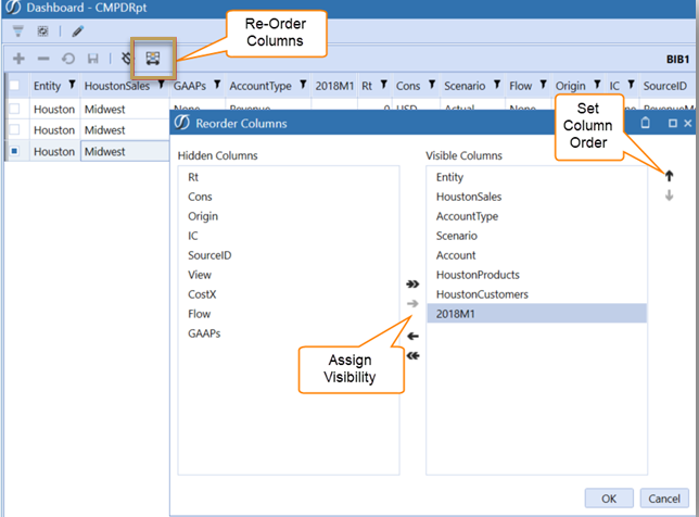
You can set column filters Column Filters can be set by the user and will be preserved if the Saved State is set to True.
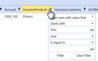
However, the Column Sort will not be preserved once the SQL Pivot Grid is deselected or the dashboard is closed.
Save State for Freeze Bar
When Save State is set to True the Freeze bar will retain its position if you drag it to a certain column.
Presenting Data With Books, Cube Views and Other Items › Dashboards › Dashboard Components › Content Components › SQL Table Editor
The SQL Table Editor lets you filter results using the following two methods, or modes:
-
Popup Mode: This is the default filtering mode and has been available for use in all prior releases of the OneStream software application. Using this mode, you can activate filtering by clicking the funnel icon in the column header, which launches a popup window.

The popup contains two field filters that let you create filtering criteria such as "value is greater than 18 and is less than 60." Field filters consist of two parts: an upper part, which is a combo box, and a lower part called the field filter editor. In the upper part (combo box), you can use filter operators like Is Equal To or Is Less Than, which change based on the data type of the column. The lower part (field filter editor) provides filtering criteria based on the data type of the column. For example, if you have a date column, you can use a date/time picker control as the filtering criteria.
-
FilterRow Mode: This filtering mode is built into the header cell of each filterable column. It is simpler to use than Popup mode and uses only one field editor to filter. All filters start as empty until a value is entered into the editor. Click the filter icon to display a drop-down list of all operators available to the data type of the column. If you select Clear Filter from the list, it will clear and reset the column filter.

You can configure the Filter Mode property of the SQL Table Editor to use either of the modes. To configure the SQL Table Editor:
-
Navigate to Application tab > Workspaces > Maintenance Units > Components > SQL Table Editor.
-
In the SQL Table Editor section settings, set Filter Mode to either Popup (default) or Filter Row.
NOTE: Consolidated column filtering is not supported on the following data types. Applying filters on these datatypes will not yield consolidated filtered results. Unsupported data types: binary, char, date, datetime2, datetimeoffset, float, geography, geometry, hierarchyid, image, filestream, money, nchar, ntext, numeric, nvarchar, real, rowversion, smalldatetime, smallmoney, sql_variant, text, time, timestamp, tinyint, varbinary, xml.
Filtering Columns Based on Values from Another Column
You can base a column’s header filter on values from another column. This includes any column that is in the data set, even if the column is hidden. This is useful for name-value pair parameter columns as long as the values and names are pulled from individual columns.
To set up and configure the SQL Table Editor component:
-
Inside the appropriate workspace, create and configure an SQL Table Editor component according to your needs.
-
Identify the column that you want to filter along with the column the filter is based upon.
-
In the SQL Table Editor component, configure the column format for the column you want to filter by typing the name of the column into the FilterByColumnName property.
Example
Begin with an SQL Table Editor grid. The data set can come from an SQL view or an SQL table.
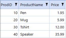
When filtering data using a column header filter, the default behavior is to filter by the value stored in that column. For example, filtering the ProdID column on a value of 10 returns one row where ProdID equals 10.
If you would like to change the ProdID column filter and base it on ProductName instead, configure the column format for ProdID by setting FilterByColumnName to ProductName.

Column filtering for column ProdID is now based on values from the ProductName column.
Presenting Data With Books, Cube Views and Other Items › Dashboards › Dashboard Components › Content Components › SQL Table Editor
You can modify data of an underlying base table through an SQL View. An SQL View is a virtual table where column and row contents are defined by an SQL query. The SQL Table Editor displays data from the virtual table, but you can change the data of the underlying base table. This provides more flexibility and control over how you present and manipulate data in the SQL Table Editor.
Use the following rules when you want to modify data through a View:
-
Use Views to create a view of the data in one or more tables in the database. You can add calculated columns to your View.
-
You can only update data in a single underlying base table. For example, if you create a View that combines data from four tables, you can only update data from one of those tables.
-
Depending on what you are trying to do, you need the correct permissions to the underlying base table.
Configuration
Set up and configure the SQL Table Editor component:
-
Inside the appropriate workspace, create and configure an SQL Table Editor component according to your needs.
-
In the Table Name property, specify the underlying base table that contains the editable data.
-
In the View Name property, type a name for the view.
-
Identify columns in the view that do not exist in the underlying table. These columns are excluded from the Insert and Update statements that the SQL Table Editor generates when updating the base table.
-
Configure a column format for each column in the view that does not exist in the base table.
-
Set the IsFromTable property to False.
Example
You begin with two tables. The first is a Products table.
The second is an Orders table.
The two tables are linked by the ProdID value, as shown in the previous images.
Next, create a simple view called OrderDetails to show products specific to each order.
SELECT dbo.Orders.OrderID, dbo.Orders.prodID, dbo.Orders.Quantity, dbo.Products.productName,
    dbo.Products.Price
FROM dbo.Orders
INNER JOIN dbo.Products
ON dbo.Orders.prodID = dbo.Products.prodID
This produces the following view:

At this point, you might want to expose the view to users so that they can update order quantities or add additional orders. This data is stored in the underlying base table, Orders.
In the SQL Table Editor, you can set Orders as the Table Name (the base table) and OrderDetails as the View Name.
You now need to identify columns in the view that do not exist in the underlying base table. In this example, that would be productName and Price. For both columns, configure a column format where IsFromTable is set to False. You can also make the columns read-only by setting AllowUpdates to False.

You can now see all columns of the view while also modifying orders.
You can also add calculated columns to views. These columns are virtual and do not exist in the database They derive their values dynamically when the view is executed.
For example, perhaps we would like to add a column that multiplies Quantity times Price. You could update the view with an expression. You can give the expression any name, such as SubTotal in the following example.
SELECT dbo.Orders.OrderID, dbo.Orders.prodID, dbo.Orders.Quantity, dbo.Products.productName,
    dbo.Products.Price,
(dbo.Orders.Quantity*dbo.Products.Price) AS SubTotal
FROM dbo.Orders
INNER JOIN dbo.Products
ON dbo.Orders.prodID = dbo.Products.prodID
Presenting Data With Books, Cube Views and Other Items › Dashboards › Dashboard Components › Content Components › SQL Table Editor
You can apply a background color to all rows or alternate rows using the BackgroundColor property and the AlternateRowBackgroundColor property. This makes it easier to distinguish between rows of data at a glance, and can significantly reduce eye strain.
To configure these properties:
-
Navigate to Application tab > Workspaces, and expand the workspace.
-
Within that workspace, expand a maintenance unit, then expand Components.
-
Expand SQL Table Editor and select a component.
-
In the Formatting section, at the far right of the Display Format property, click the Edit (ellipses) button.
-
In the Display Format dialog box, in the BackgroundColor field, click the down-arrow and select a color.
-
In the AlternateRowBackgroundColor field, click the down-arrow and select a color.
-
Click OK.

Presenting Data With Books, Cube Views and Other Items › Dashboards › Dashboard Components › Content Components
Presenting Data With Books, Cube Views and Other Items › Dashboards › Dashboard Components › Content Components › Text Box
Instead of making changes outside of OneStream or then having to continuously copy and paste into the application, you can add formatted text using the Allow Rich Text property in the Text Box component. This allows you to create formatted text using the formatting toolbar in OneStream in the Text Box Dashboard component.
Allow Rich Text
This property allows you to format font, color, alignment and more using rich text. The property is located in the Text Box component properties and has a default value of False.
-
When set to False, this defaults to plain text and the component will not contain formatting options.
-
When set to True, this allows you to add rich text formatting to your content.
NOTE: When set to True, the Multiline field will not be enabled if Allow Rich Text is set to True.
Enable Spell Check
When Allow Rich Text is set to True, this property displays the spell check options in the toolbar. When Allow Rich Text is set to False, this property is disabled. As an Implementer in the Windows Application, you can set the Enable Spell Check field in the text box component to True or False. This property is under the Text Box Component > Component Properties > Text Box section.
NOTE: This field property cannot be updated through Parameters or Business Rules.
When Enable Spell Check is set to True, these spell check icons are available in the Text Box ribbon:
- Proofing: Spelling and Language
-
Spell Check: English (United States)
The default for Spell Check is English. Spell Check will only work when English is selected in Windows for International users. When set to Not Used, misspelled words will not display red lines underneath the text.
IMPORTANT: Existing Text Box components will have Spell Check disabled and the default will be set to False.
IsReadOnly
As an Implementer in the Windows Application, you can set the rich text functionality in the text box component to be read-only or editable for select users through the IsReadOnly property.
This property is located in the Text Box Dashboard Component > Component Properties > Display Format field's Edit button > Display Format dialog > General section > Position section. You can also type "IsReadOnly=" to equal either True or False in the Display Format field. The default value is (Use Default). This property affects existing text boxes and rich text boxes.
-
When set to True, you cannot edit the Text Box content and this property is read-only.
-
When set to False or (Use Default), you can edit the Text Box content.
Set IsReadOnly Property
As an Implementer in the Windows Application, you can use a Business Rule or Custom Parameters to set the IsReadOnly parameter to True or False.
Here are a few scenarios to set this property:
Scenario 1
You can set a Dashboard String Business Rule in a Workspace Assembly with the IsReadOnly property. You can set the IsReadOnly property using Workspace Assemblies by creating a Dashboard String Function Business Rule which returns "IsReadOnly = True" or "IsReadOnly = False". This will not be automatically added to the Assembly File code.
For example, in the Rich Text Component > Display Format field, type the following string: XFBR(Workspace.Current.MyAssembly.MyStrings, IsReadOnly).
In the Workspace Assembly > Assembly File service, update the XFBR string to return either "IsReadOnly = True" or "IsReadOnly = False"” inside the Assembly File service. Refresh your dashboard after updating the XFBR string to display the updated state. If IsReadOnly is set to False, users can edit.
Scenario 2
You can reference a Custom Parameter in the Text Box Component > Display Format field. For example, if the Custom Parameter was named "TextBoxReadOnly", enter "|!TextBoxReadOnly!|" in the Text Box Component > Display Format field. Then in the Custom Parameter, write "IsReadOnly = True". If the Text Box Component > Display Format does not reference IsReadOnly, but the Display Format field references the Custom Parameter, which contains IsReadOnly = True, the Dashboard Text Box would be IsReadOnly and users will not be able to edit.
Scenario 3
You can set a Dashboard XFBR String Business Rule with the IsReadOnly property. You can set the IsReadOnly property using Business Rules by creating a Dashboard XFBR String Function Business Rule which returns "IsReadOnly = True" or "IsReadOnly = False". This will not be automatically added to the args line of code.
In a Dashboard XFBR String Business Rule, update the XFBR string to return either "IsReadOnly = True" or "IsReadOnly = False" inside the args lines of code. Refresh your dashboard after updating the XFBR string to display the updated state. If IsReadOnly is set to False, users can edit.
Presenting Data With Books, Cube Views and Other Items › Dashboards › Dashboard Components › Content Components › Text Box
Background Color
You can include the optional BackgroundColor setting to specify the background color of the Rich Text image. If the BackgroundColor setting is blank or not valid, it will default to “#FFFFFF” (white). The value for this setting must be in Hexadecimal format (#RRGGBB or #AARRGGBB) and can be prefixed with or without #.
NOTE: The background cannot be transparent. If transparency values are included in the BackgroundColor value, such as "AA" IN #AARRGGBB, it will be ignored and treated as #RRGGBB (no transparency) and remain opaque.
When using Microsoft PowerPoint to insert your rich text, you can find a Hex code on the slide by following these steps:
-
Right-click on the slide and click Format Background.

-
Next to Color, select the Fill Color (paint icon) and click More Colors.

-
Click the Custom tab. The Hex code is located under Hex. Enter the code and then click OK. The hexadecimal code will be listed in the Hex field.
Measurement Unit
You can include the optional MeasurementUnit setting to specify the measurement unit used by the PageWidth and PageHeight settings. If the MeasurementUnit setting is blank or not valid, it will default to Inch.
The following values are allowed for MeasurementUnit:
-
Document: A document unit corresponds to 1/300th of an inch.
-
Centimeter
-
Inch
-
Millimeter
-
Point: A point unit corresponds to 1/72nd of an inch.
Page Settings
You can include the optional PageWidth, PageHeight, and PageNumber settings.
-
PageWidth: This affects the width of the image that is generated and wraps the text to fit within the page width. If the PageWidth setting is blank or not valid, it will default to 8.5 inches.
-
PageHeight: This affects the height of the image that is generated. If the PageHeight setting is blank or not valid, it will default to 11 inches.
-
PageNumber: If the PageNumber setting is blank or not valid, it defaults to the first page.
Borders
You can include the optional IncludeBorders setting to display borders in the resulting image. If the IncludeBorders setting is blank or not valid, it will default to False.
Presenting Data With Books, Cube Views and Other Items › Dashboards › Dashboard Components › Content Components › Text Box
You can add formatted rich text to embed refreshable content in a document that can be published in various areas.
IMPORTANT: Copy all syntax needed to insert rich text using Document Variable arguments directly from the Object Lookup dialog box. See Extensible Document Settings.
Microsoft PowerPoint
-
Navigate to the Object Lookup dialog box in OneStream. This dialog box provides all the syntax needed to insert content into an extensible document. This icon can be found on the following pages under the Application tab:
-
Form Templates
-
Books
-
Cube Views
-
Workspaces
-
Data Management
-
-
In the dialog box, select Extensible Document Settings. Expand Insert Content Using Office Image and then expand Rich Text. Select the line of syntax, and click the Copy to Clipboard button to copy the first string.
-
In Microsoft PowerPoint, open a new or existing presentation, and insert an image.
-
Right-click on the image, and select the View Alt Text option.
-
In the Alt Text field, paste the string. The string {XF}{Application}{RichText}{RichTextContent} displays in the field. You must update the "RichTextContent" placeholder text to a specific rich text format or a parameter containing rich text to appear.
Optional: Return to the Object Lookup > Insert Content Using Office Image > Rich Text node and then copy the second string. The second string includes additional formatting options, see Rich Text in Insert Content Using Office Image.
-
Enter your special formatting changes to use with the Rich Text. See Special Formatting Changes and Extensible Document Settings.
-
Select File and Save As. Select a file name, and add .xfdoc extension to the name. The file name is appended with ".xfdoc.pptx".
-
Click Save the save the file.
-
Navigate back to OneStream, and open File Explorer. Select your folder of choice and then upload the extensible file.
-
Right-click on the file and select "Process and Open". You may need to enter or select a parameter and then click OK. Microsoft PowerPoint will display the Rich Text content in place of the original image.
Text Box Component
-
On the Application tab, under Presentation, click Workspaces.
-
Create a Workspace and Maintenance Unit or select an existing one. See Create a Workspace.
-
Navigate to Components, and click the Create Dashboard Component toolbar button.
-
In the Create Dashboard Component dialog box, click Text Box, then OK.
NOTE: Under the Text Box section, you can set the Rich Text Properties. For example, you can set Allow Rich text to True. You can also set Enable Spell Check and IsReadOnly in this section. See Rich Text Properties.
-
Set your Rich Text Properties, and name the Text Box. Click Save to save the changes.
-
Add the Rich Text Box component to a new or existing dashboard within the same Workspace.
-
While the Dashboard node is selected, click the View Dashboard toolbar button to run your dashboard with the Rich Text Box component.
-
If IsReadOnly is set to (Use Default) or False, you can begin to edit the rich text box.
Presenting Data With Books, Cube Views and Other Items › Dashboards › Dashboard Components › Content Components › Text Box
You can add formatted rich text to embedded refreshable content. This content can be used for narrative and can be edited and published into a report in the Modern Browser Experience. This works alongside the existing OneStream Windows Application to give users more options to use rich text formatting options across a wide range of devices.
You can add formatted text using the Allow Rich Text property in the Text Box component within the OneStream Windows Application. This allows you to create formatted text using the formatting toolbar in the Text Box dashboard component in a Modern Browser Experience.
See Extensible Documents with Rich Text Overview. These properties must be set up in the Windows Application to be available in Modern Browser Experience when run through a Dashboard.
NOTE: The Find and Replace formatting options are not available in Modern Browser Experience.
Supported Rich Text Functionality
Allow Rich Text
Set the Allow Rich Text field to True to add extra formatting options. This allows you to make special formatting changes using rich text, such as font, color, alignment, and more.
IMPORTANT: You may need to alter the design of your dashboard properties or individual components to allow the text box component to display properly in your dashboard layout.
Spell Check
You can perform spell checks with rich text in the Text Box ribbon in Modern Browser Experience. When spell check is enabled, the Spell Check icon is available with the following options:
-
(Not Used)
-
English (United States)
The default for this property is Use English. English Spell Check is only available. If you select (Not Used), it will ignore any misspelled words and not include any red underlining. When spell check is enabled, you can right-click on a word in Modern Browser Experience and select different Spelling Check options.
NOTE: The limit of word suggestions is seven.
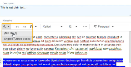
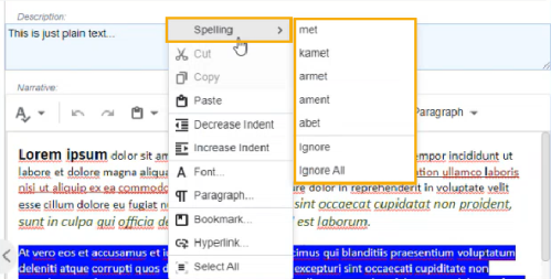
IsReadOnly
As an Implementer, you can enable the new rich text functionality within the text box component and make it read-only or editable for select users. Set and use the IsReadOnly property located in Text Box Component Display Format under Position to True to make rich text available for select users. You can set this property to the following options:
-
When set to True, you cannot edit and this property is read-only.
-
When set to False or (Use Default), you can edit.
NOTE: In the following example, IsReadOnly is set to True and no formatting options are available in the rich text box.
Presenting Data With Books, Cube Views and Other Items › Dashboards › Dashboard Components › Content Components
Menu Component Overview
Developers can add navigational menus to their solutions. With the addition of navigational menus, users can easily navigate throughout the solutions and get to where they want to go. You can hover over or select a menu item to view a drop-down menu with nested options. Then, explore additional menu items by selecting those options to navigate seamlessly to your desired page.
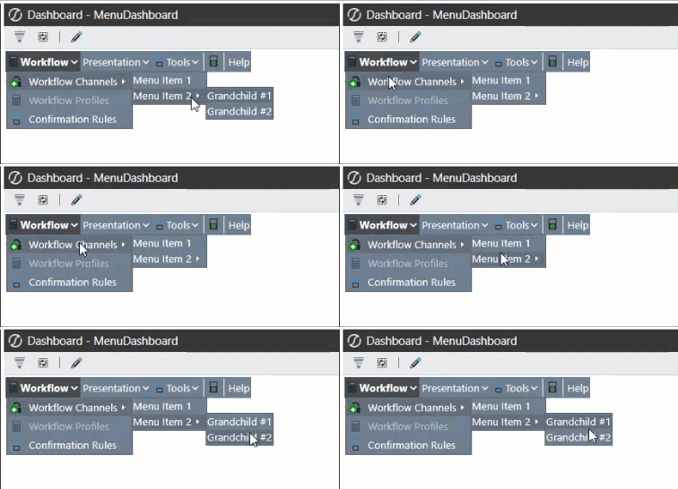
Presenting Data With Books, Cube Views and Other Items › Dashboards › Dashboard Components › Content Components › Menu Component Overview
Modern Browser Experience and Menu Component
This component is created in the Windows Application and can be displayed in the Modern Browser Experience on a dashboard. The Modern Browser Experience works alongside the existing OneStream Windows Application to give users more options to display dashboards containing Menu Components across a wide range of devices. See Menu Component Overview.
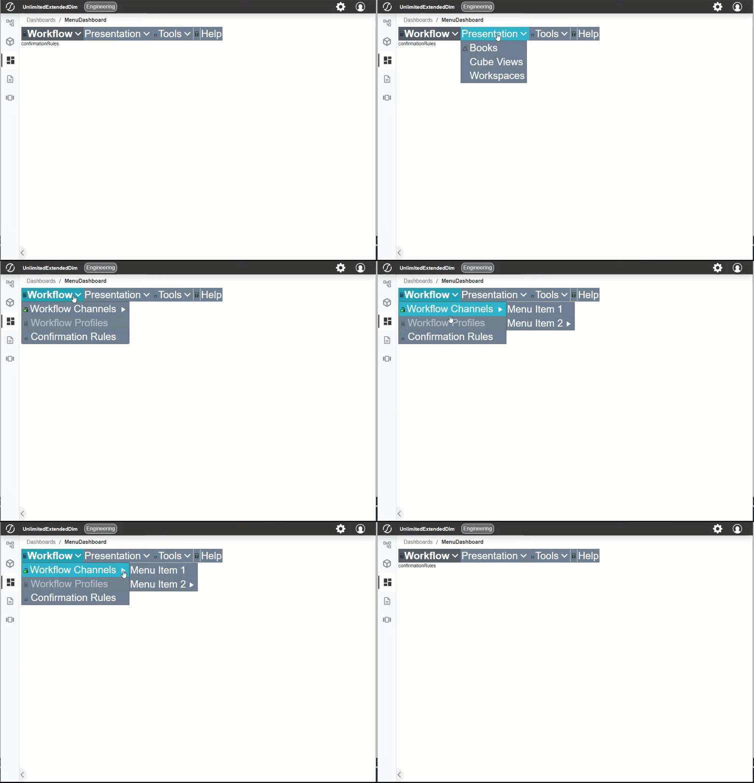
Set Up and Customization
These properties must be set up and customized in the Windows Application to be available in the Modern Browser Experience when run through a dashboard. See Set Up Menu Component and Customization.
IMPORTANT: For a dashboard to display in the Modern Browser Experience and on specific devices, the Dashboard Group containing the dashboard must be added to a Dashboard Profile that includes Web, Tablet, and/or Phone for its Client/Device Visibility property.
NOTE: If the dashboard still isn't appearing in the Modern Browser Experience, verify that the Dashboard Profile's Visibility property is set to Always or OnePlace.
Menu Component and Items
The Menu Component has multiple options for Menu Items that you can integrate and use within your component. All Menu Items must be created and set up in the Windows Application to display in the Modern Browser Experience.
As the developer, you can set the Menu Items through the Workspace Assembly or Business Rule code. The Workspace Assembly or Business Rule code containing Menu Items can then be used to populate the Data Table within a Data Adapter. You can configure specific Display Format settings for the main Menu Component through the Display Format Properties dialog. A Custom Parameter can also be included in the Display Format Properties dialog to configure the main Menu Component.
Consider the following when using Menu Component and Items in the Modern Browser Experience:
-
Menu Hover Color and Auto Open: When using tablets, the Menu Hover Color will appear after tapping to select. To Auto Open, you must tap to open the Menu Item.
Data Adapter
Developers can write a Workspace Assembly or Business Rule to include data and content that a Data Adapter can use. The Data Adapter can then be used to populate the content of a Menu Component in the Windows Application. See Data Adapter and Menu Component.
Considerations
See Considerations for a list of all items to consider when using the Menu Component in the Modern Browser Experience and Windows Application.
Presenting Data With Books, Cube Views and Other Items › Dashboards › Dashboard Components › Content Components › Menu Component Overview
Menu Component and Items
The Menu Component has the following options you can integrate and use within your navigational menu. As the developer, you can set the Menu Items through the Workspace Assembly or Business Rule code. The Workspace Assembly or Business Rule code containing Menu Items can then be used to populate the Data Table within a Data Adapter. You can configure specific Display Format settings for the main Menu Components through the Display Format Properties dialog. A Custom Parameter can also be included in the Display Format Properties dialog to configure the main Menu Component.
Menu Component Properties
Auto Open
Defaults to False. When Auto Open is set to False, you must click each Menu Component Item to expand its nested children. When Auto Open is set to True, the Menu Component Menu Items will automatically expand its nested children when you hover the cursor over the item.
Show Down Arrow
Defaults to False. When Auto Open is set to False, it will not display an arrow icon on the top-level Menu Items even if they contain nested children. When Show Down Arrow is set to True, it will display the arrow icon on the top-level Menu Items containing nested children.

Display Format Properties
General
-
Custom Parameters: Use this property to use parameters from the following locations: Default Workspace and Non-Default Maintenance Unit or Non-Default Workspace and Maintenance Unit. You can enter the name of a Parameter that contains a string specifying Display Format settings into this property.
Position
-
IsVisible: Defaults to (Use Default). Select (Use Default), True, or False to determine if the component is visible on the dashboard.
-
IsHorizontalOrientation: Defaults to (Use Default). Select (Use Default), True, or False.
-
Width: Enter a width number.
-
Height: Enter a height number.
-
MarginLeft: Enter a margin left number.
-
MarginTop: Enter a margin top number.
-
MarginRight: Enter a margin right number.
-
MarginBottom: Enter a margin bottom number.
Font
-
FontFamily: Enter a font family name.
-
FontSize: Enter a font size number.
Colors
-
BorderColor: Defaults to (Use Default). Select a color, enter a custom color, or use the default value.
-
HoverColor: Defaults to (Use Default). Select a color, enter a custom color, or use the default value.
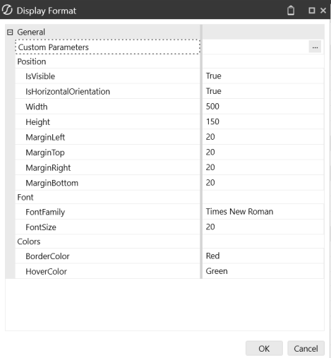
Menu Items
Nested Menus
You can create nested menus with the Menu Component. A nested menu is a menu item with a submenu. This can be displayed at any nested level depth.
NOTE: Parent menu items cannot have more than four nested child levels.
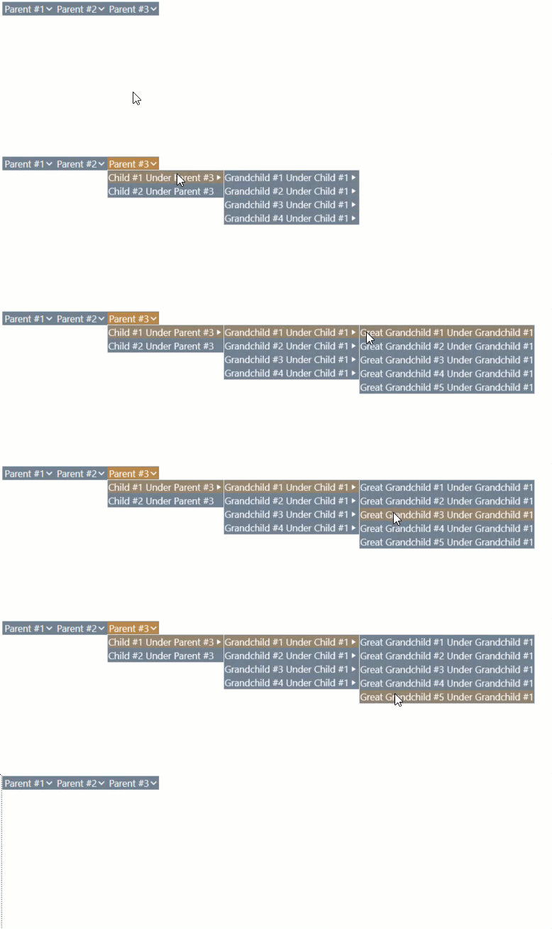
Enable or Disable Menu Items
You can set specific menu items in a Menu Component to Enabled or Disabled. When set to Disabled (bool isEnabled = false), you cannot click on or select that menu item. Both parent and child menu items can be set to Enabled or Disabled.
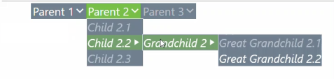
Vertical or Horizontal Menus
You can display menu components in a vertical or horizontal format. This property is configured in the Display Format Properties dialog.
Width and Height
You can configure the overall Menu Component's width and height along with setting each individual menu item's width and height. The width or height of the overall Menu Component displayed on the dashboard are set in the Display Format Properties dialog. The width or height of individual Menu Items within the Menu Component are set through the Workspace Assembly or Business Rule code. Menu Item width and height can be specified at any nested level depth.
Images
Images can be set to display within a Menu Component's parent and nested menu items. You can choose to display the image on its own within the menu item or along with header text or an arrow icon. If the menu item uses an image and the drop-down arrow, the image will always display to the left of the arrow.
NOTE: The arrow icon will only display for parent menu items if "Show Down Arrow" is set to True for the Menu Component and they contain nested items. Nested items under the parent menu items, or children, are not affected by this setting and will always display an arrow if they contain their own nested items.
Bold and Italic Menu Options
You can set the menu item text to be bold and/or italic in the Workspace Assembly or Business Rule code.
Tooltip
You can customize tooltips for the Menu Component's menu items. When the menu item has a set string for the tooltip, the text will display when you hover the cursor over that menu item.
Separators
You can set and create horizontal and vertical separators within the Menu Component. Separators are their own individual menu items set through Workspace Assembly or Business Rule code and can be listed anywhere in the Menu Component. When the isSeparator arguments is set to True on an XFMenuItem class, then it ignores most settings except for the color formatting options. If the Menu Component is horizontal, all Separator menu items created at the parent/root level will be vertical, and vice versa. Nested separators always display horizontally between child items.
Text Color for Background and Text Color Styles
You can customize the text, background, and border colors. This can be displayed at any nested level depth.

Toolbar Image Menu
You can also convert navigational menus into toolbars with image icons. You can omit header text and configure the width, height, and padding properties in the Workspace Assembly or Business Rule code to achieve this. You can also pull images from Dashboard Files, Client Images, and URLs.
Padding Options
You can add and set padding for each menu item. The padding settings are set in the Workspace Assembly or Business Rule code (PaddingLeft, PaddingTop, PaddingRight, and PaddingBottom) and can be set for each individual menu item.
Presenting Data With Books, Cube Views and Other Items › Dashboards › Dashboard Components › Content Components › Menu Component Overview
Data Adapter and Menu Component
Developers can create a Data Set using a Workspace Assembly or Business Rule to populate a Data Adapter that's used by Menu Component Items.
Data Table
The Data Table within a Data Adapter displays the Items and Relationships in your Menu Component.
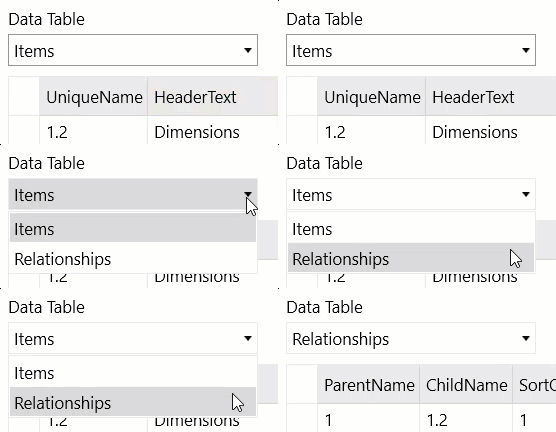
Items
The Menu Component Data Adapter contains the following fields and displays them in a table format:
| Field | Description |
| UniqueName | Unique Id |
| HeaderText | Menu Item Name (text that displays) |
| Foreground | Foreground color of Menu Item (this displays the text color) |
| Background | Background color of Menu Item (this displays the background color behind the text) |
| IsBold | Determines if HeaderText is Bolded (True or False) |
| IsItalic | Determines if HeaderText is Italicized (True or False) |
| IsEnabled |
Determines if the Menu Item is selectable (True or False) NOTE: IsEnabled is different from IsVisible. When IsEnabled is False, the Menu Item will still be visible but you cannot select the item. isVisible determines if the Menu Component is visible. |
| IsSeparator | Determines if the Menu Item is a Separator (True or False) |
| Width | Width of menu item label |
| Height | Height of menu item label |
| PaddingLeft | Amount of padding added between the HeaderText and left border of the menu item |
| PaddingTop | Amount of padding added between the HeaderText and top border of the menu item |
| PaddingRight | Amount of padding added between the HeaderText and right border of the menu item |
| PaddingBottom | Amount of padding added between the HeaderText and bottom border of the menu item |
| ImageFileSourceType | Source of the Image such as Dashboard, File Explorer, and more |
| ImageNameOrPath | Name of Image |
| ImageColumnWidth | Amount of width added to the column of the image |
| Tooltip | Displays text when hovering over the menu item |
| ParameterValue | Parameter value of the menu item |
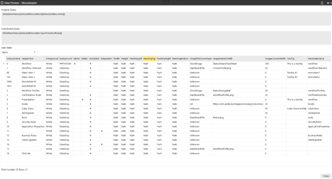
Relationships
-
ParentName: This is the name of the parent menu item of a menu item.
NOTE: Top-Level Menu Items will be blank or display Empty for the ParentName field.
-
ChildName: This is the name of the child menu item.
-
SortOrder: This number specifies the numerical order of the menu item in the parent-child relationship.
NOTE: The first menu item in the parent-child relationship will have a SortOrder value of 0.
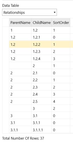
To view the data of an existing Data Adapter, follow these steps:
-
Expand the Workspace > Maintenance Unit > Data Adapter node, and then select an existing Data Adapter.
-
Click the Test Data Adapter toolbar button.
-
If a Parameter dialog box appears, input valid arguments for the Parameters, then click the OK button.
Presenting Data With Books, Cube Views and Other Items › Dashboards › Dashboard Components › Content Components › Menu Component Overview
Set Up Menu Component
To use the full capacity of the Menu Component, you must have the following items created and setup before customization:
-
Workspace and Maintenance Unit
-
Dashboard Group and Dashboard
-
Menu Component
-
Data Adapter
-
Data Set Service or Dashboard Data Set created through a Workspace Assembly or Business Rule
IMPORTANT: You can create and set up the following items in any order. You do not need to follow this order.
NOTE: You can also use a Parameter if it is part of your implementation.
Create a Menu Component
-
On the Application tab, under Presentation, click Workspaces.
-
Create a Workspace and Maintenance Unit, or select an existing one. If you are selecting an existing Workspaces, ensure it is a Default Workspace > Non-Default Maintenance Unit or any Non-Default Workspace > Maintenance Unit. See Create a Workspace.
-
Create a Dashboard Group and Dashboard, or select an existing one. See Dashboard.
-
Navigate to and select the Components node, and click the Create Dashboard Component toolbar button.
-
In the Create Dashboard Component dialog box, click Menu, then OK.
-
Name the Menu component.
-
Click the Save button to save the changes.
Create a Data Adapter and Parameter
-
In the Maintenance Unit, navigate to and select the Data Adapters node, and click the Create Data Adapter toolbar button.
-
Name the Data Adapter.
-
Click the Savebutton to save the changes.
-
(Optional) Then, create a Parameter. See Create a Parameter.
NOTE: Parameters are not a necessity, but can be used in certain Command Type queries.
-
(Optional) After creating a Parameter, utilize it as needed within the Data Adapter's Data Source properties.
Create a Workspace Assembly
-
In the Maintenance Unit, navigate to and select the Assemblies node, and click the Create Assembly toolbar button.
-
Create an Assembly. When naming the Assembly, ensure naming conventions match with what is present in the Workspace or Maintenance Unit's Workspace Assembly Service field.
Example: If the Workspace contains an Assembly named "MenuAssembly", you will need to specify "MenuAssembly.WsasFactory" in the Workspace Assembly Service field.
-
Create an Assembly file using the Service Factory source code type.
NOTE: You will choose the Service Factory and Data Set Service source code types to create two different Assembly files to use with the Menu Component.
-
Create a new Assembly File for your Menu Component. In the Assemblies Files, right-click on Files and select Add File.
In the Add File dialog box:
-
Type WsasFactory as the File Name.
-
Set your Source Code Type to Service Factory.
-
Set your Compiler Action to (Use Default).
-
Select OK.
-
-
-
Create the second Assembly File. In the Assemblies Files, right-click on Files and select Add File.
-
In the Add File dialog box:
-
Type WsasDataSet as the File Name.
-
Set your Source Code Type to Data Set Service.
-
Set your Compiler Action to (Use Default).
-
Select OK.
-
-
-
Select the WsasFactory.cs (Service Factory) Assembly File and uncomment the lines of code that reference the previously created WsasDataSet - Data Set Service Assembly File.
IMPORTANT: The Service Factory - Assembly File must contain uncommented code to function successfully: case WsAssemblyServiceType.DataSet:return new WsasDataSet();
-
Select the WsasDataSet.cs (Data Set) Assembly File, and begin to customize and build out your Menu Component. See Customization and Menu Component and Items.
-
Click the Save toolbar button to save the changes.
-
Click the Compile Assembly to check syntax button to ensure the Workspace Assembly files compile successfully.
Presenting Data With Books, Cube Views and Other Items › Dashboards › Dashboard Components › Content Components › Menu Component Overview
Customization
Developers can customize the Menu Component content through the Data Set Assembly File. Menu Components can contain nested menu items that will expand to display new menu items when hovering over or selecting them.
IMPORTANT: A maximum of 250 menu items are supported.
CAUTION: When attempting to open a dashboard with a Menu Component that contains more than 250 Menu Items, you will receive an error message: Unable to create XFMenuItemCollection. A maximum of 250 menu items are supported.
See Menu Component and Menu Items for a list of all options you can use and set up in the Workspace Assembly or Business Rule code.
The Data Set Assembly file returns a method call that contains the whole collection of Menu Items that builds your Menu Component. When building this out, you will notice that the code contains repetitive elements. When creating new menu items, it will auto-complete and display the default arguments including the Menu Item's unique name, header text, foreground color, background color, and so on.
XFMenuItem XFMenuItem(string uniqueName, string headerText, string foreground, string background, bool isBold, bool isltalic, bool isEnabled, bool isSeparator,
double width, double height, double paddingLeft, double paddingTop, double paddingRight, double paddingBottom, XFImageFileSourceType imageFileSourceType, string
imageNameOrPath, double imageColumnWidth, string parameterValue, string toolTip, List<XFMenuItem> children)

Sample Customization
See Sample Customization for samples of fully customized Data Set Service Files of a custom Menu Component.
Connect Items to the Menu Component
After customizing and creating your Menu Component, you must update, link, and connect these items. The Workspace retrieves information through its Workspace Assembly Service property, which contains the path to the Assembly and Service Factory - Assembly File. For example, MenuAssembly.WsasFactory. The Service Factory File references the Data Set Assembly file which contains the data and content needed for the Data Adapter. The Data Adapter can then query this data and be connected to the Menu Component to generate the menu items' content on a Dashboard.
IMPORTANT: You can connect any of the following items in any order. You do not need to follow this order.
Update the Data Adapter
-
In the Maintenance Unit, navigate to Data Adapter.
-
Update the Data Source:
-
Update Command Type to Method.
-
Update Method Type to Business Rule.
-
Click on the Method Query ellipsis button, and update the Method Query to reflect the Workspace Menu Component item as it is being returned in the Assembly file or Business Rule. You can also do this through other Command Types, Method Types, or Queries.
Example: {WS}{MainMenu}{SelectedMenuItem=[|!SelectedMenuItem!|]}
-
-
Click the Save button to save the changes.
Update the Bound Parameter
NOTE: (Optional) Follow these steps if you are using Bound Parameters as part of your implementation.
-
In the Maintenance Unit, navigate to Parameters.
-
Rename the Parameter to work with the path of the Data Adapter. Click the Rename Selected Item toolbar button.
Example: Rename Test Parameter to SelectedMenuItem.
-
Click the Save button to save the changes.
-
Add the specified Bound Parameter "SelectedMenuItem" to the Menu Component's Bound Parameter property.
Link the Data Adapter
-
In the Maintenance Unit, navigate to the Menu Component.
-
Click the Data Adapters tab.
-
Click the Add Dashboard Component toolbar button, and select the Data Adapter you created.
-
Click the OK button and then the Save button to save the changes.
Link the Menu Component
-
Navigate to a Dashboard Group containing a Dashboard, and select the dashboard to connect with the Menu Component.
-
Click the Dashboard Components tab.
-
Click the Add Dashboard Component toolbar button, and select the Menu Component you created.
-
Click the OK button and then the Save button to save the changes.
Update the Workspace Assembly Service
-
Navigate to Workspaces, and select the Workspace created.
-
Under the Assemblies, go to the Workspace Assembly Service property.
-
Enter the path to the Service Factory - Assembly File you created.
Example: MenuAssembly.WsasFactory
-
Click the Save button to save the changes.
Run the Dashboard
-
Navigate to Dashboard Groups, and select the dashboard linked with the Menu Component.
-
Click the View Dashboard toolbar button.
-
If the Parameter dialog box appears, enter a valid argument and then click the OK button.
NOTE: The Menu Component displays on the dashboard.
Presenting Data With Books, Cube Views and Other Items › Dashboards › Dashboard Components › Content Components › Menu Component Overview › Customization
Sample Customization
The following sample is a fully customized Data Set Service File in C# of a custom Menu Component.
using System;
using System.Collections.Generic;
using System.Data;
using System.Data.Common;
using System.Globalization;
using System.IO;
using System.Linq;
using Microsoft.CSharp;
using OneStream.Finance.Database;
using OneStream.Finance.Engine;
using OneStream.Shared.Common;
using OneStream.Shared.Database;
using OneStream.Shared.Engine;
using OneStream.Shared.Wcf;
using OneStream.Stage.Database;
using OneStream.Stage.Engine;
using OneStreamWorkspacesApi;
using OneStreamWorkspacesApi.V800;

namespace Workspace.__WsNamespacePrefix.__WsAssemblyName
{
    public class WsasDataSet : IWsasDataSetV800
    {
        public object GetDataSet(SessionInfo si, BRGlobals brGlobals, DashboardWorkspace workspace, DashboardDataSetArgs args)
        {
            try
            {
                if ((brGlobals != null) && (workspace != null) && (args != null))
                {
                    if (args.DataSetName.XFEqualsIgnoreCase("MainMenu"))
                    {
                        var menu = new XFMenuItemCollection();

                        // Top-level Menu Item #1
                        var topLevelMenuItemOne = new XFMenuItem("1", "Menu Item #1", "White", "SlateGray", false, false, true, false, double.NaN, double.NaN, double.NaN, double.NaN, double.NaN, double.NaN, XFImageFileSourceType.Unknown, null, 0, "menuItem1", null, null);

                        topLevelMenuItemOne.Children = new List<XFMenuItem>();
                        topLevelMenuItemOne.Children.Add(new XFMenuItem("2", "Child #1", "White", "SlateGray", false, false, true, false, double.NaN, double.NaN, double.NaN, double.NaN, double.NaN, double.NaN, XFImageFileSourceType.Unknown, null, 0, "child1", "Tooltip #1", null));
                        topLevelMenuItemOne.Children.Add(new XFMenuItem("3", "Child #2", "White", "SlateGray", false, false, true, false, double.NaN, double.NaN, double.NaN, double.NaN, double.NaN, double.NaN, XFImageFileSourceType.Unknown, null, 0, "child2", "Tooltip #2",
                            new List<XFMenuItem>()
                            {
                                new XFMenuItem("4", "Grandchild #1", "White", "SlateGray", false, false, true, false, double.NaN, double.NaN, double.NaN, double.NaN, double.NaN, double.NaN, XFImageFileSourceType.Unknown, null, 0, null, null, null),
                                new XFMenuItem("5", "Grandchild #2", "White", "SlateGray", false, false, true, false, double.NaN, double.NaN, double.NaN, double.NaN, double.NaN, double.NaN, XFImageFileSourceType.Unknown, null, 0, null, null, null)
                            }
                        ));

                        // Top-level Menu Item #2
                        var topLevelMenuItemTwo = new XFMenuItem("6", "Menu Item #1", "White", "SlateGray", false, false, true, false, double.NaN, double.NaN, double.NaN, double.NaN, double.NaN, double.NaN, XFImageFileSourceType.Unknown, null, 0, "menuItem2", null, null);

                        menu.MenuItems.Add(topLevelMenuItemOne);
                        menu.MenuItems.Add(topLevelMenuItemTwo);

                        return menu.CreateDataSet(si);
                    }
                }

                return null;
            }
            catch (Exception ex)
            {
                throw new XFException(si, ex);
            }
        }
    }
}
This is how this sample Menu Component displays in a dashboard:
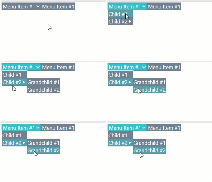
The following sample is a fully customized Data Set Service File in C# of a custom Menu Component.
using System;
using System.Collections.Generic;
using System.Data;
using System.Data.Common;
using System.Globalization;
using System.IO;
using System.Linq;
using Microsoft.CSharp;
using OneStream.Finance.Database;
using OneStream.Finance.Engine;
using OneStream.Shared.Common;
using OneStream.Shared.Database;
using OneStream.Shared.Engine;
using OneStream.Shared.Wcf;
using OneStream.Stage.Database;
using OneStream.Stage.Engine;
using OneStreamWorkspacesApi;
using OneStreamWorkspacesApi.V800;

namespace Workspace.__WsNamespacePrefix.__WsAssemblyName
{
    public class MenuSvc : IWsasDataSetV800
    {
        public object GetDataSet(SessionInfo si, BRGlobals brGlobals, DashboardWorkspace workspace, DashboardDataSetArgs args)
        {
         try {
                if ((brGlobals != null) && (workspace != null) && (args != null)) {

                    // sample menu
                    if (args.DataSetName.XFEqualsIgnoreCase("MainMenu"))
                    {
                        // create the menu object
                        XFMenuItemCollection menu = new XFMenuItemCollection();

                        // create top-level items
                        XFMenuItem parentMenuItemOne = new XFMenuItem("1", "Parent 1",
                            "White", "SlateGray", false, false, true, false, null);
                        // create items for the second level
                        XFMenuItem childMenuItemOne = new XFMenuItem("1.1", "Child 1",
                            "Black", "White", true, true, true, false, null);
                        XFMenuItem childMenuItemTwo = new XFMenuItem("1.2", "Child 2",
                            "Black", "White", true, true, true, false, null);
                        // create items for the third level
                        XFMenuItem grandChildMenuItemOne = new XFMenuItem("1.1.1", "Grandchild 1",
                            "White", "SlateGray", true, true, true, false, null);

                        // create the hierarchy by adding children to direct parents as a List
                        childMenuItemOne.Children = new List<XFMenuItem>(){
                            grandChildMenuItemOne
                        };
                        parentMenuItemOne.Children = new List<XFMenuItem>(){
                            childMenuItemOne
                        };

                        // you can also manipulate the list once created
                        parentMenuItemOne.Children.Add(childMenuItemTwo);

                        // add top-level items to the menu object
                        menu.MenuItems.Add(parentMenuItemOne);

                        // generate the dataset and return it
                        return menu.CreateDataSet(si);
                    }
                }

                return null;

            } catch (Exception ex) {
                throw new XFException(si, ex);
            }
        }
    }
}
This is how this sample Menu Component displays in a dashboard:
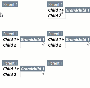
Presenting Data With Books, Cube Views and Other Items › Dashboards › Dashboard Components
Embedded Dashboard
When a Dashboard is created in the Maintenance Unit, an Embedded Dashboard is also created. These Embedded Dashboards are used for sharing across Dashboard Groups in the same Maintenance Unit.
Embedded Custom Control Dashboard
A parent dashboard can contain multiple instances of the same custom control. Independent input parameters are mapped to each instance while each embedded dashboard component listens for events from the custom control.
Instance Name
An optional name that uniquely differentiates this instance of an embedded custom control dashboard from other instances. This instance name is used when saving state information related to interactions with the dashboard when using multiple instances of the same custom control dashboard.
Input Parameter Values
A comma separated list of name-value pairs for the embedded custom control dashboard initial parameter values. For example: "Paraml=Value1, Param2=(Value2], Param3=|!AnotherParamName!|."
Event Listeners
Actions to take when a component inside the referenced embedded custom control dashboard uses its navigation action settings to forward a selection changed event to the parent dashboard.
Presenting Data With Books, Cube Views and Other Items › Dashboards
Data Adapters specify the kind of data used within a dashboard. Once the Data Adapter is configured and pointing to the appropriate data, attach it to a Dashboard component in order to display it on a dashboard.
General Properties
Name
The name of the Data Adapter.
Description
A quick description of the Data Adapter.
Maintenance Unit
The Maintenance Unit to which the Data Adapter belongs.
There are three command types:
Cube View
Choose a Cube View as the source of a Data Adapter. Additional options can be selected here to include supplemental information for the resulting tables. However, adding on to what is defaulted may have a slight impact on performance:
Cube View
This command type allows for a pre-configured Cube View to be the Data Source for a dashboard. Click and begin typing the name of the Cube View in the blank field. As the first few letters are typed, the names are filtered making it easier to find and select the one desired. If the name is unknown, expand a Cube View Group and scroll through the list to select the correct one. Once the Cube View is selected, click CTRL and Double Click. This will enter the correct name into the appropriate field.
Data Table Per Cube View Row
At the creation of the Data Adapter, the default is set to True. When set to True, a Data Table is created for each row in the dashboard. This allows for conditional formatting per Cube View row. Set this to False in order to merge the rows into one table. This will omit any undefined Cube View row.
Include Title
At the creation of the Data Adapter, the default is set to False. When set to True, the title will be displayed from the Report section of the Cube View as the title for the dashboard. Settings are True or False.
Include Header Left Label 1-4
At the creation of the Data Adapter, the default is set to False. When set to True, the left header labels will be displayed from the report section of the Cube View for the dashboard.
Include Header Center Label 1-4
At the creation of the Data Adapter, the default is set to False. When set to True, the center header labels will be displayed from the report section of the Cube View for the dashboard.
Include Header Right Label 1-4
At creation of the Data Adapter, the default is set to False. When set to True, the right header labels will be displayed from the report section of the Cube View for the dashboard.
Include… POV
If set to True, the POV information for the Cube, Entity and all other Dimensions are included. Use these if the report or dashboard needs this information.
Include Member Details
If set to True, additional Member property details are included in the results.
Include Row Navigation Link
If set to True, this data Adapter will include a row navigation link from a Cube View.
Include HasData Status
Includes additional true/false data on whether the row of results contains data for filtering purposes. Settings are True or False.
Include … View Member Text
This determines whether different Data Attachment text is going to be part of the results. This is necessary for showing text in a Data Explorer object or for using a Waterfall Chart and wanting to optionally show comments. Settings are True or False.
Results Table Name
This specifies the name of the resulting table generated when the Data Adapter is run, otherwise it will default with a name of Table.
Cube View MD
Choose a Cube View MD (Multi-Dimensional) as the source of a Data Adapter. This Command Type will return the selected Cube View as a Multi-Dimensional Fact Table versus the reporting table that is returned by the Cube View Command Type. The results of the Cube View MD are Dimensions (Entity, Consolidation, Scenario, time, View, Account, Flow, Origin, IC, UD1-UD8) as columns. This simplifies the report building process in the BI Designer, Pivot Grid, and dashboard development. There are additional Loop Parameter options that can be selected here to include incremental information from the modified Cube View definition in the resulting tables. Adding on to what is defaulted, however, may have a slight impact on performance.
Cube View MD Data Adapter example
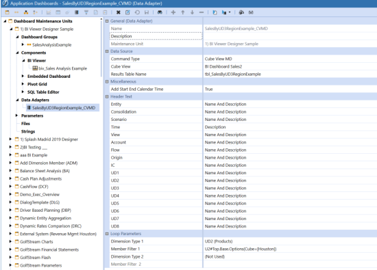
Results Table from the Cube View MD Data Adapter example above.
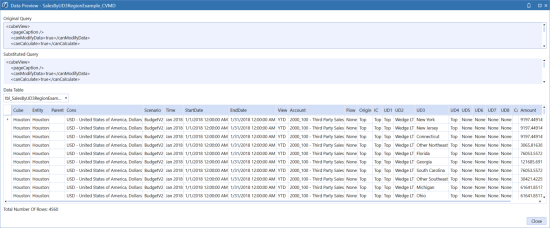
Cube View
This command type allows for a pre-configured Cube View to be the Data Source for a dashboard. Click and begin typing the name of the Cube View in the blank field. As the first few letters are typed, the names are filtered making it easier to find and select the one desired. If the name is unknown, expand a Cube View Group and scroll through the list to select the correct one. Once the Cube View is selected, click CTRL and Double Click. This will enter the correct name into the appropriate field.
Results Table Name
This specifies the name of the resulting table generated when the Data Adapter is run, otherwise it will default with a name of Table. It is optional but highly recommended that a name is defined here to distinguish between different Data Adapters if there are many assigned when using the BI Designer.
For example; tbl_OperatingExpenses can be used to identify the Results Table Name and the Name of the Data Adapter (OperatingExpenses_CVMD in this example) associated with this table.
Add Start End Calendar Time
When set to True, the Data Table incorporates the Start and End Date used in the POV / Time Profile for the Cube View and creates two additional columns in a Date/Time Field Type Format; StartDate, EndDate for each row in the dashboard. This allows for the ability to utilize the Date Grouping functions in the BI Designer. Set this to False to not add or display these Date Time fields.
Entity
At the creation of the Data Adapter, the default is set to Name And Description. This will display both the Name and Description of the Entity. When set to Name, the Entity Name will be displayed in the results table from the Cube View. When set to Description, the Entity Description will be displayed in the results table from the Cube View.
Consolidation
At the creation of the Data Adapter, the default is set to Name And Description. This will display both the Name and Description of the Consolidation. When set to Name, the Consolidation Name will be displayed in the results table from the Cube View. When set to Description, the Consolidation Description will be displayed in the results table from the Cube View.
Scenario
At the creation of the Data Adapter, the default is set to Name And Description. This will display both the Name and Description of the Scenario. When set to Name, the Scenario Name will be displayed in the results table from the Cube View. When set to Description, the Scenario Description will be displayed in the results table from the Cube View.
Time
At the creation of the Data Adapter, the default is set to Name And Description. This will display both the Name and Description of the Time. When set to Name, the Time Name will be displayed in the results table from the Cube View. When set to Description, the Time Description will be displayed in the results table from the Cube View.
View
At the creation of the Data Adapter, the default is set to Name And Description. This will display both the Name and Description of the View. When set to Name, the View Name will be displayed in the results table from the Cube View. When set to Description, the View Description will be displayed in the results table from the Cube View.
Account
At the creation of the Data Adapter, the default is set to Name And Description. This will display both the Name and Description of the Account. When set to Name, the Account Name will be displayed in the results table from the Cube View. When set to Description, the Account Description will be displayed in the results table from the Cube View.
Flow
At the creation of the Data Adapter, the default is set to Name And Description. This will display both the Name and Description of the Flow. When set to Name, the Flow Name will be displayed in the results table from the Cube View. When set to Description, the Flow Description will be displayed in the results table from the Cube View.
Origin
At the creation of the Data Adapter, the default is set to Name And Description. This will display both the Name and Description of the Origin. When set to Name, the Origin Name will be displayed in the results table from the Cube View. When set to Description, the Origin Description will be displayed in the results table from the Cube View.
IC
At the creation of the Data Adapter, the default is set to Name And Description. This will display both the Name and Description of the IC. When set to Name, the IC Name will be displayed in the results table from the Cube View. When set to Description, the IC Description will be displayed in the results table from the Cube View.
UD1-UD8
At the creation of the Data Adapter, the default is set to Name And Description. This will display both the Name and Description of the UD1-UD8. When set to Name, the UD1-UD8 Name will be displayed in the results table from the Cube View. When set to Description, the UD1-UD8 Description will be displayed in the results table from the Cube View.
Loop Parameters
This section allows changes to be made to the output of a Cube View definition being used in a table for reporting. The Loop Parameter filters the results and considers the additional parameters to be passed to the Cube View definition and add those results to the table accordingly.
The parameter(s) overrides the POV. So, if the Entity POV is set to CT, and the loop filter parameters are set to NY, MA, and NJ, then data for those will be returned and NOT CT. A Loop must be used in order to change parameters.
For example, a Loop Parameter may be used to loop through a list of Entities in the Cube View definition and return multiple Entities for that specific Cube View. The Dimension Type and Member Filters should be added here to pass along the appropriate Loop (e.g. Dimension Type=Entity, Member Filter= E#US.Base) which applies to each Entity included in the Loop.
NOTE: It is recommended to not loop on any Dimensions that already exist in the Cube View’s rows or columns.
At the creation of the Data Adapter, the default for each Dimension Type (1 & 2) are set to (Not Used) and Member Filter (1&2) are greyed out. This will display the results without any consideration of additional parameters to pass to the query. When the Dimension Types are set along with the Member Filters, the results will consider the additional parameters to be passed to the Cube View definition and add those results to the table accordingly.
Dimension Type 1
The Dimension Type containing the list of Members. e.g., Entity or Account
At the creation of the Data Adapter, the default for each Dimension Type (1 & 2) are set to (Not Used) and Member Filter (1&2) are greyed out. This will display the results without any consideration of additional parameters to pass to the query. When the Dimension Types are set along with the Member Filters, the results will consider the additional parameters to be passed to the Cube View definition and add those results to the table accordingly.
Member Filter 1
Enter a Member Filter here to determine what is seen in the Parameter.
At the creation of the Data Adapter, the default for each Dimension Type 1 is set to (Not Used) and Member Filter 1 is greyed out. This will display the results without any consideration of additional parameters to pass to the query. When the Dimension Types are set along with the Member Filters, the results will consider the additional parameters to be passed to the Cube View definition and add those results to the table accordingly.
The name of the Dimension containing the list of Members. Start typing in the blank field OR click the ellipsis button in order to launch the Member Script Builder and enter a Member Script to change the Cube View definition. The example below is changing the POV for the Products.
Example: UD2; U2#Top.Base
Dimension Type 2
At the creation of the Data Adapter, the default for Dimension Type 2 is set to (Not Used) and Member Filter 2 is greyed out. This will display the results without any consideration of additional parameters to pass to the query. When the Dimension Types are set along with the Member Filters, the results will consider the additional parameters to be passed to the Cube View definition and add those results to the table accordingly.
Member Filter 2
Enter a Member Filter here to determine what is seen in the Parameter.
At the creation of the Data Adapter, the default for Dimension Type 2 is set to (Not Used) and Member Filter 2 is greyed out. This will display the results without any consideration of additional parameters to pass to the query. When the Dimension Types are set along with the Member Filters, the results will consider the additional parameters to be passed to the Cube View definition and add those results to the table accordingly.
The name of the Dimension containing the list of Members. Start typing in the blank field OR click the ellipsis button in order to launch the Member Script Builder and enter a Member Script to change the Cube View definition. The example below is changing the POV for the Products.
Example: UD2; U2#Top.Base
Dimension Leveling
The Dimension Level property setting in the Cube View MD Data Adapter displays dimensional data as a hierarchical tree in the BI Viewer. Dimension leveling allows you to display data in a hierarchical structure into which you can drill down to view child data. After the data is leveled, you can use the BI Viewer to view data as a tree, a pivot table, a chart, or a grid.
Prerequisites
To use dimension leveling to display hierarchical data, you must first create a cube view MD data adapter with data.
Create the Data Adapter
Cube View MD Data adapters allow you to pull data from a Cube View. To create a data adapter:
- Inside the OneStream application, click the Application Dashboards tab at the bottom of the screen.
- Expand the appropriate Dashboard Maintenance Unit.
- Click the Data Adapter label.
- Click the Create Data Adapter button on the toolbar.
- In the Name field, type the name of the data adapter.
- In the Command Type field, click the drop-down arrow and select Cube View MD.
- Click the Edit button ()at the far right of the Cube View field.
- In the Object Lookup dialog box, select the appropriate Cube View and then click OK.
- In the Dimension to Level field, click the drop-down arrow and select the appropriate leveling option. With this step, you are leveling on this dimension, which in this case is Entity.
- Select one of the following:
- Outermost Row - hierarchy uses the first row and first level (of row) definition.
- Outermost Column - hierarchy uses the first column and first level (of column) definition.
- Both - hierarchy uses the first row and first level definition and uses the first column and first level (of column) definition.
NOTE: When Data Adapter is run, the Data Table will generate the additional columns for the levels including a column(s) to determine the status of the level:
RowMemberIsBase = 1: Row Member contains the Base level of data RowMemberIsBase = 0: Row Member is not the Base level of data ColumnMemberIsBase= 1: Column Member contains the Base level of data ColumnMemberIsBase= 0: Column Member is not the Base level of data
- Click Save.
- Test the data adapter by clicking Test Data Adapter. The Data Preview dialog box displays the table data.
- Click Close.
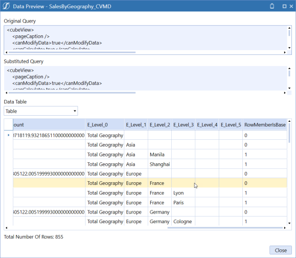
NOTE: When Data Adapter runs, the Data Table generates the additional columns for the levels including columns to determine the status of the level.
Each dimension leveled column is prefixed with an E to indicate it is an Entity, followed by a level number. A RowMemberIsBase value of 1 indicates that there is no remaining child data.
View Results in the BI Viewer
You can view data in various ways using the BI Viewer. For example, you can configure the BI Viewer to display data in pivot tables and charts at the same time. To configure the BI Viewer:
- Click the Application Dashboard tab at the bottom of the window.
- Create a BI Viewer component:
- Click the Components label in the tree.
- Click the Create Dashboard Component button on the toolbar.
- In the Create Dashboard Component dialog box, click BI Viewer and then click OK
- On the Component Properties tab, in the Name field, type the name of the new component.
- Click the Data Adapters tab at the top of the window.
- Click the Add Dashboard Component button on the toolbar.
- In the Add Data Adapter dialog box, select the appropriate data adapter and then click OK.
- Click Save.
- Design the BI Viewer dashboard:
- Click the BI Designer tab at the top of the window.
- In the Data Source field, click the drop-down arrow and select the data source from which to pull data. This is usually a table.
- Drag each dimension level that you want to view from the Table view into the Data Items column under Dimensions.
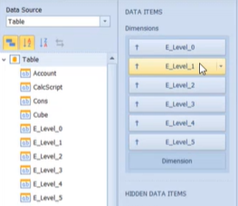
If you want to filter items based on whether they are base items, drag the RowNumberIsBase item into the Data Items column but under Hidden Data Items. This item will not display in the resulting dashboard but will be available for you to filter on if necessary.
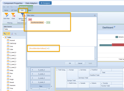
From the BI Designer ribbon, select the type of dashboard item you want to view in the dashboard. For example, select Filter Element > Tree View. In the resulting tree view in the dashboard notice that you can expand parent members down to their base child members.
If you add a Grid, all levels of the parent entity display in their own columns. If you want to see a pivot table, select Pivot from the ribbon and notice that each level is expandable similar to tree view.
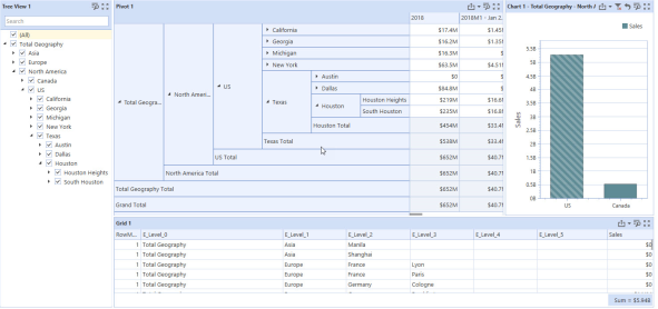
Conclusion
With Dimension leveling, you can view data in an easy-to-understand, hierarchical format. With the BI Viewer, you can design various dashboard items in which to view the dimension leveled data.
Method Query
TIP: To view an example Method Query, leave the Method Query field blank, click Save, and then click Test Data Adapter .
Method Type
BusinessRule
Use the Business Rule option when creating a custom rule to incorporate within a Method Query. The Business Rule is used as the first set of {} within the Method Query.
Example Method Query: {XFR_DataUnitCompare}{DataUnitComparisonDataSet}
{Cube1=|!Members_Cubes!|, Entity1=|!Members_Entities_AllDims_Base!|,
Parent1=[], Cons1=|!Members_Cons_Statutory!|,
Scenario1=|!Members_Scenarios_AllDims_Base!|, Time1=|!Members_Time_WFYear_
Base!|, Cube2=|!Members_Cubes!|, Entity2=|!Members_Entities_AllDims_Base!|,
Parent2=[], Cons2=|!Members_Cons_Statutory!|, Scenario2=|!Members_Scenarios_
AllDims_Base_Var!|, Time2=|!Members_Time_WFYear_Base!|, View=
|!Members_View_Numeric!|, SuppressMatches=|!DataUnit_SuppressMatches!|}
CertificationforWorkflowUnit
This lists all Certification Questions for the particular Workflow Unit.
Example Method Query:
{Workflow Profile Name}{Scenario Name}{Time Name}{Include Descendants}{} or
 {Dallas}{Actual}{2011M2}{true}{}.
ConfirmationforWorkflowUnit
This lists the Confirmation Rules results for a particular Workflow Unit.
Example Method Query:
{Workflow Profile Name}{Scenario Name}{Time Name}{Include Descendants}{Filter}
or {Montreal}{Actual}{2011M6}{true}{} Name}{Include Descendants}{Filter} or
{Montreal}{Actual}{2011M6}{true}{}
DataUnit
This returns all rows of data related to the specified Data Unit (i.e. Cube, Entity, Parent, Consolidation Member, Scenario, Time and View).
Example Method Query:
{Cube}{Entity}{Parent}{Cons}{Scenario}{Time}{View} {True}
{Empty String or Filter Expression}
DataUnitComparison
This returns all rows from two different Data Units specified for comparison purposes.
Example Method Query:
{Cube1}{Entity1}{Parent1}{Cons1}{Scenario1}{Time1}
{Cube2}{Entity2}{Parent2}{Cons2}{Scenario2}{Time2}{View}{True}{True}{
Empty String or Filter Expression}
Excel
This returns data sourced from an Excel file. Parameters for method type 'ExcelFile' should include the following, each enclosed in curly braces:
{FileSourceType}{UrlOrFullFileName}{Sheet}{NamedRange}{UseFirstRowForColumnNames}{IncludeNumericColumns}{Filter},
Example:
{Application}{Documents/Public/MyExcelfile.xfDoc.xlsx}{Sheet1 or Empty}
{MyDataRange or Empty}{False}{False}{}.
FormsStatusForWorkflowUnit
This lists detailed information about the Forms for a particular Workflow Unit. Example Method Query:
{Workflow Profile Name}{Scenario Name}{Time Name}{Form Status}{Filter} or
{Houston}{Actual}{2011M1}{All}{}
Groups
This returns the Group ID, Name, Description and whether or not this is an Exclusion Group. For example:
{GroupName = 'FinanceGroup'}
GroupsforUsers
Select User properties and all of the Groups to which the user. This returns the same group properties as the Group Method Query.
For example:
{UserName = 'Administrator'}{}
ICMatchingforWorkflowUnit
This returns a detailed Intercompany Matching Report table for the given Workflow Unit and several other Parameters. The Parameters override what is set up in the Workflow Profile. For example:
{Workflow Profile Name}{Scenario Name}{Time Name}{Plug Account Override}{
Suppress Matches Override}{Tolerance Override}{Filter} or
{Flint}{Actual}{2011M1}{Empty String or A#MyPlugAccount}{Empty String or
true/false}{Empty String or 0.0}{Empty String or Filter Expression}.
ICMatchingPlugAccountsforWorkflowUnit
This returns the list of Intercompany Plug Accounts for a given Workflow Profile and Scenario Type configured for the Workflow Profile.
Method Query Example
{MyWorkflowProfileName}{Actual}{2011M1}
{PlugAccount for Workflow Parameter Set (Exclude A#)}{Empty String
or C#MyCurrencyOverride}{Empty String or V#MyViewOverride}{Empty String or
A#MyPlugAccountOverride}{Empty String or true/false}{Empty String or 0.0}
{Empty String or E#MyEntityOverride}{Empty String or E#MyPartnerOverride}
{Empty String or MyDetailDimsOverride (F#All:O#Top:U1#All:U2#All:U3#All:
U4#All:U5#All:U6#All:U7#All:U8#All)}{Empty String or Filter Expression}
JournalforWorkflowUnit
This lists the Journals entered for a given Workflow Unit
{Workflow Profile Name}{Scenario Name}{Time Name}{Journal Status}{Filter} or
{Frankfurt}{Actual}{2011M3}{All}{}
Members
This returns Dimension ID, Member information such as ID, Name and Description, and a few other properties for the chosen Dimension and Member Filter.
{Account}{MyAccountDim}{A#Root.TreeDescendants}
{Empty String or Filter Expression}
UserCubeSliceRights
This lists each user’s Data Access settings on a given Cube.
For example:
{UserName}{CubeName}{Filter} or {AllUsers}{AllCubes}{}.
UserEntityRights
This returns the Cubes and Entities the user has access to according to the security settings under Entities. For example:
{UserName}{CubeName}{Filter} or {US Clubs Controller}{AllCubes}{}.
Users
This returns all properties associated for the chosen User Name.
For example:
{UserName = 'Administrator'}
UserScenarioRights
This returns all accessible Scenarios and many related Scenario properties for the chosen User Name filter and Cube.
Method query example: {AllUsers}{AllCubes}{Empty String or Filter Expression}
UserinGroups
This returns a list of Users and selected User properties for the chosen User Group. For example:
{GroupName = 'FinanceGroup'}{}
UserWorkflowProfileRights
This lists the rights assigned to users for Workflow Profiles.
Method query example:
{User Name}{Workflow Cube Name}{Workflow Profile Type}{Filter} or
{Administrator}{GolfStream}{AllProfiles}{}.
WorkflowandEntityStatus
This returns properties for Workflow status, status code/description, last executed step, date/time information, completed steps, and data status for the chosen Workflow Unit including both the Workflow Profile level and individual Entity level.Method query example:
{MyWorkflowProfileName}{Actual}{2011M1}
{AllProfiles}{Descendants}{Empty String or Filter Expression}
WorkflowCalculationEntities
This lists the Entities that appear under Calculation Definitions for this Workflow Profile.
WorkflowConfirmationEntites
This lists the Entities that appear under Calculation Definitions with a Confirmed check box for this Workflow Profile.
WorkflowProfileandDescendantEntities
This creates a list of Entities and all descendants located under Entity Assignment for this Workflow Profile.
WorkflowProfileEntities
This creates a list of Entities located under Entity Assignment for this Workflow Profile.
WorkflowProfileRelatives
This lists related Workflow Profiles based on certain criteria.
For example:
{Workflow Profile Name}{Scenario Name}{Time Name}{Workflow Profile Type}
{Relative Type}{Include Requesting Profile}{Filter} or {GolfStream}{Actual}
{2011M1}{AllProfiles}{Descendants}{true}{}.
WorkflowProfiles
This lists the Workflow Profiles. Example:
{WorkflowProfileType}{Filter} or {AllProfiles}{Type = 'InputAdjChild'}.
WorkflowStatus
This lists the status, lock status and last step completed of a given Workflow Unit. For example:
{Workflow Profile Name}{Scenario Name}{Time Name}{Workflow Profile Type}
{Relative Type}{Filter} or {Houston}{Actual}{2011M1}{AllProfiles}
{Descendants}{}
WorkflowStatusTwelvePeriod
This returns status value and text summary for 12 months for a given Workflow Profile, Scenario and Year. For Workflow Profile Type, options are AllProfiles, CubeRoot, Default, Review, BaseInput, InputImportChild, InputFormsChild, InputAdjChild and ParentInput. Example:
 {MyWorkflowProfileName}{Actual}{2011}{AllProfiles}
{Descendants}{Empty String or Filter Expression}
Method Query
The query ran for this Data Adapter.
Results Table Name
This specifies the name of the resulting table generated when the Data Adapter is run, otherwise it will default with a name of Table.
WorkflowLockHistory
Displays all Lock history details in a report for a given Workflow Profile with the ability to filter by Scenario, Time, Workflow Profile, Origin, Channel, Time, User and Lock Status. For example:
{Workflow Profile Name}{Scenario Name}{Time Name}{Workflow Profile Type}
{Relative Type}{Filter}
Method Query Parameter Options
Workflow Profile Type
AllProfiles, AllProfilesExceptInputChild, AllProfilesWithTemplates, AllTemplates, BaseAndParentInputProfile, BaseInput, ClassStandardProfiles, ClassTemplateProfiles, CubeRoot, Default, InputAdjChild, InputChildren, InputFormsChild, InputImportChild, NonInputParentProfiles, ParentInput and Review.
Workflow Profile Relative Type
Ancestors, Descendants, FirstLevelChildren, Siblings and Unrelated.
Workflow Status or Forms Status
Completed, HasError, InProcess, NoStatus, NotExecuted and Unknown.
Journal Status
Approved, Posted, Rejected, Submitted
SQL
A SQL query against either the Application or Framework database can be written as a Data Source. Reference substitution variables such as |WFProfile| from within the SQL statement.
Database Location
Application
The current OneStream Application database where Stage and financial Cube data resides.
Framework
The connected OneStream Framework database where security and log data resides.
External
Any other database outside of OneStream.
External Database Connection
If External is the chosen Database Location, select the External Database Connection name here. This list is defined in the OneStream Server Configuration Utility.
SQL Query
The SQL statement ran for this Data Adapter.
Results Table List
This specifies the name of the resulting table generated when the Data Adapter is run, otherwise it will default with a name of Table.
BI Blend Adapter
The purpose of the BI Blend Adapter is to provide dashboard designers with a pre-defined interface to querying BI Blend tables. The data sourced by the BI Blend Adapter can be used to design standard OneStream dashboard.
The BI Blend Workflow process is designed to generate large external database tables formatted in a column store index optimized for analytic reporting. The overall number of records that may be generated by the BI Blend process may be too large for the Dashboard components to process. Therefore, the designer should manage the returned dataset by defining an appropriate Where Clause to retrieve a “slice” of the BI Blend table which is suitable for the BI Blend Adapter.
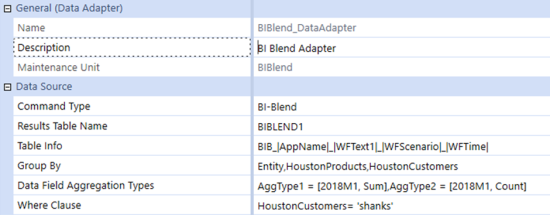
Results Table Name
Define a table name to store the content of the BI Blend adapter query.
Table Info
This defines the name of the BI Blend table name to be queried. This label supports the use of Parameters and Substitution Variables.
Group By
This defines the source database columns, and their order, which are to be returned to the adapter. These labels must match the names specified on the database. Any field to be pivoted must be in the Group by list.
Data Field Aggregation Types
The Data Field Aggregation Type is used to identify which database column should be used as the Measure field. The adapter can support multiple database columns as Measures. Each defined measure can be defined to derive the results as a different Aggregation Type. Parameters and/or Substitution Variables are supported.
-
Sum
-
Min
-
Max
-
Avg
-
Count
The syntax required is to define each Aggregation Type result as a unique key. AggregationType = [databaseColumnName, Type]
-
AggType1 = [2018M1, Count], AggType2 = [2018M1, Sum]
-
AggType1 = [|WFYear|M1, Count]
Where Clause
The is used to “pre-filter” the table. The BI Blend Adapter will query the source table and return all the results to the client for processing, such as for use in a Pivot Grid. The size of the query must be managed to ensure the overall performance of the Dashboard report is optimized. The Where Clause uses standard SQL syntax to define the filters which are applied to the query.
-
DatabaseColumn = ‘Text’
-
DatabaseColumn Like ‘2019%’ - As all columns beginning with 2019
-
DatabaseColumn1 = ‘CostCenter’ And DatabaseColumn2 = ‘Midwest’
Direct Load Reporting Data Adapter Method Types
Dashboard reporting against Direct Load Workflow activity is simplified with specialty Data Adapter Methods.
-
Direct Load Info: Retrieves results from the StageDirectLoadInformation table. Method query example:
{Workflow Profile Name}{Scenario Name}{Time Name}{Filter} -
Stage Summary Target Data: Query designed to automatically determine the method used to manage Summary Target Data, as Row or Blob, and appropriately return the results. Method query example:
{Workflow Profile Name}{Scenario Name}{Time Name}{Filter}
Presenting Data With Books, Cube Views and Other Items › Dashboards
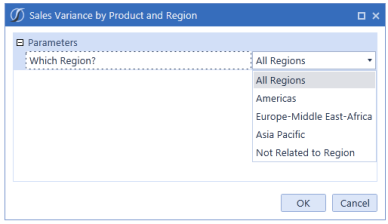
Presenting Data With Books, Cube Views and Other Items › Dashboards
Administrators use the File option to upload images and documents to create personalized, company-specific Dashboards. Items such as PDF report books and Word or Excel Extensible Documents can also be stored and used in Dashboards. You can:
-
Specify a file name and a brief description.
-
Identify the maintenance unit to which the file belongs.
-
Upload or browse to the content file to use.
Presenting Data With Books, Cube Views and Other Items › Dashboards
Presenting Data With Books, Cube Views and Other Items › Dashboards
Similar to the linked cube views, linked dashboards offers more flexibility and ease of use when performing data analysis. It provides the option to launch a dashboard from a cube view when the latter is viewed in either the data explorer grid, the Windows Application Spreadsheet tool, or the Excel Add-In.
When you right-click a cube view data cell, the context menu displays a list of linked dashboards along with linked cube views. Selecting a link launches the linked dashboard in a dialog providing more detail and visibility.
Linked dashboards enhance data analysis, providing an all-encompassing, guided-reporting experience as the data presented in the linked reports is directly related to the main cube view through Bound parameters. It also eliminates the need to incorporate too much detail in a single cube view or dashboard because you can drill down into the details as needed.
Reporting and Linking Objectives
Reporting objectives help you understand how to link the reports and determine what will be built. You should determine the following:
-
Overall purpose of the linked dashboards in relation to the source cube view.
-
The data you want to display via the source cube view as well as the detail data you want to display in the linked dashboards. This may require additional detail cube views.
-
The POV information you want to pass from the source cube view to the dashboard. This determines the Bound Parameters needed on the source cube view.
-
How the POV information will be used in the dashboard. This determines where the Bound Parameters need to be defined.
Data entry example: Using a linked dashboard and cube view for Budget data entry. The objective is to launch an Operating Expense dashboard form from a Budget Review cube view (the source cube view). Linked forms must be specific to the selected entity, time, and account from the source cube view.
Source Cube View Setup
-
Create a source cube view to link to the dashboard and/or cube view.
Source cube view example: The Budget Review cube view displays parent Operating Expense Accounts by scenario. Two Member List parameters are used to select an entity and time period at run time.
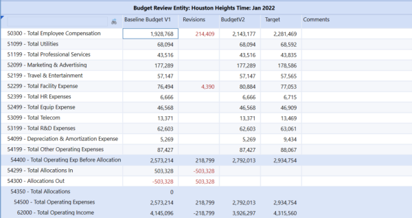
-
Define a Bound Parameter for each POV member you need to pass to the linked reports (this varies and may not always be applicable).
Source cube view Bound Parameters example: The linked form in this example must be specific to the selected entity, time and account from the source cube view. Each of those dimensions require a Bound Parameter.
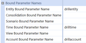
Linked Dashboard Setup
Dashboard setup varies based on the report purpose and how the dashboard and cube views are linked.
The Operating Expense dashboard contains:
-
Button Components: Run specific Save and Workflow Task Actions
-
Combo Box Component: Select a Cost Center
-
Cube View Component: Display an Operating Expense data entry Cube View
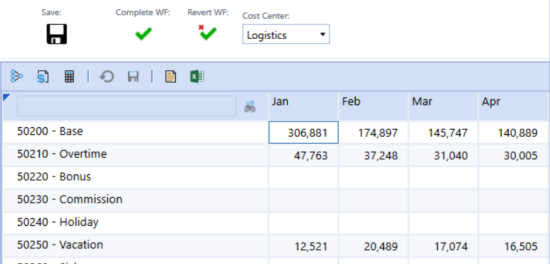
Cube View Bound Parameters in the Linked Dashboard
When using Bound Parameters on the source cube view, it is important to understand how the source cube view’s Bound Parameters relate to the dashboard’s components, and how they impact the dashboard results.
The intent of Bound Parameters is to pass the parameter value in the background rather than through a prompt, thereby creating a seamless navigation experience. Bound Parameters impact the dashboard when there is a member dependency between one of its components and the source cube view.
Passing Bound Parameters from a cube view to a linked dashboard requires:
-
Properly applying them to the component data source.
-
Creating a supplied parameter dashboard component for each cube view Bound Parameter and assigning the components to the dashboard.
Requirement 1
The data source for the dashboard cube view component is an Operating Expense cube view. The results of this cube view are dependent on the source cube view account, entity and time members.
To pass these values, three Bound parameters (drilltime, drillaccount, drillentity) from the source cube view must be assigned to the OpEx (Operating Expense) cube view. This is the cube view assigned to the cube view dashboard component and it must use the same entity member.
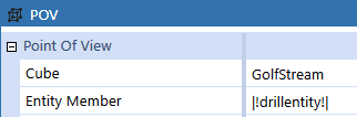
Rows must display the Base Accounts of the source cube view selected parent account:
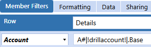
Columns must display time periods based on the selected year in the source cube view:
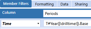
NOTE: The selected Cost Center in the Dashboard combo box is also used by the OpEx cube view. This does not require a cost center (UD1) value/Bound Parameter from the source and is specific to the dashboard functionality.
Requirement 2
The source cube view uses three Bound parameters: drillaccount, drillentity, and drilltime. Each requires three supplied parameter components.
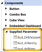
-
Type the name of the respective cube view Bound parameter in the Bound Parameter.
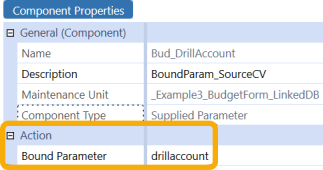
-
Construct and assign dashboard components as normal making sure to include these supplied parameters.
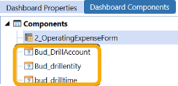
Link the Dashboard to the Cube View
Navigate back to the source cube view and assign the dashboard accordingly. This has the same behavior as linked cube view.
The dashboard is available when you right-click on any cube view data cell.
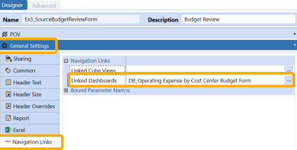
The dashboard is only available when you right-click on data cells in this specific column or row.
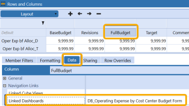
Launch the Dashboard
-
Run the source cube view.
-
Right-click on a data cell (this varies based on where it’s assigned).
-
Navigate to the dashboard.
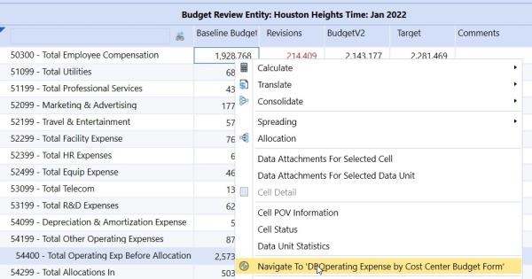
Use Cases
This functionality gives you the ability to drill down to:
-
Interactive dashboards for detailed analysis (for example, the BI Viewer and Advanced Charts)
-
Workspaces
-
Resources
Presenting Data With Books, Cube Views and Other Items › Dashboards
A User’s culture is set in the Culture property field in each User’s configuration. This is located within the Security section in the System tab under Administration.
When the User is selected, a property grid will display. The Preferences tab within the property grid will contain an option for Culture which can be selected from the dropdown field. These options are controlled in the OneStream Server Configuration Utility and additional languages can be added there as needed.
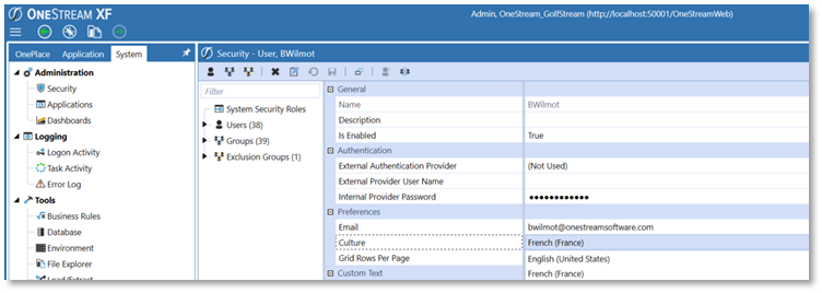
Presenting Data With Books, Cube Views and Other Items › Dashboards › User Culture
Dimension members can have more than one Description to reflect other languages for that culture. The properties for the members will be reflected in cube views and quick views as related to the user’s default or prompted culture settings.
In this example, select the Dimension tab (e.g. Account Dimension shown below). Next select the desired Dimension members (e.g. 61000 – Gross Income) to be updated. In the Descriptions field under the Member Properties tab, enter the translated description (e.g. Result d explotation) next to the language (e.g. French) being updated.
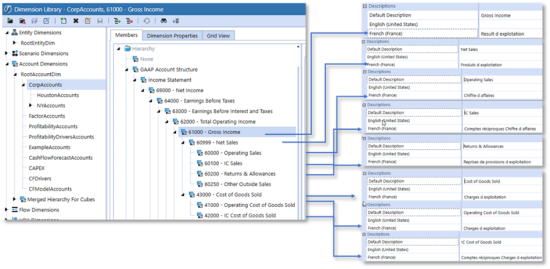
Presenting Data With Books, Cube Views and Other Items › Dashboards › User Culture
Dimension members can have more than one description to reflect other languages for that culture. The properties for the members will be reflected in cube views and quick views as related to the user’s default or prompted culture settings. This can be achieved by making certain changes to the cube view's general settings.
On the Application tab, select Cube Views, then select an existing cube view from Cube View Groups (or create a new one). On the Designer tab click General Settings and then select the Header Text box.
The Culture setting is associated with how the member description will be displayed in the cube view. This setting can be set multiple ways to display in different languages associated with the application. Selecting the ellipsis (…) at the end of the Culture field will provide options to define how the Members are displayed in the cube view:
Current (default) – When blank, reacts the same as Current, which means the current User’s Culture setting is used to apply a Report Alias during cube view rendering.
Invariant will display the members in their Default Description as defined in the item's member properties.
Selecting other cultures (e.g. fr-FR, as shown below) will display members in their respective languages for any User running the cube view. In the example below, we selected a Culture of “fr-Fr” and saved to display the members in French.
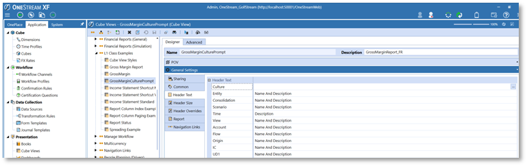
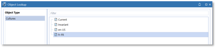
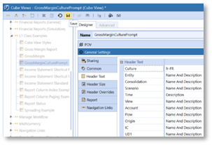
The results display the Account members in French for the given cube view.
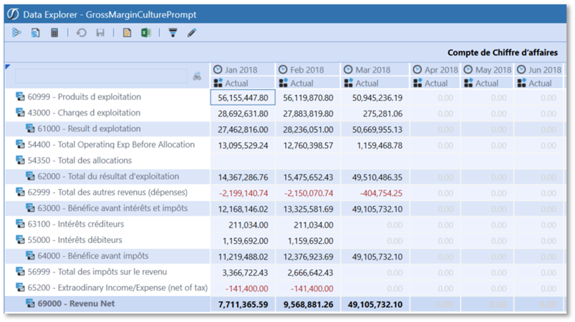
Modify the Culture Setting to Prompt the User for an Alternate Language
The Culture setting can also be set as a prompt to provide the option to change the language each time the cube view renders. The user can type in a Parameter to be used to prompt the user for a culture that will override the user’s culture setting established in their security setup.
Below, the Parameter|!Enter Culture!| was entered in the Culture field.
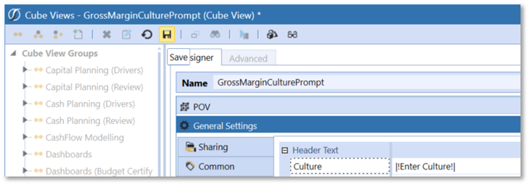
Run the cube view by clicking Open Data Explorer.
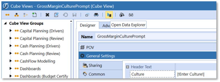
The user is prompted to enter the Culture, which they can type in. Alternatively, there could be a parameter set up under Application Dashboards which is a delimited list of applicable Cultures for this application.
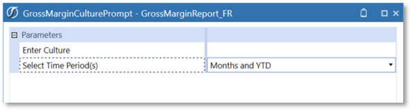
The user can modify the Culture to reflect English by typing in “en-US”.
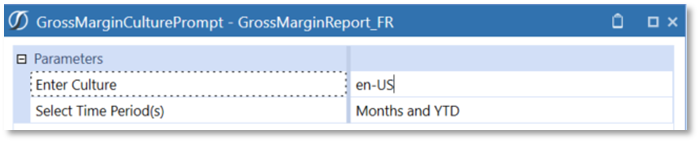
This results in a cube view displayed in English accounts.
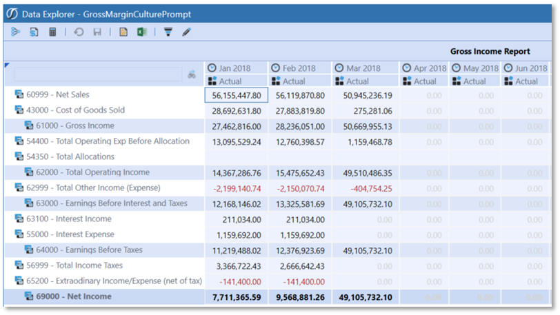
Presenting Data With Books, Cube Views and Other Items › Dashboards › User Culture
Presenting Data With Books, Cube Views and Other Items › Dashboards › User Culture › Alias for Headings: Strings within Dashboard Maintenance Unit
You can use Alias strings with the XFString function to display page captions in another designated culture.
Example: On the Application tab, select Dashboards under the Presentation. In the Dashboard Maintenance Units section, we selected “Test Maint Unit” group.
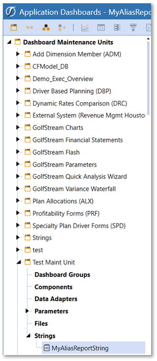
Under the Strings section we used the “Create String” button:
This adds a new String called MyAliasReportingString. This will be used in our Cube View example to display the Page Caption of the Cube View report in multiple languages based on the User’s default culture setting and via a parameter to prompt the user for a specific culture to render that respective language.
Here are the languages in the string:
English (United States): Gross Income Report
French (France): Compte de Chiffre d’affaires
From the General (String), set the Is Localizable value to True
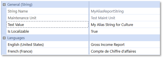
On the Designer tab under Cube View > Common > General, go to the Page Caption section. This section contains an updated with an XFString function to call a string from the Dashboard Maintenance Units.
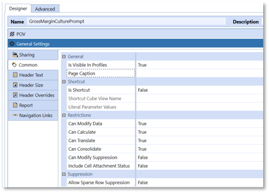
Type in “XFString(MyAliasReportString, Culture=|!Enter Culture!|)” to the Page Caption field and select the Save button. This formula will call the String, “MyAliasReportString.” 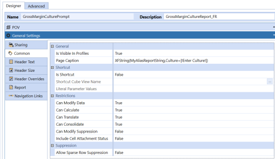
Using a parameter within the Page Caption in this instance will prompt the user to type in the culture of the language they wish the report caption to render.
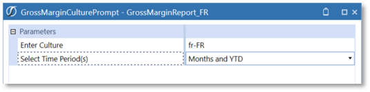
The results shown below reflect the page caption of “Gross Income Report” in French:
“Compte de Chiffre d’affaires”
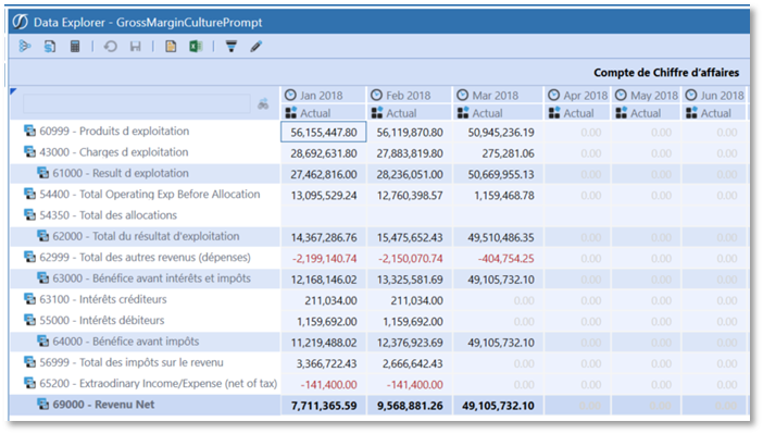
Presenting Data With Books, Cube Views and Other Items › Dashboards › User Culture
Report Alias functionality can make an end user’s reporting analysis or forms entry easier by rendering headings and headers in other languages at runtime so that the user can see these objects in their respective language based on the user’s Culture Property setting. Displaying alias descriptions for Members shown in the Headers of Cube Views as well as alias descriptions for Cube View and Report Headings is supported.
Presenting Data With Books, Cube Views and Other Items › Dashboards › User Culture
If alias properties are populated, the result is translated or alias member names are rendered in the Spreadsheet feature and Excel Add-in from Quick Views, exported Cube Views and using Cube View Connections.
For example, in the Cube View via Data Explorer, click the Export To Excel button.
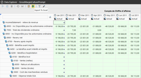
This will render the Cube View in Excel in the respective language.
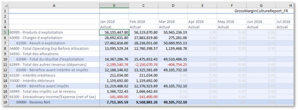
Using Cube View Connections in Spreadsheet and Excel Add-in will also render the Cube View in the language that is established. Open a new or existing Spreadsheet and select Cube Views > Cube View Connections in the OneStream menu.
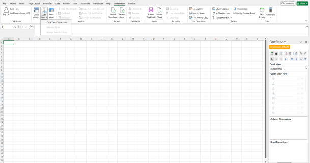
Click Add in the Cube View Connections dialog box.
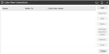
Click the ellipsis in the next Cube View Connection dialog box.
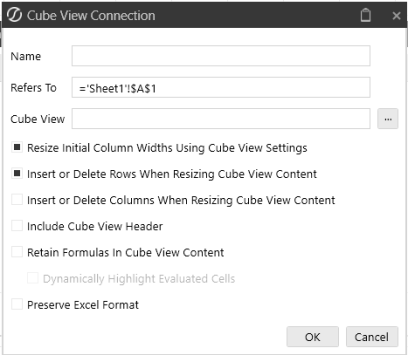
Search for your Cube View (Object Type) and then click the OK button.
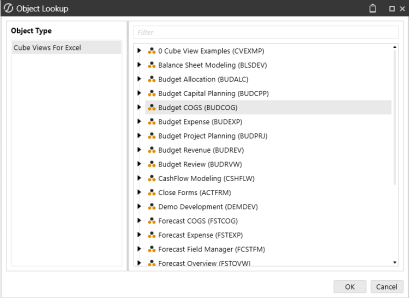
In the Cube View Connection dialog box, check your settings and click OK.
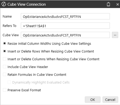
The Cube View selected contains a prompt for Culture and Time Periods. Enter those accordingly and click OK.

This Cube View is now added. Click Close to view the results.
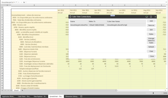
The results of the Cube View connection with the Language updates (Report Alias) in the Cube View.
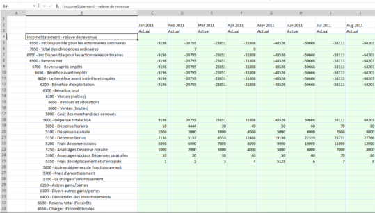
Presenting Data With Books, Cube Views and Other Items
A workspace is a framework for building software using software, creating a robust environment for developing products on the platform. It simplifies the development process and extends development capabilities for solution creators.
Workspaces store maintenance units and facilitate community development by providing an isolated environment for developers to segregate and organize solution objects. Maintenance units are stored, created, and maintained in workspaces, which vary by dashboard project need and application.
Benefits
Workspaces provide an isolated environment in which solution developers and creators can develop multiple solutions to solve complex business processes. Workspaces provide the following benefits:
-
Isolation between workspaces, which allows developers to work on the same solution or dashboard in a sandbox-like environment.
-
Greater flexibility among developers and other team members when testing, making changes, and planning.
-
Maintenance Units, along with their objects, can have the same names in separate workspaces and do not need to be renamed. This reduces the likelihood of naming conflicts especially when importing and exporting objects from other applications or sources.
-
You can selectively share workspace objects such as embedded dashboards, parameters, file resources, and string resources with other workspaces. This lets you reuse objects rather than copying them.
-
Workspace objects can have the same names in different workspaces.
-
Sets the foundation for future functionality and ongoing development.
-
Product packaging mechanism for creating, deploying, and migrating solutions.
Presenting Data With Books, Cube Views and Other Items › Workspaces
The Workspaces page, found on the Application tab and the System tab, is used to create application and system workspaces. The pages look similar between the two tabs.
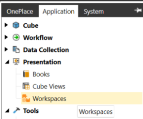
Security Roles
The following security roles and locations are necessary when creating workspaces.
| Role | Location | Property |
|---|---|---|
| Application Security | Application > Tools > Security Roles | ManageApplicationWorkspaces |
| Application User Interface | Application > Tools > Security Roles | WorkspaceAdminPage |
| System Security | System > Administration > Security > System Security Roles | ManageSystemWorkspaces |
| System User Interface | System > Administration > Security > System Security Roles | SystemWorkspaceAdminPage |
Cube Views created prior to version 8.0 are accessible through the Cube View page and the Default Maintenance Unit in the Default Workspace.
The Access Group and Maintenance Group for these cube view groups can be edited if you are assigned to the ManageCubeViews Application security role. If cube views are created within the Workspaces page outside of the Default Maintenance Unit, you cannot edit the security of these cube view groups. Security for these cube views outside the Default Maintenance Unit is controlled by the maintenance unit in which the cube view resides.
With the Application security role, ManageApplicationWorkspaces provides full rights to edit anywhere outside the Default workspace and Default Maintenance Unit. To edit any assemblies, you must be a part of the AdministerApplicationWorkspaceAssemblies security role. This applies to all dashboard groups within the generic default workspace and all non-default workspaces. Maintenance Unit security determines access.
The Access Group and Maintenance Group properties for Data Management Groups are accessible through the Default Workspace and Default Maintenance Unit. They can be edited if you are assigned the ManageData security role along with the WorkspacesAdminPage role to access the Application Workspaces Page.
NOTE: ManageData security role will override access at the Data Management Group security properties of Access Group and Maintenance Group.
Data Management Groups outside of the Default Workspace>Default Maintenance Unit will have the security properties of "Access Group" and "Maintenance Group" completely hidden from the user. Each Workspace and Maintenance Unit has their own Access Groups and Maintenance Group security properties. You will need access to the WorkspacesAdminPage user role to even access the Application Workspaces Page.
The Access Group and Maintenance Group properties for the Legacy Data Management page can be edited if you are assigned to the ManageData security role. You will need access to the DataManagementAdminPage to see legacy Data Management Groups located under Application > Tools > Data Management.
Toolbar Buttons
Several buttons on the Workspaces toolbar work with dashboards, cube views, and data management groups, depending on whether you are working with cube view groups and profiles, dashboard groups and profiles, or data management groups. Tooltips provide helpful hints and are accessed by hovering the cursor over the button.

-
Create Group: Create a new cube view group (if cursor is on the Cube View Groups icon), dashboard group (if on the Dashboard Groups text of a maintenance unit), or data management group (if cursor is on the Data Management icon).
-
Create Profile: Create a new cube view profile (if you have selected a cube view profile) or dashboard profile (if you have selected a dashboard profile).
-
Manage Profile Members: Displays the Profile Builder dialog box if you have selected either a cube view profile or a dashboard profile. If the cube view or dashboard is not in the Default workspace, a tooltip will display the workspace prefix when you hover the cursor over the group name.
-
Create Cube View: Create a new cube view when viewing cube view groups.
-
Create Sequence: Create a new sequence within data management groups.
-
Create Step: Create a new step within data management groups.

-
Delete Selected Item: Delete selected component item. You can select multiple cube views, cube view groups, and data management groups' steps and sequences. You can only delete empty Cube View Groups and multi-select more than one data management sequence and step to delete within the same data management group. Multiple cube views can only be selected and deleted if they are in the same Cube View Group. You cannot delete data management sequences or steps within different data management groups at the same time.
-
Rename Selected Item: Opens the Rename dialog box so that you can rename the selected item.
-
Copy: Makes a copy of the selected items. Select more than one item of the same type by pressing and holding the Ctrl button and clicking each item with the mouse. You can also select the items to copy then right-click to open a context menu. You can only copy items of the same type.
-
Paste: Pastes copied items into the selected destination. "_Copy" is appended to the name of the newly pasted item.
-
Search: Search for a component using the Select Workspace Object dialog box. Cube views and data management sequences and steps are added to the list of searchable objects.
-
Plus Sign: Adds a data management group sequence or step, cube view row or column, or dashboard component.
-
Move Up: Moves up a data management group sequence or step, cube view row or column, or dashboard component.
-
Move Down: Moves down a data management group sequence or step, cube view row or column, dashboard component.
-
Minus Sign: Removes a data management group sequence or step, cube view row or column, or dashboard component.
-
Open Data Explorer or Run: Allows you to view the data explorer grid of the selected cube view. Results will display in a separate tab. Also, allows you to run a data management sequence or step.
-
Show Objects That Reference the Selected Item: Opens the Object Usage Viewer and lists all objects that reference the selected item.
-
Object Lookup: Opens the Object Lookup dialog box letting you search for any object in the application, such as all workspaces that contain data management sequences and any other object.
Presenting Data With Books, Cube Views and Other Items › Workspaces
You can filter workspaces for more control and flexibility to search and browse within the Application Workspace page and System Workspaces page.
Edit Filter
Use Edit Filter to quickly and easily find what you need in the Workspaces tree hierarchy.
-
On the Application tab, under Presentation, click Workspaces.
-
In theApplication Workspacespane, to the right ofWorkspaces, click the vertical kebab (⋮), and selectEdit Filter.
-
Type keywords in the Search bar to search the workspace name and maintenance unit. You must select the Search Binocular icon to initiate search. The tree structure will update based on your search. If a workspace has multiple maintenance units, it will display on your search. Select the Maintenance Units to load and display all children objects.
NOTE: The default state for the Workspace filter will have everything selected, such as All, All workspaces, and All associated maintenance units.
-
Select your workspaces and maintenance units.
-
Click OK button.
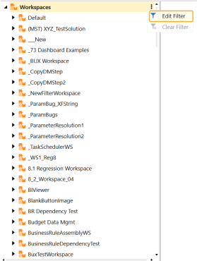
If you select any workspace and maintenance unit besides All, the Application Workspaces page will display (filtered) to let you know there is an active filter. Whenever a workspace filter is on, Dashboard Profiles and Cube View Profiles are grayed out. If you select All, the workspace will not display a filter.
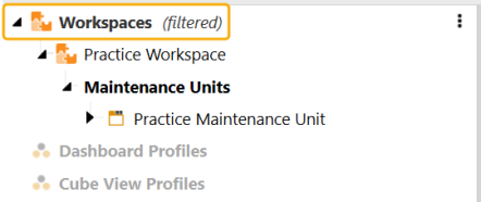
Clear Filter
Use Clear Filter to clear any previously selected and filtered workspace or maintenance unit.
-
On the Application tab, under Presentation, click Workspaces.
-
In theApplication Workspacespane, to the right ofWorkspaces, click the vertical kebab (⋮), and select Clear Filter.
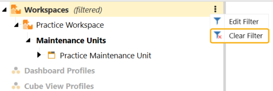
NOTE: If you previously selected a particular workspace or maintenance unit, you have the option to select the Edit Filter to continue filtering or select Clear Filter to clear all filters.
Save Workspaces Filters
Once you have a filter saved on a particular workspace and the associated maintenance units, you will be able to log off and log back into OneStream and the filter will be saved per application. OneStream will save the state of the new workspaces filter unless you select Clear Filter.
NOTE: You can also edit, clear, and save workspaces filters on the System tab, under Administration> Workspaces.
Presenting Data With Books, Cube Views and Other Items › Workspaces
Workspaces are defined and function according to the following conventions.
Naming Conventions
All maintenance unit objects can have the same name as long as they are in separate workspaces.
Default Workspace
A system generated workspace where you can create solutions. All existing maintenance units prior to version 7.3 were moved to the Default workspace.
-
The Default workspace is always shared and is accessible by any other workspace, even if not explicitly added to the Shared Workspaces list.
-
Referencing parameters do not consider workspaces and backward compatibility is enabled.
NOTE: The Default Maintenance Unit only exists on the Application Workspace page.
Properties
The following properties help to define a workspace.
General
Name
Name of a workspace.
Description
Brief description of a workspace.
Notes
Brief notes to add to a workspace.
Substitution Variable Items
Field to define substitution variables to be used within the workspace. Select the ellipses (...) to view, edit, or delete substitution variable items.
NOTE: (Collection) will always be displayed for this property.
Security
Access Group
Manages the users that have access to the workspace.
Maintenance Group
Manages the users that have access to maintain and administer the workspace.
Sharing
Sharing allows developers to selectively share workspace items such as dashboards, parameters, components, and adapters across workspaces when necessary. You should implement all related items in the same workspace to minimize sharing of items from other workspaces. Sharing items across workspaces provides opportunities for re-use of items rather than copying them.
Is Shareable Workspace
If this property is set to True, other workspaces can reference objects in the current workspace.
NOTE: To use Cube Views or Nested parameters within Spreadsheet or Excel AddIn, verify that the Workspaces containing those objects are set to Shareable.
The Default workspace is predefined by OneStream and the Is Shareable Workspace property is always set to True. All other workspaces can reference dashboards and parameters implemented in the Default workspace.
NOTE: The Default workspace is shareable by default and cannot be changed.
The Default workspace also behaves as if all other workspaces are part of its Shared Workspace Names list. Therefore, any dashboard or parameter defined in another shareable workspace can be referenced by items in the Default workspace. This approach simplifies backward compatibility since new workspaces can access all items that previously existed in the Default workspace. However, this requires an implementor to avoid using similar names for items in the Default and custom workspaces.
Shared Workspace Names
This property indicates the workspace names for use in the current workspace. This is a comma-separated (no spaces) list of names that can be used to find embedded dashboards, parameters, file resources, string resources, and so forth while processing a dashboard in this workspace.
Referenced workspaces must have the Is Shareable Workspace property set to True. The search order for a requested item name is the current workspace followed by the Default workspace, then followed by the list of Shared Workspace Names in the order they were entered.
Assemblies
Namespace Prefix
Specify different names used for referencing assemblies in a workspace.
Imports Namespace 1-8
Corresponds to the _ImportsNamespace1 placeholder value within the import statements in code.
Workspace Assembly Service
Type a name for the workspace assembly service factory used to process the dynamic creation of dashboards within this workspace. This property must be configured for the service type assembly files to be used as intended. The syntax for this property is AssemblyName.AssemblyFileName.
Text
Text 1-8
Create string values.
Search Order
Sharing items across workspaces requires a defined search order when the same item name is used more than once. The following is the order of operations:
-
Search the workspace you are currently working in.
-
Search the Default workspace.
-
Search the Shared Workspace Names list.
NOTE: If all items are defined in the Default workspace, search order is irrelevant.
Presenting Data With Books, Cube Views and Other Items › Workspaces

Presenting Data With Books, Cube Views and Other Items › Workspaces
Assemblies are integrated into workspaces to give you the freedom to write logic exactly where you need it. Here, you can write inline business rules using the Assemblies node within a given maintenance unit.
This applies to dashboard-specific business rules only and consists of the following types:
-
Cube View Extender
-
XFBRString
-
Dashboard DataSet
-
Dashboard Extender
-
Spreadsheet
-
Finance Business Rules
Workspace assemblies cater to the OneStream developer community for those who build solutions and create dashboards. They are similar to the Visual Studio product. Developers can add folders and within those folders, they can create any number of C# or VB.Net files depending on the Compiler Language specified in the Assembly Properties tab. These files are then compiled into a single assembly.
The benefits of workspace assemblies extend to OneStream developers, customers, and partners. There are also a variety of service types that assist with the development of Solutions.
Because of the power and flexibility this feature extends to those who use assemblies, it is important to:
-
Inform developers on how to take advantage of assemblies
-
Recognize evolving recommendations on using assemblies
-
Highlight key areas of assemblies to use within the broader community
IMPORTANT: The compiler language field will default to C# when creating an Application or System Workspace Assembly.
OneStream Developers
Developers include:
-
MarketPlace Developers: Engineers creating solutions that reside within the OneStream Solution Exchange for customers and partners supported by OneStream.
-
Solution Exchange Developers: Anyone in the OneStream community who designs solutions featured in Partner Solutions or Community Solutions.
-
PreSales: Sales engineers who create demonstrations and product proof of concept.
-
Consultants: Product implementers building custom solutions for clients.
-
Advanced Application Solutions: Technical team building advanced solutions for customers.
Assembly Encryption
Assembly files can be encrypted. You must be a member of the EncryptBusinessRules security role group. You must be a member of the EncryptBusinessRules security role. Within workspaces assemblies, you can create rules using either C# or VB.Net. Right-click on the file name and select Encrypt File. You will see the Encrypt File dialog box asking you to create a password using the same legacy rules. You can also decrypt files by right-clicking on the encrypted file, selecting Decrypt File, and then entering the previously created password.
Considerations
When calling business rules that reference the GetCubeViewItemUsingName and GetCubeViewItem methods, the methods needs to be updated to include this parameter: bool executeDynamicCubeViewService.
If this is not added to the methods, you will receive an error.
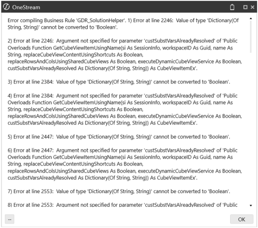
Presenting Data With Books, Cube Views and Other Items › Workspaces › Workspace Assemblies
Assemblies are structured similarly to Visual Studio where you can build assemblies using files and folders. This workspace page is also similar to the Business Rules page in OneStream, allowing you to quickly create assemblies as needed.
The following image of a workspaces page shows the various components you will need to build an assembly.
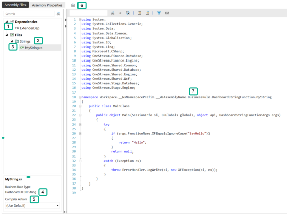
-
Dependencies: Reference other Workspaces assemblies, Business Rules, and Prepackaged assemblies from different workspaces. Right-click on Dependencies to create.
-
Folders: Organize assembly files. Right-click on Files and select Add Folderto create a folder.
-
Files: Written rules for the assemblies source code files, such as business rules, classes, interfaces, and so on. Right-click on Files to create a file.
-
Business Rule Type: Type of business rule or service type. Decided upon during creation and cannot be changed after the file is created. This item will say Not Used if you have selected a service type rather than a business rule type.
-
Compiler Action: Action to perform on the file. Can be Use Default, Disabled, or Compile (this is the same as Use Default). If you select Disabled, you cannot compile the assembly to verify syntax. This value can be changed after creating the assembly file.
-
Compile Icon: Compiles all files in the assembly when clicked.
-
Namespace: The Namespace of any given file will look different than what you would see on the Business Rules page. The filename, in this example, MyString, is the last item in the list.
Presenting Data With Books, Cube Views and Other Items › Workspaces › Workspace Assemblies
Assemblies work similarly to Visual Studio Code, where there is a project with folders, each containing dependencies, such as assemblies and business rules. Assemblies let developers add references to known packages that are part of the standard server install, such as OpenXML. In the OneStream application, assemblies are located within Maintenance Units.
NOTE: If you need to reference an assembly from a business rule, use the following syntax: WS\ followed by the long workspace assembly name. For example, WS\Workspace.wsName.wsAssemblyName.
Follow these steps to create an assembly. In this example, you will use VB.Net.
-
On the Application tab, click Workspaces.
-
Expand Workspaces and locate the workspace.
-
Expand the workspace, then expand Maintenance Units.
-
Expand the appropriate maintenance unit and click the Assemblies label.
You will not see this in the default maintenance unit, which is located in the Default workspace. This maintenance unit only stores cube view groups.
-
Click Create Assembly on the toolbar. Assemblies can be C# or VB.Net.
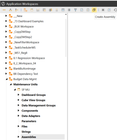
-
On the Assembly Properties page, click the drop-down arrow in the Compiler Language field and select the type of assembly. It can be either C# or VB.Net.

-
Give the assembly a name.
-
Optional. If you need to delete an assembly, while on the Assembly Properties page, click Delete.
-
Click Save.
You have now created an assembly.
Create an Assembly File
The assembly file is where you write the logic. You can choose to write a Business Rule type or a rule of your own (Not Used). The Not Used option provides great flexibility and is a good choice for most developers. Additionally, some performance gains may be realized with this choice.
-
Choose an assembly and click the Assembly Files tab.
-
Right-click on Files and select Add File.
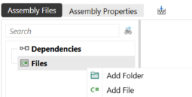
-
In the Add File dialog box:
-
Type a file name.
-
Select a Source Code type. You can choose either Business Rule or Service Type.
-
Select a Compiler Action. You can choose to compile the file when the assembly is compiled. Use Default is the same as Compile.
-
-
Click OK then Save. Your workspace will look similar to the following.
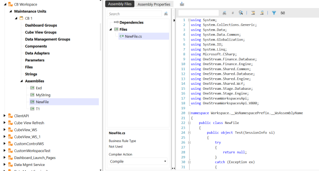
NOTE: You can change Compile Action inside this window but you cannot change the rule type. To do so, you need to delete the file.
Delete an Assembly File
-
Click on the file you would like to delete.
-
On the Assembly Properties tab, click Delete.
Encrypt an Assembly File
You may want others to have access to your Assembly Files. Encryption protects specific assembly files from users who may or may not have access to this workspace. Security can be controlled in the following ways:
-
Workspace level (access and maintenance security)
-
Maintenance unit level (access and maintenance security)
-
Application security roles that prevent others from writing assemblies in the application workspaces page (AdministerApplicationWorkspaceAssemblies)
-
System security roles that prevent others from writing assemblies in the system workspaces page (SystemApplicationWorkspaceAssemblies)
You must be inside the EncryptBusinessRules application security property to perform the following steps.
-
Right-click on an assembly file.
-
Select Encrypt File.
-
Provide a password and click OK. After you have provided a password, the file will be encrypted.
-
Optional. If you would like to decrypt the file, right-click and select Decrypt File.
Create an Assembly Folder
Assembly folders organize your assembly files. To create an assembly folder:
-
Select the assembly then click the Assembly Files tab.
-
Right-click the Files label and select Add Folder.
-
Give the folder a name and click OK.
-
Optional. To add files to the folder, right-click on the folder and select Add File.
NOTE: You cannot drag and drop files into a folder.
Create a Dependency
Dependencies are useful when you have methods within other assemblies or business rules.
-
Right-click the Dependencies label and select Add Dependency.
-
Choose a dependency type:
-
Workspace Assembly: Used when other assemblies might be included in this workspace. If you are creating a dependency with another workspace, you must provide the Shared Workspace Name and this workspace must have the Is Shareable Workspace property set to True.
Here is an example of how you would complete this dependency setup (multiple workspaces can be entered here in a comma delimited list).
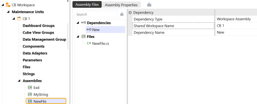
NOTE: If you are creating a dependency within the same workspace, do not fill in the Shared Workspace Name property.
-
Prepackaged Assembly: Assembly automatically included with the OneStream installation.
-
Business Rule: Create dependencies with any business rules located on the Business Rules page. Type the name of the business rule in the Dependency Name property and click Save.
-
After creating dependencies, you might receive an error when compiling the assembly if there is anything incorrect within the assembly or dependency itself.
Important notes when compiling with assemblies:
-
If the Compiler Action is set to Disabled for any dependent assembly file, you will not see an error even if you have issues with your syntax. For example, the following dependent assembly would not produce a syntax error even though one is present.
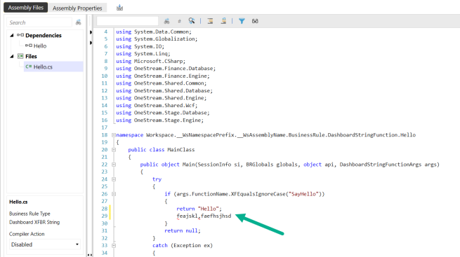
-
Assembly Files properties require you to type in the exact name of the workspace, assembly, and business rule. If incorrect, you will receive a compile error.
Presenting Data With Books, Cube Views and Other Items › Workspaces › Workspace Assemblies
When you create an assembly file, you must choose a source code type. This populates the Business Rule Type property inside the rule. You can choose from two source code types: Business Rule types and Service types.
There are several duplications between Service types and Business Rule types, which provides a choice on how you write rules in assemblies. For example, the XFBR String Service and the Dashboard String Function business rule both function the same. In some cases, you might realize slight performance gains when using Service types as they offer more flexibility.
Business Rule Types
There are two ways to create the various business rule types (cube view extenders, XFBR strings, dashboard extenders, spreadsheets, or data sets):
-
Choosing a business rule type when the assembly is created.
In this section, you will learn more about the first option as this is more familiar to developers who have written business rules in OneStream. However, the recommended action for solution developers is to use the second option due to performance impacts.
Regardless of the option you choose, it is important to be aware of the slight differences when calling rules created as assemblies versus calling business rules.
Dashboard String Function Business Rules in Assembly Files
The following examples of an XFBRString were created as files within assemblies. These types of rules are often referenced throughout the application to more finely tune formatting and display options. These business rules are usually called using the following syntax:
XFBR(RuleName, FunctionName)
However, if this XFBR was created as an assembly, it would look like this:
XFBR(Workspace.WorkspaceName.AssemblyName.FileName, FunctionName)
More information is required to call this rule to ensure correctness, such as:
XFBR(Workspace.MNExamples.New.TestRule, SayHello) or XFBR(Workspace.Current.New.TestRule, SayHello)
For workspace name, you can use the word "Current" to refer to the workspace you are currently in. This is useful when you are referencing rules within objects created in each workspace.
XFBR(Workspace.Current.AssemblyName.FileName, FunctionName)To call an XFBR workspace assembly rule, use this syntax and replace "Current" with the actual workspace name.
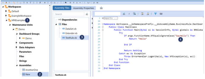
-
Name of the workspace
-
Name of the assembly
-
Name of the assembly file
-
Source code
NOTE: If you are not using “Current” as the workspace name you must have the Is Shareable Workspace property set to True, even if you are referencing the rule within the same workspace. If you do not do this, your rule will not run.
Dashboard Extender Business Rules in Assembly Files
In the following example, when a button is clicked, a dashboard extender rule completes the selected workflow profile.
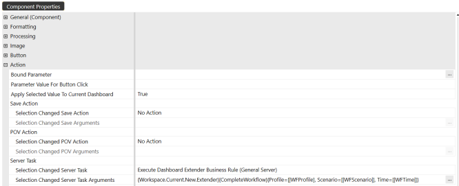
Typical syntax for this rule written in the business rules page would be:
{MyDashboardExtenderBRName}{MyFunction}{Param1=[MyValue1], Param2=[MyValue2]}
Because this is an assembly, however, the rule is modified to provide more specific syntax:
{Workspace.WorkspaceName.AssemblyName.FileName}{MyFunction}{Param1=[MyValue1], Param2=[MyValue2]}
Dashboard Data Set Business Rules in Assembly Files
In this example, a Method Query Data Adapter is referencing a business rule. However, because this was created as an assembly file, appropriate syntax must be used. This type of business rule is typically called with the following syntax:
{MyDataSetBRName}{DataSetName}{Param1=[MyValue1], Param2=[MyValue2]}
Because this is an assembly, it has to be modified:
{Workspace.WorkspaceName.AssemblyName.FileName}{DataSetName}{Param1=[MyValue1], Param2=[MyValue2]}
Spreadsheet Business Rules in Assembly Files
Business rule names are typically chosen by clicking the ellipsis icon in the spreadsheet:
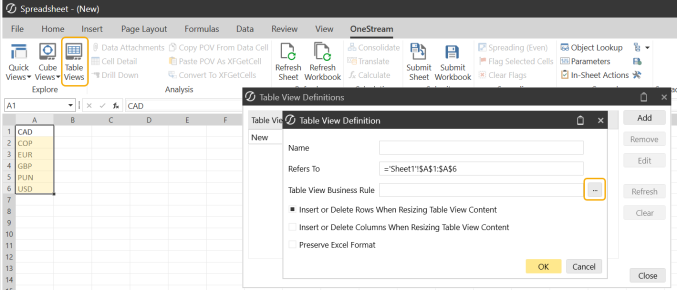
However, if you have created the spreadsheet rule as an assembly file, you will notice that the rule cannot be found by clicking the ellipsis icon. The spreadsheet assembly can still be referenced using the business rules syntax:
Workspace.WorkspaceName.AssemblyName.FileName
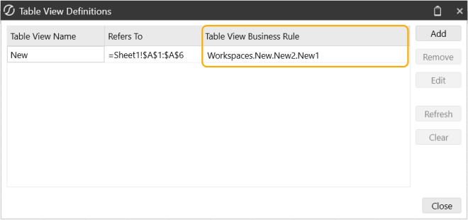
Cube View Extender Business Rules in Assembly Files
Cube view extender rules are commonly used to fine-tune formatting of cube views. You can write these rules directly on a cube view, from the Business Rules page, or through assemblies. These rules run only on the PDF version of the cube view.
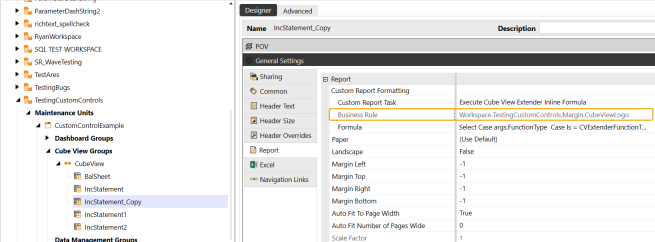
To reference a cube view extender rule that was created as an assembly, you should set the cube view custom report task to "Execute Cube View Extender Business Rule." Refer to the rule using the following syntax:
Workspace.WorkspaceName.AssemblyName.FileName
Do not use the ellipsis icon to select a business rule in this case, as this only provides rules present in the Business Rules page.
Presenting Data With Books, Cube Views and Other Items › Workspaces
Finance Business Rules are integrated into Workspace Assemblies to make it easier to write and maintain business rules. You can write Finance Business Rules using one of the four finance source code types. Developers and Implementers can run the new Finance Business Rules in Workspace Assemblies using data management jobs, BRApi, or by using a dashboard button server task.
The Business Rules name assigned can be modified under the Cube Properties tab in the Business Rules section on the Cubes page. You can also manually type in the Business Rule instead of selecting from the Object Lookup dialog. To use Finance Business Rules in Workspace Assemblies with existing business rules, you can select and copy code from one of the service types and paste it in the same arguments.
NOTE: The following code examples in this section are written in C#.
Finance Service Types
There are four source code service types you can select when creating Finance Business Rules:
-
Finance Core Service
-
Finance Custom Calculate Service
-
Finance Get Data Cell Service
-
Finance Member Lists Service
NOTE: The cases for these Finance Service types have been included in the template code for new Service Factory files as shown below.
Finance Business Rules
 //case WsAssemblyServiceType.FinanceCore:
 // return new WsasFinanceCore();
 //case WsAssemblyServiceType.FinanceCustomCalculate:
 // return new WsasFinanceCustomCalculate();
 //case WsAssemblyServiceType.FinanceGetDataCell:
 // return new WsasFinanceGetDataCell();
 //case WsAssemblyServiceType.FinanceMemberLists:
 // return new WsasFinanceMemberLists();
These business rules are called using the following syntax:
Workspace.MyWorkspaceNameOrNSPrefix.WS
IMPORTANT: These source code types can be written in C# and VB.Net.
NOTE: The same objects are available for use with each finance service type, such as api and args.
Finance Core Service
Finance Core Service allows you to calculate functions. It contains six method types. These six methods are called automatically by the platform from business rules assigned to the Cube. This service is added to Cube Properties. You can separate functions replacing these Select Case blocks on:
-
Calculate
-
Translate
-
ConsolidateShare
-
ConsolidateEliminate
-
GetCustomFxRate
-
GetConditionalInputResult ("NoInput")
Most Implementers will use this service type and implement the following calculate function:
Finance Core Service
        public void Calculate(SessionInfo si, BRGlobals brGlobals, FinanceRulesApi api, FinanceRulesArgs args)
 {
 try
 {
 }
 catch (Exception ex)
 {
 throw new XFException(si, ex);
Finance Custom Calculate Service
Finance Custom Calculate Service allows you to create custom calculations. It contains one method type. This service runs from a data management step. Its dedicated function is responsible for replacing SelectCase blocks.
Finance Custom Calculate
namespace Workspace.__WsNamespacePrefix.__WsAssemblyName
{
    public class FinanceCustomCalculateServiceName : IWsasFinanceCustomCalculateV800
    {
 public void CustomCalculate(SessionInfo si, BRGlobals brGlobals, FinanceRulesApi api, FinanceRulesArgs args)
 {
 try
 {
 }
 catch (Exception ex)
 {
 throw new XFException(si, ex);
 }
 }
    }
}
Finance Get Data Cell Service
Finance Get Data Cell Service allows you to use the GetDataCell expression in the performance section of a dynamic calculation. It contains one method type. This service is called from Cube Views. Its dedicated function is responsible for replacing Select Case blocks.
Finance Get Data Cell
namespace Workspace.__WsNamespacePrefix.__WsAssemblyName
{
    public class FBR3 : IWsasFinanceGetDataCellV800
    {
 public object GetDataCell(SessionInfo si, BRGlobals brGlobals, FinanceRulesApi api, FinanceRulesArgs args)
 {
 try
 {
 return null;
 }
 catch (Exception ex)
 {
 throw new XFException(si, ex);
 }
 }
    }
}
Finance Member Lists Service
Finance Member Lists Service allows you to create a member list. It contains one method type. This service is called from Cube Views. Its dedicated function replaces Select Case blocks and removes the "Headers" blocks.
Finance Member List
namespace Workspace.__WsNamespacePrefix.__WsAssemblyName
{
    public class FBR4 : IWsasFinanceMemberListsV800
    {
 public MemberList GetMemberList(SessionInfo si, BRGlobals brGlobals, FinanceRulesApi api, FinanceRulesArgs args)
 {
 try
 {
 return null;
 }
 catch (Exception ex)
 {
 throw new XFException(si, ex);
 }
 }
    }
}
Dashboard Button Server Task
You can also run a Finance Business Rule with a Custom Calculate using a Dashboard Button Server Task.
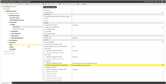
Recompile
Workspace Assemblies will recompile when making updates and changes to them. The following examples indicate when a Workspace Assembly will recompile with Finance Business Rules changes.
Example: If Workspace Assembly A has a dependency on Workspace Assembly B and changes are made to Workspace Assembly B, Workspace Assembly A will recompile.
Example: If a Workspace assembly has a reference to a Business Rule and the Business Rule changes, then the Workspace assembly will recompile. This will then extend to the cube view grids, where if you change a Finance Business Rule, the cube view data will be marked to indicate that the underlying data and Finance Workspace assembly has changed, and therefore must be recalculated.
Object Lookup for Finance Business Rules
The Workspace Assembly Service syntax will display in the following areas:
-
Go to Application > Cubes > Cube Properties > Business Rules. Click on ellipsis to open the Object lookup dialog box that contains the Workspace Assembly Services and Business Rules.
Application Business Rules will display in Object Lookup in the following areas:
-
Go to Application > Business Rules and select the Search toolbar button. This will list the Business Rules.
-
Go to Application> Business Rule > Formula > code editor, click on Object Lookup. This will display all objects including Workspace Assembly Services and Application Business Rules under the Business Rules Object Type.
System Business Rules will display in Object Lookup in the following areas:
-
When logging in to System > Business Rules > Search toolbar button.
-
Go to System >Business Rule > Formula > code editor, click on Object Lookup. This will display all object including Workspace Assembly Services and Application Business Rules under the Business Rules Object Type.
NOTE: In most locations, the OneStream Code Editor will include the Object Lookup, which will display Workspace Assembly Services and Business Rules within the Business Rules Object Type.
Presenting Data With Books, Cube Views and Other Items › Workspaces › Finance Business Rules
-
Go to Application > Presentation > Workspaces.
-
Create an Assembly or select an existing assembly.
-
Create an Assembly file using the Service Factory source code type.
NOTE: The Service Factory file will list the four Finance Business Rules service types.
-
Create a new Assembly File for your Finance Business Rule. When creating an Assembly File, you must select one of the four finance source code types.
-
Finance Core Service
-
Finance Custom Calculate Service
-
Finance Get Data Cell Service
-
Finance Member Lists Service
-
-
Configure the Workspace Service Factory code to enable your service and make updates.
IMPORTANT: The object name must match the file name.
-
Click Save to save all changes.
-
Go to Application > Cubes > Cube Properties > Business Rules. Factories can be referenced from Cube Properties.
TIP: The Business Rules fields are editable.
-
Add a Workspace Assembly Service to your Business Rule. Click the Edit button in the Business Rule field and then use the Object Lookup to copy the Workspace Assembly Services Syntax: Workspace.MyWorkspaceNameOrNSPrefix.WS
-
Replace the "MyWorkspaceNameOrNSPrefix" placeholder text with your Workspace Name or Namespace Prefix. Click Save to save the Business Rule to your Cube Properties.
Presenting Data With Books, Cube Views and Other Items › Workspaces
XF Project extract is for application project designers who are building solutions that span many artifacts, such as workspaces, data management groups, dashboard maintenance units, business rules, cubes, dimensions, cube views, and other artifacts. The application Extract and Load option collects defined objects, such as dashboards and business rules, as a single file export package that can be reloaded as a package.
XF Project is a convenient way to organize workspaces, data maintenance units, or similar solutions into a folder structure that can be integrated with a version control system, such as Git. Developers must create an XML file that is the definition for the contents of the project export.
Project File
Application designers must first manually define an XML file to support the export of objects as a project file. The file is then saved with the .xfProj file extension to a local project folder that also supports a version control system.

The root node of xfProject contains two attributes:
-
TopFolderPath: Creates and defines the starting folder location where the specified files are extracted.
-
DefaultZipFileName: Creates a standard default file name for .zip file extracts.
ProjectItems is a list structure that contains the project items to extract. No attributes needed.
ProjectItem reflects what is needed to extract from OneStream or to load from the file system. It has five attributes:
-
ProjectItemType: The type of the project item. Includes the following types:
-
BusinessRule
-
Cube
-
CubeViewGroup
-
CubeView
-
CubeViewProfile
-
DashboardWorkspace
-
DashboardMaintenanceUnit
-
DashboardFile
-
DashboardString
-
DashboardParameter
-
DashboardGroup
-
DashboardAdapter
-
DashboardComponent
-
Dashboard
-
WorkspaceAssembly
-
DashboardProfile
-
DataManagementGroup
-
DataManagementSequence
-
DataSource
-
Dimension
-
TransformationRuleGroup
-
TransformationRuleProfile
-
-
FolderPath: The name of the subfolder where the project item type is extracted.
-
Workspace: The name of the workspace for the project item.
-
Name: The name of the project item.
-
IncludeDescendants: The default is True and only affects the following project item types:
-
CubeViewGroup
-
DashboardWorkspace
-
DashboardGroup
-
DashboardMaintenanceUnit
-
DataManagementGroup
-
File Extract
You can place the .xfProj file into a local folder, such as your desktop. The defined folder path folders will be generated there as the target location for application exports and loads. There are two file extract options available:
-
.zip: The export option will collect all objects defined in the .xfProj file as a zip file to the location of the .xfProj file.
-
File: Exports all objects defined in the .xfProj file to the folder path locations defined in the .xfproj file.
To use file extract:
-
Navigate to Application > Tools > Load/Extract.
-
Click the Extract tab.
-
Under File Type, select XF Project.
-
Click the ellipses (...) and navigate to the .xfProj file.
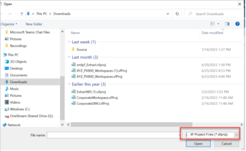
-
(Optional) Select the Extract to Zip checkbox to create an application zip file that contains all defined objects.
-
Click Extract on the toolbar.
NOTE: For XML extract, if you select the file type of “Application Workspaces,” the system will update the third line of code from <applicationDashboardsRoot> to <applicationWorkspacesRoot> on the extract.
For XML load, the system properly loads <applicationWorkspacesRoot>. To support backward compatibility, if you have an XML extract that contains <applicationDashboardsRoot>, the system still loads the older version.
File Load .xfProj
File loading using the defined .xfProj file provides a seamless link to the project files. When you load an .xfProj file you will see the option to merge or replace the target files. The only files affected are those defined by the .xfProj file.
If you select replace, only files that differ for CubeViewGroups, DashboardWorkspaces, DataManagementGroups, DashboardMaintenanceUnits, and DashboardGroups are removed. For all other items, such as business rules or extensibility rules, replace acts as a merge. You can remove files that differ with Assembly file folders as well. If you select Merge, the content of the files are merged and added into the application.
To load an .xfProj file:
-
Navigate to Application > Tools > Load/Extract.
-
Click the Load tab.
-
Under File Name, browse to the .xfProj file and select it.
-
Click Load on the toolbar.
-
Select the load method, either Merge or Replace.
NOTE: For XF Project, when extracting a file, the folder structure is updated from “Application Dashboards” to “Application Workspaces.”
Zip Load
Zip file load functions like any other application file load. The contents of the file are merged into the application. Zip file load is not supported by alternative merge or replace file load options.
Presenting Data With Books, Cube Views and Other Items › Workspaces
Cube views are used for reporting, analysis, and data entry. You can create cube views on the Cube Views page under the Application tab and also build and use them within the Workspaces page.
Depending on your security roles, cube views created on the Cube View Page can be used through the Default Maintenance Unit in the Default Workspace. You can create additional cube views in other workspaces but they cannot be accessed by the Cube View page.
You can load and extract cube views, cube view groups, and cube view profiles using the traditional XML process. The file type of Application Dashboards is renamed to Application Workspaces.
NOTE: When working with cube views that are in the non-default workspace, the workspace must be shareable.
Display Cube Views Page and Groups
There is a new Default folder under Maintenance Units within the Workspaces Default Maintenance Units section. This is where the cube views page and cube view groups reside.
-
On the Application tab, under Presentation, click Workspaces.
-
In the Application Workspacespane, under Workspaces, expand Default > Maintenance Unit > Default > Cube View Groups.
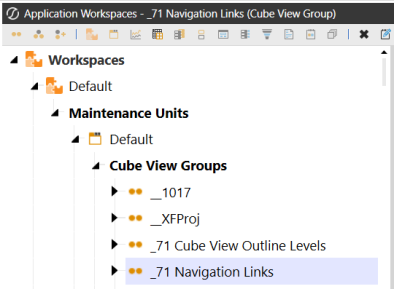
Display Cube View Profiles and Groups
-
On the Application tab, under Presentation, click Cube Views.
-
In the Cube Views pane, expand Cube View Groups or Cube View Profiles.
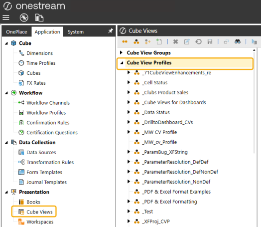
Presenting Data With Books, Cube Views and Other Items › Workspaces
Assemblies can only be written inside Workspaces. This allows for greater flexibility, extraction, and packaging, and it provides the ability to create Dynamic Dashboards, Dynamic Cubes, Dynamic Cube Views, and Dynamic Grids.
You can implement a Service Factory, as described in the following sections, to use Workspaces capabilities.
Runtime Logic
The Service Factory is a dispatcher object that routes requests to run rules to specific objects called Services that can satisfy these requests.
In a basic setup, a Service Factory can have a single service for each type of rule. For example, one is for Data Management calls, and one is for XFBR calls. However, a Service Factory can also invoke multiple services of a specific type, depending on context variables. For example, it could route calls for Data Management jobs to one service from Monday to Friday and then to a different service from Saturday to Sunday.
It is not required to provide a service for every supported type.
Example: If the Service Factory is not used for requests of that type, it may use the traditional approach, and everything will function correctly.
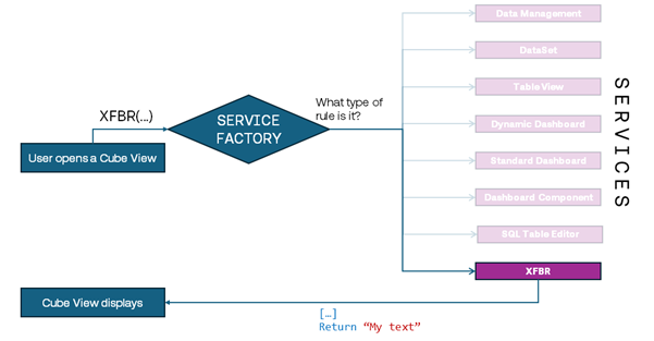
Figure 1 - Example Service Factory execution
Configuration
Step 1: Create a Maintenance Unit for all assemblies within a Workspace.
The first step is organizational, designed to keep all rules within a single location. Create a Maintenance Unit within the Workspace to hold all necessary assemblies. The following image displays multiple Maintenance Units in the Workspace, but only DynamicCode Maintenance Unit contains assemblies. This will be the central location for all rules.
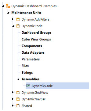
Step 2: Create an assembly file for the Service Factory.
The second step is to create an assembly file with the source code type of Service Factory.
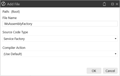
The Service Factory assembly file is needed to take advantage of all items used within assemblies. It should look similar to the following image (the example uses C#):
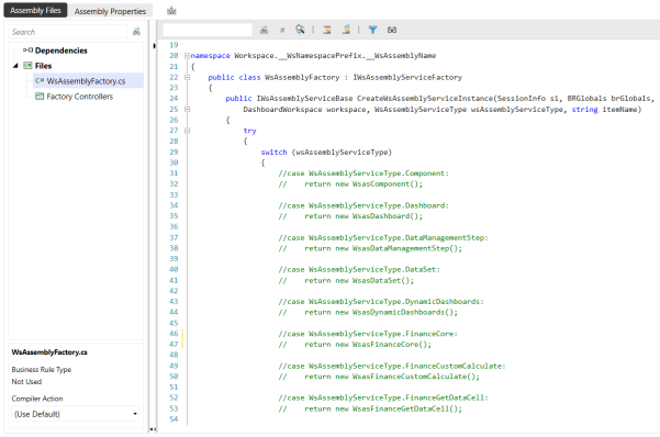
The code allows you to create the following objects:
-
Components
-
Dashboards
-
DataManagementStep
-
DataSet
-
Dynamic Dashboard
-
Dynamic Cube View
-
Finance Business Rules
-
SqlTableEditor
-
TableViews
-
XFBRString
If you are not using any of the objects listed, keep them commented out in the code. Otherwise, you will receive a syntax error when compiling. For example, if you only need the DynamicDashboard call, the Service Factory would look similar to the following image:
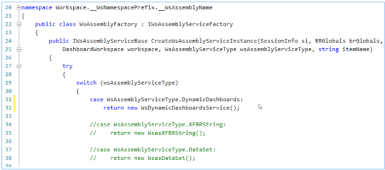
Step 3: Configure the Workspace Assembly Service property.
This last step allows the entire Workspace to use the new Service Factory file so that your rules run correctly.
IMPORTANT: Assembly files will not run correctly if you skip this step.
Go to the Workspace, and update the Workspace Assembly Service to {WsAssemblyName}.{ServiceFactoryName}. For this example, that would be DynamicCode.WsAssemblyFactory.
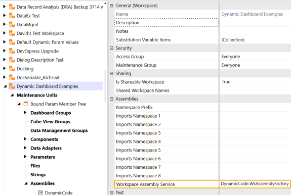
You can also do this on any given Maintenance Unit. As a best practice, you can keep all assembly files in a single Maintenance Unit. You can designate the Workspace and Workspace Maintenance Unit level in all actions.
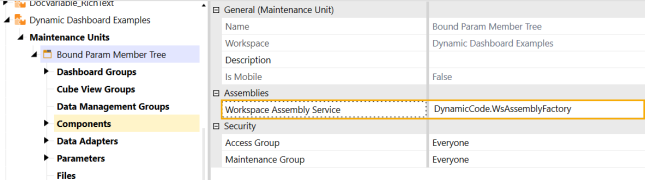
Reference the Service Factory in Properties
Service Factories can be referenced from configuration properties in different ways, depending on their location.
assemblyName.factoryName
This will look for a Service Factory File called factoryName in the Assembly called assemblyName.
This can be used on properties of:
-
Maintenance Unit
-
Workspace
WSMU
This will look for the Service Factory specified on the Maintenance Unit containing the object. If it cannot find it, it will search for the Service Factory specified on the Workspace containing the object. It will fail if it is empty.
This can be used on properties of:
-
Dashboard Components
WS
This will look for the Service Factory specified on the Workspace containing the object. It will fail if it is empty.
This can be used on properties of:
-
Dashboard Components
Workspace.workspaceName.maintenanceUnitName.WSMU
This will look for the Service Factory specified on the Maintenance Unit called maintenanceUnitName in Workspace called workspaceName. It will fail if it is empty.
NOTE: You can specify a Namespace Prefix as workspaceName.
If the specified Maintenance Unit is not in the Workspace containing the object that originates the call, or this syntax is used in Cube Views, the specified Workspace must be set to Is Shareable Workspaces.
This can be used on properties of:
-
Cube Views
-
Dashboard Components
-
Data Management Steps
Workspace.workspaceName.WS
This will look for the Service Factory specified on Workspace workspaceName. It will fail if it is empty.
NOTE: You can specify a Namespace Prefix as workspaceName.
If the specified Workspace is not the one containing the object that originates the call, or this syntax is used in Cube Views or Cube Properties, the specified Workspace must be set to Is Shareable.
This can be used on properties of:
-
Cube Properties
-
Cube Views
-
Dashboard Components
-
Data Management Steps
Workspace.Current.maintenanceUnitName.WSMU
Workspace.Current.Current.WSMU
Workspace.Current.WS
The "Current" keyword can be used to reference the Workspace or Maintenance Unit, without having to fully spell out their names when they contain the object originating the call. This makes the configuration more robust because references will not break if these containers are renamed or duplicated. This syntax will still follow the same Workspace "Is Shareable" and application restrictions and behave the same as the explicit syntax.
These can be used on properties of:
-
Cube Views
-
Dashboard Components
-
Data Management Steps
Examples
Dashboard Components
In this example, you implemented a component service with a function name of “SaveRecord”. This service is enabled by the "MyFactory" Service Factory - Assembly File specified on the same "MyMU" Maintenance Unit within the "MyWorkspace" Workspace, which contains the button component which will invoke the function when selected on a dashboard.
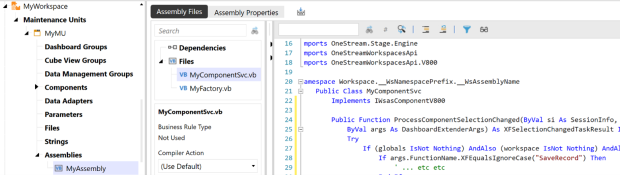
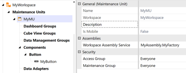
In the property Selection Changed Server Task Arguments of the "MyButton" component, you can have:
{WSMU}{SaveRecord}{}

To invoke the same rule, but from a button component that lives in another Maintenance Unit named "MyMU" in the same Workspace, use:
{Workspace.Current.MyMU.WSMU}{SaveRecord}{}
To invoke the same action from a button component in another Workspace named "MyWorkspace", you must set the property of “MyWorkspace”, and change the Workspace’s “Is Shareable Workspace” field to True, and then use:
{Workspace.MyWorkspace.MyMU.WSMU}{SaveRecord}{}
Data Management Steps
Data Management steps require the expanded syntax. For example, Workspace.MyWorkspace.MyMU.WSMU. However, to make the configuration more robust, if the factory is specified on the same Maintenance Unit that contains the step, use the "Current" keyword:

Member Lists
Cube Views require all referenced factories to be in a shareable Workspaces, even if Service Factories are in the same Workspace as the Cube View. The syntax must be explicit.

In this example, a Member List parameter called “MyMemberList” was created, provided by a Service Factory specified in the properties of Maintenance Unit “MyMU” in Workspace “MyWorkspace”.
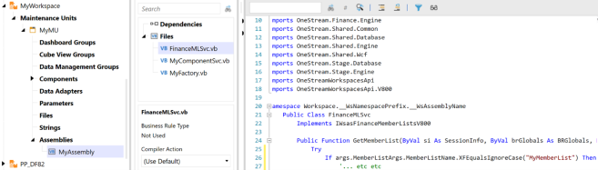
To invoke it from a Cube View, use this syntax:
[Workspace.MyWorkspace.MyMU.WSMU,MyMemberList]

GetDataCell
The same considerations apply as for Member Lists.
Example: GetDataCell(“BR#[Workspace.MyWorkspace.MyMU.WSMU,MyDataCellFunction]”):Name(My Check)

Presenting Data With Books, Cube Views and Other Items › Workspaces › Configure the Service Factory
With the Service Factory set up, you can build any necessary assembly files to bring the workspace to life. The image below shows a sample organization structure of assembly files.
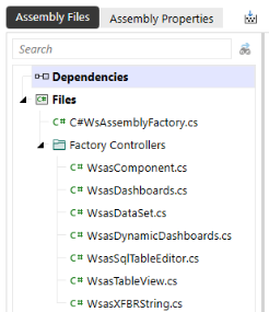
Notice that the Service Factory assembly file is separate, and a folder holds all necessary factory controller files. The workspaces use one of each calls from the Service Factory assembly file.
While you can refer to business rules created as assemblies in other workspaces, you cannot refer to service types from other workspaces. This means a lighter syntax is required when calling business rules throughout the workspace. The following sections highlight the syntax used to reference the service types.
Presenting Data With Books, Cube Views and Other Items › Workspaces › Configure the Service Factory › Organize Service Factory Assembly Files
This service type lets you create an XFBR String within assemblies. You can do this by choosing this service type or by choosing the Dashboard String Function business rule. These rules are generally used to create effects similar to parameters and substitution variables but allow greater flexibility by using code to return string values in dashboards, cube views, and extensible documents.
You must create the XFBR service type file after creating the service factory file and after uncommenting the appropriate lines of code. The following is an example of what this looks like in C#:
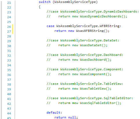
Given the changes in the code, you would configure the assembly file in the following way:
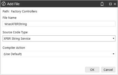
NOTE: The file name should match the return function in the Service Factory file.
The image below shows an example of an assembly file returning a page caption in a dashboard. This is commonly used to query an object or to create a dynamic page caption.

This assembly is then referenced in the Page Caption of the dashboard.
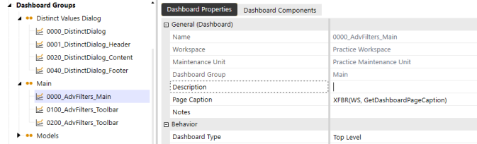
The syntax for referencing this object is XFBR(WS,FunctionName).
The syntax for using the Assembly Service on the Maintenance level is XFBR(WSMU,GetRandomText).
Presenting Data With Books, Cube Views and Other Items › Workspaces › Configure the Service Factory › Organize Service Factory Assembly Files
This service type lets you create a LoadDashboard function type in a dashboard extender rule within assemblies. You can do this by choosing this service type or by choosing the Dashboard Extender business rule type. These rules are usually used to perform custom tasks within workspaces. Developers often use the Dashboard service type with selection components, such as combo boxes to set parameters to a default value or the last selected value.
Create this file after the Service Factory file has been created and the appropriate lines of code have been uncommented. Here is an example of a dashboard service type in C#:

Given the changes in the code, you would configure the dashboard service file in the following way:
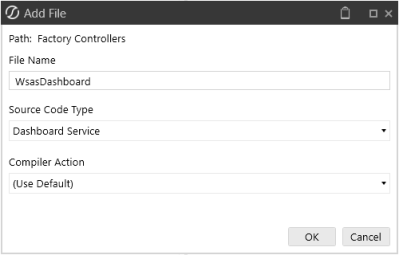
NOTE: The file name should match the return function in the Service Factory file.
The following is an example of an assembly file that is populating default values inside labels:
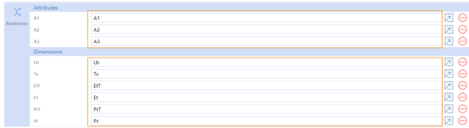
The labels should be populated at runtime, so the assembly file is referenced in the following manner:
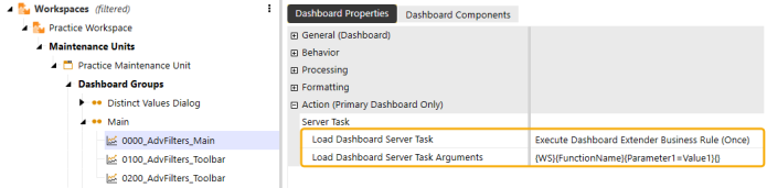
The syntax for referencing this object is {WS}{FunctionName}{Parameter1=Value1}.
The syntax for using the Assembly Service on the Maintenance level is {WSMU}{FunctionName}{Parameter1=Value1}.
Presenting Data With Books, Cube Views and Other Items › Workspaces › Configure the Service Factory › Organize Service Factory Assembly Files
This service type lets you create a ComponentSelectionChanged function type in a dashboard extender rule within assemblies. You can do this by choosing this service type or by choosing the Dashboard Extender business rule type. These rules are usually used to perform custom tasks within workspaces. Developers often use this Dashboard extender rule as it handles all actions occurring due to interactions with dashboard components, such as grids or combo boxes. These rules are referenced in the action properties of a given component.
Create this file after the Service Factory file has been created and the appropriate lines of code have been uncommented. Here is an example of a dashboard service type in C#:

Given the changes in the code, you would configure the dashboard service file in the following way:
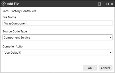
NOTE: The file name should match the return function in the Service Factory file.
The following is an example of an assembly file that is operating the two highlighted icons in the dashboard:
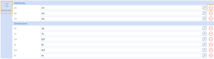
The Randomize icon fills the labels with random values, while the second icon resets the values to their original state. The logic, populated within the assembly file, runs when you click a button.
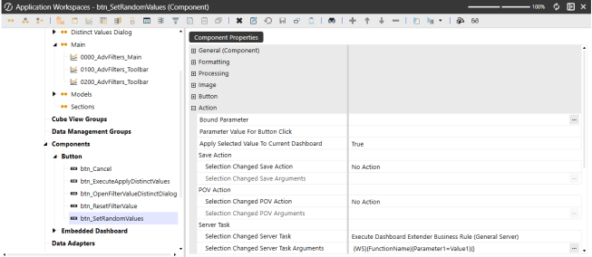
The syntax for referencing this object is {WS}{FunctionName}{Parameter1=Value1}.
The syntax for using the Assembly Service on the Maintenance level is {WSMU}{FunctionName}{Parameter1=Value1}.
Presenting Data With Books, Cube Views and Other Items › Workspaces › Configure the Service Factory › Organize Service Factory Assembly Files
This service type lets you create Data Set logic within assemblies. You can do this by choosing this service type or by choosing the Dashboard Data Set business rule type. These rules are usually queries and return data to data adapters and parameters using a method query.
Create this file after creating the Service Factory file and after the appropriate lines of code have been uncommented. Here is an example of a data set service type in C#:
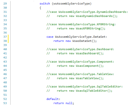
Given the changes in the code, you would configure the dashboard service file in the following way:
NOTE: The file name should match the return function in the Service Factory file.
The following is an example of an assembly file that creates a grid of potential values you might see based on a selection. The assembly file activates when you click on an icon.
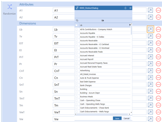
This runs through a method query data adapter that populates the grid component.
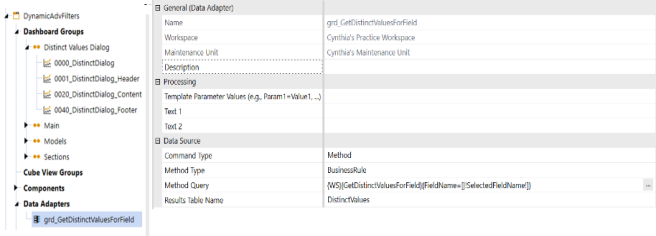
The syntax for referencing this object is {WS}{DataSet}{Parameter1=Value1}.
The syntax for using the Assembly Service on the Maintenance level is {WSMU}{DataSet}{Parameter1=Value1}.
Presenting Data With Books, Cube Views and Other Items › Workspaces › Configure the Service Factory › Organize Service Factory Assembly Files
Dynamic Dashboards allow you to modify components within the dashboard as well as modifying the dashboard itself.
Create a Dynamic Dashboard Service Type assembly file after the Service Factory file has been created. Here is an example of a Service Factory file referencing a Dynamic Dashboard Service type in C#:

Given the changes in the code, configure the dashboard service file in the following way:
NOTE: The file name should match the return function in the Service Factory file.
The example below shows embedded components that have not been created manually in the workspaces interface but are generated by the assembly file.
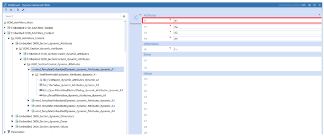
Before writing the assembly, ensure the Dashboard Type property is set to Embedded Dynamic. The rule will not run if you forget this step. This is also where you should ensure the Workspace Assembly Service property is set to the Service Factory assembly file.
There is no special syntax required for referencing this service type.
If you created Dynamic Dashboard Service Type Assembly Files using VB.Net before version 9.0, you need to manually add the new GetDynamicCubeViewForDynamicComponent function to the source code or you will receive this error:
To update and compile pre-Version 9.0 VB.Net Dynamic Dashboard Service files, complete the following steps:
-
Copy the following lines of code to add the GetDynamicCubeViewForDynamicComponent method.
GetDynamicCubeViewForDynamicComponent VB.Net Code
Public Function GetDynamicCubeViewForDynamicComponent(ByVal si As SessionInfo, ByVal api As IWsasDynamicDashboardsApiV800, ByVal workspace As DashboardWorkspace, _
        ByVal maintUnit As DashboardMaintUnit, ByVal dynamicComponentEx As WsDynamicComponentEx, ByVal storedCubeViewItem As CubeViewItem, _
        ByVal customSubstVarsAlreadyResolved As Dictionary(Of String, String)) As WsDynamicCubeViewEx Implements IWsasDynamicDashboardsV800.GetDynamicCubeViewForDynamicComponent
        Try

            If api IsNot Nothing Then
                Return api.GetDynamicCubeViewForDynamicComponent(si, workspace, dynamicComponentEx, storedCubeViewItem, String.Empty, Nothing, TriStateBool.Unknown, WsDynamicItemStateType.Unknown)
            End If

            Return Nothing
        Catch ex As Exception
            Throw New XFException(si, ex)
        End Try
End Function -
Paste the code in the Dynamic Dashboard Service File that is producing the error. You can paste the full function after the GetDynamicParametersForDynamicComponent method. This is after line 93 in the original source code.
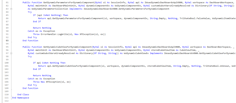
-
Select Compile Assembly to compile the Assembly File.
IMPORTANT: You can utilize new functionalities within Platform Release 8.2 and later versions for service types in C#. While new coding options will work successfully in C#, these new functionalities in Platform Release 8.2 or later may not be compatible with VB.Net.
Presenting Data With Books, Cube Views and Other Items › Workspaces › Configure the Service Factory › Organize Service Factory Assembly Files
This service type enables you to manipulate Cube View formatting and data at runtime by modifying the CubeViewItem object. Create a Dynamic Cube View Service type assembly file after the Service Factory has been created. The following example is a Service Factory file with the case statement for Dynamic Cube Views uncommented. See Implementing Dynamic Cube View Services.
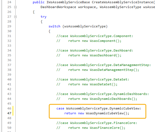
Given the changes in the code, configure the assembly file in the following way from the Add File window:
-
In the File Name field, enter a file name.
-
From the Source Code Type drop-down menu, select Dynamic Cube View Service.
-
From the Compiler Action drop-down menu, select a compiler action. You can choose to Compile or Disable the file. Selecting Disable ignores the file when the assembly is compiled. (Use Default) is the same as Compile.
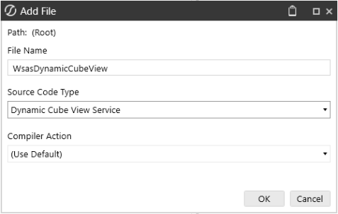
NOTE: The file name should match the return function in the Service Factory file.
Presenting Data With Books, Cube Views and Other Items › Workspaces › Configure the Service Factory › Organize Service Factory Assembly Files
This service type lets you create SqlTableEditorSaveData function type in a dashboard extender rule within assemblies. You can do this either by choosing this service type or by choosing the Dashboard Extender business rule type. These rules are generally used to perform custom tasks in workspaces, such as saving actions within the SQL Table Editor component.
Create this file after the Service Factory file has been created and after the appropriate lines of code have been uncommented. Here is an example of a data set service type in C#:
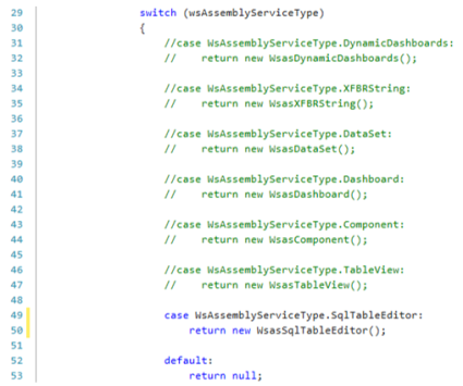
Given the changes in the code, you would configure the assembly file in the following way:
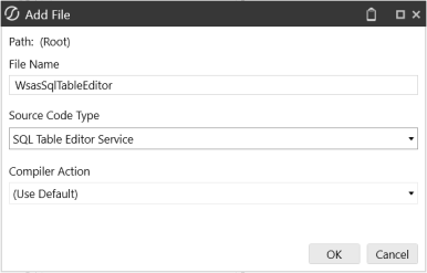
NOTE: The file name should match the return function in the Service Factory file.
The syntax for referencing this object is {WS}{FunctionName}{Parameter1=Value1}, similar to the Dashboard service type and the Component service type.
Presenting Data With Books, Cube Views and Other Items › Workspaces › Configure the Service Factory › Organize Service Factory Assembly Files
This service type lets you create SqlTableEditorSaveData function type in a dashboard extender rule within assemblies. You can do this either by choosing this service type or by choosing the Spreadsheet business rule type. These rules query and edit data that does not live within a cube in the spreadsheet or the Excel Add-In.
Create this file after the Service Factory file has been created and after the appropriate lines of code have been uncommented. Here is an example of a data set service type in C#:
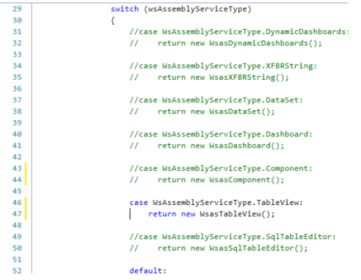
Given the changes in the code, you would configure the assembly file in the following way:
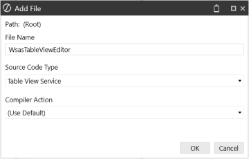
NOTE: The file name should match the return function in the Service Factory file.
The syntax for referencing this object is Workspace.WorkspaceName.AssemblyName.FileName.
Presenting Data With Books, Cube Views and Other Items › Workspaces › Configure the Service Factory › Organize Service Factory Assembly Files
Dynamic Grids enable you to read, write, and transform data from various sources, offering a flexible and high-performance solution for managing large datasets.
Create the Service Factory Assembly File and then the Dynamic Grid Service Assembly File. Then, uncomment the appropriate lines of code. The following example is in the Service Factory Assembly File with the lines for the Dynamic Grid uncommented and highlighted.
NOTE: The file name must match the name of the return function in the Service Factory file.
Configure the Dynamic Grid Service Assembly File with the following options:
-
In the File Name field, enter a name for the file (for example, DynamicGridService).
-
In the Source Code Type drop-down menu, select Dynamic Grid Service.
-
In the Compiler Action drop-down menu, select (Use Default).
There is no special syntax required for referencing this service type.
See Dynamic Grid and Dynamic Grid Service.
Presenting Data With Books, Cube Views and Other Items › Workspaces › Configure the Service Factory
The following common arguments are accepted or made available by many functions.
| Object | Object Type | Description |
|---|---|---|
| si | SessionInfo | Generic information about the current user session, including the type of client. |
| brGlobals | BRGlobals | Generic object to store and retrieve data between calls in the same execution thread. |
| args | DashboardDataSetArgs, DashboardExtenderArgs, ExtenderArgs | Run-specific context properties. |
| workspace | DashboardWorkspace | The Workspace containing the object that is being processed. |
| maintUnit | DashboardMaintUnit | The Maintenance Unit containing the object that is being processed. |
| dynamicDashboardEx | WsDynamicDashboardEx | The dashboard that is being processed. |
| dynamicComponentEx | WsDynamicComponentEx | The component that is being processed. |
| dynamicAdapterEx | WsDynamicAdapterEx | The adapter that is being processed. |
|
customSubstVarsAlreadyResolved |
Dictionary (Of String, String) | Populated dashboard Parameters. |
| nextLevelNameSuffixToAdd | String | In a Repeater configuration, this string is attached to the name of the original component to create the dynamic instance. For example, generated instances are called <originalName>_dynamic_<nextLevelNameSuffixToAdd>. |
| nextLevelTemplateSubstVarsToAdd | Dictionary (Of String, String) | In a Repeater configuration, this dictionary contains the Template Parameters available to repeated objects. |
| convertStoredComponentToDynamic | TriStateBool | To mark the original component as a dynamic version. |
| dynamicItemStateType | WsDynamicItemStateType | How an object is persisted when saving or replicating state across servers. |
Service Factory
The Service Factory class must implement interface IWsAssemblyServiceFactory and contain the following CreateWsAssemblyServiceInstance method:
 public IWsAssemblyServiceBase CreateWsAssemblyServiceInstance(SessionInfo si, BRGlobals brGlobals,
DashboardWorkspace workspace, WsAssemblyServiceType wsAssemblyServiceType, string itemName)Public Function CreateWsAssemblyServiceInstance(ByVal si As SessionInfo, ByVal globals As BRGlobals, ByVal workspace As DashboardWorkspace, ByVal wsasType As WsAssemblyServiceType, ByVal itemName As String) As IWsAssemblyServiceBase Implements IWsAssemblyServiceFactory.CreateWsAssemblyServiceInstanceThe object returned must implement interface IWsAssemblyServiceBase. All supported service types inherit the IWsAssemblyServiceBase interface through their specific interfaces.
wsasType
The type of service that the Service Factory expects to provide. This is used to determine which Service object to return.
itemName
This contains the name of the invoked function if it is present. For example, a Data Set name or a Custom Calculation Function name.
Component Service
The Component Service responds to component-triggered actions in dashboards. It is similar to a feature found in traditional Dashboard Extenders, such as DashboardExtenderFunctionType.ComponentSelectionChanged.
It must implement interface IWsasComponentV800, which requires the following method:
public XFSelectionChangedTaskResult ProcessComponentSelectionChanged(SessionInfo si, BRGlobals brGlobals, DashboardWorkspace workspace, DashboardExtenderArgs args)Public Function ProcessComponentSelectionChanged(ByVal si As SessionInfo, ByVal globals As BRGlobals, ByVal workspace As DashboardWorkspace, _
ByVal args As DashboardExtenderArgs) As XFSelectionChangedTaskResult Implements IWsasComponentV800.ProcessComponentSelectionChangedDashboard Service
The Dashboard Service responds to Dashboard-triggered actions. It is similar to a feature found in traditional Dashboard Extenders, for example DashboardExtenderFunctionType.LoadDashboard.
It must implement interface IWsasDashboardV800, which requires the following method:
public XFLoadDashboardTaskResult ProcessLoadDashboardTask(SessionInfo si, BRGlobals brGlobals, DashboardWorkspace workspace, DashboardExtenderArgs args) Public Function ProcessLoadDashboardTask(ByVal si As SessionInfo, ByVal globals As BRGlobals, ByVal workspace As DashboardWorkspace, _
ByVal args As DashboardExtenderArgs) As XFLoadDashboardTaskResult Implements IWsasDashboardV800.ProcessLoadDashboardTaskData Management Step Service
The Data Management Step Service runs when invoked by a Data Management Step of an Execute Business Rule type. This is similar to a feature found in traditional Extensibility rules, for example ExtenderFunctionType.ExecuteDataMgmtBusinessRuleStep.
It must implement interface IWsasDataManagementStepV800, which requires the following method:
public void ProcessDataManagementStep(SessionInfo si, BRGlobals brGlobals, DashboardWorkspace workspace, ExtenderArgs args) Public Sub ProcessDataManagementStep(ByVal si As SessionInfo, ByVal brGlobals As BRGlobals, ByVal workspace As DashboardWorkspace, _
ByVal args As ExtenderArgs) Implements IWsasDataManagementStepV800.ProcessDataManagementStepData Set Service
The Data Set Service returns a Data Set or DataTable object, often to be processed by a Data Adapter or Bound List Parameter. It is similar to a feature found in traditional Dashboard Data Set rules, for example, DashboardDataSetFunctionType.GetDataSet.
It must implement interface IWsasDataSetV800, which requires the following method:
public object GetDataSet(SessionInfo si, BRGlobals brGlobals, DashboardWorkspace workspace, DashboardDataSetArgs args)Public Function GetDataSet(ByVal si As SessionInfo, ByVal globals As BRGlobals, ByVal workspace As DashboardWorkspace, _
ByVal args As DashboardDataSetArgs) As Object Implements IWsasDataSetV800.GetDataSetDynamic Grid Service
This service type feeds data to the Dynamic Grid Component. It implements interface IWsasDynamicGridV800, which has the following two methods:
This method is called whenever the dynamic grid requests data, such as on the initial page load.
C# Code
public XFDynamicGridGetDataResult GetDynamicGridData(SessionInfo si, BRGlobals brGlobals, DashboardWorkspace workspace, DashboardDynamicGridArgs args)VB.Net Code
Public Function GetDynamicGridData(ByVal si As SessionInfo, ByVal brGlobals As BRGlobals, ByVal workspace As DashboardWorkspace, ByVal args As DashboardDynamicGridArgs) As XFDynamicGridGetDataResult Implements IWsasDynamicGridV800.GetDynamicGridDataDashboardDynamicGridArgs has everything needed to request data, such as start row index, page size, and column filters.
This method is called whenever the user clicks the Save button on the toolbar to save modified rows.
C# Code
public XFDynamicGridSaveDataResult SaveDynamicGridData(SessionInfo si, BRGlobals brGlobals, DashboardWorkspace workspace, DashboardDynamicGridArgs args)VB.Net Code
Public Function SaveDynamicGridData(ByVal si As SessionInfo, ByVal brGlobals As BRGlobals, ByVal workspace As DashboardWorkspace, ByVal args As DashboardDynamicGridArgs) As XFDynamicGridSaveDataResult Implements IWsasDynamicGridV800.SaveDynamicGridDataThe DashboardDynamicGridArgs has everything needed to save data, including a list of modified rows.
Dynamic Cube View Service
This service type enables you to manipulate Cube View formatting and data at runtime by modifying the CubeViewItem object. It must implement interface IWsasDynamicCubeViewV800, which requires the following method:
C# Code
public CubeViewItem GetDynamicCubeViewItem(SessionInfo si, IWsasDynamicCubeViewApiV800 api, DashboardWorkspace workspace, CubeViewItem cubeViewItem, DynamicCubeViewArgs args)VB.Net Code
Public Function GetDynamicCubeViewItem(ByVal si As SessionInfo, ByVal api As IWsasDynamicCubeViewApiV800, ByVal workspace As DashboardWorkspace, _ ByVal cubeViewItem As CubeViewItem, ByVal args As DynamicCubeViewArgs) As CubeViewItem Implements IWsasDynamicCubeViewV800.GetDynamicCubeViewItemDynamic Dashboard Service
The Dynamic Dashboard Service is responsible for preprocessing dashboards at runtime. It provides several hooks to manipulate objects created by dashboards of an Embedded Dynamic Dashboard type or an Embedded Dynamic Repeater Dashboard type. For more information on general strategies, see Dynamic Dashboards
It must implement interface IWsasDynamicDashboardV800, which requires the following method:
 public WsDynamicDashboardEx GetEmbeddedDynamicDashboard(SessionInfo si, IWsasDynamicDashboardsApiV800 api, DashboardWorkspace workspace, DashboardMaintUnit maintUnit,
WsDynamicComponentEx parentDynamicComponentEx, Dashboard storedDashboard, Dictionary<string, string> customSubstVarsAlreadyResolved) Public Function GetEmbeddedDynamicDashboard(ByVal si As SessionInfo, ByVal api As IWsasDynamicDashboardsApiV800, ByVal workspace As DashboardWorkspace, _
ByVal maintUnit As DashboardMaintUnit, ByVal parentDynamicComponentEx As WsDynamicComponentEx, ByVal storedDashboard As Dashboard, _
ByVal customSubstVarsAlreadyResolved As Dictionary(Of String, String)) As WsDynamicDashboardEx Implements IWsasDynamicDashboardsV800.GetEmbeddedDynamicDashboardThis method returns an object representing a completed dashboard of an Embedded Dynamic Dashboard type or an Embedded Dynamic Repeater Dashboard type. Use this function to modify dashboard-specific properties, such as layout or data used by Repeaters. It is considered similar to the LoadDashboard approach of traditional Dashboard Extenders with these significant differences:
-
The method will always be triggered, regardless of embedded status.
-
The method will trigger before any other event is processed. For example, before LoadDashboard extenders would run.
-
The API allows for extensive access to Dashboard Properties.
parentDynamicComponentEx
The dashboard that will embed the dashboard generated by this function.
storedDashboard
The stored dashboard from which the function will generate a dynamic instance.
Implement the GetDynamicComponentsForDynamicDashboard method to modify any component property. This method returns a collection of dynamic components to use on an Embedded Dynamic Dashboard type or an Embedded Dynamic Repeater Dashboard type.
public WsDynamicComponentCollection GetDynamicComponentsForDynamicDashboard(SessionInfo si, IWsasDynamicDashboardsApiV800 api, DashboardWorkspace workspace,
DashboardMaintUnit maintUnit, WsDynamicDashboardEx dynamicDashboardEx, Dictionary<string, string> customSubstVarsAlreadyResolved)Public Function GetDynamicComponentsForDynamicDashboard(ByVal si As SessionInfo, ByVal api As IWsasDynamicDashboardsApiV800, ByVal workspace As DashboardWorkspace, _
ByVal maintUnit As DashboardMaintUnit, ByVal dynamicDashboardEx As WsDynamicDashboardEx, ByVal customSubstVarsAlreadyResolved As Dictionary(Of String, String)) _
As WsDynamicComponentCollection Implements IWsasDynamicDashboardsV800.GetDynamicComponentsForDynamicDashboardImplement the GetDynamicAdaptersForDynamicComponent method to modify any adapter. This method returns a collection of Data Adapters to use on an Embedded Dynamic Dashboard type or an Embedded Dynamic Repeater Dashboard type.
public WsDynamicAdapterCollection GetDynamicAdaptersForDynamicComponent(SessionInfo si, IWsasDynamicDashboardsApiV800 api, DashboardWorkspace workspace,
DashboardMaintUnit maintUnit, WsDynamicComponentEx dynamicComponentEx, Dictionary<string, string> customSubstVarsAlreadyResolved) Public Function GetDynamicAdaptersForDynamicComponent(ByVal si As SessionInfo, ByVal api As IWsasDynamicDashboardsApiV800, ByVal workspace As DashboardWorkspace, _
ByVal maintUnit As DashboardMaintUnit, ByVal dynamicComponentEx As WsDynamicComponentEx, ByVal customSubstVarsAlreadyResolved As Dictionary(Of String, String)) _
As WsDynamicAdapterCollection Implements IWsasDynamicDashboardsV800.GetDynamicAdaptersForDynamicComponentImplement the GetDynamicCubeViewForDynamicAdapter method to modify the Cube View configuration, for example, changing row filters. This method is used to return a Cube View that will be used by a Data Adapter on an Embedded Dynamic Dashboard type or an Embedded Dynamic Repeater Dashboard type.
storedCubeViewItem
The stored Cube View referenced by the Adapter configuration.
public WsDynamicCubeViewEx GetDynamicCubeViewForDynamicAdapter(SessionInfo si, IWsasDynamicDashboardsApiV800 api, DashboardWorkspace workspace,
DashboardMaintUnit maintUnit, WsDynamicAdapterEx dynamicAdapterEx, CubeViewItem storedCubeViewItem, Dictionary<string, string> customSubstVarsAlreadyResolved) Public Function GetDynamicCubeViewForDynamicAdapter(ByVal si As SessionInfo, ByVal api As IWsasDynamicDashboardsApiV800, ByVal workspace As DashboardWorkspace, _
ByVal maintUnit As DashboardMaintUnit, ByVal dynamicAdapterEx As WsDynamicAdapterEx, ByVal storedCubeViewItem As CubeViewItem, _
ByVal customSubstVarsAlreadyResolved As Dictionary(Of String, String)) As WsDynamicCubeViewEx Implements IWsasDynamicDashboardsV800.GetDynamicCubeViewForDynamicAdapterImplement the GetDynamicParametersForDynamicComponent method to modify the configuration or state of any Parameter referenced by components or by the dashboard itself. This method returns a collection of Parameter instances used on an Embedded Dynamic Dashboard type or an Embedded Dynamic Repeater Dashboard type.
public WsDynamicParameterCollection GetDynamicParametersForDynamicComponent(SessionInfo si, IWsasDynamicDashboardsApiV800 api, DashboardWorkspace workspace,
DashboardMaintUnit maintUnit, WsDynamicComponentEx dynamicComponentEx, Dictionary<string, string> customSubstVarsAlreadyResolved) Public Function GetDynamicParametersForDynamicComponent(ByVal si As SessionInfo, ByVal api As IWsasDynamicDashboardsApiV800, ByVal workspace As DashboardWorkspace, _
ByVal maintUnit As DashboardMaintUnit, ByVal dynamicComponentEx As WsDynamicComponentEx, ByVal customSubstVarsAlreadyResolved As Dictionary(Of String, String)) _
As WsDynamicParameterCollection Implements IWsasDynamicDashboardsV800.GetDynamicParametersForDynamicComponentImplement the GetDynamicCubeViewForDynamicComponent method to modify the WsDynamicCubeViewEx that is returned as part of the Dynamic Dashboard creation.
C# Code
WsDynamicCubeViewEx GetDynamicCubeViewForDynamicComponent(SessionInfo si, IWsasDynamicDashboardsApiV800 api, DashboardWorkspace workspace, DashboardMaintUnit maintUnit,
WsDynamicComponentEx dynamicComponentEx, CubeViewItem storedCubeViewItem, Dictionary<string, string> customSubstVarsAlreadyResolved)VB.Net Code
Public Function GetDynamicCubeViewForDynamicComponent(ByVal si As SessionInfo, ByVal api As IWsasDynamicDashboardsApiV800, ByVal workspace As DashboardWorkspace, _
ByVal maintUnit As DashboardMaintUnit, ByVal dynamicComponentEx As WsDynamicComponentEx, ByVal storedCubeViewItem As CubeViewItem, _
ByVal customSubstVarsAlreadyResolved As Dictionary(Of String, String)) As WsDynamicCubeViewEx Implements IWsasDynamicDashboardsV800.GetDynamicCubeViewForDynamicComponentIWsasDynamicDashboardsApiV800
Dynamic Dashboard Services make an API instance of the IWsasDynamicDashboardsApiV800 interface available to their methods. This object has several methods and properties.
| Property Name | Type | Notes |
|---|---|---|
| DbConnFW | DbConnInfo | Open connection to the Framework database. Use this to avoid opening a new connection. |
| DbConnAppOrFW | DbConnInfo | Open connection to the Application database or the Framework database, depending on which dashboard it is run in. Use this to avoid opening a new connection. |
| IsSystemLevel | Boolean | Whether this code is being run as part of a System dashboard. |
| BRGlobals | BRGlobals | Can be used to cache data between runs. |
These are the main types of methods provided by this API object:
GetDynamic*/GetEmbedded*
This is used to load in one or more dynamic instances, typically to modify them.
SaveDynamic*State
This is used to save the state of a particular element.
GetStored*
This is used to load in the configuration of specific elements, typically to modify them.
GetDynamic*/GetEmbedded* Functions
The call provided in the following example will load in memory any instance of the specified storedDashboard dashboard, typically so that some of its properties or components can be modified. convertStoredDashboardToDynamic will determine whether the resulting dashboard should be considered dynamic. This will impact available properties and further running of Services.
WsDynamicDashboardEx GetEmbeddedDynamicDashboard(SessionInfo si, DashboardWorkspace workspace, WsDynamicComponentEx parentDynamicComponentEx, Dashboard storedDashboard, string nextLevelNameSuffixToAdd, Dictionary<string, string> nextLevelTemplateSubstVarsToAdd, TriStateBool convertStoredDashboardToDynamic, WsDynamicItemStateType dynamicItemStateType);The call provided in the following example will load in memory the collection of Component instances necessary to display the dashboard. convertStoredComponentsToDynamic will determine whether the resulting instances should be considered Dynamic. This will impact available properties and further running of Services.
C# Code
WsDynamicComponentCollection GetDynamicComponentsForDynamicDashboard(SessionInfo si, DashboardWorkspace workspace, WsDynamicDashboardEx dynamicDashboardEx, string nextLevelNameSuffixToAdd, Dictionary<string, string> nextLevelTemplateSubstVarsToAdd, TriStateBool convertStoredComponentsToDynamic, WsDynamicItemStateType dynamicItemStateType);The call provided in the following example will generate all repeated dashboards and components necessary to display a Dynamic Repeater dashboard. repeatArgsList is a list containing instances of type WsDynamicComponentRepeatArgs. This is a representation of key value pairs that should be used for each iteration. See Service-based Dynamic Repeater.
C# Code
WsDynamicComponentCollection GetDynamicComponentsRepeatedForDynamicDashboard( SessionInfo si, DashboardWorkspace workspace, WsDynamicDashboardEx dynamicDashboardEx, List<WsDynamicComponentRepeatArgs> repeatArgsList, TriStateBool convertStoredComponentsToDynamic, WsDynamicItemStateType dynamicItemStateType);The call provided in the following example will load in memory an instance of the specified storedComponent Component. This is typically so that some of its properties or components can be modified. convertStoredComponentToDynamic will determine whether the resulting instances should be considered Dynamic. This will impact available properties.
C# Code
WsDynamicComponentEx GetDynamicComponentForDynamicDashboard(SessionInfo si, DashboardWorkspace workspace, WsDynamicDashboardEx dynamicDashboardEx, DashboardComponent storedComponent, string nextLevelNameSuffixToAdd, Dictionary<string, string> nextLevelTemplateSubstVarsToAdd, TriStateBool convertStoredComponentToDynamic, WsDynamicItemStateType dynamicItemStateType);The call provided in the following example will load in memory a collection of Data Adapters necessary to display the specified component instances.
C# Code
WsDynamicAdapterCollection GetDynamicAdaptersForDynamicComponent(SessionInfo si, DashboardWorkspace workspace, WsDynamicComponentEx dynamicComponentEx, string nextLevelNameSuffixToAdd, Dictionary<string, string> nextLevelTemplateSubstVarsToAdd, TriStateBool convertStoredAdaptersToDynamic, WsDynamicItemStateType dynamicItemStateType);The call provided in the following example will load in memory a single Data Adapter necessary to display a component. storedAdapter must be the source Adapter configuration.
C# Code
WsDynamicAdapterEx GetDynamicAdapterForDynamicComponent(SessionInfo si, DashboardWorkspace workspace, WsDynamicComponentEx dynamicComponentEx, DashboardAdapter storedAdapter, string nextLevelNameSuffixToAdd, Dictionary<string, string> nextLevelTemplateSubstVarsToAdd, TriStateBool convertStoredAdapterToDynamic, WsDynamicItemStateType dynamicItemStateType);The call provided in the following example will load in memory a single Cube View, which will be used to provide records for a Data Adapter. dynamicAdapterEx is the source Adapter configuration. storedCubeViewItem is the source Cube View configuration.
C# Code
WsDynamicCubeViewEx GetDynamicCubeViewForDynamicAdapter(SessionInfo si, DashboardWorkspace workspace, WsDynamicAdapterEx dynamicAdapterEx, CubeViewItem storedCubeViewItem, string nextLevelNameSuffixToAdd, Dictionary<string, string> nextLevelTemplateSubstVarsToAdd, TriStateBool convertStoredCubeViewToDynamic, WsDynamicItemStateType dynamicItemStateType);The call provided in the following example will load in memory a collection of Parameter instances necessary to display the provided component.
C# Code
WsDynamicParameterCollection GetDynamicParametersForDynamicComponent(SessionInfo si, DashboardWorkspace workspace, WsDynamicComponentEx dynamicComponentEx, string nextLevelNameSuffixToAdd, Dictionary<string, string> nextLevelTemplateSubstVarsToAdd, TriStateBool convertStoredParametersToDynamic, WsDynamicItemStateType dynamicItemStateType);GetStored* Functions
-
List<DashboardDbrdCompMemberEx> GetStoredComponentsForDynamicDashboard(SessionInfo si, DashboardWorkspace workspace, WsDynamicDashboard dynamicDashboard);
-
DashboardDbrdCompMemberEx GetStoredComponentForDynamicDashboard(SessionInfo si, DashboardWorkspace workspace, WsDynamicDashboard dynamicDashboard, string componentName);
-
DashboardDbrdCompMemberEx GetStoredComponentForDynamicDashboard(SessionInfo si, DashboardWorkspace workspace, WsDynamicDashboard dynamicDashboard, Guid componentID);
Save*State Functions
-
void SaveDynamicDashboardState(SessionInfo si, WsDynamicComponent parentComponent, WsDynamicDashboardEx dynamicDashboardEx, WsDynamicItemStateType dynamicItemStateType);
-
void SaveDynamicComponentState(SessionInfo si, WsDynamicDashboard parentDashboard, WsDynamicComponentEx dynamicComponentEx, WsDynamicItemStateType dynamicItemStateType);
-
void SaveDynamicAdapterState(SessionInfo si, WsDynamicComponent parentComponent, WsDynamicAdapterEx dynamicAdapterEx, WsDynamicItemStateType dynamicItemStateType);
Presenting Data With Books, Cube Views and Other Items › Workspaces
Dynamic Dashboards give developers the ability to build and modify dashboards through code. You use Workspace Assemblies, which enhance the flexibility of your dashboards and reduce the time spent in the user interface. This enables you to build more of your solutions within Workspaces.
NOTE: Dynamic Dashboards should be created by developers.
Implementing Dynamic Dashboard Services
Dynamic Dashboard Services offer unique capabilities because unlike other service types, they do not have an equivalent in traditional Business Rules. Dynamic Dashboard Services provide additional connections in the loading mechanism of a dashboard, enabling developers to customize the dashboard and its components.
The most commonly implemented methods in a Dynamic Dashboard Service are GetEmbeddedDynamicDashboard and GetDynamicComponentsForDynamicDashboard.
Dynamic Dashboard Service Methods
GetEmbeddedDynamicDashboard
This method is run when you display an Embedded Dynamic Dashboard type or an Embedded Dynamic Repeater Dashboard type. The Dynamic Dashboard Service is returned by the Service Factory set in the Maintenance Unit or Workspace containing the dashboard. In the body of this function, developers can access or modify their properties and instantiate in memory all objects necessary to display the dashboard.
In the following example, users can load a dashboard that uses a certain border color by default and change it according to a user-specific property:
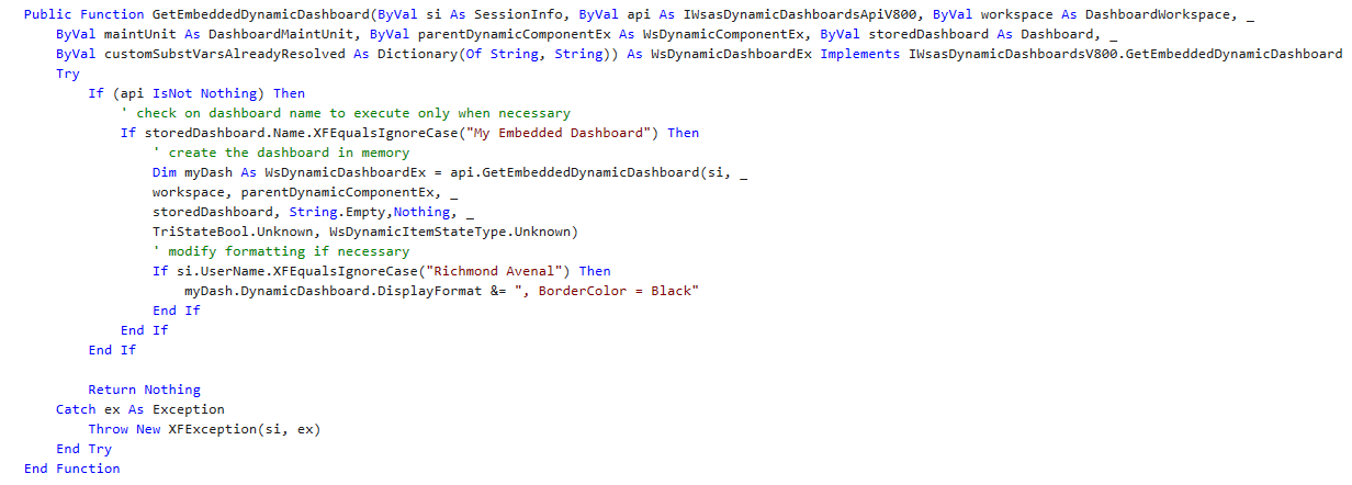
        Public Function GetEmbeddedDynamicDashboard(ByVal si As SessionInfo, ByVal api As IWsasDynamicDashboardsApiV800, ByVal workspace As DashboardWorkspace, _
            ByVal maintUnit As DashboardMaintUnit, ByVal parentDynamicComponentEx As WsDynamicComponentEx, ByVal storedDashboard As Dashboard, _
            ByVal customSubstVarsAlreadyResolved As Dictionary(Of String, String)) As WsDynamicDashboardEx Implements IWsasDynamicDashboardsV800.GetEmbeddedDynamicDashboard
Try
If (api IsNot Nothing) Then
' check on dashboard name to execute only when necessary
If storedDashboard.Name.XFEqualsIgnoreCase("My Embedded Dashboard") Then
' create the dashboard in memory
Dim myDash As WsDynamicDashboardEx = api.GetEmbeddedDynamicDashboard(si, _
workspace, parentDynamicComponentEx, _
storedDashboard, String.Empty,Nothing, _
TriStateBool.Unknown, WsDynamicItemStateType.Unknown)
' modify formatting if necessary
If si.UserName.XFEqualsIgnoreCase("Richmond Avenal") Then
myDash.DynamicDashboard.DisplayFormat &= ", BorderColor = Black"
End If
End If
End If
Return Nothing
Catch ex As Exception
Throw New XFException(si, ex)
End Try
End Function
Users can also create new Repeater items to generate a large number of new components on the page without having to set them up manually. See the use case in Service-based Dynamic Repeater.
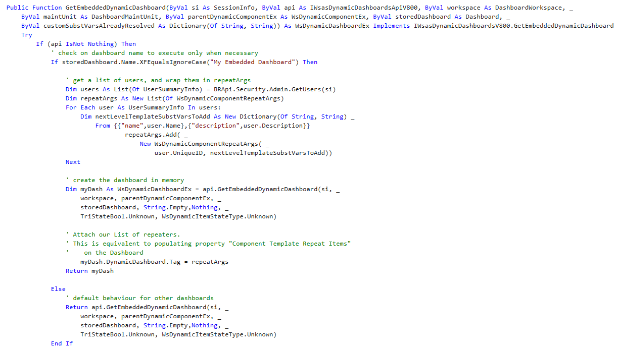
Public Function GetEmbeddedDynamicDashboard(ByVal si As SessionInfo, ByVal api As IWsasDynamicDashboardsApiV800, ByVal workspace As DashboardWorkspace, _
ByVal maintUnit As DashboardMaintUnit, ByVal parentDynamicComponentEx As WsDynamicComponentEx, ByVal storedDashboard As Dashboard, _
ByVal customSubstVarsAlreadyResolved As Dictionary(Of String, String)) As WsDynamicDashboardEx Implements IWsasDynamicDashboardsV800.GetEmbeddedDynamicDashboard
Try
If (api IsNot Nothing) Then
' check on dashboard name to execute only when necessary
If storedDashboard.Name.XFEqualsIgnoreCase("My Embedded Dashboard") Then
' get a list of users, and wrap them in repeatArgs
Dim users As List(Of UserSummaryInfo) = BRApi.Security.Admin.GetUsers(si)
Dim repeatArgs As New List(Of WsDynamicComponentRepeatArgs)
For Each user As UserSummaryInfo In users:
Dim nextLevelTemplateSubstVarsToAdd As New Dictionary(Of String, String) _
From {{"name",user.Name},{"description",user.Description}}
repeatArgs.Add( _
New WsDynamicComponentRepeatArgs( _
user.UniqueID, nextLevelTemplateSubstVarsToAdd))
Next
' create the dashboard in memory
Dim myDash As WsDynamicDashboardEx = api.GetEmbeddedDynamicDashboard(si, _
workspace, parentDynamicComponentEx, _
storedDashboard, String.Empty,Nothing, _
TriStateBool.Unknown, WsDynamicItemStateType.Unknown)
' Attach our List of repeaters.
' This is equivalent to populating property "Component Template Repeat Items"
' on the Dashboard
myDash.DynamicDashboard.Tag = repeatArgs
Return myDash
Else
' default behaviour for other dashboards
Return api.GetEmbeddedDynamicDashboard(si, _
workspace, parentDynamicComponentEx, _
storedDashboard, String.Empty,Nothing, _
TriStateBool.Unknown, WsDynamicItemStateType.Unknown)
End If
End If
Return Nothing
Catch ex As Exception
Throw New XFException(si, ex)
End Try
End FunctionGetDynamicComponentsForDynamicDashboards
This method is run when a Dynamic Dashboard generates the necessary components in memory. Users can specify custom logic to modify the generated components rather than modifying the dashboard as a whole. GetEmbeddedDynamicDashboard and GetDynamicComponentsForDynamicDashboard are often coupled, particularly when using a Repeater configuration. GetEmbeddedDynamicDashboard sets up values for each iteration of the Repeater Template, and GetDynamicComponentsForDynamicDashboard uses these values to configure the repeated components.
For example, users may want to dynamically change an Embedded Component property to display a different Embedded Dashboard. Instead of having to use Parameters that reference Legacy Business Rules within the Maintenance Unit, users can use code in a Dynamic Dashboard Service. See the following example:
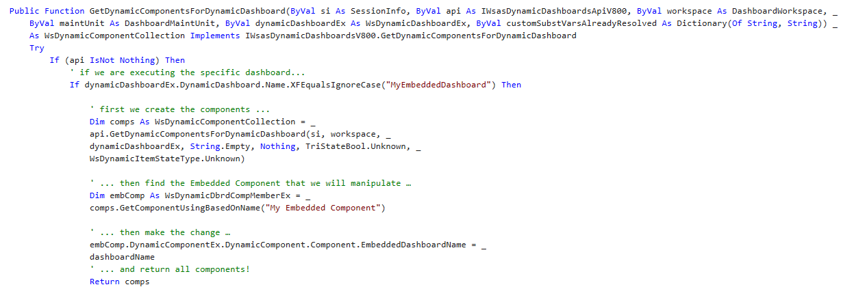
Public Function GetDynamicComponentsForDynamicDashboard(ByVal si As SessionInfo, ByVal api As IWsasDynamicDashboardsApiV800, ByVal workspace As DashboardWorkspace, _
            ByVal maintUnit As DashboardMaintUnit, ByVal dynamicDashboardEx As WsDynamicDashboardEx, ByVal customSubstVarsAlreadyResolved As Dictionary(Of String, String)) _
            As WsDynamicComponentCollection Implements IWsasDynamicDashboardsV800.GetDynamicComponentsForDynamicDashboard
Try
If (api IsNot Nothing) Then
' if we are executing the specific dashboard...
If dynamicDashboardEx.DynamicDashboard.Name.XFEqualsIgnoreCase("MyEmbeddedDashboard") Then
' first we create the components ...
Dim comps As WsDynamicComponentCollection = _
api.GetDynamicComponentsForDynamicDashboard(si, workspace, _
dynamicDashboardEx, String.Empty, Nothing, TriStateBool.Unknown, _
WsDynamicItemStateType.Unknown)
' ... then find the Embedded Component that we will manipulate …
Dim embComp As WsDynamicDbrdCompMemberEx = _
comps.GetComponentUsingBasedOnName("My Embedded Component")
' ... then make the change …
embComp.DynamicComponentEx.DynamicComponent.Component.EmbeddedDashboardName = _
dashboardName
' ... and return all components!
Return comps
End If
End If
Return Nothing
Catch ex As Exception
Throw New XFException(si, ex)
End Try
End FunctionThese are the other methods implemented in a Dynamic Dashboard Service:
-
GetDynamicAdaptersForDynamicComponent
-
GetDynamicCubeViewForDynamicAdapter
-
GetDynamicParametersForDynamicComponent
-
GetDynamicCubeViewForDynamicComponent
These methods are similar to GetDynamicComponentsForDynamicDashboard. They are run when the relevant elements, such as Data Adapters and parameters, are created in memory. To implement these methods, instantiate the elements in memory with the relevant API method, modify them as necessary, and return them. For more information on these methods and their arguments, see API Reference.
Stored Components and Dynamic Components
A Stored Component is any item you create on the Workspaces page, such as a button component. Its configuration is saved in the database and used whenever the component is displayed in a dashboard. When a Stored Component is used in an Embedded Dynamic Dashboard or an Embedded Dynamic Repeater Dashboard, one or more Dynamic Component instances are created in memory. You can modify these instances in the Dynamic Dashboard Service to provide a customized experience without modifying the underlying Stored Component.
Stored Components are represented by traditional classes, such as DashboardComponent and DashboardParameter. Dynamic Components are represented by classes with a Ws prefix, like WsDynamicComponent and WsDynamicParameter.
Presenting Data With Books, Cube Views and Other Items › Workspaces
The Embedded Dynamic Repeater dashboard is a type of dashboard used to add multiple instances of the same component without having to recreate each component individually. Unlike custom controls, you are not required to make additional embedded components. An example is a dashboard that requires the following:
-
Multiple labels that have differing text
-
Many buttons that perform different actions
-
Multiple reports and charts with slight variations in data
NOTE: Embedded Dynamic Repeater dashboards are not visible outside of the Workspaces page.
Recommended Setup
To maintain organization, OneStream recommends you create your first dashboards using the Embedded Dynamic Repeater dashboard type, similar to the following image.
The Repeater Dashboard group contains three dashboards:
-
Child: This dashboard contains the components needed to create a dashboard.
-
Main: This dashboard contains the Embedded Component of the Middle dashboard. Make sure to set the Dashboard Type property to Top Level, Use Default, or Top Level No Parameters. This ensures that the dashboard is visible outside the Workspaces page.
-
Middle: This dashboard has its Dashboard Type property set to Embedded Dynamic Repeater. You will also configure other properties as well. This is where you assign the Embedded Component for the Child dashboard.
Component Template Repeat Items
Whichever dashboard you designate with the Embedded Dynamic Repeater dashboard type it must have a few additional properties configured. Setting the dashboard type to Embedded Dynamic Repeater will activate the Component Template Repeat Items property.
Click the ellipses at the right end of the Component Template Repeat Items property to repeat the component added to this dashboard and to display a dialog box where you can configure additional properties.

In the example above, three versions of the same component have been repeated: FirstMonth, SecondMonth, and ThirdMonth. You must set the following two General settings for each:
-
Template Name Suffix: Added to the name of the dashboard when run.
-
Template Parameter Values: Resolve any parameters in the component or data adapter. In the following image, the Time parameter is resolved differently in each repeated item.
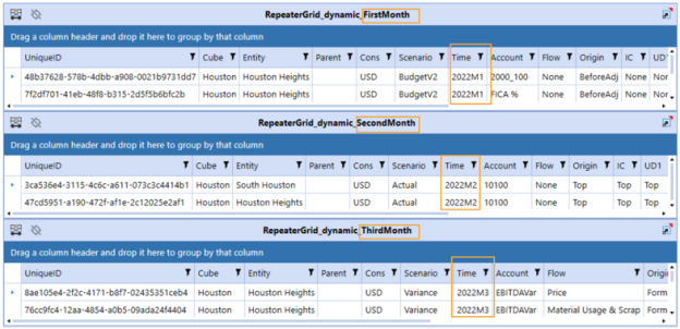
Template Parameters
Template parameters are slightly different than the typical parameters used within OneStream. Template parameters in Embedded Dynamic Repeater dashboards use the following syntax: ~!ParameterName!~.
The following is an example of a template parameter used in a SQL Data Adapter:
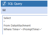
This parameter type does not prompt you for information and can only be resolved through the Template Parameters property.
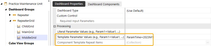
The Component Template Repeat Items property is where you could repeat the component and vary the parameter setting each time. However, the first highlighted property in the above image is where you would resolve the parameter without repeating it.
NOTE: You cannot use this parameter type in cube views.
Embedded Dynamic Repeater in Design Mode
When you are using the Embedded Dynamic Repeater dashboard in design mode, your changes to the dashboard are viewable so that you can see variations. For example, in the following image, it looks as though three separate dashboards, grid components, and data adapters have been added to the Middle Grid dashboard.
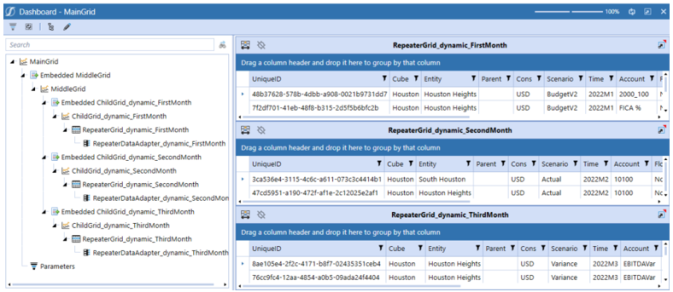
But if you look at the Workspace> Dashboard> Dashboard Component tab , only one embedded component was added.
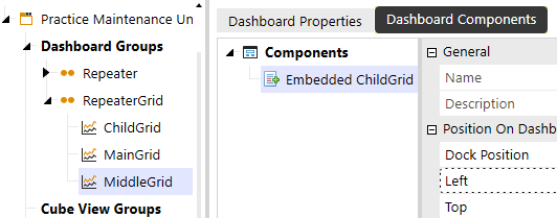
This means that the view in design mode shows different variations configured through the Embedded Dynamic Repeater dashboard components.
Dynamic Bound Parameter
When using an Embedded Dynamic Repeater Dashboard type, any components that use a bound parameter can be dynamically created and repeated to support Template Substitution variables. The syntax is (~|SubstitutionVariable|~). Components that are set up to use bound parameters ensure that template parameters are substituted prior to the execution of a bound parameter.
While in Design mode, you can view the dashboard that displays the Dynamic Bound Parameters in the Tree View. You can click on the Dynamic Bound Parameter to highlight its parent control.
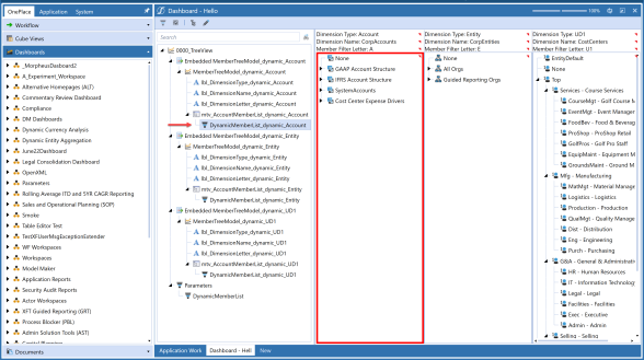
NOTE: A red border will highlight the parent control of the dynamic bound parameter.
Click the Edit Dashboard toolbar button in the Design Mode toolbar when a Dynamic Bound Parameter is selected to navigate to the Workspaces page.
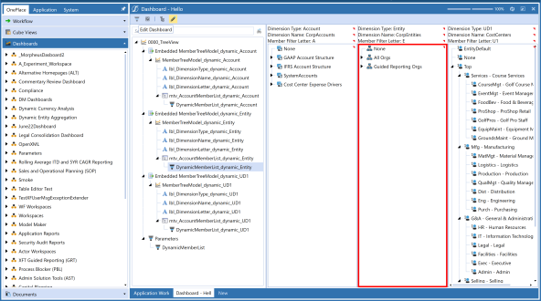
The Parameter will be selected.
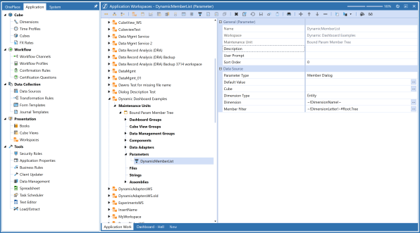
Presenting Data With Books, Cube Views and Other Items › Workspaces › Embedded Dynamic Repeater Dashboard
Dynamic Dashboards can leverage templates to display similar items in the same dashboard, such as a list of icons or multiple grids. You can also trigger this from a Dynamic Dashboard Service Assembly file, which enables you to dynamically generate the list of items. For information on the standard no-code Repeater functionality, see Embedded Dynamic Repeater Dashboard.
USE CASE
Use an Embedded Dynamic Repeater Dashboard to Display User Images and Names
| Role | Benefits |
|---|---|
| Developer: Writes custom code and sets properties. | Users can set up an Embedded Dynamic Repeater Dashboard and add multiple instances of the same components without having to re-create each component individually. |
You want to display user images and names in a Dashboard. Complete the following steps:
-
Create an image component and a label component. See Component Display Format Properties. In this use case, each component is configured with template parameter values variables. These are populated by the RepeatArgs in the code. When the template runs, it is replaced with the actual image URL or name.
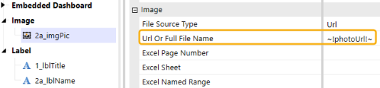
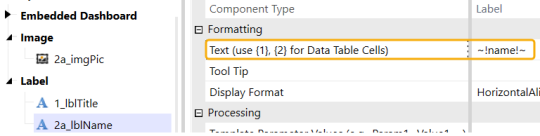
-
Create an Embedded Dashboard. See Dashboard Properties. In the Dashboard Components tab, add the image and label components to the Embedded Dashboard.
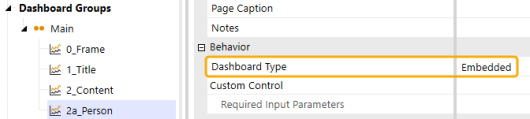
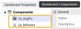
-
Create an Embedded Dynamic Repeater Dashboard. See Embedded Dynamic Repeater Dashboard. In the Dashboard Components tab, add the Embedded Dashboard Component. When the Embedded Dynamic Repeater Dashboard runs, it will repeat this Embedded Dashboard Component for each user. 0_Frame dashboard contains the Embedded Dashboard Components for 1_Title and 2_Content dashboards.
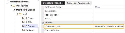
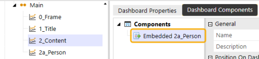
-
In this use case, the Maintenance Unit's Workspace Assembly Service property is set to ITAssembly.MyServiceFactory. This property matches the ITAssembly Assembly which contains the MyServiceFactory Assembly file. This assembly will return the services.
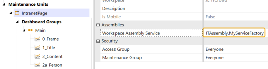
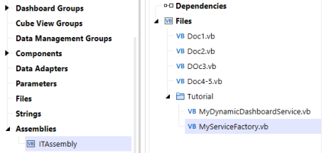
-
In the MyServiceFactory Assembly file, the following code is the request you need to enable the processing of Dynamic Dashboards. This code returns what is set in the MyDynamicDashboardService file in the same Assembly.
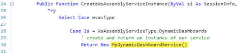
-
The MyDynamicDashboardService Assembly file's default source code contains various automatically created methods. Fill in the sections required to display the user images and user names.
The logic starts with GetEmbeddedDynamicDashboard. Use this to retrieve the list of users and set them in a data structure to keep track of the user images and user names.
-
Build a dictionary with a list of these RepeatArgs.
-
Create the dashboard in memory and add that RepeatArgs, the list of objects containing the user images and user names, to this Tag object.
-
After the dashboard has built the list and ran the method, it calls the GetDynamicComponentsForDynamicDashboard method, which generates each individual object.
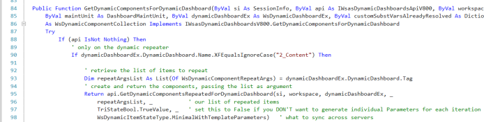
This is the result. When this dashboard is run, it will display the corresponding user images and user names.
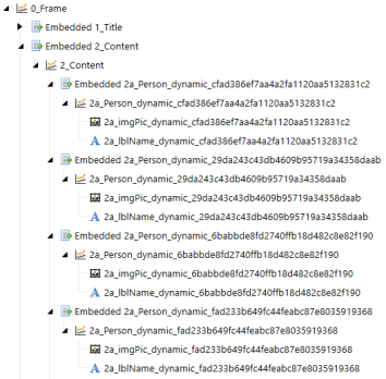
Presenting Data With Books, Cube Views and Other Items › Workspaces
Dynamic Cube Views give developers the ability to build and modify Cube Views through code. Developers can modify existing Cube Views at runtime to configure what is presented. Any property a developer can set for a Cube View in the user interface can also be set in the Assembly file when configuring a Dynamic Cube View.
NOTE: Dynamic Cube Views should be created by developers.
Complete the following steps to set a Cube View as dynamic:
-
Navigate to the Workspace and Maintenance Unit.
-
From Cube View Groups, select the Cube View.
-
Navigate to Advanced > Cube View Properties > Dynamic and set the Is Dynamic field to True. If you are using the Designer tab, go to General Settings > Common > Dynamic.
NOTE: If the Is Dynamic property is set to False, the Cube View will display what is set in the Designer and Advanced tabs' user interfaces and ignore anything set in the assembly file.
Complete the following steps to set up a new assembly for a Dynamic Cube View:
-
Create an assembly under the same Maintenance Unit that contains the Dynamic Cube View.
-
Create a file under the new assembly. See Create an Assembly.
-
In the Add File dialog box, enter a file name. From the Source Code Type drop-down menu, select Service Factory. See Configure the Service Factory.
-
-
Create another assembly file. This will be used in the Service Factory.
-
In the Add File dialog box, enter a file name.
-
From the Source Code Type drop-down menu, select Dynamic Cube View Service.
-
-
Open the Service Factory file you created in step 2.
-
Uncomment the case statement for Dynamic Cube Views.
-
Replace the returned class with the name of the file created in step 3.
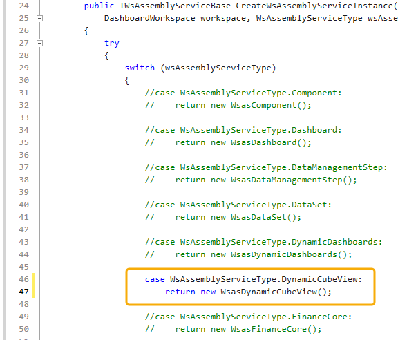
-
-
Select the Workspace. Under Assemblies, update the Workspace Assembly Service property to {WsAssemblyName}.{ServiceFactoryName}.
-
The Service Factory will return an instance of the WsasDynamicCubeView class you created in step 3 for any Cube View that has its Is Dynamic property set to True. To target a specific Cube View in the Dynamic Cube View Service, enter the CubeViewItem's Name property.
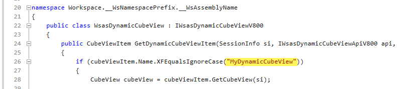
Presenting Data With Books, Cube Views and Other Items › Workspaces › Dynamic Cube Views
Any property that you can set in the Cube View Advanced and Designer tabs can be set in code through your Dynamic Cube View Service.
This example displays sample configurations of common Cube View Properties.
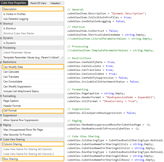
This example displays the Point Of View properties configured in code, which includes a Literal Parameter containing the string Actual set to the Scenario Member.
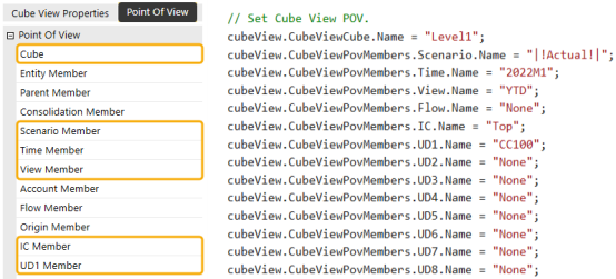
This example displays configuration to the Column Header properties.
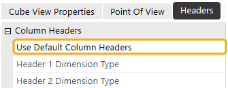

This example displays configuration to the Column Members properties.
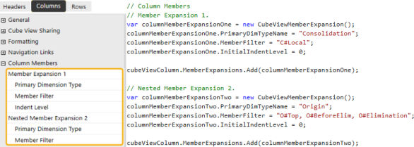
This example displays the Row Members, Suppression, and Column Overrides properties configured in code.
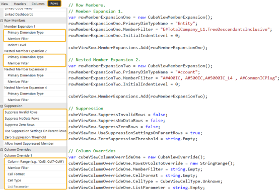
Use the cubeViewItem.GetCubeView and cubeViewItem.SetCubeView methods to retrieve and set Cube View data for your Dynamic Cube View. Enter these methods to use an existing Cube View and add the defined properties for configuration.
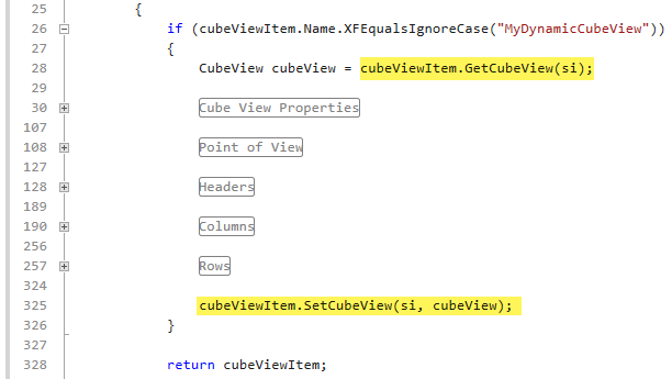
Presenting Data With Books, Cube Views and Other Items › Workspaces
Data Management objects, such as groups, sequences, and steps are used to run common tasks and processes through a series of steps and sequences. You can create data management objects on the Data Management page under the Application tab and also build and use them on the Workspaces page.
NOTE: Data Management Profiles will not be displayed in the user interface.
Display Data Management Groups
There is a Default folder under Maintenance Units in the Default Workspace and Default Maintenance Units section. This is where the legacy data management objects from the Data Management groups page reside.
-
On the Application tab, under Presentation, click Workspaces.
-
In the Application Workspaces pane, under Workspaces, expand Default > Maintenance Units > Default > Data Management Groups.
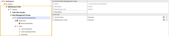
Display Data Management Groups (Non-Default Maintenance Unit)
Data management groups also display under a Default Workspace, under the Non-Default Maintenance Unit.
-
On the Application tab, under Presentation, click Workspaces.
-
In the Application Workspaces pane, under Workspaces, expand Maintenance Units, locate the maintenance unit, and expand Data Management Groups.
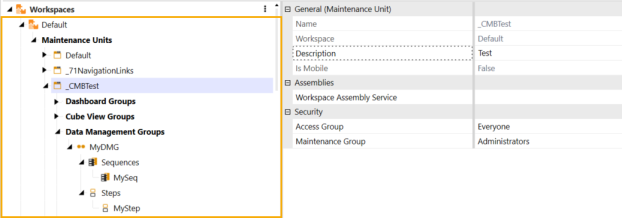
Display Data Management Groups (Non-Default Workspace)
Data management groups also display under a Non-Default Workspace.
-
On the Application tab, under Presentation, click Workspaces.
-
In the Application Workspaces pane, under Workspaces, locate the workspace and expand it. Then expand Maintenance Units, locate the maintenance unit, and expand Data Management Groups.
Display Data Management Groups Profiles
Data management group profiles will not be displayed in the user interface under the Data Management page under the Application tab or on the Workspaces page.
NOTE: The following Data Management Profile tables still exist if you are using Data Management Profiles: DataMgmtProfile, DataMgmtProfileMember, AuditDataMgmtGroup and AuditDataMgmtProfileMember.
Presenting Data With Books, Cube Views and Other Items › Workspaces › Build Data Management in Workspaces
Data Management objects, such as sequences and steps, can be copied, pasted, and deleted in the workspace to maintain existing applications and create new solutions.
Copy and Paste Sequences and Steps in Workspaces
When copying a data management sequence, it will copy and paste the associated data management steps. When selecting a data management step to copy and paste, it will only copy the specific data management step not the associated data management sequence.
You can copy and paste data management steps and sequences to a different data management group in the same workspace and maintenance unit.
-
In the Application Workspaces pane, under Workspaces, locate the workspace and expand it. Then, expand Maintenance Units, select and expand the maintenance unit, and expand a specific Data Management Groups.
-
Select the data management sequence and then either right-click and select copy or click
 to copy your sequence to another data management group within the same maintenance unit.
 -
Select a data management group in the same maintenance group to paste your copied sequence to and either right-click and select paste or click
 to paste.
If there are associated data management steps, they will also be copied and pasted to the data management group. The copied sequence name will append “_Copy” to the end of the name in the same maintenance unit and workspace.
NOTE: Sequence names must be unique in a workspace within the same maintenance group or in a workspace with a different maintenance unit or data management group, which will append "_Copy" to a copied sequence.
You can also copy and paste data management sequences and steps to another workspace.
-
In the Application Workspaces pane, under Workspaces, locate the workspace and expand it. Then, expand Maintenance Units, select and expand the maintenance unit, and expand Data Management Groups.
-
Select the data management sequence and then either right-click and select copy or click
 to copy your sequence to another workspace data management group.
 -
Select the other workspace to paste your copied sequence to and then either right-click and select paste or click
 to paste.
The copied sequence name will display in the new Workspace data management group without “_Copy” and as the copied sequence name.
NOTE: When copying and pasting steps and sequences to another workspace, the sequence name will appear as is since it is not located in the same maintenance unit and workspace.
If you multi-select and highlight a data management sequence and its associated data management steps, you will not be able to use the copy functionality. You can copy multiple sequences and steps at a time but cannot multi-select and copy both sequences and steps in the same instance.
Delete Sequences and Steps in Workspaces
You can multi-select more than one data management sequence and data management step to delete within the same data management group.
-
In the Application Workspaces pane, under Workspaces, locate the workspace and expand it. Then, expand Maintenance Units, select and expand the maintenance unit, and expand Data Management Groups.
-
Use the CTRL key to select multiple data management sequences and data management steps not grouped together.
- Click
 to delete the selected data management sequences and steps.
NOTE: You cannot delete data management sequences or steps within different data management groups at the same time. Selecting data management items in different data management groups will disable the delete functionality.
Run Sequences or Steps in Workspaces
In the Application Workspaces page, you can run or modify existing data management objects.
To run a sequence:
-
In the Application Workspaces pane, under Workspaces, locate the workspace and expand it. Then, expand Maintenance Units, select and expand the maintenance unit, and expand Data Management Groups.
-
Select the data management sequence in the data management group.
-
Select the
 Run button to run the data management sequence.
 -
You will get a confirmation box asking if you are sure you want to run the data management sequence. Click the OK button.
NOTE: Running a sequence without steps added to it will produce an error message.
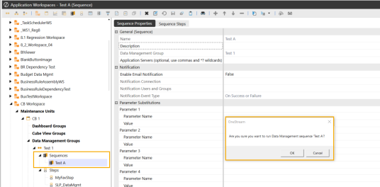
To run a step:
-
In the Application Workspaces pane, under Workspaces, locate the workspace, and expand it. Then, expand Maintenance Units, select and expand the maintenance unit, and expand Data Management Groups.
-
Select the data management step in the data management group.
-
Select the
 Run button to run the data management step.
 -
You will get a confirmation box asking if you are sure you want to run the data management step. Click the OK button.
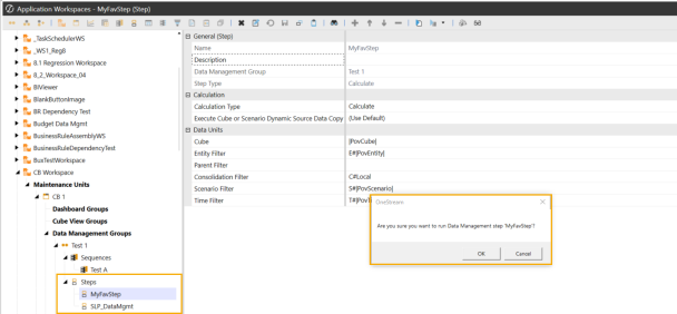
IMPORTANT: REST API Previous API 7.2.0 and 5.2.0 will accept an optional Workspace Name for Data Management Sequence. See OneStream Web API Endpoints.
Presenting Data With Books, Cube Views and Other Items › Workspaces › Build Data Management in Workspaces
Display Data Management Export Sequences
-
On the Application tab, under Data Collection, click Data Sources.
-
Expand Data Mgmt Export Sequences and select a data management export sequence.
-
Under Data Management Settings, in the Data Export Sequence Name field, click the ellipsis (...).
-
On the Object Lookup dialog box, select the Data Management Sequence based on the workspace location.
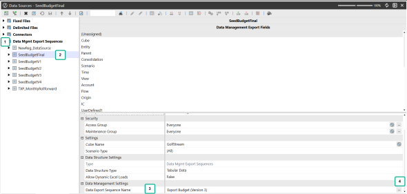
NOTE: You can select Data Management Sequences from the following areas: Default Workspace/Default Maintenance Unit, Default Workspace/Non-Default Maintenance Unit, and Non-Default Workspace for the Data Export Sequence Name.
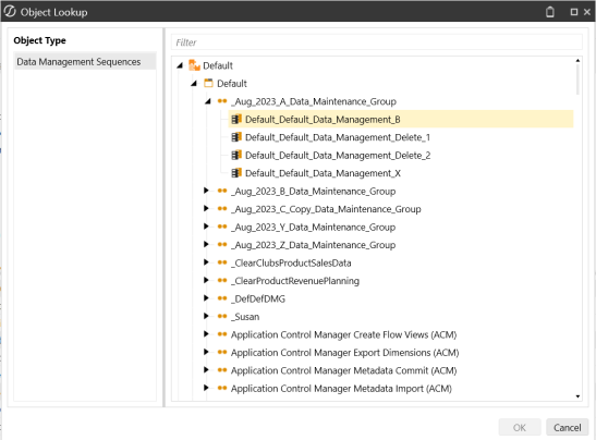
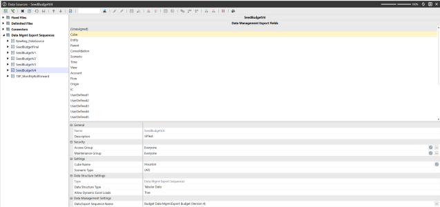
NOTE: The workspace name will be prefixed to the Data Management Sequence Name if you are selecting a sequence outside the Default Workspace. For example, Budget Data Management workspace is prefixed to Export Budget (Version 4) sequence.
Presenting Data With Books, Cube Views and Other Items › Workspaces › Build Data Management in Workspaces
Task Scheduler allows you to schedule data management sequences that can run one or more data management steps within the application. You can reference the workspace path and sequence within the Task Scheduler to determine the tasks, sequences, or modifications are running correctly.
Display Task Scheduler in Workspaces
-
Under Application Tools > Task Scheduler, click New Task.
-
Enter the Name, Description, and Start Date/Time for the task.
-
On the Schedule tab, specify details for the task.
-
On the Advanced tab, select the number of times to retry a failed task.
-
Under Sequences, select the data management sequence under the workspace name and path, and click the OK button to add the task to the Grid View and the Calendar View.
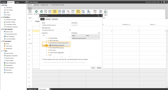
NOTE: When selecting a data management sequence, if a workspace, a data management group, or a maintenance unit has no sequences in it, it will not display as an option to select under Sequences. If a workspace is not set to shareable, you cannot select the Workspace. .
-
Under the Task Scheduler > Calendar View, the new Task is added and listed.
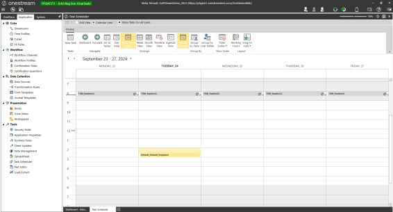
You can also view the workspace name and sequence name in the calendar pop under calendar view.
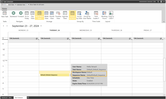
-
Under the Task Scheduler > Grid View, the task displays the Workspace and Sequence name.
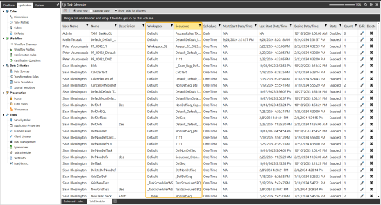
NOTE: You will not be able to delete a sequence on the Workspaces or Data Management pages if it is assigned to a Task Scheduler item.
Presenting Data With Books, Cube Views and Other Items › Workspaces
Presenting Data With Books, Cube Views and Other Items › Workspaces › Load and Extract for Data Management Objects
You can import and export parts of the Application Workspaces for data management objects using an XML format.
XML Extract Application Workspaces
To extract Data Management Groups, follow these steps:
-
On the Application tab, under Tools, click Load/Extract.
-
Click the Extract tab and select Data Management as the file type.
-
Expand Groups and select data management groups to export.
-
Click
 to extract.
To extract the default workspace and default maintenance unit, follow these steps:
-
On the Application tab, under Tools, click Load/Extract.
-
Click the Extract tab and select Application Workspaces as the file type.
-
Click the All folder to de-select all items.
-
Expand Workspaces in the tree hierarchy and select the default workspace and default maintenance unit.
-
Click
to extract.
To extract the default workspace and a non-default maintenance unit, follow these steps:
-
On the Application tab, under Tools, click Load/Extract.
-
Click the Extract tab and select Application Workspaces as the file type.
-
Click the All folder to de-select all items.
-
Expand Workspaces in the tree hierarchy and select the default workspace and the non-default maintenance unit.
-
Click
to extract.
To extract a non-default workspace, follow these steps:
-
On the Application tab, under Tools, click Load/Extract.
-
Click the Extract tab and select Application Workspaces as the file type.
-
Click the All folder to de-select all items.
-
Expand Workspaces in the tree hierarchy and select the workspace.
-
Click
to extract.
NOTE: You can also use the search bar and click to search for items to extract in the tree hierarchy.
NOTE: You cannot extract data management profiles since they will no longer be displayed in the user interface but still extract specific Data Management Groups in addition to extracting all of them at once. The tree hierarchy will display All and Groups for all data management groups to extract.
XML Load Application Workspaces
To load Data Management Groups, follow these steps:
-
On the Application tab, under Tools, click Load/Extract.
-
Click the Load tab and select an existing XML file of data management groups to load by the ellipsis (...) or editor.
-
Click
 to load.
To load a default workspace and default maintenance unit, default workspace and non-default maintenance unit, or a non-default workspace, follow these steps:
-
On the Application tab, under Tools, click Load/Extract.
-
Select the Load tab and select the Application Workspaces XML file type to load by the ellipsis (...) or editor.
-
Click
to load.
Presenting Data With Books, Cube Views and Other Items › Workspaces › Load and Extract for Data Management Objects
When you extract Task Scheduler items, the workspace name will be prefixed to the Data Management Sequence Name on the extract.
-
On the Application tab, under Tools, click Load/Extract.
-
Select the Extract tab and select Task Scheduler as the file type.
-
Select Task Scheduler items to extract.
-
Click
to extract.
When you extract Task Scheduler items sequences in the default workspace/default maintenance unit, it will display on the extract. The Default> Default>Task Scheduler Item will list the Data Management Sequence name on the <DataMgmtSequenceName> line.

NOTE: Since the Task Scheduler Item did not use a Non-Default Workspace>Sequence, the Data Management Sequence name within the file will not be prefixed by a Workspace Name.
When you extract Task Scheduler items sequences in the default workspace/non-default maintenance unit, it will display on the extract. The Default> Non-Default>Task Scheduler Item will list the Data Management Sequence name on the <DataMgmtSequenceName> line.

NOTE: Since the Task Scheduler Item did not use a Non-Default Workspace>Sequence, the Data Management Sequence name within the file will not be prefixed by a Workspace Name.
When you extract Task Scheduler items sequences in a non default workspace, it will display on the extract. The Non-Default Workspace, Task Scheduler Item will list the correct Data Management Sequence name on the <DataMgmtSequenceName> line.

NOTE: Since the Task Scheduler Item used a Non-Default Workspace>Sequence, the Data Management Sequence name within the file will contain the Workspace Name as a prefix.
Example: If a Task Scheduler Item was created using a Sequence located in the Non-Default Workspace and NonDefaultWorkspace_Sequence" Data Management Group, it's <DataMgmtSequenceName> line should read: "NonDefaultWorkspace.NonDefaultWorkspace___Sequence</DataMgmtSequenceName>".

Presenting Data With Books, Cube Views and Other Items
Workspace Substitution Variable Items are a collection of static name and value pair properties that can be retrieved in dashboarding or code. Utilizing a substitution variable permits a copied solution to only need the substitution variable value changed. For example, myschema1 to myschema2. Name/Value pairs are added to a property at the Workspace level and referenced on Dashboards/Components.
TIP: Substitution variables can also be used elsewhere throughout Workspaces such as inside labels, images, or button image URLs.
Substitution variable items can be viewed, edited, or deleted through two general properties:
Substitution Variable Name Suffix
Enter the suffix for a substitution variable prefixed by "WSSV" to use within the Workspace.
Substitution Variable Value
Enter the value to replace the processed substitution variable.
Substitution Variable Syntax
|WSSVSUFFIX|
The syntax for referencing the substitution variable with a suffix of "Suffix".
|WSSV{NameOfSubstitutionVariable}|
The syntax for a Workspace substitution variable.
|WSSV{Suffix}|
The syntax within a Workspace running a dashboard that references the substitution variable property.
NOTE: The substitution variable can also be retrieved in code through the DashboardWorkspace object provided to each of the factory services.
Add a Workspace Substitution Variable
Follow these steps to add a Workspace Substitution Variable:
-
Navigate to Application > Presentation > Workspaces. Select or create a new Workspace.
-
Under the General (Workspace) section, click the ellipses (...) next to Substitution Variable Items.
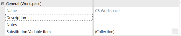
-
The Substitution Variable Items dialog box appears. Click on the Add Item button to add a variable.
-
Enter values into the Substitution Variable Name Suffix and Substitution Variable Value.
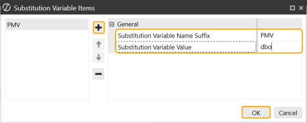
-
Select the OK button, then select the Save button on the Workspace.
TIP: You can remove a variable through the Remove Selected Item button and move variables through the Move Up or Move Down buttons in the Substitution Variable Items dialog box.
Presenting Data With Books, Cube Views and Other Items
Use the Object Lookup dialog box throughout OneStream to search for object to assign rather than having to remember a specific object name or format. The Object Lookup dialog box is useful when you do not know the value or object to apply with a parameter or to display as the default value the first time a parameter runs.
In an Input Value parameter, the default value is the object or value the parameter applies when assigned to an object. For the other parameter types, the default value is the object or value to initially display when a parameter first runs. For example, to display a specific member at the top of a list of six members in a member list parameter, specify that member name as the default value.
Object Lookup enables you to browse application values and objects, such as business rules, colors, cube views, dimensions, number formats, and then copy and paste them where needed. Instead of entering a default value, use Object Lookup as follows to find and assign a value or object.
For example, to use Object Lookup to a default value to a parameter, first create the parameter, then do the following:
-
In the parameter's Default Value, click Edit and then Object Lookup.
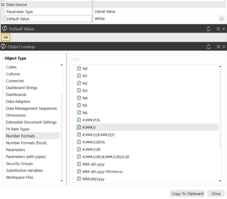
-
In the Object Lookup dialog box, select an object type to the left to browse available objects or values. To refine the objects displayed, filter by name.
-
Select the object and click Copy To Clipboard.
-
In the Default Value dialog box, right-click, select Paste, and then click OK.
To remove or use another value or object, delete the contents in the Default Value dialog box and click Object Lookup.
Parameters (with Pipes) Example
When designing a cube view header, click the Object Lookup icon and select Parameters (with Pipes) from the Object Type menu. If the name of the specific parameter is known, begin typing it in the filter at the top of the dialog box. Select the desired cube view styles parameter, such as DefaultHeader, and click Copy to Clipboard or click CTRL/double-click to copy.

Next, click into the empty field where the copied parameter needs to go, and click CTRL+V. This pastes the parameter into the Cube View field.
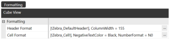
Presenting Data With Books, Cube Views and Other Items › Find and Assign Values Using Object Lookup
Another example of how this feature can be used is when using Cube View Templates to create Cube View Rows or Columns. Open the Object Lookup, and begin typing the desired Cube View Template name, select the Cube View Template, and click Copy to Clipboard.
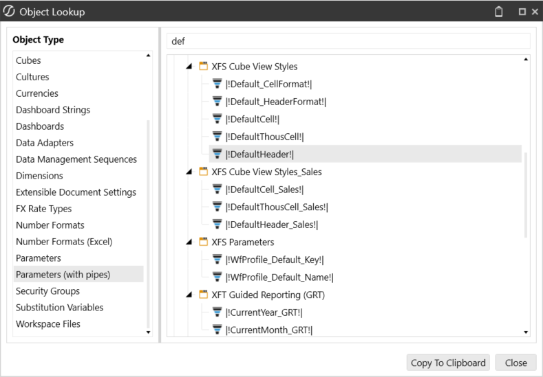
Then paste it into the Cube View Name For Sharing All Rows property.
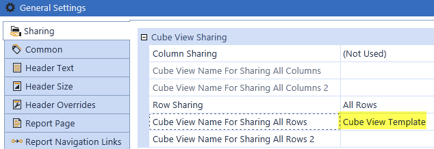
Presenting Data With Books, Cube Views and Other Items › Find and Assign Values Using Object Lookup
You can find each of the strings for Extensible Document Settings in the Object Lookup dialog. There is a variety of item types that can be used in Extensible Documents, however each one needs to be configured a specific way to process correctly at run-time. An example of each item type’s configuration is provided below. For more details on how to utilize and configure these item types in an Extensible Document, see Extensible Document Framework in Presenting Data With Extensible Documents.
Insert Content Using Document Variables
Cube View Report
To insert a Cube View Report into an Extensible Document, the following string needs to be updated and pasted when configuring the document variables:
"{XF}{Application}{CubeViewReport}{CubeViewName}"
(Optional formatting): “IncludeReportMargins=False” “IncludeReportHeader=False” “IncludeReportFooter=False” “IncludePageHeader=True” “IncludePageFooter=True”
IMPORTANT: Arguments such as the "CubeViewName" are placeholders for Cube Views, Reports, and Files that must be updated.
Example
"{XF}{Application}{CubeViewReport}{CubeViewStatement}"
Excel Sheet
To insert an Excel Sheet into an Extensible Document, the following string needs to be updated and pasted when configuring the document variables:
"{XF}{Application}{File}{Documents/Public/ExtensibleDocs/ExcelFileName.xfDoc.xlsx}"
(Optional formatting): “ExcelSheet=Sheet1"
IMPORTANT: The specific path to the File in the File Explorer must be included and updated.
Example
"{XF}{Application}{File}{Documents/Public/ExtensibleDocs/Excel4.xfDoc.xlsx} "
"{XF}{Application}{File}{Documents/Public/ExtensibleDocs/Excel4.xfDoc.xlsx}" "ExcelSheet=Sheet1"
Excel Named Range
To insert an Excel Named Range into an Extensible Document, the following string needs to be updated and pasted when configuring the document variables:
"{XF}{Application}{File}{Documents/Public/ExtensibleDocs/ExcelFileName.xfDoc.xlsx}"
(Optional formatting): “ExcelNamedRange=SampleNamedRange"
Example
"{XF}{Application}{File}{Documents/Public/ExtensibleDocs/Excel5.xfDoc.xlsx} "
"{XF}{Application}{File}{Documents/Public/ExtensibleDocs/Excel4.xfDoc.xlsx}" "ExcelNamedRange=NamedRange1"
Microsoft Word Document
To insert a Microsoft Word Document into an Extensible Document, the following string needs to be updated and pasted when configuring the document variables:
"{XF}{Application}{File}{Documents/Public/ExtensibleDocs/WordFileName.docx}"
Example
"{XF}{Application}{File}{Documents/Public/ExtensibleDocs/OneStreamWordDocument.docx}"
Rich Text Document
To insert a Rich Text Document into an Extensible Document, the following string needs to be updated and pasted when configuring the document variables:
"{XF}{Application}{File}{Documents/Public/ExtensibleDocs/RTFFileName.rtf}"
Example
"{XF}{Application}{File}{Documents/Public/ExtensibleDocs/RichTextFormatDoc.rtf}"
Text Document
To insert a Text Document into an Extensible Document, the following string needs to be updated and pasted when configuring the document variables:
"{XF}{Application}{File}{Documents/Public/ExtensibleDocs/TextFileName.txt}"
Example
"{XF}{Application}{File}{Documents/Public/ExtensibleDocs/TextFileData.txt}"
Report
To insert a Report into an Extensible Document, the following string needs to be updated and pasted when configuring the document variables:
"{XF}{Application}{Report}{ReportComponentName}"
(Optional formatting): “IncludeReportMargins=False” “IncludeReportHeader=False” “IncludeReportFooter=False” “IncludePageHeader=True” “IncludePageFooter=True”
Example
"{XF}{Application}{Report}{Report3}"
NOTE: Parameters and Substitution Variables are not listed under Extensible Document Settings.
Insert Content Using Office Image
Chart/Chart Report
To insert a Chart or Chart Report Dashboard Component into an Extensible Document, the following string needs to be updated and pasted in the Content Control Properties dialog:
{XF}{ItemLocation}{ItemType}{ChartComponentName}
Example
{XF}{Application}{Chart}{Waterfall}
{XF}{Application}{ChartReport}{Waterfall}
NOTE:
Use this for all Chart (Advanced) Dashboard Components.
Cube View Report
To insert a Cube View Report into an Extensible Document, the following string needs to be updated and pasted in the Content Control Properties dialog when configuring the image:
{XF}{Application}{ItemType}{CubeViewName}
Example
{XF}{Application}{CubeViewReport}{BalanceSheetSummary}
Excel Sheet/Excel Named Range
To insert an Excel Sheet or Excel Named Range into an Extensible Document, the following string needs to be updated and pasted in the Content Control Properties dialo when configuring the image:
{XF}{Application}{ItemType}{FilePath}
Example
{XF}{Application}{ExcelFile}{Documents/Users/jsmith/Favorites/VarianceReport.xfDoc.xlsx}
NOTE: For Excel Named Range Item Types, the Excel Named Range Name is configured in the formatting string. (e.g., ExcelNamedRange=TotalAssets)
To insert a PDF into an Extensible Document, the following string needs to be updated and pasted in the Content Control Properties dialog when configuring the image:
{XF}{Application}{ItemType}{FilePath}
Example
{XF}{Application}{FileViaPDF}{Documents/Users/jsmith/Favorites/IS.pdf}
Report
To insert a Report Dashboard Component into an Extensible Document, the following string needs to be updated and pasted in the Content Control Properties dialog when configuring the image:
{XF}{ItemLocation}{ItemType}{ReportComponentName}
Example
{XF}{Application}{Report}{UserTaskActivity}
Rich Text
To insert Rich Text into an Extensible Document, the following string needs to be updated and pasted into the Alt Text Description Field for the specific image:
{XF}{Application}{RichText}{RichTextContent}
(Optional formatting): PageNumber=1, CropLeft=0, CropTop=0, CropWidth=0, CropHeight=0, Zoom=100, MaintainAspectRatio=True, FillMode=Width, Anchor=TopLeft, IncludeBorders=False, BackgroundColor=#FFFFFF, MeasurementUnit=Inch, PageWidth=8.5, PageHeight=11
Example
{XF}{Application}{RichText}{|!Narrative2!|} BackgroundColor=#C1E5F5, PageNumber=1, IncludeBorders=False
NOTE: "Narrative2" is a parameter containing a specific Rich Text. You can also paste the specific rich text format in the string.
Options
The following options are available when formatting Extensible Document Image Content. Each Image Type has a formatting string which is located in the Object Lookup Dialog under Extensible Document Settings|Insert Content in Office Image. The user can copy and paste the desired formatting string into the Description field when configuring the image. If changes need to be made to the string, delete the current option and replace it with the correct one. The list below covers all of the formatting options for each Image Type.
Item Location
Application, System
Item Type
Chart, ChartReport, CubeViewReport, ExcelFile, FileViaPDF, Report
FillMode Options
Width, Height, LargestSide, SmallestSide
Anchor Options
BottomCenter/Left/Right, MiddleCenter/Left/Right, TopCenter/Left/Right
Cropping Options
This allows a user to narrow in on a portion of the image before other settings are applied. The default setting is 0 which means cropping is not being used.
CropLeft, CropTop, CropWidth, CropHeight
XFCell
XFCell is a retrieve function used mainly in text documents such as Microsoft Word or PowerPoint. The specific Dimension details provided in the function obtains a single cell of data from OneStream and displays the updated value on an Extensible Document at run-time. Examples of common XFCell formulas are provided below. See Extensible Document Framework in Presenting Data With Extensible Documents for more details on how to configure XFCells in an Extensible Document.
The following example pulls data for a specific Entity and Account:
XFCell(E#US:A#Sales)
Additional Dimension Members can be added for more specific detail:
XFCell(E#US:A#Sales:T#2014)
NOTE: Any Dimensions not specified in the formula will come from the user’s POV.
Number formatting and scaling can also be added to an XFCell.
The example below is using the number format N3 with a scaling of 6
XFCell(E#US:A#Sales, NumberFormat=N3, Scale=6)
Culture Invariant is a default culture not associated with a specific country. It is typically used when users need to convert a number to a string, but do not want the result to be different if one user is running the string on a French PC and another user is using an English PC.
XFCell(E#US:A#Sales, Culture=Invariant)
Include Member Scripts in XFCells in order to retrieve data for specific Dimension Members. Culture User is based on the computer’s Windows settings and the User settings.
XFCell(Memberscript, Culture=User, NumberFormat=N3, DisplayNoDataAsZero=True, Scale=3, FlipSign=True, ShowPercentageSign=False)
Use Business Rules in Extensible Documents
Business Rules can also be referenced in an XFCell function. The following details need to be updated for this to work correctly.
BR#[BRName, FunctionName=yourFunctionName, Name1=Value1, AnotherName=[AnotherValue]]
Example
BR#[BRName=FMK_Helper, FunctionName=GetUserSetting, SolutionID=MBL, FieldName=[Period]]